| The objective of this page is to present, in the most elementary way, some of the one variable graphs that we find or use in elementary statistics. Links are provided to other pages that demonstrate creating these graphs in R. |
| As a small but significant disclaimer, please note that R has at least three completely separate, and to some extent, redundant systems for creating graphs, charts, and plots. These pages only use the base plotting system. We expect that this base system to be more than sufficient for our needs. However, should you ever need fancier graphs, rest assured that R is quite capable of producing them, though maybe through the other two systems. |
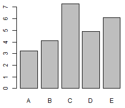
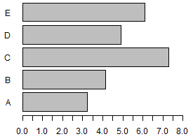
| Table 1 | |||||
| Label | A | B | C | D | E |
| Value | 3.24 | 4.13 | 7.3 | 4.9 | 6.1 |
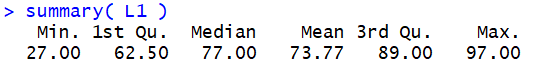
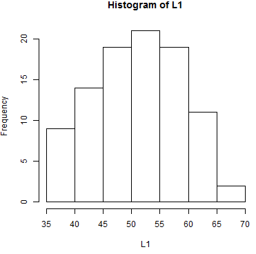
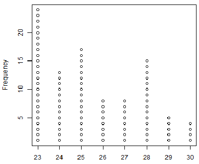
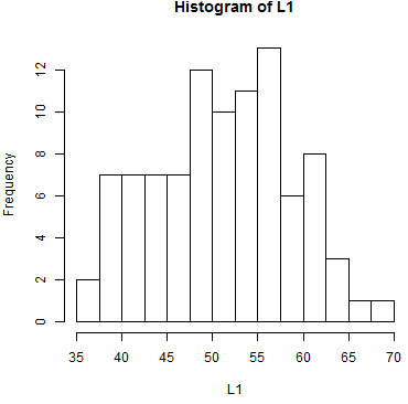
In particular, we see that the values must be between
35 and 80, and that most of the values appear near the middle of that range
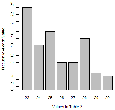
with fewer values at the extremes. In fact, of the 95 value in the table, only 2 appear to be
greater than 65 and only 9 appear to be less than or equal to 40,
assuming the histogram was produced using the default R settings.
One aspect of making a histogram is deciding how many bins
you will use and where the breaks between the bins will fall. In Figure 5
there are 7 bins starting at 35 and having a width of 5. What if we keep
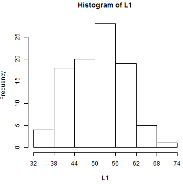
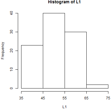
the 7 bins but we change the breaks between the bins?
One version of that is shown in Figure 6.
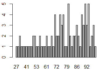
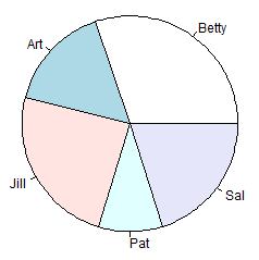
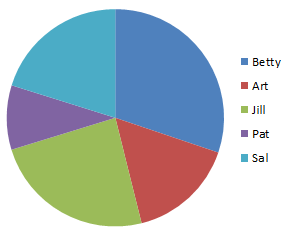
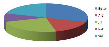
| Table 6 | |||||
| Label | Betty | Art | Jill | Pat | Sal |
| Value | 9.13 | 4.82 | 7.3 | 2.9 | 6.1 |
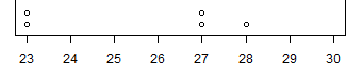
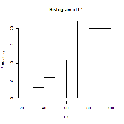
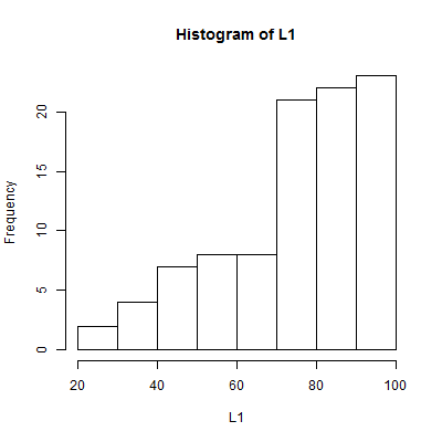
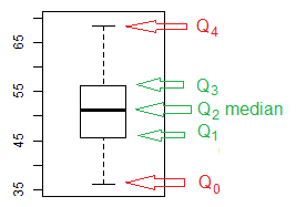
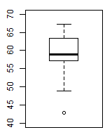
| Figure 13 | Figure 14 |
|
|