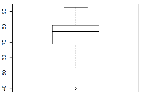
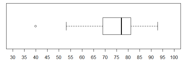
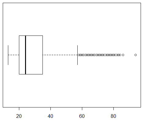
A box and whisker chart gives us a way to picture all of the quartile values for a collection of data. To illustrate this we will start with the values in Table 5, values that you can generate in R by using
Just calling the boxplot() function for this data means entering the statement boxplot(L1). This produces the chart shown in Figure 1.
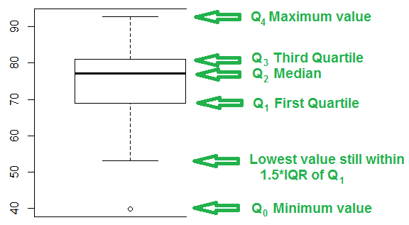
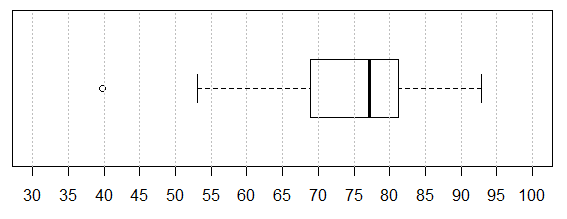
An annotated version of that same chart appears in Figure 2.
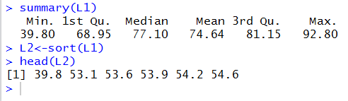
Before discussing the annotations of Figure 2, we will take a peek at the values in Table 1. First, we get a summary of that data, via the summary(L1) command. Second, we put a sorted copy of the data into L2 via the L2<-sort(L1) command. And third, we look at the first few items in the sorted version via the command head(L2). All of this is shown in Figure 3.
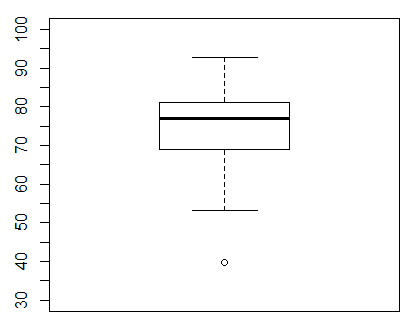
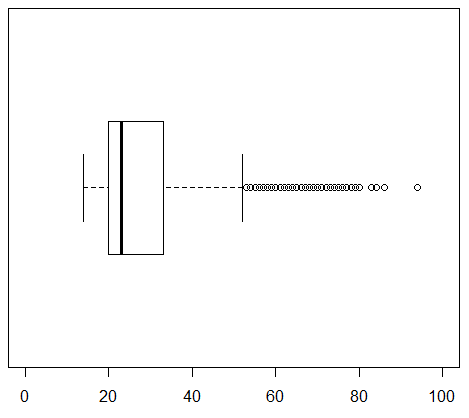
Knowing the values shown in Figure 3 we can see the design of the box and whisker chart in Figure 2. First, we will look at the box, the rectangle in the middle of the chart. The heavy line across the middle of the rectangle corresponds to the median value, 77.10. Remember that the median is also the second quartile, Q2. The top of the rectangle corresponds to the third quartile, Q3, 81.15. The bottom of the rectangle corresponds to the first quartile, Q1, 68.95.
The whiskers of the chart pose a slightly more complex problem. The box and whisker charts of Figures 1 and 2 is the result of the simple command boxplot(L1). As such, that chart uses the default interpretation for drawing the whiskers. In order to understand that default interpretation we need to consider the interquartile range, the IQR, the difference between Q3 and Q1. In this case that will be 81.15-68.95 or 12.2. That is really the distance from the top to the bottom of the rectangle. Then we compute 1.5*IQR, in this case, 1.5*12.2 or 18.3. The top whisker extends up from the rectangle to the largest value in the table that is less than or equal to Q3+1.5*IQR. For the data in Table 1 81.15+18.3 is 99.45. However, the largest value in the table is 92.8. Therefore, the top whisker extends from the Q3 up to 92.8.
The bottom whisker extends down from the rectangle to the lowest value in the table that is greater than or equal to Q1-1.5*IQR. For the data in Table 1 68.15-18.3 is 50.65. However, the largest value in the table is 39.8, while the lowest value in the table that is greater than or equal to 50.65 is the value 53.1. Therefore, the bottom whisker extends from the Q1 down to 53.1.
Finally, any value that is not included in between the top of the top whisker and the bottom of the bottom whisker is plotted as a small circle. In our example, the value 39.8 fits that requirement and the chart has a small circle at that level.
All of that computation and concern about the length of the whiskers really does have some use. Any value that is outside of the range of the whiskers, that is, any value that is plotted separately, is considered to be an outlier. An outlier is a value that is unexpectedly far away from all the other values. Having the box and whisker chart helps us to identify any outliers in the data.
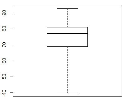
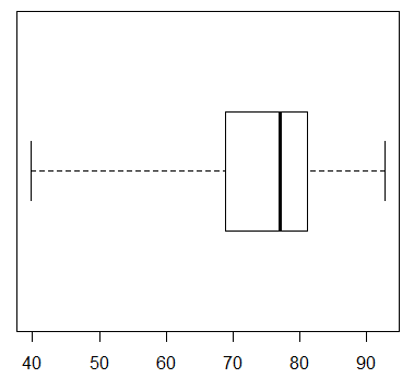
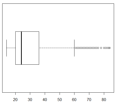
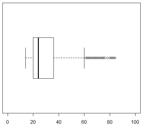
Of course, R does give us a way to make a really simple box and whisker plot, one that just has the whiskers extend to the extreme values. To do this we change the command to boxplot(L1,range=0) which produces the image in Figure 4.
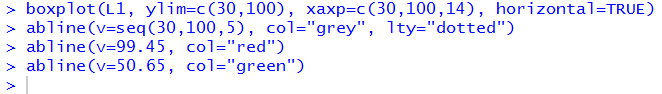
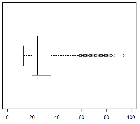
Box and whisker charts are not always presented in this vertical setting. They ofter appear in a horizontal format. We can change the arrangement in R with the direction horizontal=TRUE. With this the command appears as boxplot(L1, range=0, horizontal=TRUE) and the plot appears as in Figure 5.
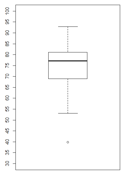
Returning to the default, vertical arrangement, we can make changes in the scale values and tick marks as we have done in our other graphs. For example, if we want the range of values on the y-axis to go from 30 to 100, then we include the direction ylim=c(30,100). And if we want tick marks every 5 units we include the direction yaxp=c(30,100,14). This gives us the command boxplot(L1, ylim=c(30,100), yaxp=c(30,100,14)) which then produces the chart in Figure 6.
Some of the labels are missing in Figure 6, but that is because we did not leave enough room in our RStudio session for the graph to expand vertically. If we adjust the Plot pane to give it more height we can get the graph in Figure 7.
Such a tall plot seems wasteful of space in a printed setting. We will just add the horizontal=TRUE direction and make the command boxplot(L1, ylim=c(30,100), yaxp=c(30,100,14), horizontal=TRUE) producing the chart in Figure 8.
The horizontal format is more appealing here, and our limits still seem to be 30 to 100, but what happened to our tick marks? Through a quirk in the implementation of the boxplot() command, when we move to the horizontal format, the ylim direction is still used to set the limits on the values, but the yaxp direction needs to be replaced by the xaxp direction. Thus, changing the command to boxplot(L1, ylim=c(30,100), xaxp=c(30,100,14), horizontal=TRUE) produces the chart in Figure 9.
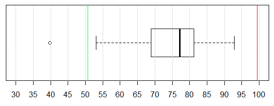
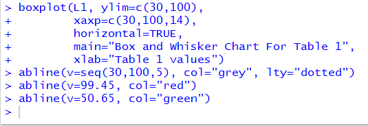
We will add an overlay of grey dotted lines on the tick marks by issuing a new command abline(v=seq(30,100,5), col="grey", lty="dotted") after we have issued the plot command. The image of our commands is given in Figure 10.

Those commands produce the chart in Figure 11.
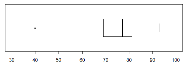
Recall that in the text between Figure 3 and Figure 4 we computed Q3+1.5*IQR to be 99.45 and Q1-1.5*IQR to be 50.65. We will draw a red line at the upper value and a green one at the lower by issuing two more commands, abline(v=99.45, col="red") and abline(v=50.65, col="green"). Thus, the group of all the commands we need is shown in Figure 12.
Those commands produce the chart in Figure 13.
Then, too, it would be nice to add a title and a label for the one axis that we have. Changes to effect those additions are shown in Figure 14.
All of which produces the chart in Figure 15.
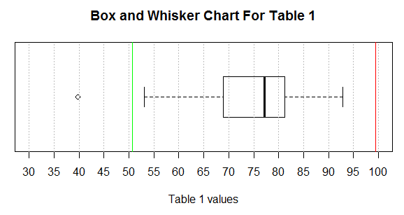
The box and whisker chart in Figure 15 tells us a great deal about the data in Table 1. We get a feel for the range of all the values (about 40 to 93), we see that we have one extremely low value (our outlier at around 40), we see that the next lowest value is way up at around 53, we see that the lower quarter of the values are somewhere between 53 and 69 (forgetting about the outlier), we see that the second quartile is more concentrated in the range of about 69 to 77, we see that the third quartile is packed into values between about 77 and about 81, and that the fourth quartile is again spread out from about 81 to about 93.
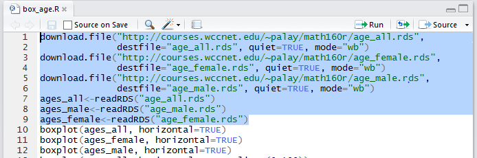
How about looking at some real data? First, we will look the ages of all WCC credit students in the Fall of 2012. Then we will look at the ages of just the students identified as female and the ages of just the students identified as male. To do this, without introducing too much new R material, I have prepared three files, age_all.rds, age_female.rds, and age_male.rds. I have also prepared a file, box_age.R, that you can download to your computer. You could do that download by right-clicking on the link box_age.R and then selecting the Save Link As option. Alternatively, I have included the text of that file in Table 2 here:
| Table 2 |
download.file("http://courses.wccnet.edu/~palay/math160r/age_all.rds",
              destfile="age_all.rds", quiet=TRUE, mode="wb")
download.file("http://courses.wccnet.edu/~palay/math160r/age_female.rds",
              destfile="age_female.rds", quiet=TRUE, mode="wb")
download.file("http://courses.wccnet.edu/~palay/math160r/age_male.rds",
              destfile="age_male.rds", quiet=TRUE, mode="wb")
ages_all<-readRDS("age_all.rds")
ages_male<-readRDS("age_male.rds")
ages_female<-readRDS("age_female.rds")
boxplot(ages_all, horizontal=TRUE)
boxplot(ages_female, horizontal=TRUE)
boxplot(ages_male, horizontal=TRUE)
boxplot(ages_all, horizontal=TRUE, ylim=c(0,100))
boxplot(ages_female, horizontal=TRUE, ylim=c(0,100))
boxplot(ages_male, horizontal=TRUE, ylim=c(0,100))
boxplot(ages_all, horizontal=TRUE,
        ylim=c(0,100),main="all students",
        xaxp=c(0,100,20))
boxplot(ages_female, horizontal=TRUE,
        ylim=c(0,100),main="female students",
        xaxp=c(0,100,20))
boxplot(ages_male, horizontal=TRUE,
        ylim=c(0,100),main="male students",
        xaxp=c(0,100,20), lty=1)
par(mfrow=c(3,1))
boxplot(ages_all, horizontal=TRUE,
        ylim=c(0,100),main="all students",
        xaxp=c(0,100,20), lty=1)
boxplot(ages_female, horizontal=TRUE,
        ylim=c(0,100),main="female students",
        xaxp=c(0,100,20), lty=1)
boxplot(ages_male, horizontal=TRUE,
        ylim=c(0,100),main="male students",
        xaxp=c(0,100,20), lty=1)
par(mfrow=c(1,1))
|
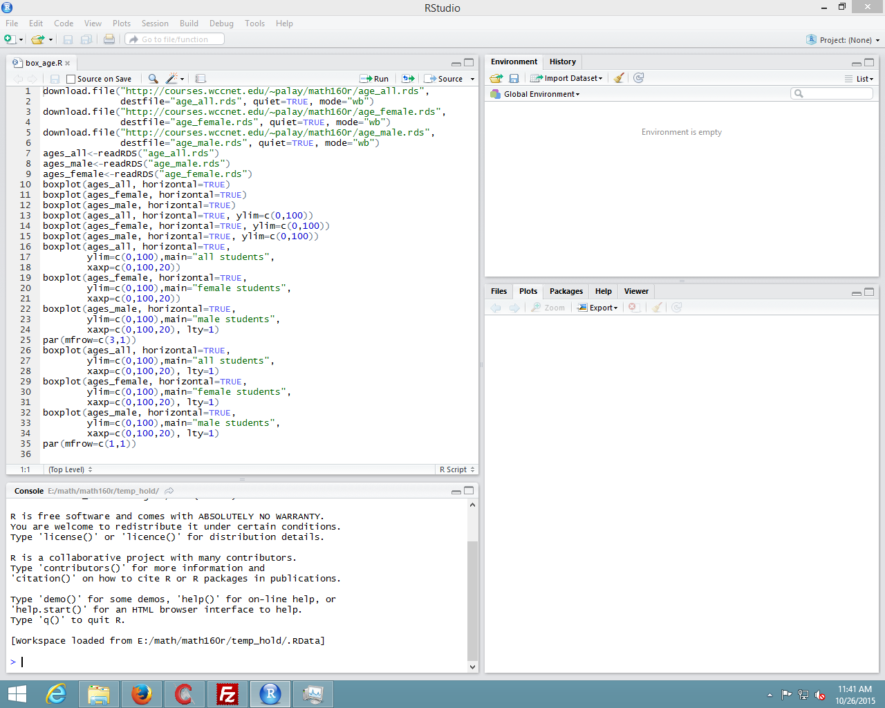
That upper left pane contains the commands that we want to use. They are a bit hard to read in Figure 16. To help us, we look just at that upper left pane, shown in Figure 17.
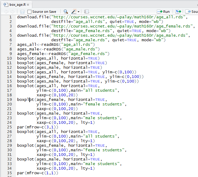
One advantage of the seeing the commands in Figure 17 is that the lines are numbered. We will use those line numbers throughout the following presentation. For example, we want to have R perform these commands but not all of them at once. We can start with performing the first 6 commands (lines 1-9). To do this we highlight those lines, as shown in Figure 18.
Then, we click on the Run button at the top of the pane. Figure 18a
The result, in the Console pane, will be that the commands will have been copied there and performed. This is captured in Figure 18b.
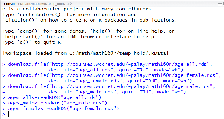
There is nothin in Figure 18b to tell us that anything happened, other than the lack of any error messages. However, in the Environment pane, shown in Figure 19, we see that we now have three variables, and that each one is a long list of ages.
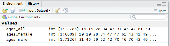
In fact, we see, in Figure 19, that we have ages for 13,785 students, ages for 6,609 female students, and ages for 7,126 male students. We should note here that the WCC system both allows students to mark their gender as not reported and even to not respond to the question. Thus, there are a number of the 13,785 student records that are not identified as either male or female.
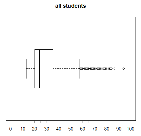
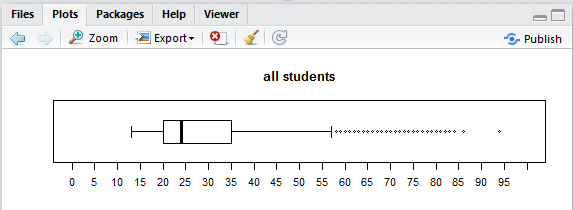
Let us just jump into making some box and whisker charts for this data. We can do this by highlighting line 10 of our commands and clicking on the Run button. That will cause the command boxplot(ages_all, horizontal=TRUE) to be performed, creating the chart shown in Figure 20.
Remember that Figure 20 is showing us the distribution of 13,785 ages. We see that the median age for all students is about 24, that a quarter of the students are below about age 20, that a quarter of the students are between age 20 and the median value, that a quarter of the students are between the median and about age 35, and that the final quarter of the students are older than 35.
Furthermore, we see that there a number of data values that are outside of the right whisker. We understand, from the earlier discussion, that by default the whisker will be drawn to the largest data value that is less than or equal to Q3+1.5*IQR. So many of the students are near the median and therefore the IQR is about 35-20, or approximately 15. Then 1.5*15=22.5 and the whisker needs to go no further than 35+22.5 or about 57.5. As a result, every student age over 57.5 is graphed as a circle beyond the whisker. These outliers are not bad data. There really are such students at WCC. This chart merely points out that students above the age of about 57 are "rare" in terms of the overall population of 13,785 students.
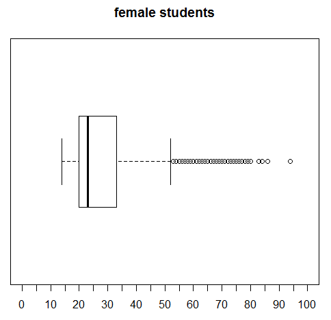
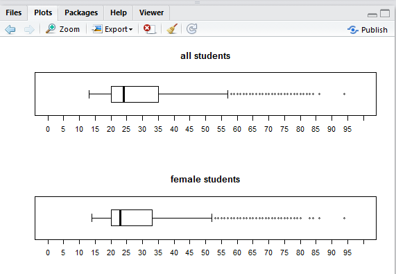
We turn our attention to just the female students by highlighting line 11 of our commands and clicking on the Run button, thus having R perform the command boxplot(ages_female, horizontal=TRUE) and that creates a new chart, shown in Figure 21.
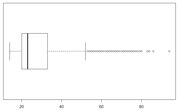
Figure 21 is similar to Figure 20, but not identical. We can confirm that the largest value is the same for both charts, but there is a difference in the values leading up to it. Note the different pattern of the final circles. In addition, the second and third quartiles seem to be more narrow, resulting in a smaller IQR and thus a shorter right side whisker.
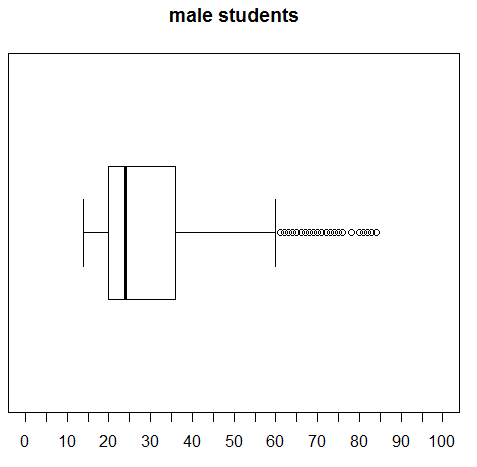
This would be a good time to look at the ages of just the make students. Highlight line 12 of the commands, boxplot(ages_male, horizontal=TRUE), and click on the Run button. This produces the chart in Figure 22.
This is clearly different from the other two. First, the tick marks in Figure 22 are only 10 apart. Second, and relatedly, the scale does not go as far as did the earlier scales in the previous two Figures. Third, although it is hard to compare because we have a changing scale, the right whisker seems to extend further.
Lines 13, 14, and 15 of our commands are just repeats of the previous three commands but with a new direction, ylim=c(0,100), added to each command. By making such a change we force R to have the same scale for each of the charts. That will make it easier to compare the charts.
Highlight and perform each of the three commands. The first generates the chart in Figure 23 for all students.
The second command, the one in line 14, generates the chart in Figure 24 for the female students.
The third command, the one in line 15, generates the chart in Figure 25 for the male students.
It is much easier to compare the last three charts because they have identical limits to the scale. Then again, we could increase the number of tickmarks and put titles on these just to make it even easier to compare them. Lines 16 through 24 of our commands reflect such changes.
Highlight the command in lines 16 through 18, then click on the Run button to produce the chart in Figure 26.
Highlight the command in lines 19 through 21, then click on the Run button to produce the chart in Figure 27.
Highlight the command in lines 22 through 24, then click on the Run button to produce the chart in Figure 28.
Again, we see an improvement in making our charts easier to compare.
What would really help, however, would be if we could produce all three charts on the same plot. The command at line 25, namely, par(mfrow=c(3,1)), will tell R to divide the plot are into 3 rows and 1 column. Then, the next three plots are to be put, successively, into those three regions.
Highlight lines 25 through 28 of the commands and click on the Run button and the image in Figure 29 appears at the top of the Plot pane.
Highlight lines 29 through 31 of the commands and click on the Run button and the image of the next plot is added to the Plot pane so now the top two thirds of that pane appear as in Figure 30.
Highlight lines 32 through 34 of the commands and click on the Run button and the image of the next plot is added to the Plot pane so now the pane appears as in Figure 31.
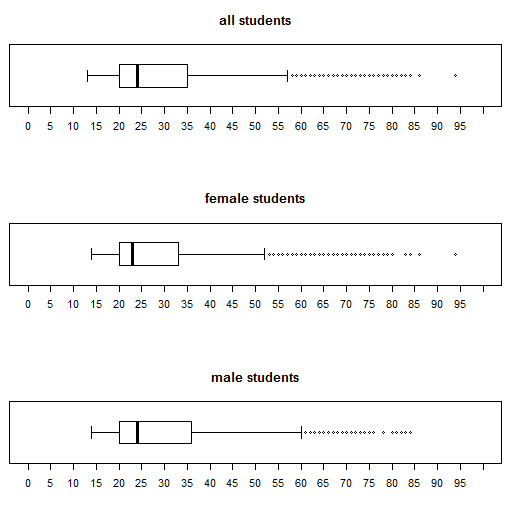
Finally, in Figure 31, we see all three of the charts and they all have the same limit to their scale, and they all have the same tick marks. We can distinguish the differences between the charts and feel confident of our interpretation.
Before we finish our session we should highlight and perform the command at line 35, namely, par(mfrow=c(1,1)), just to return the plotting system to the point where each plot is separate.
©Roger M. Palay
Saline, MI 48176 October, 2015