| Please note that at the end of this page there is a listing of the R commands that were used to generate the output shown in the various figures on this page. |
Without much ado we can create these values and generate a quick histogram to show the distribution of the values. The commands to do this are shown in Figure 1.
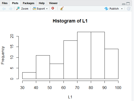
Just the simple command, hist(L1) given in Figure 1 produces the histogram shown in Figure 2.
Unlike our first bar chart this histogram fills in
some fields for us. In particular, we have a title
for the graph, along with labels for both the x-axis
and the y-axis. Of course, if we want to we can override those values
and set the labels to text that we want.
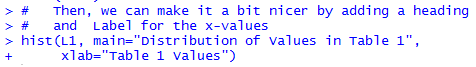
The command
hist(L1, main="Distribution of Values in Table 1",
     xlab="Table 1 Values")
shown again in Figure 3, implements changing the
title of the graph to "Distribution of Values in Table 1",
and the label below the x-axis to "Table 1 Values".
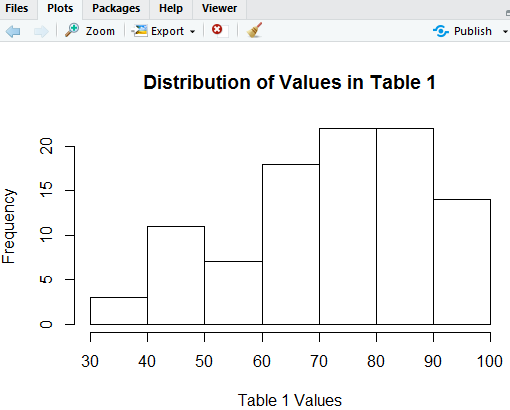
The command of Figure 3 produces the chart seen in Figure 4.
The histogram in Figure 4 is beautiful. It gives us a good feel for the distribution of the data. All of the values are between 30 and 100 inclusive. There are more of the higher values than there are lower values. It looks like there are about 21 of the values that are in the 70's and another 21 of the values that are in the 80's.
As good as that histogram is, we think we may get a better impression of the distribution if the bins are half as wide as R initially set them. That is, we want to find out how many values are in the range 30 to 35, how many in 35 to 49, and so on.
Just to get a quick read on the minimum and maximum values we use the R command summary(L1).
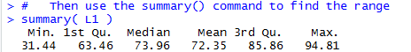
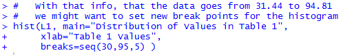
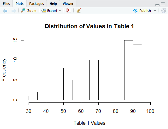
From that information we see that we need only go from 30 to 95 in steps of 5. We can modify our histogram to do this by telling it where to make the breaks. We include the direction breaks=seq(30,95,5) in our hist() command so that it now appears as in Figure 6.
The result of the command above is the histogram in Figure 7.
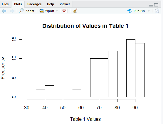
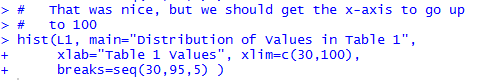
In Figure 7 we see that got our bins to be 5 units wide but now our x-axis stops a bit short at 90. We can fix that by including the direction xlim=c(30,100) in our hist() command, as in Figure 8.
That command creates the histogram shown in Figure 9.
Again, this looks really nice, but we just cannot stop trying to improve it.
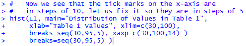
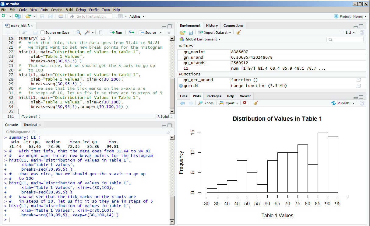
We have our bins correct, but our x-axis scale is still showing up every 10 units (i.e., tick marks at 30, 40, 50, and so on) and we want them every 5 units, at 30, 35, 40, and so on. The direction xaxp=c(30,100,14) should do this. We put that into the hist() command so that it now appears as
That produces the histogram in Figure 11.
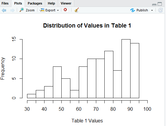
Our tick marks are now there, but why do the new ones not have labels on them?
The problem here is that the RStudio session that created these images was in a window arranged as shown in Figure 12.
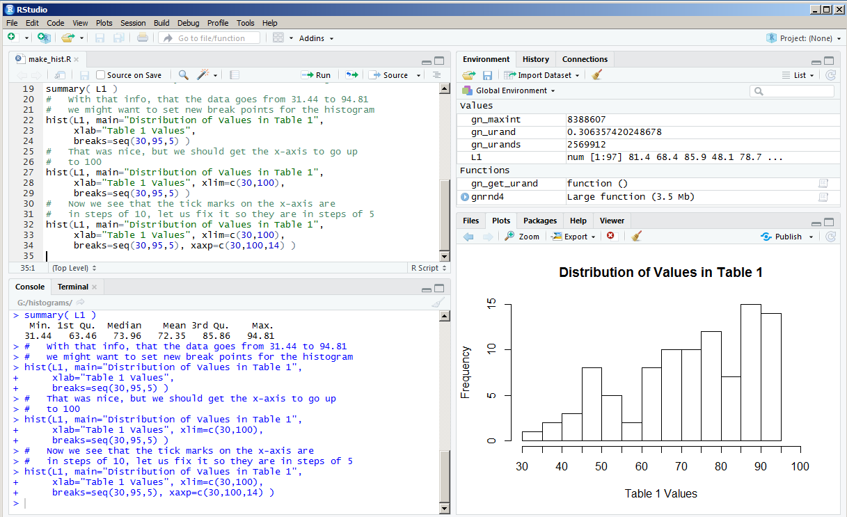
In that window the size of the Plot pane is just too narrow to allow R to reasonably place the extra labels under the x-axis.
One solution to this is to move the vertical separation bar to the left, thus expanding the width of the Plot pane. That is what we did to create Figure 13.
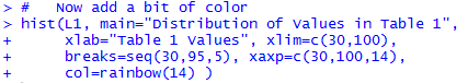
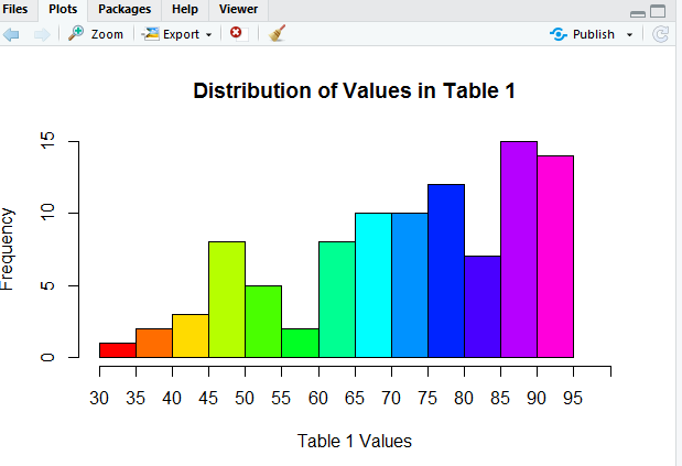
Now we see all of the labels for the tick marks. The histogram looks great, but how about a little color? The direction col=rainbow(14) should fix that.
That command produces:
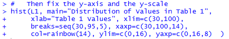
A beautiful picture, although perhaps we should improve the y-axis scale. How about going in steps of 2? We can use ylim=c(0,16) to set the limits on the y-axis. We can use yaxp=c(0,16,8) to create 8 pieces on the y-axis, thus putting a tick mark every 2 units. Now our command appears as in Figure 16.
The result of the command is the histogram in Figure 17.
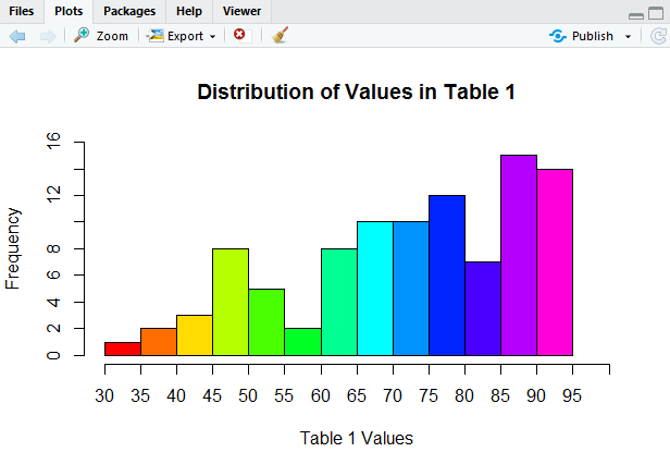
This is looking so good!
But then again, it would be really nice if we had grid
lines, faint lines going across the graph at
each tick mark so that it would be a bit easier, and more accurate, for
us to determine the height of
each rectangle. To do this we want to add specific lines
at height=0, 2, 4, 6, 8, 10, 12, 14, and 16.
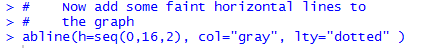
We can do this with a separate command, abline(h=seq(0,16,2), col="gray", lty="dotted" ).
This separate command, entered and performed after we do the hist()
command, will draw lines on top of the graph that we just created.
In that new command, the abline() command,
we can also set the color and the type of the line to be drawn.
Figure 18 shows the two commands used to generate Figure 19.
And, then, the resulting histogram.
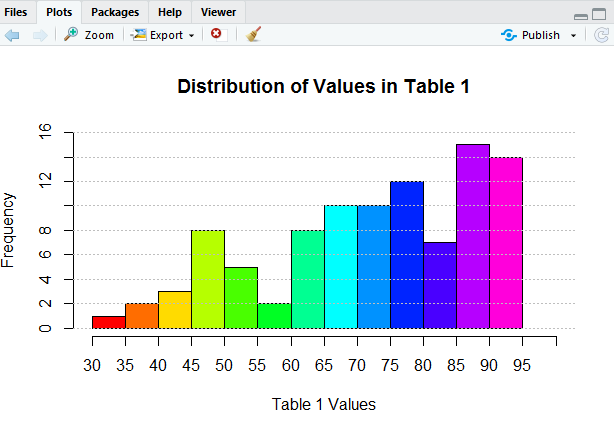
It would seem that we could go on forever making improvements to our histogram, but we will stop here. The histogram in Figure 19 does not really show us any more than what we saw back in Figure 7, but is sure looks better.
What if we want to "save" the image that we just created. One way would be to put a copy of the image into the "clipboard" and then "paste" the image into some other picture or document. If we click on the Export button at the top of the Plot pane in Figure 19, RStudio opens a choice box as shown in Figure 20.
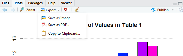
We could follow the path of "Copy to Clipboard..." and eventually "paste" the image into some other program. However, rather than do that, we will take the option of Save as Image... and move to where we just save the image as a file. click on the "Save as Image..." option and RStudio opens a new window, shown in Figure 21.
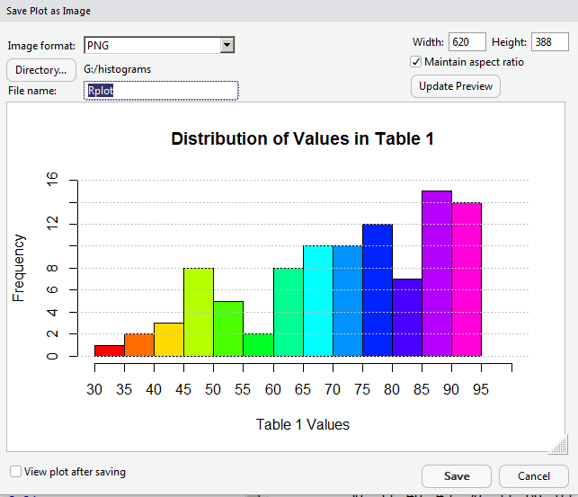
The current image is 620 pixels wide. For some strange reason, we decide to see if we can save some space and get the image down to 400 pixels in width. To see what this would look like, we put 400 into the Width box, as shown in Figure 22.
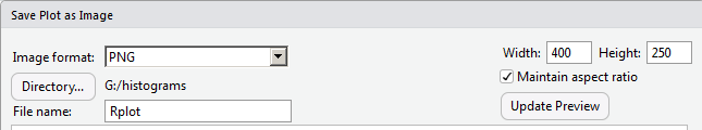
Then, to see that take effect, we click on the Update Preview button. That resizes the image as shown in Figure 23.
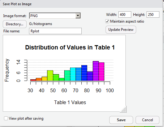
Making the image only 400 pixels wide means that we lost a lot of our work in getting appropriate values as labels in the graph. It looks like we will have to return to a larger size to get those values to show up again. In Figure 24 we reset the width field to 600, and now set the height to 450, and, therefore, uncheck the "Maintain Aspect Ratio" box.
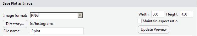
Again, click on the Update Preview button to move to Figure 25.
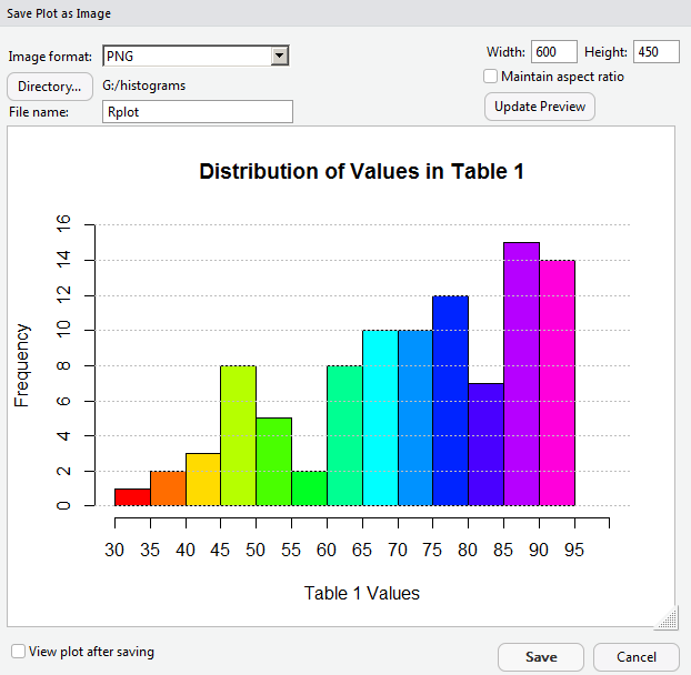
We are back to the kind of graph we wanted. Now we will change the name of the file, in the File Name box. After that we can click on the Save button at the bottom of the window (shown back in Figure 25) to have RStudio create the new file.
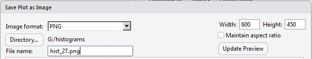
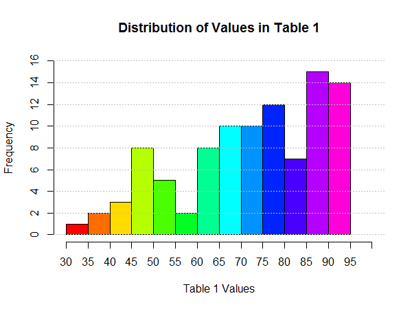
As it turns out, Figure 27 shows that file as it was saved.
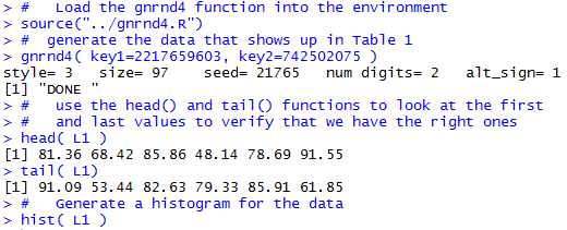
#This holds the commands used to generate images in
#   makehist.htm
#
#   Load the gnrnd4 function into the environment
source("../gnrnd4.R")
#  generate the data that shows up in Table 1
gnrnd4( key1=2217659603, key2=742502075 )
#   use the head() and tail() functions to look at the first
#   and last values to verify that we have the right ones
head( L1 )
tail( L1)
#   Generate a histogram for the data
hist( L1 )
#   Then, we can make it a bit nicer by adding a heading
#   and  Label for the x-values
hist(L1, main="Distribution of Values in Table 1",
     xlab="Table 1 Values")
#   Then use the summary() command to find the range
summary( L1 )
#   With that info, that the data goes from 31.44 to 94.81
#   we might want to set new break points for the histogram
hist(L1, main="Distribution of Values in Table 1",
     xlab="Table 1 Values",
     breaks=seq(30,95,5) )
#   That was nice, but we should get the x-axis to go up
#   to 100
hist(L1, main="Distribution of Values in Table 1",
     xlab="Table 1 Values", xlim=c(30,100),
     breaks=seq(30,95,5) )
#   Now we see that the tick marks on the x-axis are
#   in steps of 10, let us fix it so they are in steps of 5
hist(L1, main="Distribution of Values in Table 1",
     xlab="Table 1 Values", xlim=c(30,100),
     breaks=seq(30,95,5), xaxp=c(30,100,14) )
#   Now add a bit of color
hist(L1, main="Distribution of Values in Table 1",
     xlab="Table 1 Values", xlim=c(30,100),
     breaks=seq(30,95,5), xaxp=c(30,100,14),
     col=rainbow(14) )
#
#   Then fix the y-axis and the y-scale
hist(L1, main="Distribution of Values in Table 1",
     xlab="Table 1 Values", xlim=c(30,100),
     breaks=seq(30,95,5), xaxp=c(30,100,14),
     col=rainbow(14), ylim=c(0,16), yaxp=c(0,16,8)  )
#
#    Now add some faint horizontal lines to
#    the graph
abline(h=seq(0,16,2), col="gray", lty="dotted" )
©Roger M. Palay
Saline, MI 48176 October, 2015