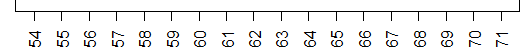
In order to construct a dot plot for that data we would just start with a number line covering the range of values in the table. That range looks to be within 54 to 71. Such a number line appears in Figure 1.
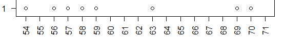
Then, we just go through the values in the table, and for each value we find its position on the number line and we stack a dot on top of that value. Thus, the first eight values in the table are 69, 57, 63, 70, 54, 56, 59, and 58, so we will have a plot that has grown to look like the image shown in Figure 2.
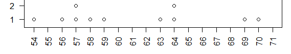
The next three values in the chart are 57, 64, and 64. We already have a dot above 57. Therefore, we stack another dot on top of it. There are no dots above 64 so the first 64 puts one dot there and the second 64 stacks a second dot on top of that. Now our plot looks like the image in Figure 3.
To finish the dot plot we just keep moving through the values in Table 1, adding a dot for each value we examine. The final result would a chart similar to that shown in Figure 4.
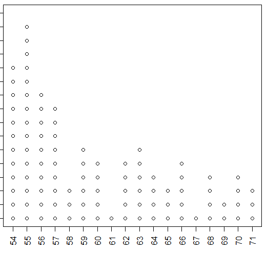
The nice thing about building the dot plot this way is that involves no technology. We just mechanically go through the data and create the chart. At the end we have what amounts to a bar chart or histogram of the data values. We can see the frequency of each value; we get a good feel for the distribution of the values.
However, when we do have technology at our disposal we can have the computer and R make the same chart for us directly. In previous pages we looked at creating a bar chart for just this kind of data. The R commands to make such a chart are given in Figure 5.
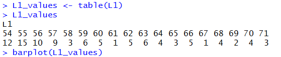
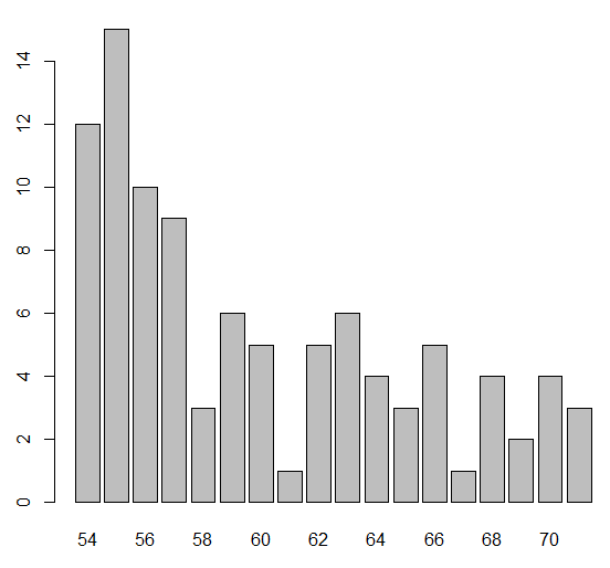
The resulting bar chart appears in Figure 6.
Alternatively, we could just make a histogram of the data. In that case we would probably want to refine the hist() command to get a rectangle for each of the values in the table. Figure 7 gives a possible R command to create such a histogram.
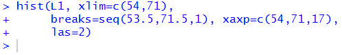
Figure 8 has that histogram.
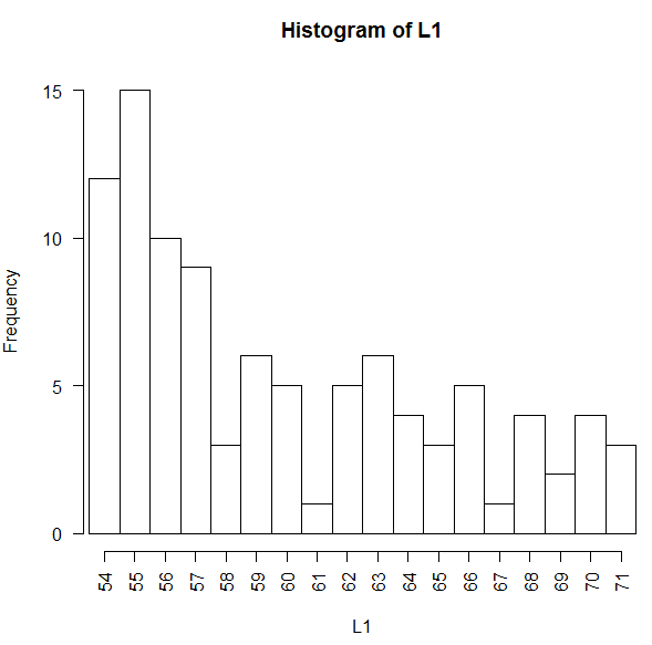
The information in Figures 4, 6, and 8 is the same information. We just employed different methods to construct the chart.
As far as I can tell, R does not have a function to produce the chart shown in Figure 4. I am relatively certain that many other people have been in the situation where they wanted to have such a chart and I am sure that many of those people have solved the problem in any number of ways.
In this case, rather than search for someone else's solution, I have created one to be used here. My solution is to create a function, I call it dot_plot, that will accept a collection of data values and produce a dot plot of those values. It is not a formal part of this course for you to be writing your own functions, but at the same time, it does not hurt to just look at this one. The text of the function is:
##  The following function, dot_plot, is a simple-minded attempt
##  to get R to be able to create a dot plot from discrete, integer values.

dot_plot<-function( this_list, ... )
{
  ## the first thing to do is to just sort the list into a local copy

  lcl_list <- sort( this_list )

  ## then we want a second list that is just as long as was the
  ## original list, because, in that second copy we will place the
  ## vertical position of the associated value in the sorted copy

  lcl_count <- lcl_list

  ## then, to start, we begin at the first item in the sorted list
  ## It will have  avertical position of 1
  cur_val <- lcl_list[1]
  m <- 1
  lcl_count[1]<-1

  ## now we just move through the rest of the sorted
  ## list and if we are at the same value then we go up one
  ## vertical level, but if we are at a new value we reset
  ## the vertical position to 1

  for (i in 2:length(lcl_list))
  {
    x <- lcl_list[i]
    if ( x==cur_val )
    { m <- m+1
      lcl_count[ i ] <- m
    }
    else
    {
      cur_val <- x
      m <- 1
      lcl_count[i] <- m
    }
  }

  ## once we are done with that, we can just do a scatter plot on
  ## the two vectors that we have created.


  plot( lcl_list,lcl_count, xlab="", ylab="Frequency", ...)
}
The design of the function is documented by the comments that are included in it, that is, by the lines that start with the # character. (The use of the double ## is just a matter of style. A single # starts a comment and everything on the line of text from the # to the end of the line is considered to be a comment.) The dop_plot() function really just builds up a second, parallel vector of data to hold the vertical location of each dot in the plot. Once that structure is completed then the function just calls the standard R function to plot points defined by two parallel structures.
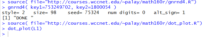
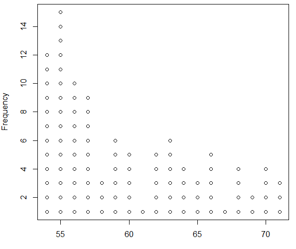
The file dot_plot.R holds the text shown above. The command source( file="http://courses.wccnet.edu/~palay/math160r/dot_plot.R") can be given to R to load the funtion into the workspace. Once the function is loaded we can use it with a command such as dot_plot(L1) to create a dot plot. Figure 9 shows the commands that have been run in the RStudio Console to load the gnrnd4(), function, to run that function to create the same data that we saw in Table 1, to load the dot_plot() function, and then to create a dot plot of the data values.
The result of those commands is the image shown in Figure 10.
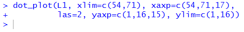
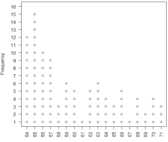
We could improve the appearance of the plot with a few additional directions that we will pass through dot_plot() to the underlying plot() command at the end of the definition of our function. Thus, the command shown in Figure 11 has been tuned to produce a better image.
The result is shown in Figure 12.
Feel free to use our new function should you ever need to produce a dot plot via R.
©Roger M. Palay
Saline, MI 48176 October, 2015