
| As noted in the previous page, the use of pie charts is to be discouraged! However, because pie charts are so familiar, and because you may be asked at some point to actually create one, as part of this course it is important to show you how this can be done in R. |
A pie chart is used to show the relative size of a small group of values. We will start with the values given in Table 1.
| Table 1 Count of toys for Playgroup 3241 | ||||||
| Name | Betty | Robert | Neal | Amanda | Tracy | Patricia |
| Number of toys | 34 | 27 | 42 | 58 | 38 | 24 |
Our first task is to get those values into R. For our purposes we will do all of this work in RStudio. Once RStudio has started, we can put the desired values into the system with the command
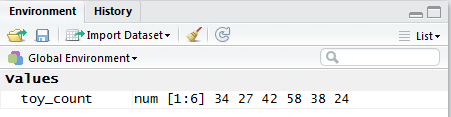
The result of performing the command shown in Figure 1 is the creation of a new variable, toy_count, and we can see this in the Environment pane, shown in Figure 2.
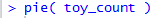
Once the values are in the system, we can get a pie chart with the simple command
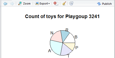
The resulting pie chart appears in the Plot pane of RStudio, shown in Figure 4.
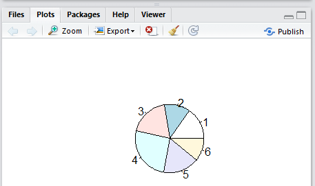
Indeed, the image in Figure 4 is the appropriate pie chart for the given data. However, the default labels for the sectors of that chart are not helpful at all. There are just the ordinal number of the plotted group. Thus, the first item, value 34 associated in Table 1 with Betty, has been given the label 1. The second item, value 27, associated in the table with Robert, has been given the label 2. The third item, value 42, associated in the table with Neal, has been given the label 3. And so on.
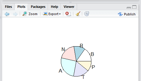
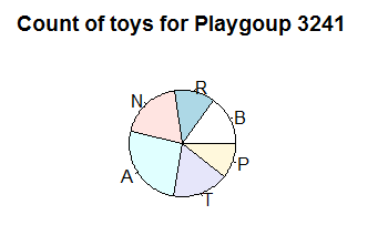
We can specify more appropriate labels by including the direction labels=c("B","R","N","A","T","P") in the command as shown in Figure 4.5.

The result of that command is shown in Figure 5.
As usual, we should add some title to this chart. In Figure 6 we have the new command to do this.

As might be expected, the new chart, with the new label, is shown in Figure 7.
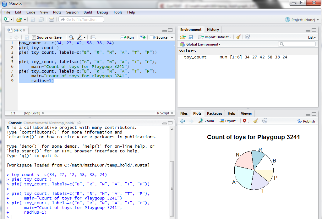
One thing that you may have noticed in the previous charts is that the image of the pie chart within the Plot pane is smaller than we might expect. In fact, the default value of the radius direction is 0.8, and we can increase the size of the chart by changing that value. Figure 8 shows the modified command setting the radius to 1.

That new version of the command produces the image shown in Figure 9.
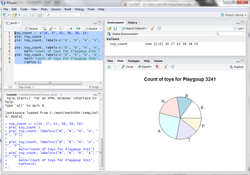
A better "feel" for the amount of the space in the Plot pane that is actually used by the pie chart is available by looking at the entire RStudio window, shown in Figure 10.
We can change the allocation of space within the RStudio window, as shown in Figure 11, in order to give R more room for the pie chart.
The result, visible in Figure 11, is that we have a bigger chart. Of course, an alternative is to Export the chart, a process that we start by clicking on the Export button at the top of the Plot pane. This opens a sub-window as shown in Figure 12.
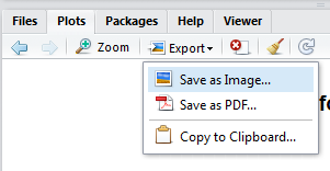
Clicking on the Save as Image... option opens the window shown in Figure 13.
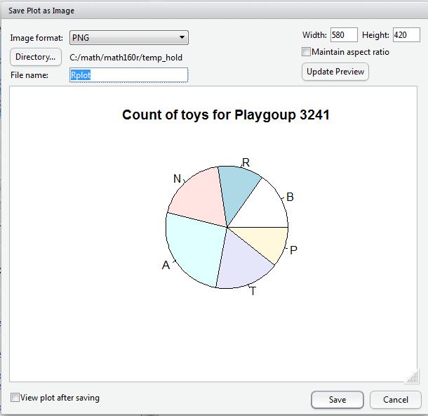
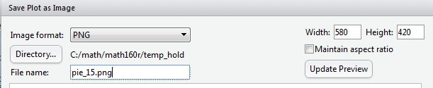
I that window we see that the current width is set at 580 pixels. We could increase that if desired and that would create a larger chart. However, in this case we will jutt save the chart in a file called pie_015.png by putting that filename into the appropriate box in the screen, as shown in Figure 14
Then, licking on the Save button at the bottom of the window will cause RStudio to save the image in that file.
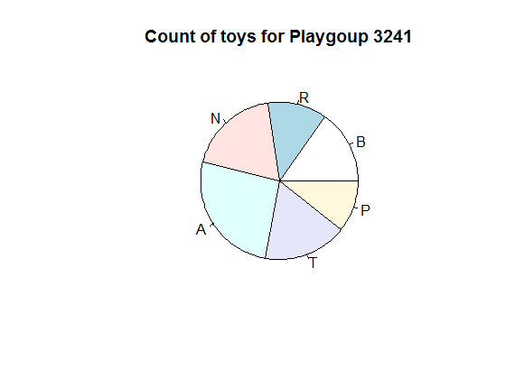
Figure 15 is an image taken directly from that file.
It still seems like R is not using all that much of the available space for drawing the pie chart. In fact, there is a direction named radius that gives R a goal for the proportion of the space to be used. So far we have been using the default value which happens to be 0.8. We can get a larger chart by setting the value of that direction to be 1.
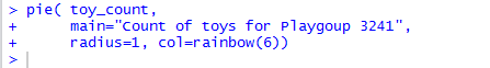
In addition, we can get some more vibrant colors by setting col=rainbow(6). Finally, there is no need to just use the single letter names for the sectors of the pie. We can set the labels to the full person name. All of these changes are shown in Figure 16.
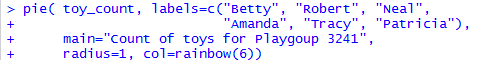
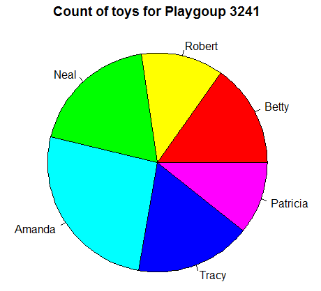
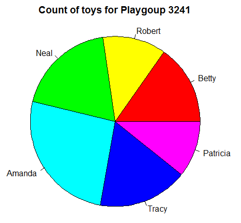
The result of that command is shown in Figure 17.
In presenting the commands for making a bar chart, around Figure 12 of that presentation, we saw that we can attach names directly to values such as the ones we have stored in toy_count. In Figure 18 here we assign the names to the variable. Next we reference the variable causing R to display the values, and, because we have assigned names to the values, this new display shows those names as well.
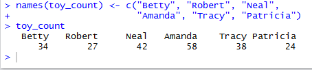
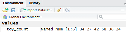
Looking at the Environment pane in Figure 19, and comparing it to what we saw back in Figure 2, we see that the variable toy_count is now "Named".
Now that names are tied to the values in toy_count we have no need to specify the labels direction in the pie() command. As such, that command now appears as in Figure 20.
The result of that command is shown in Figure 21.
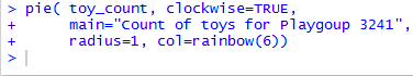
You may have noticed that R displays the pieces of the pie in the order of the data, but it does so by moving in a counterclockwise direction. We can change that behavior by adding the direction clockwise=TRUE to our command. Figure 22 shows the updated command.
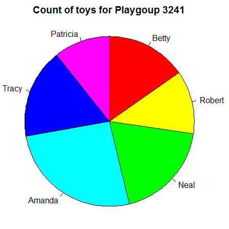
The result of that command is shown in Figure 23. There the slices follow a clockwise pattern as R moves through the data values to produce the pie chart.
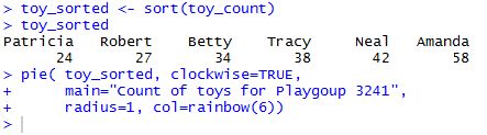
As one more refinement, rather than have the values appear in the original order, we decide that we want them to appear in a "sorted" order. That is, starting with the smallest piece we place successive pieces into the pie so that as we move around the pie the pieces keep getting larger. (Of course, that is the perspective if we are moving clockwise. If we view the same pie in a counterclockwise manner, we would see the pieces getting smaller.) To accomplish this we can sort the original values and store the result in a new variable, one we will name toy_sorted. The first line of Figure 24 shows that command. Then, just to confirm our action, we give R the name of our new variable to which R responds by displaying the values in that variable. Furthermore, we might note that the command toy_sorted < sort(toy_count) not only sorted the values but also kept the names with the appropriate values. That means that the names are now part of toy_sorted, as we see in Figure 24.
Finally, Figure 24 ends with a new pie() command, this one referencing the toy_sorted variable.
The result of that last command is shown in Figure 25.
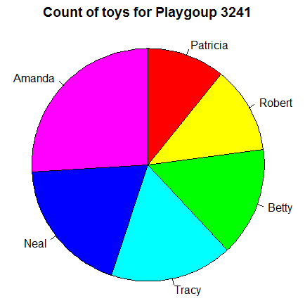
Now the slices of the pie appear in "sorted" order.
©Roger M. Palay
Saline, MI 48176 October, 2015