| Please note that at the end of this page there is a listing of the R commands that were used to generate the output shown in the various figures on this page. |
| Table 1 | ||||||||
| Value | 11.4 | 6.3 | 12.2 | 5.1 | 9.2 | 8.5 | 7.8 | 6.9 |
The R command to create a bar chart is
barplot(). However, to use that command we need to "feed" it the data,
the values that are in Table 1.
We can create a structure, in this case a vector,
to hold the data values.
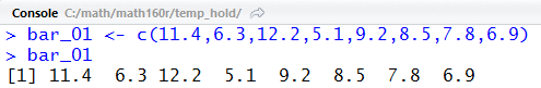
Figure 1 shows, first, the command to create the structure, namely,
bar_01 <- c(11.4,6.3,12.2,5.1,9.2,8.5,7.8,6.9),
and second, the resulting contents of bar_01.
The function c() is used to combine the values given to
it into a vector, and in Figure 1 that vector is assigned to the
variable bar_01.
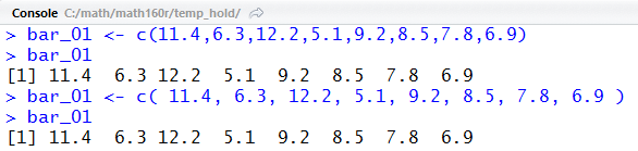
There is nothing wrong with the actions in Figure 1. However, we might note that it is much easier to read the values we are using in the final line than it was to read them in the assignment statement. That is because there is extra spacing in the display line. We could have, and probably should have, included spaces when we entered the values in the first place. R is quite happy for us to make our commands more readable by adding spaces to them. To illustrate this, we have repeated the assignment statement in the middle of Figure 2 but this time we have added before all of the values and a space before the final parenthesis. We see, on the final line of Figure 2, that the added spaces made absolutely no difference to R. We get the same result. Adding such spaces is a matter of style, but it is a style worth considering.
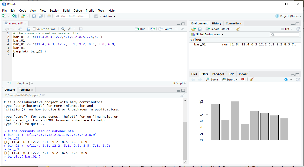
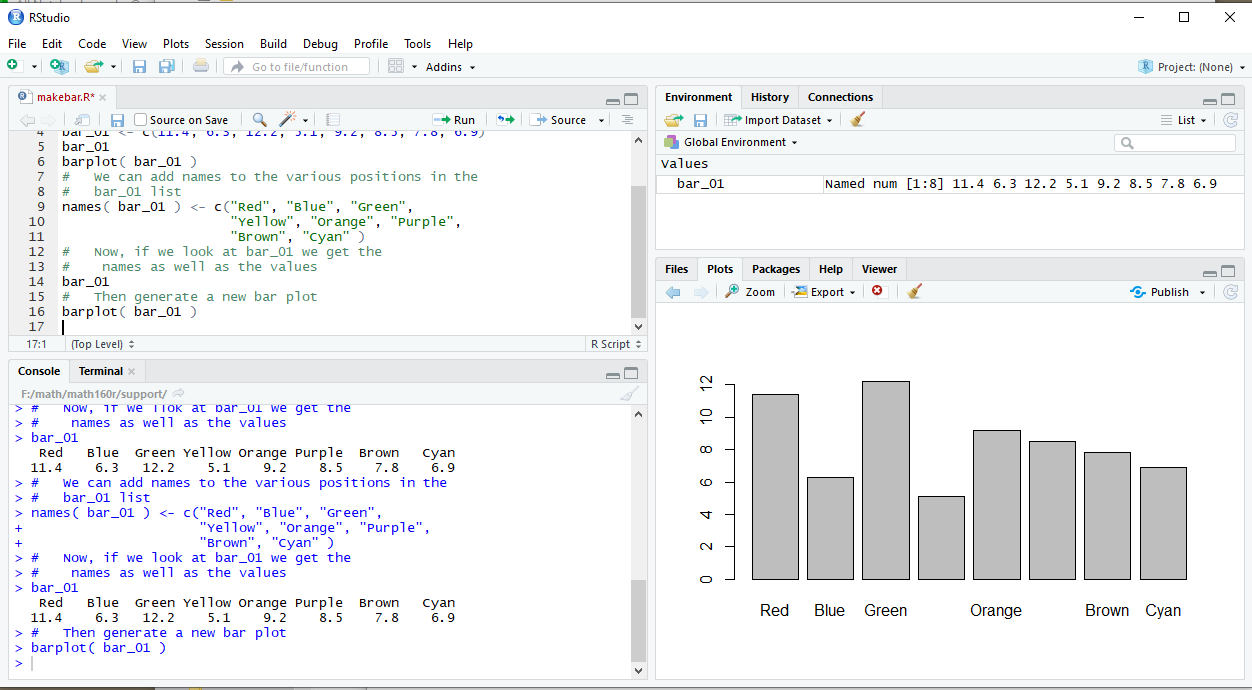
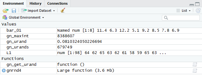
Because the images here were taken from a RStudio session we can see, in Figure 3 showing the Environment pane, the result of our assignment statement.
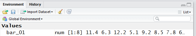
We might note that given the size of our RStudio window and the size of the resulting Environment pane, that not all of the contents of bar_01 could be displayed in that pane. However, we do know from that pane that bar_01 holds numbers and that there are 8 of those numbers.
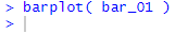
Now that we have the data in R we just have to
give the command barplot( bar_01 )
to tell R to create our plot. That is shown in Figure 3.5.
The result of the command is the plot shown in Figure 4.
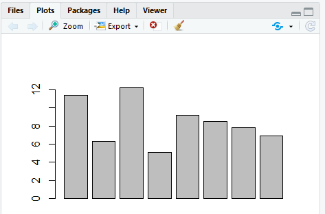
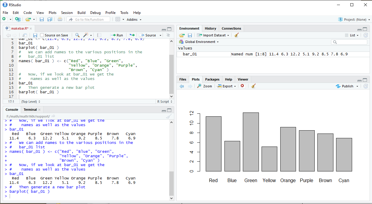
Figure 4 appears in the Plot pane in the lower right portion of the RStudio window. That entire RStudio window is captured in Figure 5.
It is important to note that we can resize the panes in the RStudio window, and doing so will change the way our bar chart appears. To demonstrate this, we have taken the window shown in Figure 5, moved the center divider to the leftt expanding the Environment and the Plot panes, and moved up the right horizontal divider, the one between those two panes, shrinking the Environment pane but expanding the vertical size of the plot pane. The result is shown in Figure 6.
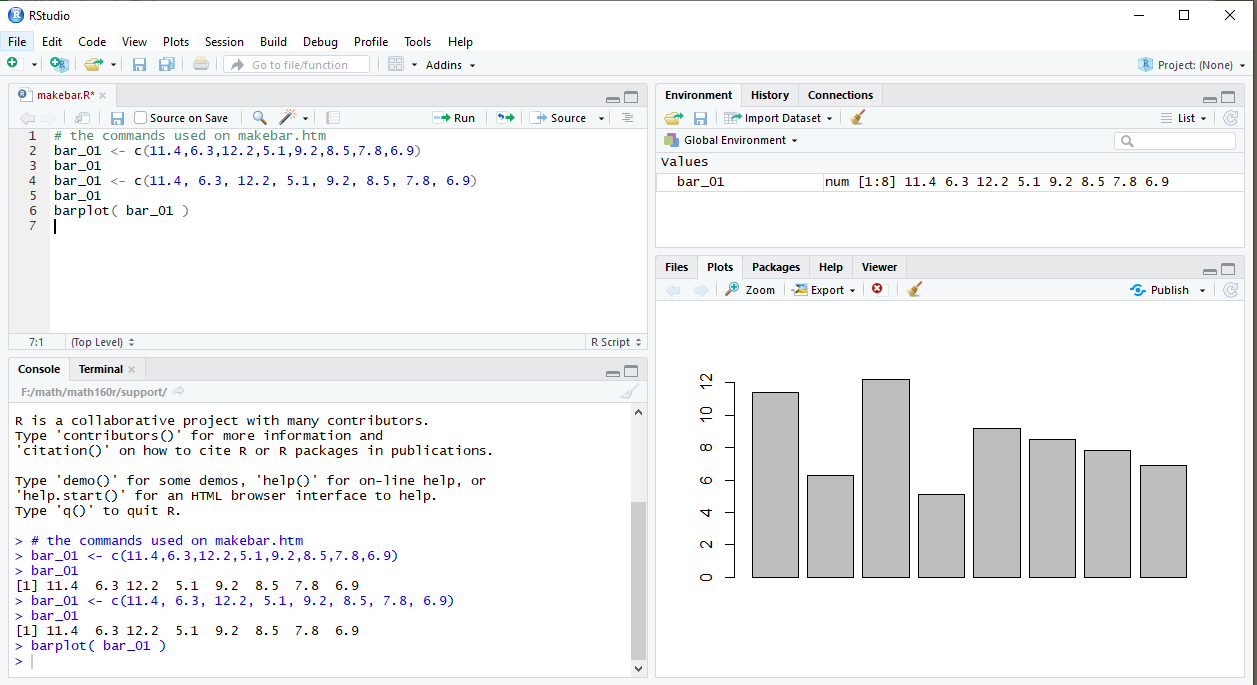
Notice, in comparing the plots in Figure 5 and Figure 6 that the plot has automatically adjusted to fit in the available pane. Naturally, we could continue to change the size of the RStudio window and of the internal panes to get a different sized plot. However, if what we want is not just to see the plot but to save it for later use, perhaps in some document, and save it in a particular size, then RStudio provides a feature to help us do that.
If, in the Plot pane, we click on the Export button then we get the option window shown in Figure 7.
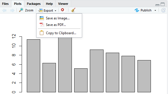
We want to save the image as a file, so we click on that option in Figure 7. This, in turn, opens a new window, shown in Figure 8.
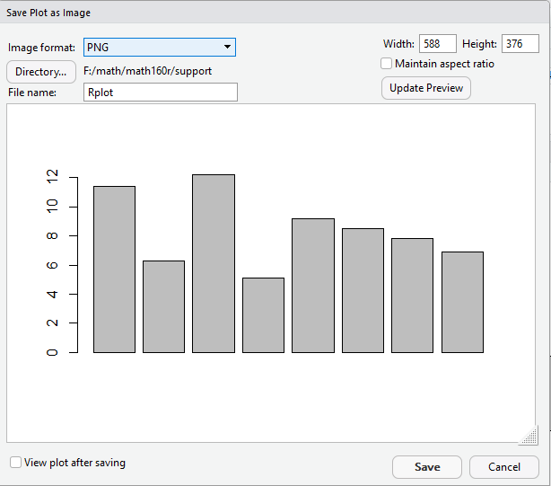
In Figure 8 we see that we will save the image as a PNG file (other options are JPEG, TIFF, BMP, metafile, SVG, and EPS). Furthermore, we see that RStudio is suggesting the name Rplot as the name of the file. Finally, in the upper right hand corner of the window we see that the current size of the plot is 588x376 pixels.
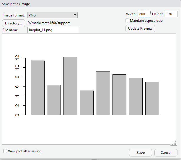
We can change those values to suit our needs. In Figure 9 we have changed the name of the destination file to be barplot_11.png, we have changed the width to 600 pixels, and we have checked the Maintain aspect ratio button.
To move from Figure 9 to Figure 10 we have just pressed the Update Preview button.
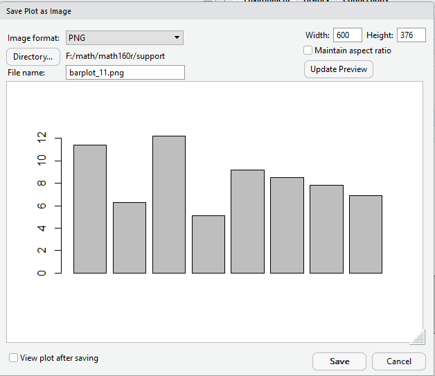
The change from 588 to 600 pixels was actually accomplished in this update, though it is hard to see in the rendering that is shown here. In fact, Figure 11 is that image.
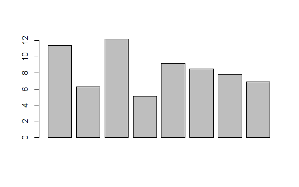
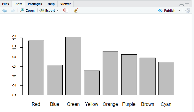
The image in Figure 11 may well be enough for our needs. It does show the relative magnitude of the eight values. However, there are many things that we could do to improve the chart. For one thing, it might be nice if we had a way to distinguish the various values. In particular, there should be a name for each of the values. In Table 2 we now see labels assigned to the values.
| Table 2 -- with labels for data values | ||||||||
| Label | Red | Blue | Green | Yellow | Orange | Purple | Brown | Cyan |
| Value | 11.4 | 6.3 | 12.2 | 5.1 | 9.2 | 8.5 | 7.8 | 6.9 |
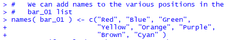
Again, the c() function is used to combine the separate values into a vector. This time that vector is assigned to the construct names(bar_01) which means that the names in the vector are assigned to the values in bar_01. You might also note the use of space in our command to make it more readable, and the fact that R allows us to enter commands across multiple lines. For that matter, in typing the command, when we press Enter at the end of the first line, R knows that we have not finished the command and therefore prompts us with the + to start the new line.
Having given the command in Figure 12, we look at the contents of the Environment pane, shown in Figure 13.
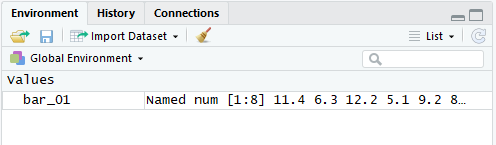
The difference between Figure 13 and what we saw earlier in Figure 3 is that the variable bar_01 is now noted as being named. Although, in Figure 13 we cannot see what those names are.
However, we start Figure 14 by typing bar_01 to which R responds by displaying the contents of that variable. We see, in Figure 14, that the names now appear above each of the values stored in bar_01.
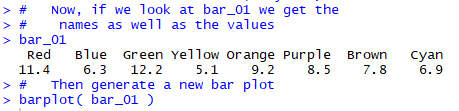
Figure 14 ends with another command to create a bar chart for the values in bar_01. That bar chart appears in Figure 15.
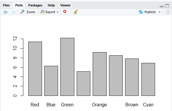
How strange! Some of the names appear in Figure 15, but not all of them. If we step back for a moment and look at the entire RStudio window, in Figure 16, we see that the Plot pane is squeezed into that lower right corner.
We will expand the area given to the Plot pane to move to Figure 17 and see what happens.
With the extra room, R has determined that it can fit in the formerly missing names. We can look, in more detail, at the plot in Figure 18.
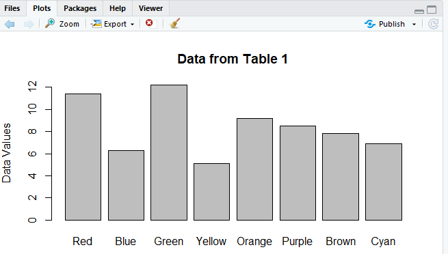
Goodness! This is starting to look like a nice plot. What else could we add? How about a main title and a label along the vertical axis? We can modify the barplot() command to make those changes. The new command appears in Figure 19.
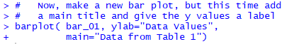
And the result of that command is shown in Figure 20.
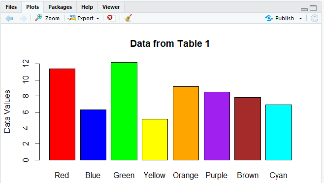
As long as we're getting fancy, perhaps we can add some color to the plot? R allows this via the col= parameter in the barplot() command. By some strange bit of luck, it turns out that R actually "recognizes" the very color names that we have already introduced as names. We might as well have the color match the name. To do this we modify the command to be that shown in Figure 21.
The result is the colorful plot shown in Figure 22.
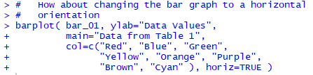
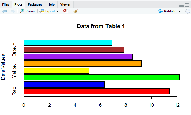
Not being able to leave a good thing as it is, we have a need to have the plot be horizontal rather than vertical. Fortunately, R is ready for us. We just add the direction horiz=TRUE to the barplot() command, as shown in Figure 23.
The result is shown in Figure 24.
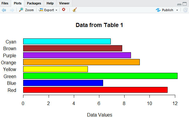
But Figure 24 now has a few problems. First, the label Data Values is still on the y-axis but it is now inappropriate there. We want it on the x-axis. We should be able to make that change by converting ylab to xlab in the command.
Second, many of the data names are not showing up on the plot. Clearly, there is not much room for them. We could stretch the plot vertically to create more room, but that is not an appealing choice.
How about if we ask R to write the names of the values horizontally rather than vertically? The direction to do that is las=1. With those changes, our command is now shown in Figure 25.
The result of that command is shown in Figure 26.
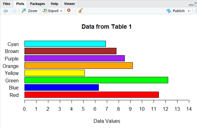
The chart in Figure 26 looks really good. We sort of hate to play with it any more, but the temptation is just too great. The Green bar extends beyond our scale in Figure 26. Also, the scale jumps in steps of 2. We would prefer that it have steps of 1.
Figure 27 has the new command needed to effect such changes. The direction xaxp=c(0,14,14) sets the x-axis points to the values 0 through 14, with 14 divisions. The direction xlim=c(0,14) sets the length of the x-axis to go from 0 to 14.
And, as usual, here is the result of that command.
All of the work thus far has really explained how to set up and then improve a bar chart. The rest of this page will do this task again, but this time starting with different data. In particular, Table 3 has many data values in the range of 56 through 65. You can generate the same data in R by using Figure 29 does show the command to create the same set of values, assigned to L1 in R.
And, in RStudio we can confirm some of the values in L1 by looking at the Environment pane, shown in Figure 29.5.
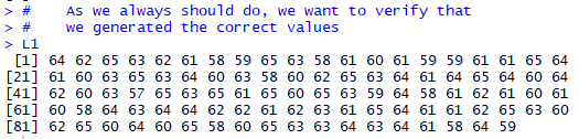
Of course we really should look at all of the values to be sure that we have the right numbers in L1. Figure 29.7 does this.
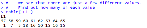
A common task is to create a bar chart showing the frequency distribution of the values in Table 3. We already saw in the example above that if we have distinct values then we can make a bar chart from those values. What we really need here is the number of times each different value appears in the table. Fortunately, R has a function to do this, the table() function. If we have R perform table(L1), as in Figure 30, the response shows us the number of times that each of the values in L1 appears.
Now that we know those values, we could use that information, along with we saw above about barplot() to make the command:
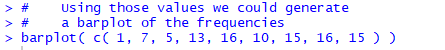
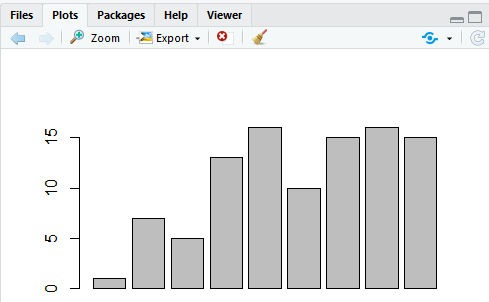
And Figure 30.4 shows the generated bar plot.
However, we will try a slightly different approach. We start by assigning the results of our table(L1) command to a new variable, bar_02 with the command
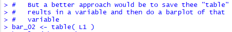
We can verify what has happened by looking in the Environment pane, shown in Figure 32.
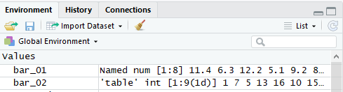
In Figure 32 bar_02 now appears, and it is clearly structurally different from from bar_01. bar_02 is some kind of 'table' and it has int values in it [we can assume that these are integer values instead of decimal (rational) values].
We will go ahead and just try to use our new variable in a barplot() command by entering
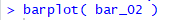
The result is the chart in the Plot pane shown in Figure 34.
The chart in Figure 34 is a great start. It not only shows the relative frequency of the different values in Table 4, it even has the names of those values under each bar. R pulled those names out of the structure stored in bar_02; we did not have to create those names the way we did back in Figure 12.
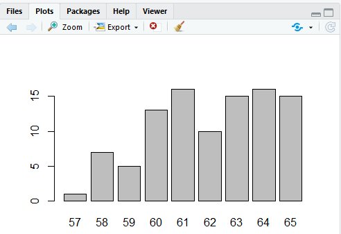
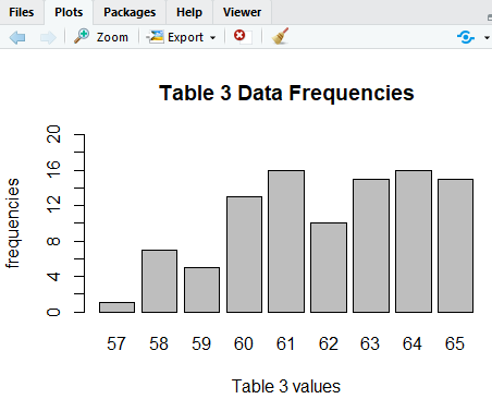
Of course, we could make our chart a bit fancier by using the features that we learned in the first example. We can add a title to the chart (main="Table 3 Data Frequencies"). We can add a label for the y-axis (ylab="Frequencies"). We can add a label for the x-axis (xlab=Table 3 values"). And we can change the range for the y-axis and the tick points along it: (ylim=c(0,20) and yaxp=c(0,20,10)). All of those changes are shown in Figure 35.
The result of that command is shown in Figure 36.
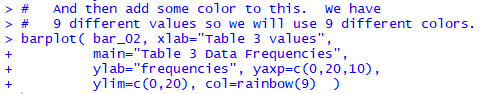
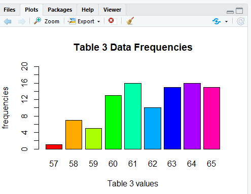
This is an outstanding chart. But, a little color would spice it up, impress the boss, though adding color will not help us read or understand the chart. Back in Figure 21 we saw that we could add the colors with a long c() direction. Here we will use a faster approach that lets R choose the colors. In particular, we add the direction col=rainbow(9) to the barplot() command, which now appears as in Figure 37.
The rainbow(9) feature tells R to pick out 9 values from the rainbow of all colors, As a result, we now get the more colorful chart shown in Figure 38.
# the commands used on makebar.htm
bar_01 <- c(11.4,6.3,12.2,5.1,9.2,8.5,7.8,6.9)
bar_01
bar_01 <- c(11.4, 6.3, 12.2, 5.1, 9.2, 8.5, 7.8, 6.9)
bar_01
barplot( bar_01 )
# We can add names to the various positions in the
# bar_01 list
names( bar_01 ) <- c("Red", "Blue", "Green",
"Yellow", "Orange", "Purple",
"Brown", "Cyan" )
# Now, if we look at bar_01 we get the
# names as well as the values
bar_01
# Then generate a new bar plot
barplot( bar_01 )
# Now, make a new bar plot, but this time add
# a main title and give the y values a label
barplot( bar_01, ylab="Data Values",
main="Data from Table 1")
#
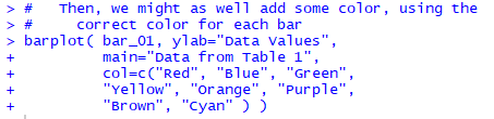
# Then, we might as well add some color, using the
# correct color for each bar
barplot( bar_01, ylab="Data Values",
main="Data from Table 1",
col=c("Red", "Blue", "Green",
"Yellow", "Orange", "Purple",
"Brown", "Cyan" ) )
#
# How about changing the bar graph to a horizontal
# orientation
barplot( bar_01, ylab="Data Values",
main="Data from Table 1",
col=c("Red", "Blue", "Green",
"Yellow", "Orange", "Purple",
"Brown", "Cyan" ), horiz=TRUE )
#
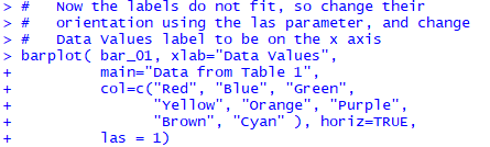
# Now the labels do not fit, so change their
# orientation using the las parameter, and change
# Data Values label to be on the x axis
barplot( bar_01, xlab="Data Values",
main="Data from Table 1",
col=c("Red", "Blue", "Green",
"Yellow", "Orange", "Purple",
"Brown", "Cyan" ), horiz=TRUE,
las = 1)
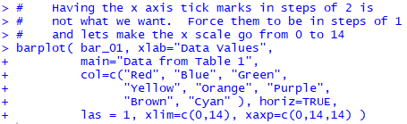
# Having the x axis tick marks in steps of 2 is
# not what we want. Force them to be in steps of 1
# and lets make the x scale go from 0 to 14
barplot( bar_01, xlab="Data Values",
main="Data from Table 1",
col=c("Red", "Blue", "Green",
"Yellow", "Orange", "Purple",
"Brown", "Cyan" ), horiz=TRUE,
las = 1, xlim=c(0,14), xaxp=c(0,14,14) )
#
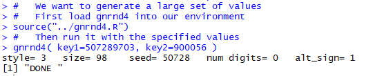
# We want to generate a large set of values
# First load gnrnd4 into our environment
source("../gnrnd4.R")
# Then run it with the specified values
gnrnd4( key1=507289703, key2=900056 )
# As we always should do, we want to verify that
# we generated the correct values
L1
#
# We see that there are just a few different values.
# Find out how many of each value
table( L1 )
#
# Using those values we could generate
# a barplot of the frequencies
barplot( c( 1, 7, 5, 13, 16, 10, 15, 16, 15 ) )
#
# But a better approach would be to save thee "table"
# reults in a variable and then do a barplot of that
# variable
bar_02 <- table( L1 )
barplot( bar_02 )
#
# Then we can apply some of our earlier techniques
# to get a fancier plot
barplot( bar_02, xlab="Table 3 values",
main="Table 3 Data Frequencies",
ylab="frequencies", yaxp=c(0,20,10),
ylim=c(0,20) )
# And then add some color to this. We have
# 9 different values so we will use 9 different colors.
barplot( bar_02, xlab="Table 3 values",
main="Table 3 Data Frequencies",
ylab="frequencies", yaxp=c(0,20,10),
ylim=c(0,20), col=rainbow(9) )
©Roger M. Palay
Saline, MI 48176 October, 2015