Figure 1
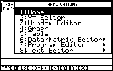
| We will start by entering the data into the calculator. To do this we will
use the List Editor. We open the List Editor by first
pressing the  key. This brings up the
window shown in Figure 1. key. This brings up the
window shown in Figure 1.
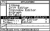
Of the options presented, we are interested in #6, Data/Matrix Editor.
We can press the  key to select that option and move to
Figure 2. key to select that option and move to
Figure 2.
|
Figure 2

| The TI-89 responds by asking if we want to edit the current item,
open an existing item, or create a new item. This is a new problem.
Therefore, we press  to indicate that we want a
new item. to indicate that we want a
new item. |
Figure 3
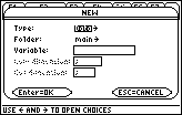
| To define a new item, the TI-89 needs more information.
Figure 3 shows the screen that the calculator uses to obtain that
information. The default is to have the new item be of type Data.
This is not what we want. Therefore we press the  cursor control key to move to Figure 4.
 |
Figure 4
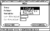
| In Figure 4 we see a new window, one that allows us to choose the type
of data that we want. In our case we want a list of values.
We press to select the List option. |
Figure 5

| The calculator returns to the previous screen,
having changed Data to List
in the Type line.
Because we will create the new list in the main folder,
we will leave the second line as it is. We use the
 key to move down to the third line where we need
to specify a name for our list.
In Figure 5 we have supplied the name miles for the new item.
We did that by pressing key to move down to the third line where we need
to specify a name for our list.
In Figure 5 we have supplied the name miles for the new item.
We did that by pressing
  to shift
into a locked alphabetic mode, and then to shift
into a locked alphabetic mode, and then
  
 to produce the letters.
Finally, we press
to produce the letters.
Finally, we press  to accept our name, and then again to
indicate that the information on the window is OK.
to accept our name, and then again to
indicate that the information on the window is OK. |
Figure 6
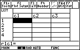
| In Figure 6 we finally see the List Editor.
We are ready to start entering the data from our two lists.
Note that the calculator is still in alphabetic mode.
We will have to press the
key to get out of that mode.
Then we can start entering the values from the first list. |
Figure 7
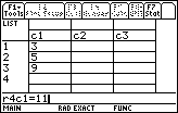
| Figure 7 captures the screen after we have entered the first
3 values from our miles list, and
in the middle of the entry of the fourth value, 11, which is in the
data and command entry line.
|
Figure 8
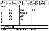
| In Figure 8 we have finished entering the eight values for the
first list, miles, and we have used the
key to move over to the next column, the c2 column,
where we have started to enter the corresponding values of the times list.
Note that we happen to be entering the values from the end of the list toward the
top of the list. Figure 8 illustrates the screen after we have
entered two values and as we are about to enter the value into row 6 column 2,
namely 21. The calculator has prefilled the as yet unspecified values
at the top of the list with the "undef" designation.
|
Figure 9

| As of Figure 9 we have entered all of the values into
our two columns. The List Editor makes it easy for us to enter the data,
to check the data, and to verify that corresponding values from the
two lists are on the same row of data.
At this point we are ready to set up the plot area. To do this we press
 . .
|
Figure 10

| The result is the window shown in Figure 10. Actually, we do not want to be
here.
Rather thn set up the plot, we want to specify the
kind of data analysis that is to be performed.
We really want to return to the previous window, shown in Figure 9, and
from there select the Calc tab. To do this we press
  . .
|
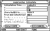
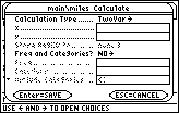
Figure 11
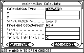
| Figrue 11 shows the "Calculate" screen.
The default "Calculation Type" is TwoVar.
We want to alter that selection. Therefore,
we press to move to Figure 12. |
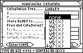
Figure 12
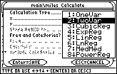
| Now we have some choices for the Calculation Type.
In particular, item 5 is the LinReg or Linear Regression option.
We select taht option by pressing .
|
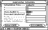
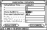
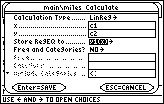
Figure 13
| In Figure 13 we can verify that the Calculation Type has been
changed to LinReg. In addition, we have specified that the x list is in c1
and the y list is in c2.
Those were the column names that we saw back in Figures 6 through 9.
|
Figure 14
| We use the key to move down
to the next option, "Store RegEQ to".
The default is none.
We want to change that setting. Therefore, we press
to see the alternate values.
|
Figure 15
| The new window in Figure 15 gives the alternate values for the
Store RegEQ to setting. We want to select
y1(x). Press to move the highlight down
to that item. Then press to select it. |
Figure 16
| Again, the change is reflected in the Calculate window.
We press to Save these values, to close the
window, and to perform the computation. |
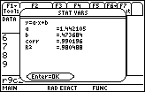
Figure 17
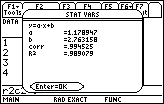
| Figure 17 shows the window that pops
up to give us the results of the computation.
This STAT VARS window is identical to that produced
in Figure 13 of the other web page,
Steps to a Linear Regression on the TI-89,
which used a different approach to doing this same problem.
We can close the STAT VARS window and return to the List Editor
by pressing the key.
|
|
Figure 17a
| Leaving Figure 17 would return us to the image captured in
Figure 9. Now we do want to set up a plot. Again, we do this by pressing
.
|
Figure 18
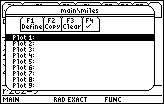
|
We will define Plot1 by pressing  . .
|
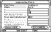
Figure 19

| The window shown in Figure 19 allows us to define Plot 1.
The default is a Scatter plot, and that is what we want.
We will be happy to use a small Box as a marker of the
location of the data points on the plot.
We need to specify the x list and the y list.
We use the key to move down to those items.
|
Figure 20
| In Figure 20 we have identified the x list as the valuse
in column c1, and the y list as the values in column c2.
We can press to accept that last input
value. and again, but this time to SAVE
the settings. This will take us to Figure 21.
|
Figure 21

| Here we can see that the definition of Plot1 has changed to
indicate that we want a Scatter plot, using the small Box as a
marker, with the x list as c1 and the y list as c2.
|
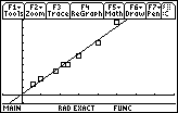
Figure 22

| We can move to view the plot and the graph of the Regression Equation
by pressing   . .
The result shown in Figure 22 depends upon the calculator
WINDOW settings being the standard settings,
– 10 to 10 for both
x and y.
With those settings we can see the regression equation,
but only two of the data points. The third point has an x value of 9
which could be graphed, but the y value is 13 which is off the window.
|
Figure 23
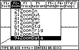
| It is pretty clear that we want to see more of the
data points. We can press
to open the Zoom window. Then, by using the
key, we can move the highlight down to item number
9, ZoomData. We will select that action by pressing the
key.
|
Figure 24

| The resulting new graph, shown in Figure 24,
has had its WINDOW settings changes to accommodate all of the data points.
Unfortunately, that means that the y-axis is no longer visible,
and, the x-axis, which seems to be on the image, is not really the x-axis.
We can press to
open the WINDOW screen, shown in Figure 25. |
Figure 25

| The values displayed in Figure 25 are
those set by the calculator when we used the
ZoomData command. We will want to change those values so
that they conform to the values used inthe text.
|
Figure 26

| Once the new values are set, we can press
to draw a new graph, shown in Figure 27. |
Figure 27
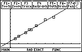
| Finally, we have a graph similar to the one generated for the
text.
The beauty of using the built-in special functions of the TI-89
is that we can change data values and produce new results with relative ease.
For example, if we want to change the final data pair from (25,31) to
(25,39), we can perform the follwoing steps.
|
Figure 28
| Open the APPS menu via .
Select the Data/Matrix Editor, via .
Then choose to open the Current item via the  key. key.
|
Figure 29

| In the List Editor, move to row 8 column 2 and change the
value there from 31 to 39. Press the
to accept that new value.
Then, press to move to the Calc tab.
|
Figure 30
| The calculator presents the Calculate window. |
Figure 31
| Fill in the Calculate window as before.
Press to save the values and open
the STAT VARS window.
|
Figure 32
| Read the values from the STAT VARS window.
Press to indicate OK. Then press
to generate a new plot, shown in Figure 33. |
Figure 33
| The data points have been plotted again. Because there has been a change
in a data point, the regression equation has changed.
|