Linear Regression Example
This problem uses the following (x,y) data points:
(3,6), (10,7), (15,13), (19,14), and (25,22).
These points make up the data for our problem. They are "observed" values.
These observed points are graphed in the following
chart.
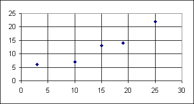 Even though these points are not on a straight line, they do look like they could be
close to a straight line that could be drawn among them.
We are assuming that there is some linear relation between the x and the y values.
A strict linear relation, one governed by a constrain such as y=0.5x+4.5, would mean that
the points would have to line up, they would have to be on the line y=0.5x+4.5.
We know that these points are not on any line, so there can not be a
strict linear relation between the x and the y values. However, there could be an
underlying linear relation that allows for some natural variability.
If these points represent measurements from the real world, then we
can expect some real world variability to throw the values off from
a strict linear relation.
Even though these points are not on a straight line, they do look like they could be
close to a straight line that could be drawn among them.
We are assuming that there is some linear relation between the x and the y values.
A strict linear relation, one governed by a constrain such as y=0.5x+4.5, would mean that
the points would have to line up, they would have to be on the line y=0.5x+4.5.
We know that these points are not on any line, so there can not be a
strict linear relation between the x and the y values. However, there could be an
underlying linear relation that allows for some natural variability.
If these points represent measurements from the real world, then we
can expect some real world variability to throw the values off from
a strict linear relation.
The question is, which straight line would best represent the underlying relationship
between the x and y values.
There are an infinite number of choices. Let us take a
look at two choices, y=(1/2)x +4.5 and y=x – 3.
Clearly these are different lines.
The figure below plots these lines along with a re-plot of the observed data points,
this time connected by solid line segments.
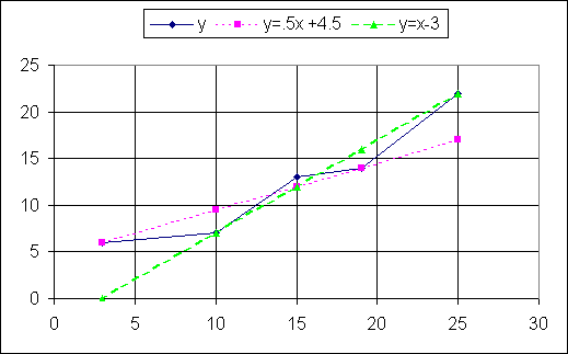
Note that each line hits two of the original points, but misses others. Since the points are not
on a single line, any line that we draw is bound to miss some of the points.
Which of our two lines is a better fit?
The line for y=(1/2)x +4.5 looks like it is closer to more of the points,
but it just does not give a feel for the rising values; it looks too flat.
On the other hand, the line for y=x – 3 gives a good
feel for the data points, but it is way off at the lowest value. How do we choose between
these two proposed lines?
For either proposed line, we can find the "expected"
value of y for any given value of x.
In particular, we can plug in our observed x values, and
calculate the expected y value. The chart below does just that.
|
|
Column B |
Column C |
Column D |
Column E |
Column F |
Column G |
Column H |
Column I |
|
|
observed |
observed |
expected |
(observed -
expected) |
square of
(observed -
expected) |
expected |
(observed -
expected) |
square of
(observed -
expected) |
|
|
x |
y |
y=.5x + 4.5 |
|
|
y=x – 3 |
|
|
|
row 1 |
3 |
6 |
6 |
0 |
0 |
0 |
6 |
36 |
|
row 2 |
10 |
7 |
9.5 |
-2.5 |
6.25 |
7 |
0 |
0 |
|
row 3 |
15 |
13 |
12 |
1 |
1 |
12 |
1 |
1 |
|
row 4 |
19 |
14 |
14 |
0 |
0 |
16 |
-2 |
4 |
|
row 5 |
25 |
22 |
17 |
5 |
25 |
22 |
0 |
0 |
|
|
|
|
|
|
|
|
|
|
|
Totals |
72 |
62 |
58.5 |
3.5 |
32.25 |
57 |
5 |
41 |
Columns B and C give the observed x and y values in rows 1 through 5.
Column D gives the expected y value, for each observed x value, based on the
equation y=(1/2)x + 4.5. Column G gives the expected y value,
for each observed x value, based on the equation
and y=x – 3. Once we have both the observed and the expected y values
we can compute the difference between them.
This is done in column E for y=(1/2)x + 4.5
and in column H for y=x – 3. Then, we can find the square of each of
these differences. By squaring the differences we end up with positive values, and
large differences produce much larger squared values. The squared differences
are in columns F and I.
Finally, we obtain the sum of the squared differences, shown in the TOTALS row.
Thus we find that the sum of the squared differences for y=(1/2)x + 4.5
is 32.25 and the sum of the squared differences
for y=x – 3 is 41.
We judge which line is a better fit by taking the line with the smaller sum of the squared
differences. In this case, we would say that
y=(1/2)x + 4.5 is a better fit
than is y=x – 3.
But, is y=(1/2)x + 4.5 the
line with the best fit? We just made up y=(1/2)x + 4.5
as an example. There should be lines with a better fit. How do we find the line with the
best fit, the line that will produce the least sum of the squared differences?
For the simple case of two variables, it turns out that the line of best fit
will have the form y=mx+b and the m and the b will satisfy the
following system of linear equations:
N b + (Sx) m = Sy
(Sx) b + (Sx2) m = Sxy
where
- N is the number of pairs of data points,
- Sx is the sum of the x values
- Sy is the sum of the y values
- Sx2 is the sum of the squares of the x values
- Sxy is the sum of the products of the x and y values.
In the following table, Columns B and C give the observed data. Column D gives the square of
each x value. Column E gives the product of each pair of x, y values.
And, the TOTALS row
gives the totals for the columns.
|
|
Column B |
Column C |
Column D |
Column E |
Column F |
Column G |
Column H |
|
|
observed |
observed |
|
|
|
|
|
|
|
x |
y |
x^2 |
x*y |
y=0.728107*x+1.915254 |
(observed -
expected) |
square of
(observed -
expected) |
|
row 1 |
3 |
6 |
9 |
18 |
4.099575 |
1.900425 |
3.61161518 |
|
row 2 |
10 |
7 |
100 |
70 |
9.196324 |
-2.196324 |
4.82383911 |
|
row 3 |
15 |
13 |
225 |
195 |
12.836859 |
0.163141 |
0.02661499 |
|
row 4 |
19 |
14 |
361 |
266 |
15.749287 |
-1.749287 |
3.06000501 |
|
row 5 |
25 |
22 |
625 |
550 |
20.117929 |
1.882071 |
3.54219125 |
|
|
|
|
|
|
|
|
|
|
Totals |
72 |
62 |
1320 |
1099 |
61.999974 |
2.6E-05 |
15.0642655 |
From this we see that N=5,
Sx=72,
Sy=62,
Sx2=1320, and
Sxy=1099
Thus, the equations given above can be re-written as
5 b + 72 m = 62
72 b + 1320 m = 1099
The solution to this system of linear equations
gives b=1.915254 and m=0.728107.
Therefore, the equation
y = 0.728107 x + 1.915254
should give the best fit to the data.
Column F of the chart above gives the expected y values for
each of the observed x values, according to that equation.
Column G gives the differences
between the observed and the expected values.
Column H gives the squares of the differences.
The TOTALS row extends to give the sum of the squared differences as 15.0642655,
a value less than half of our previous best value, 32.25.
The graph of that equation is given below.
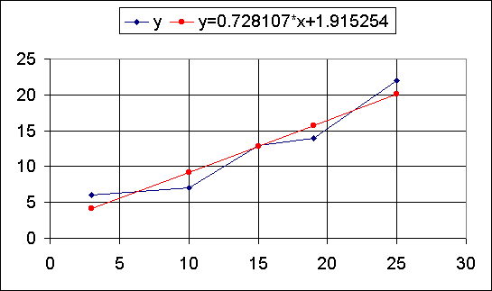
What can we say as a result of all of this? We can say that, assuming there is an underlying linear
relationship between the x and y values that we observed, the equation of the line that best fits
the data is y = 0.728107 x + 1.915254, because
that equation gives the smallest sum of the squared differences between observed and expected values.
PRECALCULUS: College Algebra and Trigonometry
© 2000 Dennis Bila, James Egan, Roger Palay