Figure 1
|
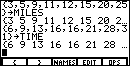
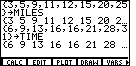
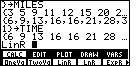
We start off in Figure 1 by opening the LIST menu,
and then entering our two sets of
values. The first set is stored in a list called MILES
and the second is stored in TIME.
The result is shown in Figure 1.
|
Figure 2
| We will do a little preparation work before we process and display the
data from our two lists. In particular, we would like to be able to
plot the values in the list. We will need to set the "WINDOW" values
in the graphing calculator to handle the values in our lists. In Figure 2 we open the
GRAPH menu. Then we select the WIND option
by pressing the  key. key.
|
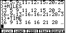
Figure 3
| Figure 3 displays the current limits to the WINDOW values.
These are the values that were last used on this particular calculator.
If we look back
at our two lists, we see that only the first two
pairs of values (3,6) and (5,9)
will fall into our current setting. Therefore, we will want to change those settings.
|
Figure 4
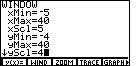
| Changing the xmin to – 5,
the xmax to 40, and the xscl to 5 will handle the
MILES list, and having ymin set to – 4,
ymax set to 40, and yscl set to 4 will handle the
TIME list values.
We change xres to 1 so that the calculator will evaluate and plot a point
for every pixel-column across the screen.
This will not affect plotting the points of our lists, but it will affect the
graph of hte regression equation done later.
|
Figure 5
| In Figure 5 we have used the
 key to get out of the GRAPH
menu and we have started the STAT menu via the key to get out of the GRAPH
menu and we have started the STAT menu via the

 keys.
Even before we do the real work at hand, we will take a moment and
check the settings in the PLOT menu. We press the keys.
Even before we do the real work at hand, we will take a moment and
check the settings in the PLOT menu. We press the
 key to move to that screen. key to move to that screen.
|
Figure 6
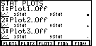
| Figure 6 is a summary of the PLOT settings. In particular, we
see that all of the PLOTS, Plot1, Plot2, and Plot3, are turned off.
We can change the settings for Plot1 by pressing the
 key to move to the
screen for that particular Plot. key to move to the
screen for that particular Plot.
|
Figure 7
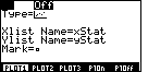
| The flashing cursor is covering the "On" setting, but we can see that the
"Off" setting is currently selected, which is what we had expected.
We press the  key
to change the setting to "On", which is confirmed in Figure 8. key
to change the setting to "On", which is confirmed in Figure 8.
|
Figure 8
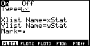
| The settings shown in Figure 8 are as we want them. In particular,
Plot1 is "On", it will be doing a scatter plot,
the plot will be of values in xStat and yStat, and
the character used to show the
points will be the little square. Note that the settings indicate that
we will be using xStat and yStat for the values to be plotted.
Our data has been stored in two other lists, namely, MILES and TIME.
The command that we will give in Figure 9 will not only do a linear regression
based on the values that we have stored in MILES and TIME,
but also that command
will copy those lists to xStat and yStat, respectively.
|
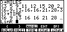
Figure 9
| In Figure 9 we have returned to the STAT menu, and the CALC submenu.
Then we have used the
key to select the LinR option. This merely pastes the text, LinR, onto the
screen as is shown in Figure 9. The command that we want to form is
LinR MILES,TIME
and we could do this by typing the rest of the command, letter by letter.
However,...
|
Figure 10
| In Figure 10 we have opened the LIST menu and
then the NAMES submenu.
This causes the calculator to display the names of the defined lists.
Now we can complete the command started in Figure 9 by selecting the
names from the menu. |
Figure 11
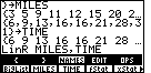
| The command has been completely formed in Figure 11.
To perform the command we need only press the
key.
This command has the calculator determine the linear equation that
"best fits" the ordered pairs of data from the two lists,
MILES and TIME.
|
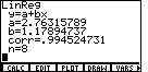
Figure 12
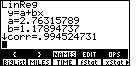
| Figure 12 gives us the results of the LinR command.
In this case, those results state that the line of best fit
for the data that we supplied in MILES and TIME, could be written as
TIME = 2.76315789 + (1.17894737)(MILES)
Furthermore, the correlation coefficient of the "fit" is 0.994524731.
The correlation coefficient is the measure of just how good the fit
is between the actual data and the line represented by the
equation just determined.
Correlation coefficients close to 1 or to -1 mean that
the linear equation is not far away from the actual values. A correlation
coefficient near 0 would indicate a poor fit. The correlation coefficient
in Figure 12 is extremely good. |
Figure 13
| We found the regression equation for the given data, but we have yet to
produce a graph that shows both the data points and the regression line.
Remember, that as a consequence of performing the LinR command,
the TI-86 placed copies of MILES and TIME
into xStat and yStat, respectively.
Furthermore, we had set up Plot1 to do a scatter
graph of xStat and yStat.
We just need to go to the menu item to draw the graph.
We can do this by returning to the STAT menu, shown in Figure 13.
Then, we use the  key to
select the DRAW option. This will produce the graph in Figure 14. key to
select the DRAW option. This will produce the graph in Figure 14.
|
Figure 14
| Figure 14 is similar to, though not identical to, the graph
given in the textbook.
The menu in Figure 14 obscurs some of the graph.
We can hide that menu by pressing the
 key. We do this
to move to Figure 15. key. We do this
to move to Figure 15. |
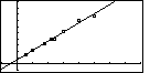
Figure 15
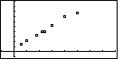
| Figure 15 shows all 8 of the points from our original lists and
it shows the two axes. If we want to recall the menu, we press the
key, and move to
Figure 16. |
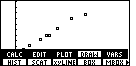
Figure 16

| Figure 16 returns the menu. We have produced a graph
that is the scatter plot of the data points.
How about producing the graph
that also shows the regression equation?
The command that we want is not shown in the menu on Figure 16. However,
we need only press the  key to show more options, as can be seen in Figure 17.
 |
Figure 17
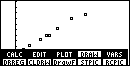
| The command that we want is DRREG, "draw the regression equation".
We press
to actually draw that equation.
|
Figure 18
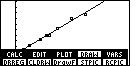
| In Figure 18 we can see the points from the original lists and we can
see the graph of the regression equation. Again, the menu obscurs part of the
graph, and, again, we press the
key to hide the menu,
as in Figure 19. |
Figure 19
| Figure 19 is similar to the graph in the textbook.
It is important to note that this linear model results
in an absurdity, even though the regression is a great fit with a correlation
coefficient extremely close to 1. The absurdity is that the y-intercept is
at (0, 2.76). The interpretation of this is that if we travel 0 miles on the highway,
it will take us 2.76 minutes to go that far.
Actually, this absurdity can be used to make an essential point about
using regressions to generate mathematical models for real data.
The regression model is best
used to look at data values between the low and high domain values.
In the example we have here, it is best to use the regression model to
predict travel time if we are going between 3 and 25 miles.
Doing so is called interpolation. A regression model becomes suspect if
we use it to look at domain values that are not between
the given low and high values. When we look at the graph to find the
time it takes to travel 0 miles, we are looking outside of the given data.
The same would be true if we tried to determine the time it would take to travel 30 miles.
Using a regression model to predict values from outside the given domain values is
called extrapolation.
|
Figure 20
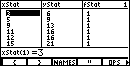
| For completeness, Figure 20 was produced by returning to the
STAT menu and selecting the EDIT option.
This brings up the statistical list editor.
In this editor, as shown in Figure 20, we can see that indeed the values that we had
placed into MILES and TIME have indeed been copied to
the xStat and yStat columns.
In addition, the corresponding values of fStat have been set to 1 meaning that each
pair of xStat and YStat values appears 1 time.
|