 ,
and then press
,
and then press  to paste the
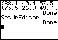
SetUpEditor command here. Then press
to paste the
SetUpEditor command here. Then press  to have the calculator perform the command.
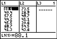 to open the StatEditor as shown in Figure 3. We
compare these values
to the first seven pairs of X and Y values in the table.
Then we can move down the list to see and check the remaining values.
to open the StatEditor as shown in Figure 3. We
compare these values
to the first seven pairs of X and Y values in the table.
Then we can move down the list to see and check the remaining values.

 .
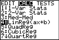
There we use the
.
There we use the  key to move the
highlight down to the
fourth item, LinReg(ax+b). At that point we
can press to paste that command onto our main screen.
key to move the
highlight down to the
fourth item, LinReg(ax+b). At that point we
can press to paste that command onto our main screen.
 to get the calculator to
perform the task.
to get the calculator to
perform the task.
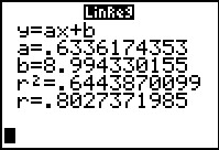
If the last two lines of output are not showing on your calculator it is because you do not have Diagnostics turned On.
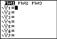
 to move to the Y=
screen. Once we are there, we could just type in the equation. However,
we might as well use the features of the calculator
and let it paste the equation here.
We just need to find where the calculator gives us access to that equation.
to move to the Y=
screen. Once we are there, we could just type in the equation. However,
we might as well use the features of the calculator
and let it paste the equation here.
We just need to find where the calculator gives us access to that equation.

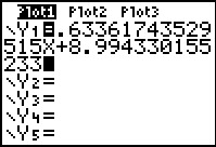
 to open the
VARS menu, and then use
to move the highlight to the Statistics option.
Press to open the Statistics sub-menu.
to open the
VARS menu, and then use
to move the highlight to the Statistics option.
Press to open the Statistics sub-menu.
 to move to the EQ sub-menu.
 to use that option.
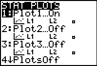
 to see the
STAT PLOT menu. Here we note that Plot1 is On, that it is set to
do a scatter plot, and that the scatter plot will be based on the
values in L1
and L2. This is just what we want.
to see the
STAT PLOT menu. Here we note that Plot1 is On, that it is set to
do a scatter plot, and that the scatter plot will be based on the
values in L1
and L2. This is just what we want.
If any of those settings were incorrect then we would have had to open the Plot1 menu and to make the required changes.
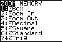
 key. From long experience we know that we want to use
option 9, ZoomStat even though that option is not visible on the current screen.
Nonetheless, we press
key. From long experience we know that we want to use
option 9, ZoomStat even though that option is not visible on the current screen.
Nonetheless, we press  and the calculator
continues with teh ZoomStat option.
and the calculator
continues with teh ZoomStat option. This causes the calculator to look at the data for the plot, to set the WINDOW values appropriately, and then to move to do the actual graph.
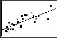
Unlike the example in the earlier web page on this topic, the data points plotted here are not quite so close to the graphed line. We should have expected this based on the much lower value for the correlation coefficient in this example. Remeber that the closer the correlation coefficient is to 1 or –1 the smaller the spread of plotted points from the regression line. Our correlation coefficient in this example,

 key.
key.
Note that in TRACE mode the calculator first moves to trace the plotted points. Furthermoe, the calculator "traces" those points in the order in which they were given in the original data lists. Thus, the first point in the list, X=88.1 and Y=73.5 is the highlighted point. It is hard to see in a still image such as Figure 16, but the highlight is on that point, the one in the upper right corner. A comparison to the image in Figure 15 will demonstrate the slight difference present when this image was captured.
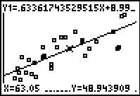 to move the trace to the graph of the regresson equation.
The calculator choose a point on the line midway across the screen as its initial trace point on the line.
althogu we did not ask for it, this shows that when X=63.05 then the
expected value of Y is 48.943909.
to move the trace to the graph of the regresson equation.
The calculator choose a point on the line midway across the screen as its initial trace point on the line.
althogu we did not ask for it, this shows that when X=63.05 then the
expected value of Y is 48.943909.
 key the calculator will move to that X
value, position the blinking cursor on the graph of the regression equation, and
give us the Y value at the bottom of the screen.
key the calculator will move to that X
value, position the blinking cursor on the graph of the regression equation, and
give us the Y value at the bottom of the screen.

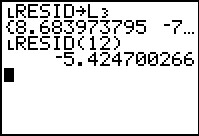
Of course, looking at the original data values in the table above, we know that X=71.7 is one of those values. It is in index position number 12 in the list. The corresponding Y value is 49. On the graph this is the plotted point directly below the highlight. Thus, The observed value of X=71.7 is 49 and the expected value of X=71.7 is 54.4247. The difference, (observed) – (expected) is called the residual value at X=71.7. Using our numbers, the residual value at X=71.7 is 49 – 54.4247 = –5.4247.
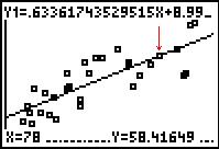 to get the calculator to "trace" that
value. The image in Figure 20 has been altered to place an arrow
showing the location of the highlighted point. From this screen
we know that 58.41649 is the expected value for X=78.
There is no observed value for X=78 because none of the
points in the original table had an X value of 78.
to get the calculator to "trace" that
value. The image in Figure 20 has been altered to place an arrow
showing the location of the highlighted point. From this screen
we know that 58.41649 is the expected value for X=78.
There is no observed value for X=78 because none of the
points in the original table had an X value of 78.
The safest way to leave Figure 20 is to use the
 key sequence.
 keys.
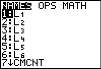
Here, in Figure 21, the calculator shows a menu of all the list names that
exist on this calculator. We will use the
key to go looking for and eventually highlighting
the list we want, RESID.
keys.
Here, in Figure 21, the calculator shows a menu of all the list names that
exist on this calculator. We will use the
key to go looking for and eventually highlighting
the list we want, RESID.
 to paste that name onto the main screen.
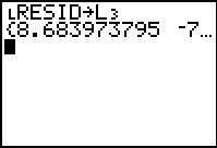

 to complete the command. This will
make a copy of RESID in the list L3.
We do this so that when we re-open the editor the residual valeus
will be shown without our having to change the lists that appear in the
editor.
to complete the command. This will
make a copy of RESID in the list L3.
We do this so that when we re-open the editor the residual valeus
will be shown without our having to change the lists that appear in the
editor.
To perform the command we pressed .
The calculator displayes the assigned values of the new list,
L3, but we would have a hard time
following that list were we to
scroll across it.
 to open the StatEditor. Now we see, in each row of the display,
the associated X, Y, and residual values.
We can scroll down and up on the list to see all 30 of the calcualted residual
values.
to open the StatEditor. Now we see, in each row of the display,
the associated X, Y, and residual values.
We can scroll down and up on the list to see all 30 of the calcualted residual
values.

Which value should we use? That depends upon the accuracy of the original measures and the demands of our assignment. In this case, looking back at the original data, the Y values are only given to one decimal place. We really should not give an expected value that is derived from the table values any more accuracy than we had in the table. Therefore, the most appropriate expression of the expected value, when X=71.7 would be Y=54.4. Had we used that expected, value in determining our residual value, we would have the residual value be –5.4, and we would get that answer from just rounding either of the two values we have found so far.
Having commented on the appropriate rounding for the residual values, it is clear that the calculator has no problem giving answers that imply an accuracy far more impressive than deserved.

To do this we use
to return to the STAT PLOT menu.
We want to change the settings of Plot1.
Plot1 is the highlighted plot so we just press
to move to that screen.

 character indicating that the calculator is willing
to accept letters here.
character indicating that the calculator is willing
to accept letters here.


 .
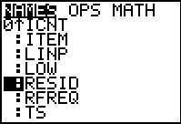
[An
alternative method to get the RESID name here would be to
open the LIST menu, scroll down to find the RESID name there,
and press the ENTER key at that point. Either method will work.]
Once we have entered the name, we move to the next screen
by pressing the key.
.
[An
alternative method to get the RESID name here would be to
open the LIST menu, scroll down to find the RESID name there,
and press the ENTER key at that point. Either method will work.]
Once we have entered the name, we move to the next screen
by pressing the key.

 opens the ZOOM menu.
chooses and performs the 9th
option, ZoomStat, even though it is not on the display here.
opens the ZOOM menu.
chooses and performs the 9th
option, ZoomStat, even though it is not on the display here.
