 to open
the STAT PLOT menu.
to open
the STAT PLOT menu.
Of course, we could just use some software to produce such a chart:
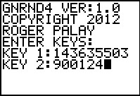
We need to start with some data. We will generate a list of data on the calculator using GNRND4 with Key 1=143635503 and Key 2=900124. That list will be the same numbers that appear in the following table: Thus, our problem will be to generate a bar chart for the data in the list above.
Before we go any further, we need to understand that there are just a few issues that really concern us in making a bar chart. They are:
| We jump right into the process by starting the GNRND4 program and giving it the two key values. (If you need to review the steps behind this please see the frequency table pages.) |
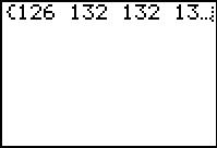 |
The GNRND4 program produces and then displays the values of our table above, and it does this in a list called L1. |
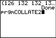 |
We conclude the program by pressing the  key. The calculator marks the program as Done.
We then look in the list of programs, find the COLLATE2 program,
select it to paste the
prgmCOLLATE2 on the screen.
Press the key to start the program.
key. The calculator marks the program as Done.
We then look in the list of programs, find the COLLATE2 program,
select it to paste the
prgmCOLLATE2 on the screen.
Press the key to start the program.
|
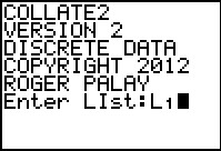 |
The program starts, prints out some information, and then asks for the
List that contains the data to process.
Our data is in L`. Thus, we
press   to provide the
name of the list. Then press
to get the program to accept our response and start processing. to provide the
name of the list. Then press
to get the program to accept our response and start processing.
|
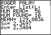 |
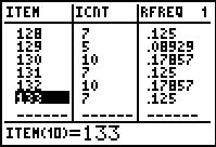
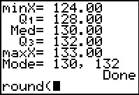
Figure 5 shows the first part of the output from COLLATE2.
Within this output we find our first useful data, namely that there were
56 values read but there were only 10 different values found.
The 10 different values found means that our bar chart will have 10 bars.
Were we going to actually calculate the relative frequency, we would want to know the
56 value in order to do our computation. owever, we will let the COLLATE2
program do those calculations for us.
We move onto further output by
pressing the key to tell the program to continue.
|
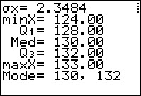 |
Figure 6 finishes the program output.
Here we have two other useful pieces of information.
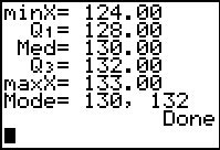
In particular, we see that the lowest value
will be 124 while the highest is 133.
We finish the program by pressing the key.
|
 |
Having completed the program, we want to examine some of the
lists that the COLLATE2 program generated.
To do this we press the  key
to open the STAT menu. Here we
want to select the "Edit" option. It is already highlighted so we need only
press the key. key
to open the STAT menu. Here we
want to select the "Edit" option. It is already highlighted so we need only
press the key.
|
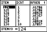 |
In Figue 8 we see the computed lists. In particular LITEM holds the different values that we found. LICNT holds the count of these items, i.e., the frequency of those values. LRFREQ holds the relative frequency of each of the values. This column is merely the LICNT coumn values divided by the number of values read, namely 56. |
 |
Since we already know that there were 10 unique values found, we
can use the  key to see the other values in the
lists. key to see the other values in the
lists.
Observing these values we see that the values 130 and 132 each appear 10 times and that no other value appears as often. Thus, the bars for 130 and 132 will be the tallest bars. We conclude from this that the vertical scale of our chart must be at least 10 units high. |
 |
To exit the STAT Editor we press
 .
This reurns us to the main screen, shown again in Figure 10. .
This reurns us to the main screen, shown again in Figure 10.
Next we will take a moment to have the calculator actually
produce something similar to our desired
bar chart. To do this we press
|
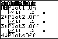 |
We are happy to see in this menu that Plot1 is "On" and that the other
plots are "Off". However, Plot1 is currently set to show a "scatter plot" using
the lists L1 and L2.
We need to change these setting. To do that, given that Plot1
is highlighted, we
press the key to open the settings for Plot1.
|
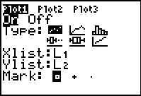 |
Figure 12 shows the settings for Plot1. We will use the cursor keys to move the highlight over the icon of the histogram. We can see that this has been done in Figure 13. |
 |
Now that the cursor is over the histogram icon, we merely
need to press the key
to make that the choice. Note that once we have done that, the other options on the screen
change to indicate that, by default, the histogram will use data in
L1. We could change this but since our data is in
L1 we will just leave it the way it is.
To move to the next figure we press the
 key. This will open the ZOOM menu. key. This will open the ZOOM menu.
|
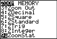 |
We use the key to move down the list of
options until we find ZoomStat. We want to use this option because it
examines the data to be sued to make the plot and then it automatically
sets the parameters of the WINDOW of our graph. The calculator may not shoose the exact values that we want, but at least it will
put in close to the desired valeus.
Once we have highlighted our choice, we press
|
 |
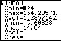
The calculator responds by creating a histogram of the values in
L1, the list specified in the Plot1
screen back in Figure 13. We know that the historgram is not our desired
bar chart because this histogram has 8 bars and we know that we want 10 bars, one for
each unique value in the data set.
Therefore, we have some adjustments to make and we make them
in the WINDOW settings. To get there we press  . .
|
 |
This is the current values placed in the WINDOW settings when we did the ZoomStat command back in Figure 14. What we want is to have each of our values, 123, 124, 125, ..., 133, in a separate bar. To do this we can start the bars at 123.5 and have a width of 1 unit. Then, we will want the largest x value to be 133.5. |
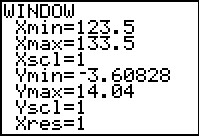 |
Figure 17 shows the changes that we have made. We press
 to create a new chart. to create a new chart.
|
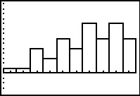 |
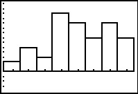
This is exactly the bar chart that we want. Although there is no visible vertical scale, we see that we have 10 bars, that the 7th and 9th are the highest, and the 5th, 8th, and 10th are tied as the next highest bars. This corresponds exactly to the counts that we saw back in Figures 8 and 9. |
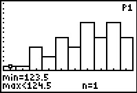 |
If we move from Figure 18 to Figure 19 by pressing the
 key then the calculator will let us inspect the
range and height of each bar, startign with the first. Here we see that the bar
represents valeus from 123.5 up to but not including 124.5 and that there is just
1 (n=1) such value. key then the calculator will let us inspect the
range and height of each bar, startign with the first. Here we see that the bar
represents valeus from 123.5 up to but not including 124.5 and that there is just
1 (n=1) such value.
|
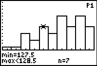 |
For Figure 20 we have used the  key to move the highlight over to the
5th bar, noting that it holds valeus from 127.5 up to but not including 128.5, and that
there are 7 (n=7) such values.
key to move the highlight over to the
5th bar, noting that it holds valeus from 127.5 up to but not including 128.5, and that
there are 7 (n=7) such values.
We can exit the graph display by pressing the
|
 |
Figures 10 through 20 demonstrated having the calculator create what amounts to
a bar chart for our values. [In most cases a real bar chart would
have the "bars" separated. The calculator has them next to each other because
the calculator does a histogram, not a bar chart. We could have forced the
calculator to produce separated bars by setting Xmin=123.75,
Xmax=133.25, and Xscl=0.5 since that would produce an empty
"bar" between each bar that has values. That is, the bar that goes from 124.25 to 124.75
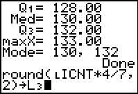
would not have anything in it. If we were to try to draw our own bar chart, we would have to allocate some space on a piece of paper and we would have to determine the scale that we will use. This means that we would have to determine the heigth of each "bar". Or rather, we could set the height of any one "bar" and from that compute the required height of all the "bars". Thus, if we set the height of the "bar" representing 128, the 5th bar, to be 4 centimeters, then we can find the height of any other bar by taking its frequency times 4 and dividing that by 7 (the frequency of the 4 inch bar). [Another way to look at this is to note that if our bar that represents a frequency of 7 is 4 centimeters high, then a bar that represents a frequency of 1 will be 4/7 centimeters high. Therefore, a bar that represents a frequency of 10 will be 10 times the height of a bar that represents 1.] Now, if we want to do this for all the bars, we might as well use the list of frequencies. That is the list LICNT. Since the calculator will compute these values to absurd precision, we can round our results to 2 decimal places, still more than we need but easy enough to read and use. If we want to place the answers into L3 then the command that we want is |
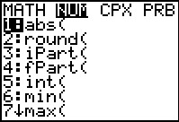 |
We start building that command by going to the MATH menu via the
 key and then
using the to open the
NUM sub menu. Here we see that the
command that we want, round(, is in the second position.
We can select that command by pressing the key and then
using the to open the
NUM sub menu. Here we see that the
command that we want, round(, is in the second position.
We can select that command by pressing the
 key. key.
|
 |
We have round( pasted onto the screen, now we need to get the list name.
To do this we open the LIST menu via the
sequence.
|
 |
Figure 24 shows the LIST menu on the calculator being used.
Using the key we have moved down the list
of names until we find and highlight the desired name, LICNT.
we press to select that name.
|
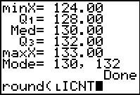 |
We are building our command. |
 |
We need to add the rest of the command which we do with


 .
Once the command is built, we press
to have the calculator run the command. .
Once the command is built, we press
to have the calculator run the command.
|
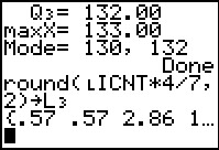 |
The result is a list and we can see the start of that list.
From here we see that the 1st bar is 0.57 centimeters tall,
as is the second. The 3rd needs to be 2.86
centimeters.
Then we can use the key to
find more values.
|
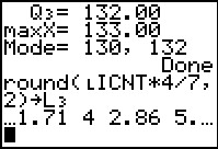 |
The 4th bar needs to be 1.71 centimeters high, the 5th is the expected 4 centimeters, the 6th is 2.86 centimeters, and we will need to scroll to the right to see the rest. |
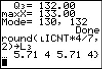 |
We can read the rest of the values here. |
Of course, we could just use some software to produce such a chart:
©Roger M. Palay
Saline, MI 48176
September, 2012