The main goal of the material presented in this chapter has been to find ways to characterize sets of data, especially large sets of data. We have looked at three measures of central tendency, the mean, the median, and the mode, as ways to characterize the "center" of the data values. We have looked at three measures of dispersion, the range, the quartile points, and the standard deviation, as ways to characterize the "spread' of the data values. In all cases we have noted both appropriate and inappropriate uses of these measures depending upon the kind of values in the data set, nominal, ordinal, interval, and ratio. This section continues the pursuit of ways to characterize sets of data. However, unlike the previous sections, here we are not trying to find a single value to represent either the "center" or the "spread" of the data values. Rather, we will characterize the data by rearranging it and presenting it in a different form.
Earlier we looked at a data set representing the colors of candies as they
were taken out of a bag of M&M's®. That data set was
{1, 1, 2, 1, 6, 6, 6, 7, 4, 1, 4, 3, 2, 3, 6, 2, 1, 6, 6, 6, 6, 7,
6, 6, 7, 2, 1, 6, 6, 7, 6, 4, 4, 2, 1, 6, 2, 4, 7, 6, 7, 3, 6, 6, 6, 6,
3, 6, 3, 7, 1, 6, 6, 2, 6}
We note that there are actually only a small number of possible values in our data
set. We could open hundreds of bags of that candy and still our data set would consist
of the numbers 1 through 7. Remember that
1 is the name for a red candy, 2 is the name for a green, 3 for a yellow,
4 for blue, 5 for a light brown,
6 for a dark brown, and 7 for orange.
Another way to present the data set is through the following table:
| Color | Name | Frequency |
| red | 1 | 8 |
| green | 2 | 7 |
| yellow | 3 | 5 |
| blue | 4 | 5 |
| light brown | 5 | 0 |
| dark brown | 6 | 23 |
| orange | 7 | 7 |
| Total | 55 |
This kind of a table is much easier to examine and understand than is the original list of 55 values. We have captured in 7 lines the essential facts about the distribution of values in the original data set. By looking at the table we can see the range (1 through 7), and the mode (6, because it happens more often than does any other value). Note that the underlying measures are nominal and, therefore, it is inappropriate to look at the mean or median, much less the quartile points and the standard deviation.
We could enhance our table slightly by adding another column to express the frequency given in each row as a percent of the total number of data values. Now the table appears as:
| Color | Name | Frequency | Percent of Total |
| red | 1 | 8 | 14.55% |
| green | 2 | 7 | 12.73% |
| yellow | 3 | 5 | 9.09% |
| blue | 4 | 5 | 9.09% |
| light brown | 5 | 0 | 0% |
| dark brown | 6 | 23 | 41.81% |
| orange | 7 | 7 | 12.73% |
| Total | 55 | 100.00% |
Having the percentage column helps standardize our view of the table because we recognize that the percentages must total to 100%.
We can take this frequency table and change it into a frequency plot. We chart the possible values along the horizontal axis, and the range of frequencies along the vertical axis.

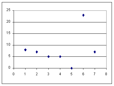
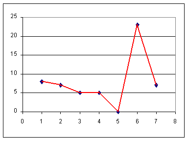
In one of the strange "leaps of faith" that we use in mathematics, we expand on this frequency plot by connecting consecutive marks. This produces a new chart. This chart, shown below, is called a "frequency polygon".
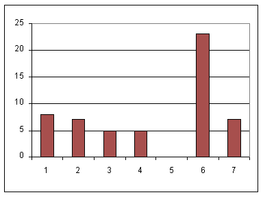
A more appropriate picture of the distribution of values in the data set would be a column chart. In such a chart, a histogram, we have a column for each value in the data set, and the height of that column corresponds to the frequency of that item. In effect, we replace the "mark" on the frequency plot with a column that extends up to where that mark was located. Here is a column chart of our data.
Before we look at another example data set, let us ask and answer the question "What, if anything, do we lose by representing the data set through a frequency table?" In our example, we have:
| The original data set | The frequency table | ||||||||||||||||||||||||||||||||||||
| {1, 1, 2, 1, 6, 6, 6, 7, 4, 1, 4, 3, 2, 3, 6, 2, 1, 6, 6, 6, 6, 7, 6, 6, 7, 2, 1, 6, 6, 7, 6, 4, 4, 2, 1, 6, 2, 4, 7, 6, 7, 3, 6, 6, 6, 6, 3, 6, 3, 7, 1, 6, 6, 2, 6} |
|
As a second example, consider the three sets of data given below, Q1, Q2, and Q3. These sets are given in frequency tables. Each table represents the responses to one of three different questions on an opinion survey. For each question, the people taking the survey were given the opportunity to respond to a statement with
Q1
|
Q2
|
Q3
|
This time the data set is composed of ordinal data. Therefore, we can look at Q1, Q2, and Q3 to find the mode, the median, the range, and the quartile points. We are given the data for Q1, Q2, and Q3 in the frequency tables above. Clearly, the value that appears most often in Q1 is 3, which makes 3 the mode for Q1. In the same way, 1 is the mode value for Q2, and 4 is the mode value for Q3. The range for all three data sets is 1 to 5. The median for any set is the item in the middle of the sorted list of values. We will modify each table above to add a "Cumulative Frequency" column. The Cumulative Frequency will be the number of items with the given value or a lower value. Examine the new tables below.
Q1
|
Q2
|
Q3
|
There are 103 items in Q1. The middle item is the 52nd item in the sorted list. Looking at the chart for Q1 above, we see that item 3 is the first item to have the cumulative frequency hit or pass the 52nd item. That is, there are 18 items with a value 2 or lower. However, there are 71 items with the value 3 or lower. Therefore, the middle term, the median value, is one of the 3's in Q1.
There are 107 items in Q2, which means that the 54th item is the middle item in the sorted list. From the frequency table for Q2 we see that one of the 2's is the middle term. Therefore, the median value for Q2 is 2. In the same way, 3 is the median value for Q3.
We can find the quartile points for each of Q1, Q2, and Q3 in much the same fashion. For 103 items, the quartile points are the 26th, 52nd, and 78th data values in the sorted list. Interestingly enough, for Q1 this means that one of the 3's is the first quartile point, and another 3 is the second quartile point, while a 4 is the third quartile point. For Q2 with 107 values, the quartile points will be the 27th, 54th, and 81st data values in the sorted list. According to the frequency table, 2 is the first quartile value, 3 is the second, and the final 4 is the third. And, Q3 has quartile points at the 25th, 50th, and 75th data values in the sorted list, namely, 2, 3, and 4, respectively.
In this example, where there are only 5 possible different values, it seems at best an exercise to find these quartile points. The important point of the preceding few paragraphs is that we can find the median and the quartile points directly from the frequency table.
Before we leave this example of answers to three questions, Q1, Q2, and Q3, on a survey, let us return to the issue of "Do we lose anything by just looking at the data in the frequency tables?" In the earlier example, we noted that we lose the order of the original numbers, but that loss did not mean much. In the example of our three questions, Q1, Q2, and Q3, we again lose the order of the various responses. And, again, for each individual question, that loss does not seem important. However, if we were trying to understand the relationship between answers to the three questions, then the loss of order would become significant. For example, there were 22 "Strongly Diasagees" for Q3. It would be important to know if most of those 22 also marked Q2 as "Stongly Disagree", or did most of them also mark Q2 as "Strongly Agree", or was there no real pattern connecting the answer of Q2 with the answer to Q3. The statistical methods that examine this issue are beyond this chapter. However, it is important to note that the frequency tables lose the order of the responses, and that such a loss can limit our ability to better understand the original data.
The following data set, which changes every time this page is loaded,
represents the height, in centimeters, of applicants to the
flight training program at a certain school.
Let us put these values into a frequency table.
| Value | Freq. | Cum. Freq. |
This frequency table is both more concise than was the original list and it facilitates the computation of the mode In addition we can readily see the range of values. Considering the number of data values, the median will be at position The quartile values will be at positions
Since the data represented here is a ratio measurement, it makes sense to find the mean and the standard deviation of the data. If we augment the table above with two more columns we will be able to compute these values from the changed frequency table. The first of the new columns will hold the product of the value and its frequency. That means that in the first row, the row for We can use the total of these columns in computing the mean and the standard deviation. The new table appears as
| Value | Freq. | Cum. Freq. |
Value * Freq | Value2 * Freq |