Worksheet 06a: Strange Residuals
Return to Topics page
This page makes much more sense if you have read and understood
Worksheet 06 in that here we build off
some of the data from that worksheet. This time, however,we cannot
use gnrnd4() to generate the data. In fact, for this
worksheet we will start with all of the
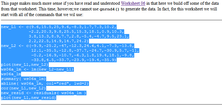
commands that we wil use:
new_L1 <- c(9.6,15.5,25,9.6,-8.3,1.7,7.3,10.2,
           -2.2,20.3,9.8,25.5,15.3,18.1,0.9,10.3,
           3.8,13.3,8.9,7.7,2.8,-5.4,-4.7,9.5,23.1,
           2.2,22.5,14.9,14.7,24.2)
new_L2 <- c(-9.9,-25.2,-47,-12.3,24.6,4.1,-7.3,-13.8,
            12.1,-35.5,-12.8,-37.7,-24.7,-30.9,5.7,-11,
            -0.2,-16.9,-10.7,-6.3,1.8,19.4,18.1,-9.8,
            -33.8,4.5,-33.7,-23.9,-19.4,-35.9)
plot(new_L1,new_L2)
ws06a_lm <- lm(new_L2~new_L1)
ws06a_lm
summary( ws06a_lm)
abline( ws06a_lm, col="red", lwd=2)
cor(new_L1,new_L2)
new_resid <- residuals( ws06a_lm )
plot(new_L1,new_resid)
We will follow the usual procedure for doing our work on the USB drive.
In particular, we have
- inserted our USB drive,
- created a directory called
worksheet06a
on that drive
- have copied
model.R from our root folder into
our new folder,
- have renamed that new copy of the file to the name
ws06a.R, and
- have double clicked on that file to open RStudio.
The result should be a window pretty much identical to the one shown in Figure 1.
Figure 1
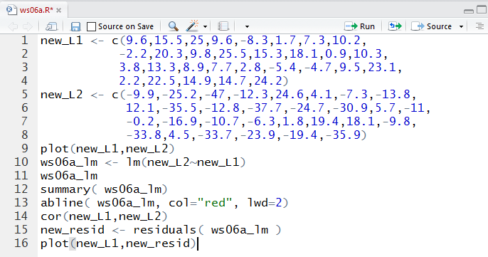
Then, we highlight the commands given above on this we page
as shown in Figure 1a.
Figure 1a
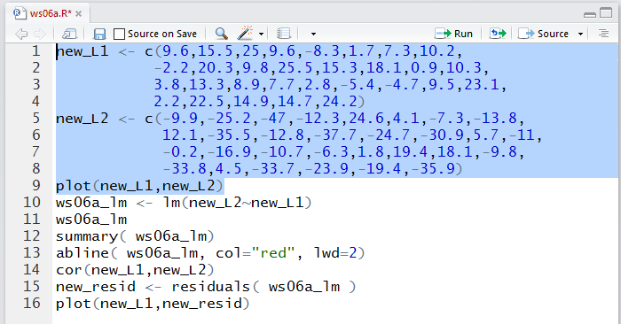
We copy those commands (via the Ctrl-C key sequence on a Windows machine)
and paste them (via a Ctrl-V key sequence) into our ws06a.R
worksheet in our RStudio session Editor pane.
This should produce the image shown in Figure 1b.
Figure 1b
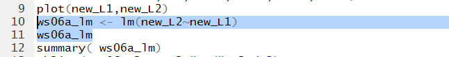
Now that we have all of the commands we can highlight the ones we want
to execute and then run those commands.
Figure 2 shows the two commands to put values into the variables
new_L1 and new_L2 plus the command to create a
scatter plot of the values in those two variables.
Just to help us understand the relationship of these values
to the ones we reated in Worksheet 06,
you might observe that the new_L1 values
are identical to those in L1 in the old example.
The values in new_L2 have changed, slightly, but they are not far off
from the values that we had.
Figure 2
Running the lines highlighted in Figure 2produces the plot in Figure 3.
Figure 3
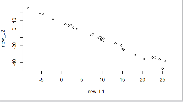
The similarity in the values we have in Figure 3 to those
that we had for Worksheet 06 is brought home when we go back and look at
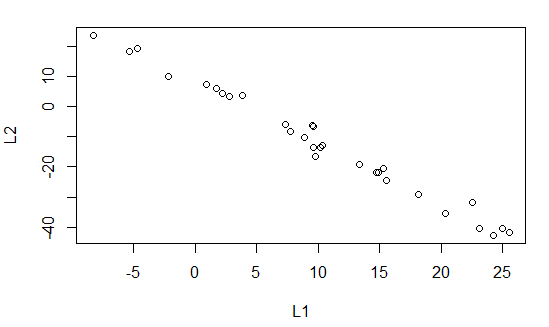
the scatter plot from that example shown again in Old Figure 6.
Old Figure 6
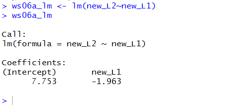
Moving on we create a linear model for the relation between
new_L1 and new_L2. Those are the commands in lines
10 and 11 of our list of commands.
Figure 4
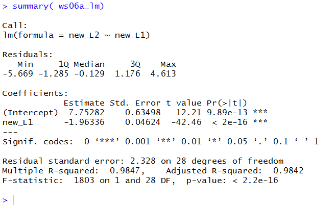
The output, shown in Figure 5, gives rise to the regression equation
y =7.753 + (-1.963)x
This is indeed slightly different from the line we
got in the previous worksheet, but not much different.
Figure 5
The summary(ws06a_lm) command gives us even
more information about our linear model.
Figure 6

The result of running the command is given in Figure 7.
Figure 7
We can compare the results shown in Figure 7 with those that we saw in
the earlier example, shown here in Old Figure 15.
Old Figure 15
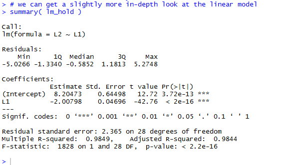
Again, we can detect differences, but they seem minor.
Figure 8 shows the command we need to add the
regression line to the scatter plot.
Figure 8
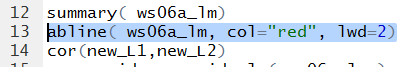
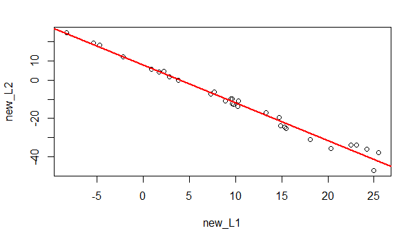
Figure 9 shows that new graph.
Figure 9
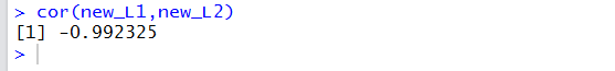
Of course we want to find the correlation coefficient.
Figure 10

/center>
The value of the correlation coefficient is given in Figure 11.
Again, this is not much different from the
value in the earlier worksheet.
Figure 11
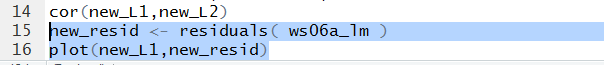
But now we get to the whole point of this worksheet, wewill
look at the residual values. Figure 12
holds the commands to retrieve those values from the linear model and
then to plot them.
Figure 12
As you should expect at this point, there is not much to see in the
Console pane shown in Figure 13.
Figure 13

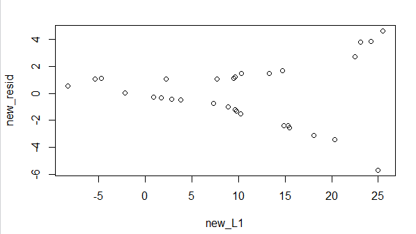
However, the scatter plot shown in Figure 14
is the real change from the earlier example. Here the
residual values are not all over the place. They form a
definite, if strange, pattern.
Seeing this would be enough to make us cautious about applying the linear
regression equation. In particular, in this case,
what we see is that as the x-values increase
(as we move toward the right side of the graph)
the residual values move further and further away
from 0. In other words, for low values of x
it appears that the regression equation is outstanding.
For higher values it is not as good.
We would be exceptionally cautious in extrapolating
with values in excess of 25.5, our highest x-value.
Figure 14
Not shown here are the usual steps of saving our file and
quiting our RStudio session.
Return to Topics page
©Roger M. Palay
Saline, MI 48176 February, 2017