Scatter plots illustrate the relationship between paired values. If we have one collection of data, which we will call X, and if each value in X has a related value, where the collection of those related values is called Y, then we can use scatter plot to display the relation of values in X to values in Y
We start with an example of such pairs of values. Table 1 gives 12 pairs of values where each value in the X row is paired to the value directly below it in the Y row. For example, the first pair is (24.2,47.3). You can generate these values in R by using
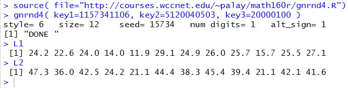
Just to verify that gnrnd4( key1=1157341106, key2=5120040503, key3=20000100 ) works, Figure 1 shows both that command and two subsequent commands to display the contents of L1 and L2. The gnrnd4() function creates the X values in a variable called L1 and the Y values in a variable called L2. Comparing the values shown in Figure 1 with those in Table 1, confirms that our R session now holds the values.
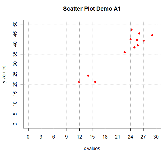
To get a scatter plot of the pairs of values we use the command plot(L1,L2) as shown in Figure 2.
The result of that plot(L1,L2) command is shown in Figure 3.
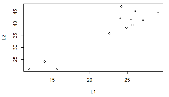
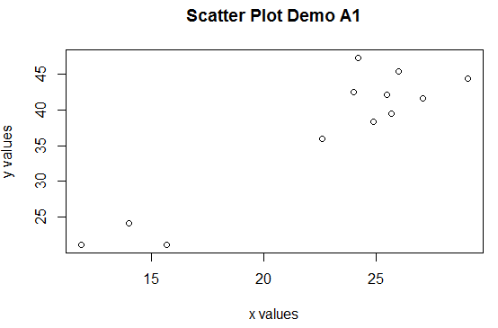
The scatter plot in Figure 3 is unadorned. It is the result of the most basic version of the plot() command. There are many ays for us to make the plot look better, and even to help us read the plot. First, we will give the plot a title and we will change the labels from their default value which was the name of the variabless used to make the plot. Our new command becomes
plot(L1,L2, main="Scatter Plot Demo A1",
     xlab="x values", ylab="y values")
and the resulting plot is shown in Figure 4.
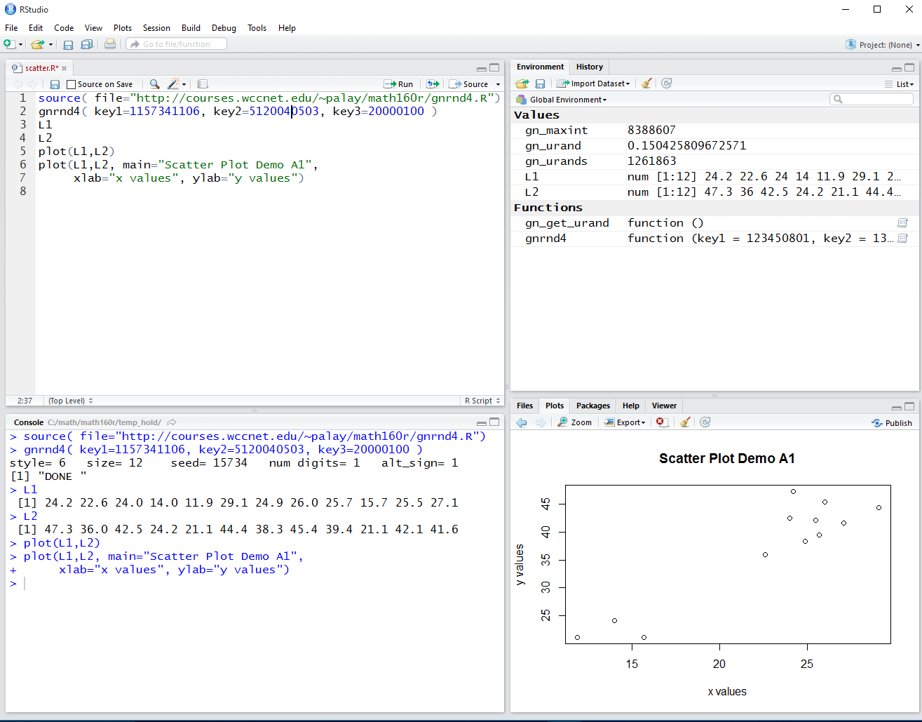
The plot in Figure 4 was generated within RStudio. The area in the RStudio window allocated to displaying the plots, the lower right corner pane, was relatively small and was much wider than it was high. The image of that window is shown in Figure 5.
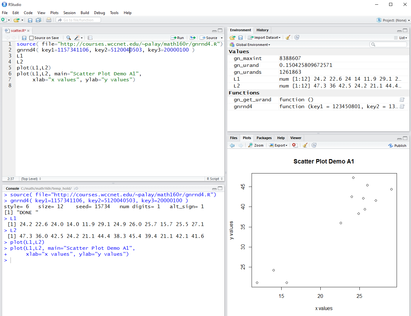
By sliding upward the pane separater bar above the Plot pane we can increase the vertical height of the area allocated for the Plot. This is shown in Figure 6. Note that the scatter plot has exanded to fill that space.
Another improvement will be to set the ranges and tick marks on the axes to a finer degree of specificity. First, we look at the two variables, L1 and L2 to find their minimum and maximum values. We can do this with the summary() command as shown in Figure 7.
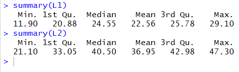
Knowing the the values in L1 range from 11.9 to 29.1 it would seem wise to set the x-axis to range from 10 to 30. The direction to to this is xlim=c(10,30). Then, we can set the tick marks to go from 10 to 30 and to have 10 divisions within that limit (thus making the step between marks = (30-10)/10 = 2) by using the direction xaxp=c(10,30,10).
Knowing the the values in L2 range from 21.1 to 47.3 it would seem wise to set the y-axis to range from 20 to 50. The direction to to this is ylim=c(20,50). Then, we can set the tick marks to go from 20 to 50 and to have 10 divisions within that limit (thus making the step between marks = (50-20)/10= 3) by using the direction yaxp=c(20,50,10).
We add this these directions to our plot command making it
plot(L1,L2, main="Scatter Plot Demo A1",
     xlab="x values", ylab="y values",
     xlim=c(10,30), xaxp=c(10,30,10),
     ylim=c(20,50), yaxp=c(20,50,10)
     )
Figure 8 shows the command in the Control Pane.
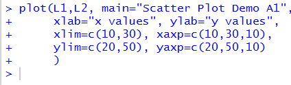
Figure 9 shows the resulting plot as it appears in the RStudio Plot pane.
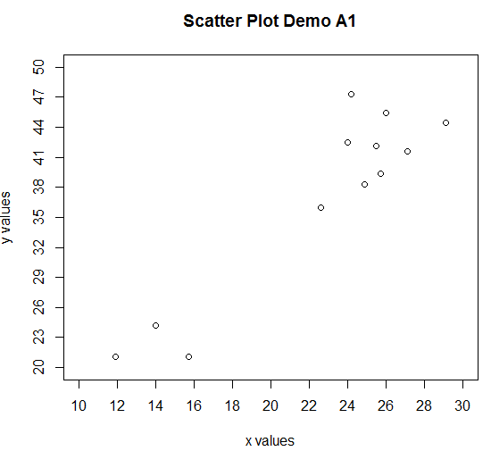
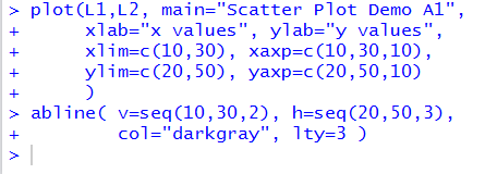
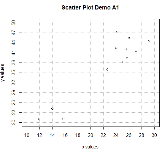
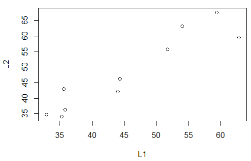
Figure 9 could be made easier to read and interpret if there were grid lines on the plot. We can add such grid lines via the abline() command. That command will add lines to the already existing plot. We want vertical lines at values 10 through 30 in steps of 2. The direction v=seq(10,30,2) will do this. We want horizontal lines at values 20 through 50 in steps of 3. The direction h=seq(20,50,3) will do this. We want the lines to be dark gray in color. The direction col="darkgray" will do this. Finally, we want the grid lines to be composed of dashes. The direction lty=3 will do this. Thus the entire abline() command becomes
abline( v=seq(10,30,2), h=seq(20,50,3),
        col="darkgray", lty=3 )
When we give that command the Control Pane then looks like Figure 10.
The resulting graph is shown in Figure 11.
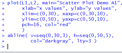
The previous page pointed out the danger of showing a graph that is not 0-based. We can redo the commands to change our plot so that it is 0-based. While we are at it, we can also change the plot character to a solid dot, via the diretion pch=16, and the color of that dot to be red, via the direction col="red". With the recalculations for the other directions, this makes our two commands appear as
plot(L1,L2, main="Scatter Plot Demo A1",
     xlab="x values", ylab="y values",
     xlim=c(0,30), xaxp=c(0,30,10),
     ylim=c(0,50), yaxp=c(0,50,10),
     pch=16, col="red"
     )
abline( v=seq(0,30,3), h=seq(0,50,5),
        col="darkgray", lty=3 )
We see those commands in the Control pane in Figure 11.
The resulting plot is shown in Figure 13.
Now that we have developed such a nice looking graph of the data in Table 1, we return to the same data that we had used in the previous web page. That data is given here as Table 2. As usual, you can create the same values in R by using We could construct the scatter plot we had in that previous page by the commands
gnrnd4( key1=1723370910, key2= 450008500425 )
plot( L1, L2 )
Those commands, in the RStudio session being employed, produced the image in Figure 14.
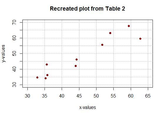
Of course, we could make the plot a bit fancier by adding a few more directions and by adding a grid to the plot. The new commands would be
plot( L1, L2, xlab="x-values", ylab="y-values",
      main="Recreated plot from Table 2",
      xlim=c(30,65), xaxp=c(30,65,7),
      ylim=c(30,70), yaxp=c(30,70,8),
      pch=16, col="darkred")
abline(v=seq(30,65,5), h=seq(30,70,5),
       col="darkgray", lty=3)
They produce the scatter plot in Figure 15.
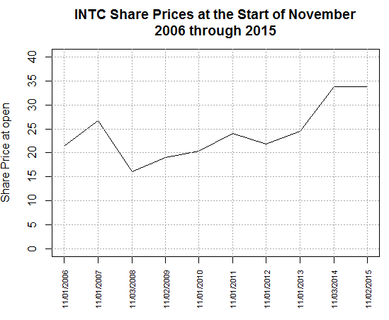
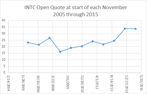
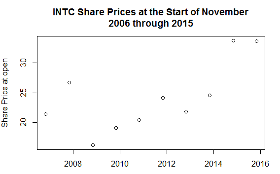
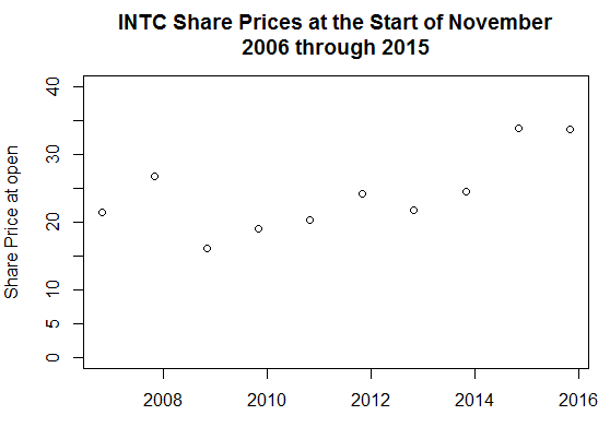
One of the points made in the previous web page was that it is often the case that scatter plots are transformed into, and presented as, line plots. We saw an example of that in the previous page with a chart showing the stock price for INTC at the open of the market in each November from 2006 through 2015. Figure 16 redisplays that plot.
We can change our plot of Figure 15 to a line plot by adding the direction type="l" to our plot() command so that it becomes
plot( L1, L2, xlab="x-values", ylab="y-values",
      main="Recreated plot from Table 2",
      xlim=c(30,65), xaxp=c(30,65,7),
      ylim=c(30,70), yaxp=c(30,70,8),
      pch=16, col="darkred", type="l")
abline(v=seq(30,65,5), h=seq(30,70,5),
       col="darkgray", lty=3)
though the result, shown in Figure 17, is not what we might expect.
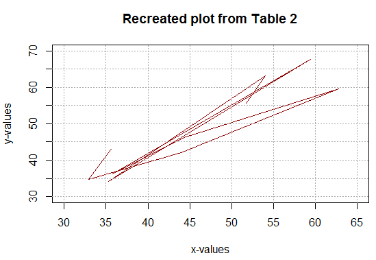
Why did this not work? Well, actually it did. R did exactly as we had asked. It plotted each point and then connected them in the order in which they appear in the two lists. Most likely we had anticipated that the points would be connected from left to right. To do that we would need to reorder the original data so that the x-values are ascending. Note that we need to do this while we maintain the "pairing" of specific y-values to their associated x-values.
A few commands in R will accomplish this, though the meaning of the commands is a bit ahead of us. The commands are
comb<-data.frame(L1,L2)
comborder<-comb[order(L1),]
L1sort<-comborder$L1
L2sort<-comborder$L2
L1sort
L2sort
As seen in the Control pane they appear as in Figure 18.
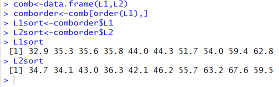
Comparing the display of the values assigned to L1sort and L2sport shown in Figure 18 with the values in Table 2 it is clear that we have accomplished out task. The values in L1sort are indeded the sorted x-values of Table 2, and the values in L2sort are still paired with the same x-value items as they were in Table 2.
If we reconstructed the sorted data as a new table it would appear as: Now that the data is sorted so that the x-values are increasing and the associated y-values have been kept with their corresponding x-values we can redo the plot() and abline() commands as
plot( L1sort, L2sort, xlab="x-values", ylab="y-values",
      main="Plot from Table 3",
      xlim=c(30,65), xaxp=c(30,65,7),
      ylim=c(30,70), yaxp=c(30,70,8),
      pch=16, col="darkred", type="l")
abline(v=seq(30,65,5), h=seq(30,70,5),
       col="darkgray", lty=3)
Those commands produce the chart seen inb Figure 19.
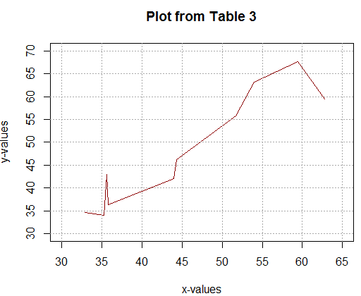
Figure 19 appears as we expected.
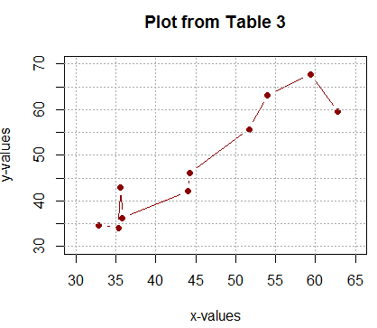
Just for completeness, note that if we set type="b" in our commad, so that it now appears as
plot( L1sort, L2sort, xlab="x-values", ylab="y-values",
      main="Plot from Table 3",
      xlim=c(30,65), xaxp=c(30,65,7),
      ylim=c(30,70), yaxp=c(30,70,8),
      pch=16, col="darkred", type="b")
abline(v=seq(30,65,5), h=seq(30,70,5),
       col="darkgray", lty=3)
then the plot will have the data points and lines almost connecting those points,
as shown in Figure 20.
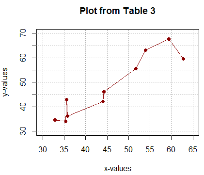
On the other hand, using the direction type="o" so that the commands now appear as
plot( L1sort, L2sort, xlab="x-values", ylab="y-values",
      main="Plot from Table 3",
      xlim=c(30,65), xaxp=c(30,65,7),
      ylim=c(30,70), yaxp=c(30,70,8),
      pch=16, col="darkred", type="o")
abline(v=seq(30,65,5), h=seq(30,70,5),
       col="darkgray", lty=3)
produce the image in Figure 21 where the lines actually connect the dots.
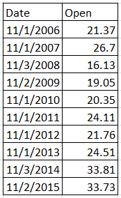
If we want to try to reproduce in R the chart from the previous page displayed above as Figure 16, we will need to have the table of values that provides the 10 points of the scatter plot. Such a table is shown in Figure 22.
Two statements in R that will create two variables to hold these values are:
dd<-as.Date(c("2006-11-01","2007-11-01",
              "2008-11-03","2009-11-02",
              "2010-11-01","2011-11-01",
              "2012-11-01","2013-11-01",
              "2014-11-03","2015-11-02"))
ov<-c( 21.37, 26.70, 16.13, 19.05, 20.35,
       24.11, 21.76, 24.51, 33.81, 33.73)
Please note that the as.Date function is used here so that the data
values will actually be dates, not stings of characters.
Then we can create our first attempt to generate a scatter plot for this data via the command:
plot( dd, ov, xlab="",
      ylab="Share Price at open",
      main="INTC Share Prices at the Start of November\n2006 through 2015")
The result is the plot shown in Figure 23.
That plot is a good start. We will add the directions
ylim=c(0,40) and
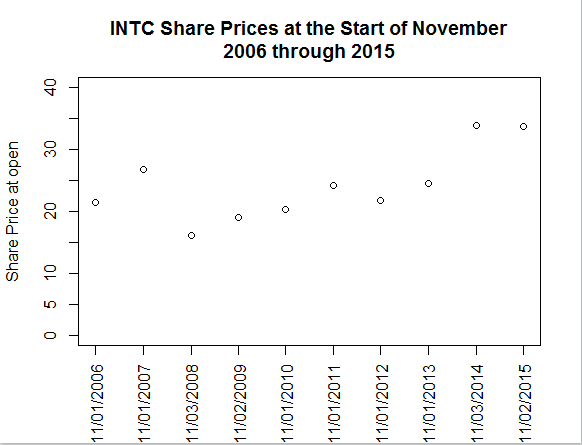
Figure 24 is a decided improvement, but the tick marks on the x-axis
are not very helpful.
As it turns out, it will be easier to create and display
better tick marks if first we use the
the direction xaxt="n" to suppress plot()
from
producing tick marks on the
x-axis, and, second, if we add a new command,
axis.Date() that is specially designed to produce "date"
tick marks on an axis.
The two new commands are:
Figure 25, with its specialized tick marks on the x-axis
is actually a bit better than we got off of Excel in Figure 16,
although we have yet to convert the scatter plot to a line plot.
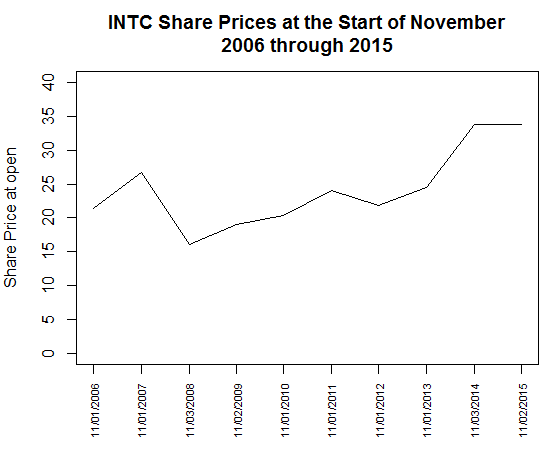
Besides that change, looking at Figure 25, it seems that we are really squeezed
for space below the plot. We can add the direction cex.axis=.7 to
the axis.Date() function
make the date values use a smaller font. And, we can add the direction type="l"
to the plot() function
to make this into a line plot.
Now our commands appear as
Finally, we might want to add a set of grid lines to the graph,
using abline(). Now the three commands appear as
That plot is every bit as good as the one from Excel.
©Roger M. Palay
Saline, MI 48176 November, 2015
plot( dd, ov, xlab="",
      ylim=c(0,40), yaxp=c(0,40,8),
      ylab="Share Price at open",
      main="INTC Share Prices at the Start of November\n2006 through 2015")
with the reulting plot appearing in Figure 24.
plot( dd, ov, xaxt="n", xlab="",
      ylim=c(0,40), yaxp=c(0,40,8),
      ylab="Share Price at open",
      main="INTC Share Prices at the Start of November\n2006 through 2015")
axis.Date(side = 1, dd, format = "%m/%d/%Y",
          las=2, at=dd)
These two commands produce the image shown in Figure 25.
plot( dd, ov, xaxt="n", xlab="",
      type="l",
      ylim=c(0,40), yaxp=c(0,40,8),
      ylab="Share Price at open",
      main="INTC Share Prices at the Start of November\n2006 through 2015")
axis.Date(side = 1, dd, format = "%m/%d/%Y",
          las=2, at=dd, cex.axis=.7)
The resulting image is shown in Figure 26.
plot( dd, ov, xaxt="n", xlab="",
      type="l",
      ylim=c(0,40), yaxp=c(0,40,8),
      ylab="Share Price at open",
      main="INTC Share Prices at the Start of November\n2006 through 2015")
axis.Date(side = 1, dd, format = "%m/%d/%Y",
          las=2, at=dd, cex.axis=.7)
abline(h=seq(0,40,5),
       v=dd,
       lty=3, col="darkgray")
The resulting plot is shown in Figure 27.