| The objective of this page is to present, in the most elementary way, some of the two variable graphs that we find or use in elementary statistics. A link is provided, at the end of the page, to another page that demonstrate creating these graphs in R. |
| As a small but significant disclaimer, please note that R has at least three completely separate, and to some extent, redundant systems for creating graphs, charts, and plots. These pages only use the base plotting system. We expect that this base system to be more than sufficient for our needs. However, should you ever need fancier graphs, rest assured that R is quite capable of producing them, though maybe through the other two systems. |
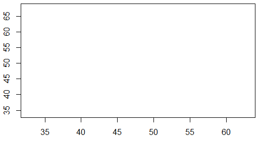
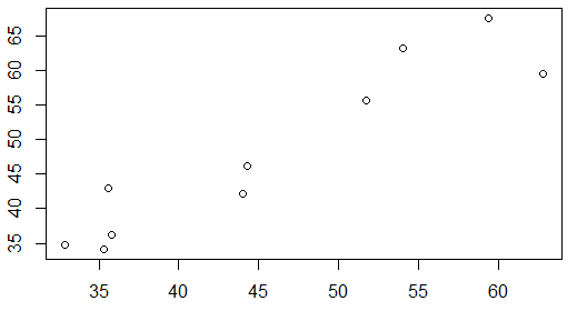
This page looks at scatter plots, also known as xy-plots, along with some variations that may be employed. These plots are meant to show the relation between two variables. To illustrate this we need to have data values that come in pairs, an x-value and a y-value. Table 1 shows these pairs. You can create the same pairs of values in R using Traditionally, the x-axis runs horizontally and the y-axis runs vertically. We need to have enough space for all of our values. Looking at Table 1 we see that the x-values fall between 30 and 65, while the y-values fall between 30 and 70. Thus, we could construct a plotting area such as the one shown in Figure 1.
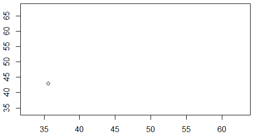
Then we just need to add the points, the x-y pairs of values to the graph. The first pair is (35.6,43.0). We put a dot above 35.6 on the x-axis and across from 43.0 on the y-axis. That point is plotted in Figure 2.
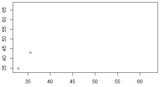
The second pair is (32.9,34.7). We put a dot above 32.9 on the x-axis and across from 34.7 on the y-axis. That point is plotted in Figure 3.
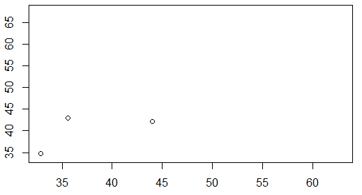
The third pair is (44.0,42.1). We put a dot above 44.0 on the x-axis and across from 42.1 on the y-axis. That point is plotted in Figure 4.
If we continue that process for all 10 points we arrive at the plot shown in Figure 5.
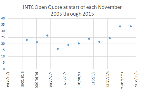
The data in Table 1, and shown in Figure 5, did not come from a real-life situation. However, we experience many examples of scatter plots shows the in our daily lives. Figure 6 presents the stock price for Intel Corporation (INTC) at the start of each November from November, 2006 through November, 2015. That particular chart was made in Excel and uses the Excel default presentation parameters.
In a scatter plot, as we have seen, we plot points. Therefore, one might reasonably expect that all scatter plots would appear as graphs of individual points. However, there is a tendency to "connect the dots" and as such we often find scatter plots where the points are "connected". Figure 7 shows the same data as we had in Figure 6, but this time Excel was asked to connect the points of the graph.
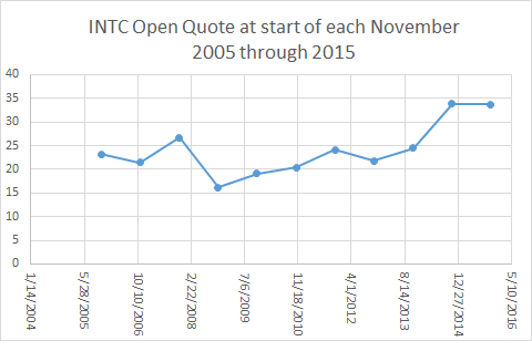
In some sense, looking at the lines of Figure 7 gives us a "feeling" for the change in the stock price over time. The problem with this is that it is a lie. Reading Figure 7, and glossing over the fact that we have but 10 real data points, it would look like the price of INTC stock stayed essentially constant from November, 2014 to November, 2015, the last two data values that we have. After all, in the chart, the line between those two points is a horizontal line at about $34 (the actually values for 2014 and 2015 were $33.81 and $33.73, respectively).
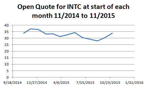
If we look a little closer at the data, or rather at data from the start of every month between November, 2014 and November, 2015, we could generate, in Excel, the scatter plot shown in Figure 8.
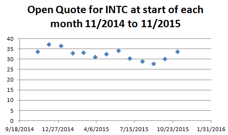
It should be clear from Figure 8 that the "essentially unchanged" stock price that we saw in Figure 7 from November, 2014 to November, 2015 really was not "unchanged" at all. In fact, from Figure 8 we see that the price was over $36 at the start of December, 2014 and around $28 at the start of September, 2015.
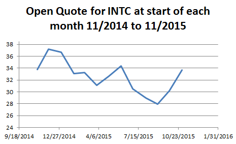
Of course, we could "connect the dots" of Figure 8 and we would get the nicer looking Figure 9.
For the same reason, Figure 9, though it is more appealing, is suggesting to us things that are not true. The stock price did not have a constant rise from April, 2015 through the start of June, 2015.
All of the data used to generate Figures 6 through 9 came from Yahoo Finance. That same site will give us a scatter plot (with the dots connected) for the period from the start of November, 2014 through the start of November, 2015, but with a point for each day the market was open. Figure 10 has that plot, though reduced in size to fit on a printed page. (In most browsers you can right-click on the image of Figure 10 and then click on the "View Image" option to see a larger version of the chart.)
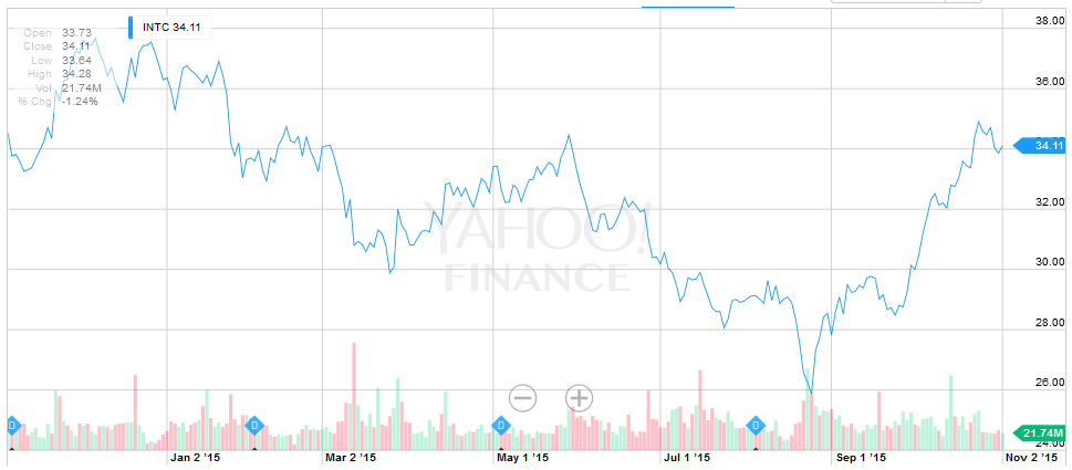
You can certainly verify the points used for Figure 8 and Figure 9 from the points in Figure 10.
One striking impression from comparing Figure 10 to Figure 9 is that the stock price seems more volatile in Figure 10. Part of that is due to the day to day changes, all of the little ups and downs between adjacent points. However, a great deal of that "impression of volatility" is due to the fact that the Yahoo chart does not have a 0 based vertical scale. The vertical scale in Figure 9 went from 0 to 40. The vertical scale in Figure 10, goes from about 24 to just over 38.
Just to see the impact of changing the vertical scale, look at Figure 11 which is an Excel chart of the same data shown in Figure 9 but with a changed vertical scale.
The image in Figure 11 now seems much closer to that of Figure 10, giving the same impression of volatility that we got in Figure 10, than did Figure 9.
There are two concepts to take away from the information presented on this page.
|
See the page Making Scatter Plots in R for a more detailed discussion of how you can create scatter plots in R.
©Roger M. Palay
Saline, MI 48176 October, 2015