Frequency Tables -- grouped values
Return to Topics page
This page presents issues related to grouping values.
There are many cases where our measurements are a bit finer than we need.
If we are looking at the weight of a some collection of people, do we really
care if a single person weight 145.6 pounds or 145.7 pounds?
Remember that your weight varies by more than a pound during a day. Those
people who exercise significantly, and those people who eat significantly,
can see ever a wider fluctuation in their weight during a day.
Let us consider the values given in Table 1.
Looking at the data in Table 1
it is pretty clear that it would not make any sense
to try to find the frequency with which values appear.
A few values may repeat two or three times, but for the most part, the
table is filled with
different values. However, it is also pretty clear that these values are
bunched together is some way. Furthermore, we know that we could
get a histogram of the values such as the one shown in Figure 1.
Figure 1
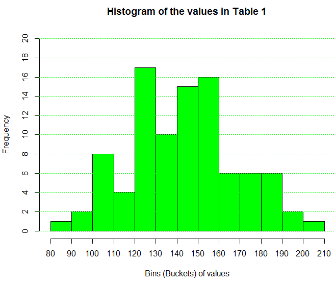
From Figure 1 we can say that there is one value in Table 1
that is between 80 and 90, here are two values between 90 and 100, there are 8
values between 100 and 110, and so on. The histogram
accumulates values into bins or buckets and simply
reports the number of values in each collection.
Seeing that we can get a frequency of the values in each bin
leads us to following steps similar to those
that we had in the case where we had a relatively
small number of discrete values. Namely, we want to produce a frequency table
that gives such things as the relative frequency
and the cumulative frequency.
The simple version of such a table, the version that just gives us the
intervals (i.e., the endpoints of each bin)
and the frequency for each bin appears here as Table 2.
It is a bit comforting to note that the frequency numbers
in Table 2 are exactly the same as the
frequencies shown in the histogram of Figure 1.
You may recall that in R, the language used to produce Figure 1,
the intervals are "closed on the right" by default.
That is, in Figure 1, the interval from 90 to 100 included the right
end value, 100. The interval from 100 to 110 includes the 110, but not the 100 since it is
in the interval from 90 to 100. The intervals in Table 2
conform to that same pattern. In fact the first interval is
writen as (80,90], to indicate that it is "closed on the right.
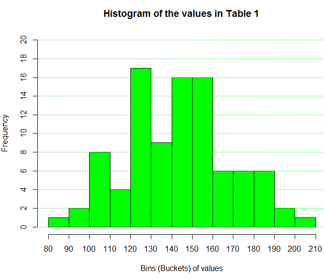
Just as the histogram could have been made with
intervals "closed on the left" so too could we create a frequency table
that follows the same rule. Table 3 does that.
Two things should be obvious in comparing Table 2 to Table 3.
First, in Table 3 the intervals are indeed
"closed on the left". Second, the frequencies changed slightly.
The reason for this change can be seen by inspecting the values in Table 1.
When we do that we note that there is a value of 140.0 in the original data.
For Table 2 that value ends up in the (130,140] interval.
However, for Table 3 that same value is found in the [140,150)
interval.
Just for completeness we create a histogram, shown in Figure 2,
that uses this same "closed on the left" approach.
Figure 2
If we come across a table such as Table 2 where we do not have
access to the original data, the best we can do to "characterize" the
now unknown original data is to use the midpoint of each interval
as the representative value for that interval. Therefore, it would be
nice if we could expand our table to not only give the individual intervals but also to give
the midpoint of each interval.
Table 4 has such an expanded structure.
Then too, just as we had expanded our frequency tables
in the discussion of discrete values,
we should expand our frequency table here to include the
relative frequency, the cumulative frequency,
and the relative cumulative frequency.
We have done this in Table 5.
That only leaves the addition of a column
that contains the number of degrees that should be
allocated in a pie chart to each interval.
Remember that a pie chart is a poor way to
represent the distribution of values, and that, despite that issue, it
is commonly requested and produced.
The interpretation of each of these columns
is identical to that given in the earlier
discussion of discrete values,
Here is another set of data, this time it is data that changes each time the web page is
reloaded.
Having seen these frequency tables the next challenge is to
see how to produce them in R.
To do that
we look at
Computing in R: Frequency Tables -- Grouped Values.
Return to Topics page
©Roger M. Palay
Saline, MI 48176 November, 2015