Contingency Tables

Return to Topics page

Consider two variables of a population, each with discrete characteristics. The first variable has 5 distinct values,
  1. Red
  2. Green
  3. Blue
  4. Purple
  5. Yellow
The second variable has 6 distinct values,
  1. Square
  2. Triangle
  3. Parallelagram
  4. Hexagon
  5. Octogon
  6. Circle
We have a hypothesis that the two varaibles are independent. To test that hypothesis we take a sample of the population and then for each element of the population we identify its color and shape. We use that identification to build the following contingency table.
To test our hypothesis that the color and shape are independent we will perform a χ² test. We can generate the data in R via the given commands:
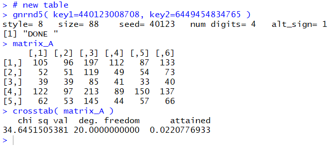
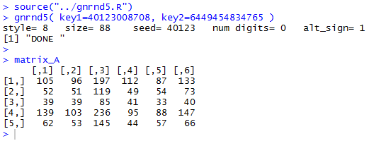
source("../gnrnd5.R")
gnrnd5( key1=40123008708, key2=6449454834765 )

matrix_A
as is shown in Figure 1.
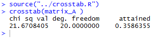
Figure 1

The display in Figure 1 matches the values shown in Table 1. As explained and exemplified in an earlier page we could go through numerous steps to do such things as to find the row totals, the column totals, and the grand total. However, we also saw that the function crosstab() has been designed to perform all of those steps. In fact, 
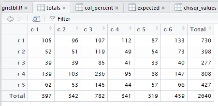
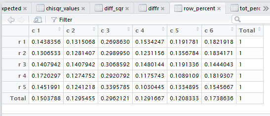
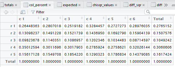
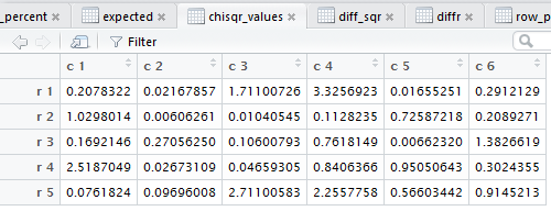
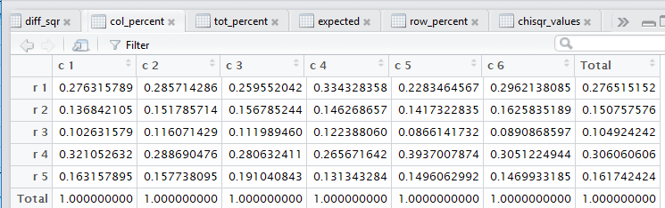
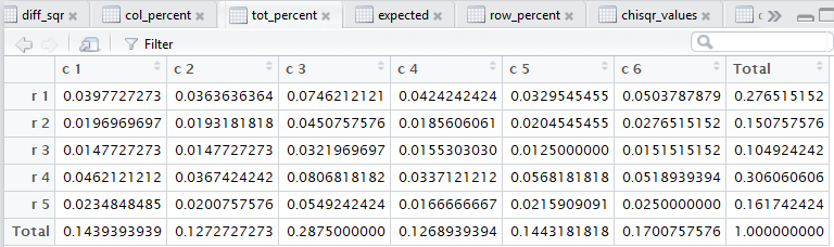
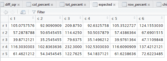
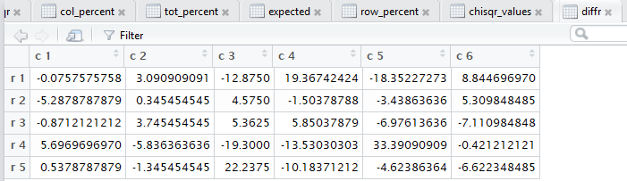
crosstab() also computes the row percents, the column percents, and the total percent for the data. Beyond that, also as noted in that earlier page, crosstab() goes through and displays the tabular results for each of the steps needed to do the χ² computation.

Rather than painfully reproducing all of the steps here, we will merely load and then run the crosstab() function. The R commands:
source("../crosstab.R")
crosstab(matrix_A )
produced the console output shown in Figure 2.

Figure 2

That console output actually provides the answer to our question. The chi sq val is shown as 21.670805 and we see that we should be using 20 degrees of freedom. The attained value of 0.3586355 means that if the hypothesis of independence in the base population is true then if we were to take repeated samples of the size that we have in Table 1, we would find a sample chi sq val of 21.6708405 or larger in about 35.8% of those repeated samples. Therefore, we see that it is not at all strange to have such a chi sq value and we do not have evidence to reject our null hypothesis.

Although the console output is quite concise, it does not show all of the steps that we would have gone through to look at the data and to compute the chi sq value. The function 
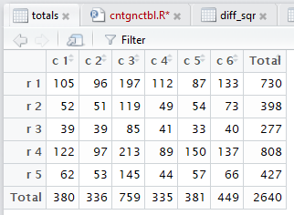
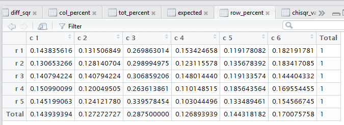
crosstab() produces, and then displays in the editor pane, 
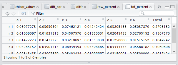
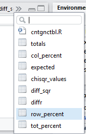
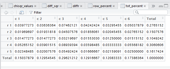
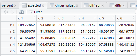
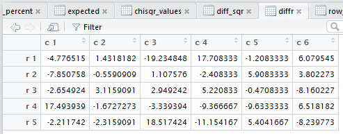
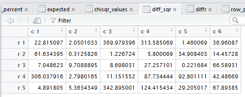
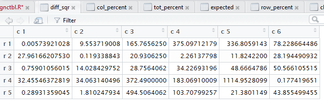
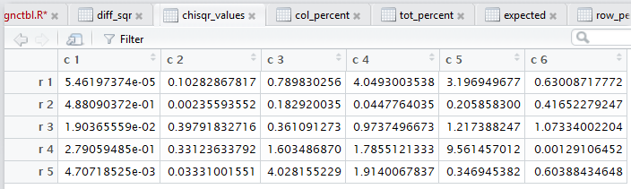
all of those steps. Figure 3 captures that editor pane from my computer. In Figure 3 we see that there are now many tabs for different windows in that pane. It may be hard to see because of the lack of significant contrast, but the tot_percent tab is highlighted meaning that the display is showing that set of values.

Figure 3

In our investigation of the various tabs, we do not want to start with that display. In fact, the one we want is the totals tab, but it is not even on our current display. We can , however, click on the chevron (circled in red in Figure 4) to open the selection of tabs shown in Figure 4.

Figure 4

Within that selection, we point to our desired tab, in this case totals, now highlighted in Figure 5.

Figure 5

Once we click on the selection the dispaly shifts to show our desired tab, totals, as reproduced in Figure 6.

Figure 6

The difference between the console display of the table shown in Figure 1 and the display in Figure 6 is that we now have the row totals, the column totals, and the grand total. In this example that grand total is 2640. Recall that row 3 represents the color Blue. Therefore, the table shows that we have a total of 277 blue items. Column 4 represents Hexagons so we have 341 hexagons. And, of course, we have 41 Blue Hexagons.

Next we want to examine the row percents. That is, since we know that there are 277 blue items, what percent of them are hexagons? Clearly, that would be 41/277. That value is shown in the row_percent tab. However, as before, we do not see that tab in Figure 6. So, we click on the chevron again to open our selections as seen in Figure 7. There we point to the row_percent selection.

Figure 7

When we click on the row_percent selection we change the display to that shown in Figure 8.

Figure 8

Figure 8 shows all of the row percents, expressed as decimal values, for the entire table, including the total row and the total column. In row 3 column 4 we find the value 0.1480144, the decimal approximation to the 41/277 that we expected.

A deeper view of the data in Figure 8:
We already know from the console display of Figure 2 that there is not sufficient evidence to reject the hypothesis of independence. In the case of perfect independence we would expect that the row percents for any one row would be identical to the row percents for any of the other rows, including the total row. That is, if we look at column 4, the total row value is 0.1291667. In the case of perfect independence we expect that all of the values in that column would be exactly the same 0.1291667 value. We know that a sample, such as we have in is case, is not expected to have perfect independence. However, note how close the values are in the fourth column. And in fact, within any of the columns the values are pretty much the same. This is what we expect to see when we have a sample from a population in which the two characteristics are independent.


Next we can look at the column percents. Unfortunately, those are not at shown in the tabs displayed in Figure 8 so we return to the tab selections via the chevron, as shown in Figure 9.

Figure 9

Clicking on the col_percents takes us to Figure 10.

Figure 10

Figure 10 shows the column percents for all of the cells in the table. Recall that there were 341 hexagons, column 4, but only 41 of those, in row 3, were blue. Looking at just the hexagon column then we have 41/341 that are blue hexagons. Expressing that as a decimal gives us the 0.1202346 shown in row 3 column 4 of the table.

A deeper view of the data in Figure 10:
As we saw for the row percents above, in a perfect independence situation each column in Figure 10 should look like each of the other columns. Again, Figure 10 is a sample. Even given that the hupothesis is true we would not expect the sample to have perfect independence. However, since we have seen, via Figure 2, that we do not have evidence to reject the idea that the two characteristics are independent in the underlying population, we should expect that the columns in this sample would be similar to one another. And, indeed they are.


Next, somewhat for completeness, we want to look at the tot_percent tab. Again, it is not shown in Figure 10, but at this point we know how to use the chevron to navigate to that tab which is shown in Figure 11.

Figure 11

We really have little use for the tot_percent values; there is no particular pattern that we would expect to find. It is just a nice computation. Thus we see that our 41 blue hexagons constitute 1.553030% of the total, that is 41/2640.

When we get to the task of computing our χ²: value we want to remember the steps that we would need to take.
  1. For each cell in the matrix, note the value in the cell as the observed value.
  2. For each cell in the matrix, find the expected value. This will be the value (row total) * (column total) / grand total.
  3. For each cell in the matrix, find the difference between the observed and expected values, i.e., compute observed - expected.
  4. For each cell in the matrix, find the square of that difference, i.e., compute (observed - expected)².
  5. For each cell of the matrix find the ratio of the squared difference and the expected value, i.e., compute (observed - expected)² / expected.
  6. Get the sum of all of those ratios; that sum is the χ² value
The tabs that crosstab() produced show us the results of the computations in steps 2 through 5 above. If we move to the expected tab we will get the display shown in Figure 12.

Figure 12

Figure 12 holds all of the expected values. In particular, the cell we have been following, the blue hexagons (row 3 column 4) should hold the result of the row 3 total (277) times the column 4 total (341) divided by the grand total (2640). Indeed, 277*341/2640 is 35.77917, the value in row 3 column 4 of Figure 12.

Then we move to the calculation of the observed -expected by moving to the diffr tab, shown in Figure 13.

Figure 13

Recall that we had 41 observed values for blue hexagons and that we just found that we have 35.77917 as the expected number of blue hexagons, so Figure 13 shows that we have observed - expected equal to 41 - 35.77917 or 5.220833 as the difference. In fact, Figure 13 shows all 30 of the differences, one for each cell of the matrix.

Then we want to look at the square of those differences. That is in the diff_sqr tab shown in Figure 14.

Figure 14

Sure enough, the cell we have been following, row 3 column 4, now has the square of the corresponding cell back in Figure 13. Thus 5.220833² is 27.257101.

Once we have all of those squared values we want to find the ratio of the squared value to the corresponding expected value. We look at tab chisqr_values in Figure 15.

Figure 15

Again, focusing on our row 3 column 4 value, we expect that to be 27.257101 / 35.77917, which it is 0.7618149 as shown in Figure 15.

The only remaining step is to add all 30 values in Figure 15. The function crosstab() did this and reported the result back in Figure 2 as the chi sq val, namely, 21.6708405.

That concludes our walk-through of the crosstab() function and its output. However, it might be nice to make a quick walk through of a similar situation, but this time one where the table is so far from perfect independence that we can reject the hypothesis that the two variables, color and shape, are independent in the underlying population. To do this we need to get that new sample.
[Note: It is interesting to compare Table 2 to the sample shown in Table 1. It is only row 4 in Table 2 that shows any change. The rest of the new table is exactly the same as the values given in the original table. Therefore, we should expect to find major changes in the row 4 values shown in subsequent tables when compared to earlier tables.

Again, we want to test the null huypothesis that the two varibables, color and shape, in the underlying population are independent. We will test this hypothesis at the 0.05 level of significance. To do this test we have taken our sample and built the matrix shown in Table 2. We have generated that same table in R as shown in Figure 16.

Figure 16

Looking at the console output in Figure 16 we confirm that we have the correct matrix values. In addition, in Figure 16, we have run the crosstab() function. It produced, in the console pane, the χ² value 34.64515, indicated the appropriate degrees of freedom, 20, and reported the attained significance to be 0.022. That means that if the null hypothesis were true then we would get a sample of this size having a distribution of row-column values as far from perfect independence or further from perfect independence about 2.2% of the time. Because we are doing the test at the 0.05 level of significance, here we have a random sample that should only show up about 2.2% of the time, we reject the null hypotheses.

There was a good deal of work that went into actually computing the χ² value. That work is shown, along with some descriptive work, in the various tabs displayed in the editor pane. For example, the tab totals, shown in Figure 17, displays matrix of values and it augments that with row, column, and the grand totals.

Figure 17

Comparing this to its corresponding display above, Figure 6, we see the result of having different values in row 4. In particular, all of the row totals have remained the same. However, the column totals have changed.

Figure 18 shows the row_percent version of the matrix.

Figure 18

Again, the row percent values, with the exceptions of row 4 and the column total row, are unchanged from the old Figure 8. However, whereas in Figure 8 each row was pretty much the same, now, in Figure 18, the values in row 4 seem a bit out of alignment, especially the value in row 4 column 5, 00.1856.

Figure 19 shows the col_percent version of the matrix.

Figure 19

As we might expect, the columns are pretty much the same, except for the changes in the row 4 values. Again, note the change in row 4 column 5.

Figure 20 shows the tot_percent version of the matrix.

Figure 20

Now we look at the tabs that represent the actual computation of the χ² value. Figure 21 shows the expected version of the matrix. That is, each cell of the matrix has the expected value for that pair of color and shape characteristics. Each expected is computed as the (row total) * (col total) / (grand total)

Figure 21

Figure 22 shows the diffr version of the matrix, that is, each cell represents the observed - expected value.

Figure 22

Figure 23 shows the diff_sq version of the matrix, that is, each cell represents the (observed - expected)² value.

Figure 23

Figure 24 shows the chisq_values version of the matrix, that is, each cell represents the (observed - expected)² / expected value.

Figure 24

If we were to add up all of the values in Table 24 we would arrive at the Figure 16 reported toal of 34.64515.

Return to Topics page
©Roger M. Palay     Saline, MI 48176     September, 2016