Probability: Assessing Normality
Return to Topics page
We know that the normal distribution is
continuous, symmetric, unimodal (it only has one modal region),
and relatively free from outliers
(extreme values, relative to the spread of other values,
are extremely rare).
We should also know that we will never find
a real population or sample that is exactly normal.
Every collection of real values is at best close to
being normally distributed.
It would be nice to have some method to say
that some sample is approximately normal.
This turns out to be a big challenge.
About the best we can do is to come up with
a list of characteristics that should disqualify
a sample from being called approximately normal.
We can go back to our earlier characterization and
say that any one of the following should disqualify
a sample from being called approximately normally distributed.
Disqualify as normal if a sample
- has distinct values, and not a huge number of distinct values, so that it is hard to believe it is continuous,
- is clearly not symmetric,
- has more than one modal region,
- has excessively many or extreme outliers, or
- does not have a linear quantile plot
That last item will need a bit of explanation, but we will get to
it later.
First, consider an example that has too few different values
to be called continuous.
The sample in Table 1 may
have 23 values but there are only
3 distinct values, 56, 57, and 58.
The does not look like it is a continuous measure.
We could certainly have a sample that has no more spread than
this and yet it could easily be construed as continuous.
Such a sample appears in Table 2.
Small samples mean that we just do not have enough
data to claim that something is normal. How small is small?
Nobody knows but clearly 4 is too small and
30 is probably more than enough.
All the examples below will have more than 30 items so there should
not be any question about sample size in those examples.
Our next sample is shown in Table 3.
We have plenty of values here. How do we look at
things like symmetry, modal regions, and outliers?
We have some tools to help, namely, dot plots,
box and whisker plots, and histograms. We can do each of these
for the data in Table 3.
We recall from our page on making dot plots
that R has no built-in command to do dot plots.
Instead, we developed our own function to make these plots.
A listing of that function is included here for your
convenience.
dot_plot<-function( this_list, ... )
{
  ## the first thing to do is to just sort the list into a local copy

  lcl_list <- sort( this_list )

  ## then we want a second list that is just as long as was the
  ## original list, because, in that second copy we will place the
  ## vertical position of the associated value in the sorted copy

  lcl_count <- lcl_list

  ## then, to start, we begin at the first item in the sorted list
  ## It will have  avertical position of 1
  cur_val <- lcl_list[1]
  m <- 1
  lcl_count[1]<-1

  ## now we just move through the rest of the sorted
  ## list and if we are at the same value then we go up one
  ## vertical level, but if we are at a new value we reset
  ## the vertical position to 1

  for (i in 2:length(lcl_list))
  {
    x <- lcl_list[i]
    if ( x==cur_val )
    { m <- m+1
    lcl_count[ i ] <- m
    }
    else
    {
      cur_val <- x
      m <- 1
      lcl_count[i] <- m
    }
  }

  ## once we are done with that, we can just do a scatter plot on
  ## the two vectors that we have created.


  plot( lcl_list,lcl_count, xlab="", ylab="Frequency", ...)
}
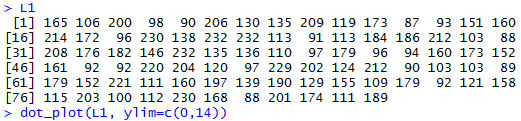
Once the function is defined in our R session we
can use it with the data in L1, the data values generated
by the gnrnd4( key1=357848501, key2=15200083 )
function call. The command to do this is
dot_plot(L1, ylim=c(0,14)). Figure 1
displays the contents of L1 along with our
dot_plot() function call.
Figure 1
The result of the dot_plot() command is the dot plot
shown in Figure 2.
Figure 2
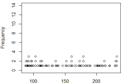
That dot plot does not indicate that there is any problem
with symmetry. There
do not seem to be any outliers.
The dot plot does raise questions about the sample in L1 having
even one modal area. The values seem to be spread out,
not collected in any areas at all.
A box plot might give us another view of the same data.
The web page on Box plots gave
numerous examples of ways to configure those charts,
but for out purposes we can just take the default version of the
command, boxplot(L1, horizontal=TRUE).
It produces the plot shown in Figure 3.
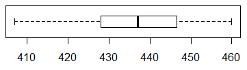
Figure 3
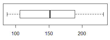
Unfortunately, we do not learn much from this box plot.
The left tail is a bit shorter than is the right tail, suggesting
some asymmetry where the plot in Figure 2 did not,
but the difference is not all that dramatic.
There is no help here about the question of having a mode.
There is some help in that the box plot does not indicate
any recognized outliers. Recall that the box plot whisker
lines stop at 1.5*IQR (the interquartile range) and leave outliers
as marks beyond those whiskers. There are no such outliers
in Figure 3.
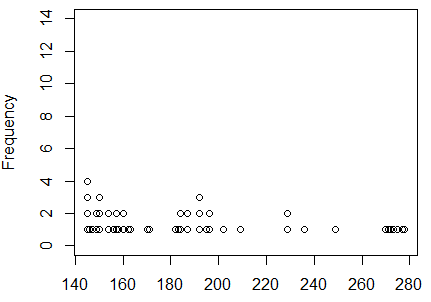
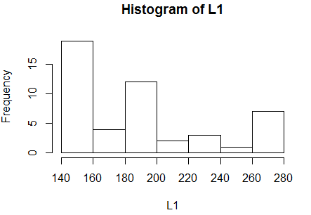
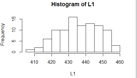
A histogram should give us better idea on the question
of having a modal region. A simple hist(L1) produces the
graph in Figure 4.
Figure 4
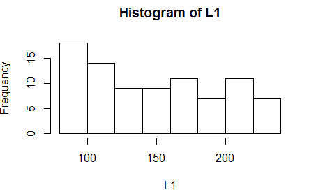
The histogram, for this data, could be interpreted in two ways.
Fortunately, the conclusion about normality drawn from both
interpretations is the same.
On the one hand, we could say that the graph
does suggest that there is a modal region at the extreme left
and that
data is skewed to the right (the long tail is on the right).
That would mean that the data is asymmetric and not normally distributed.
On the other hand, we could say that there is no
strong modal area (we will see other examples where there will be one).
Sure, there is a small pile of values to the left, but that could
just be by chance. However, with no mode in the middle, we would
conclude that this sample is not normally distributed.
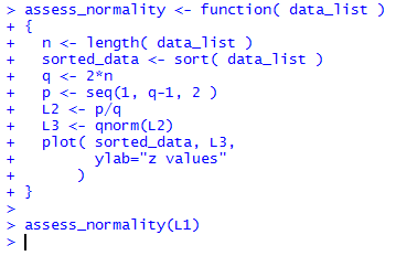
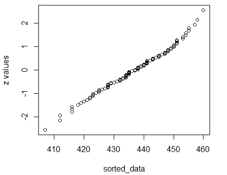
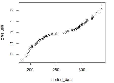
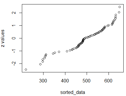
Our last approach to this question is the quantile plot.
We have not seen this before.
The concept is a bit involved but worth understanding.
The idea is that
if L1 represents an approximately normal distribution
then we could sort the values in L1 and the resulting
sorted list would correspond to the density of a normal
distribution. That is, the lower and upper
values would be more spread out and, as we approach the center
of the values, they would be more tightly packed.
We have 86 values in L1. In effect, we expect about 1/86th
of the area under a normal curve to be between the sorted
points. Well, we need to leave a little area for the tails too.
We could construct our own list where we are
sure that the values correspond to the density of the normal
distribution. The qnorm() function will allow us
to find z-values for any size area that we choose.
The entire area under the curve is 1 square unit.
What we need is a list of z-scores
that split the region into equal size areas.
We start by finding 86 evenly spaced values strictly between
0 and 1. We can do this by first finding the number that is twice
86. That will be 86*2=172. Then the values that we want are
1/172, 3/172, 5/172, 7/172, ..., 167/172, 169/172, and 171/172.
Each of those values has 2/172=1/86 between them.
Of course, there
are only 85 "between" areas. The final area is in the region below 1/172
(and above 0) and in the region above 171/172 (and below 1).
From those values we can use qnorm() to find the
corresponding z-score that has that area to its left.
Our list of generated z-scores will be 86 values
long and there will be an equal area between the scores.
Finally, if the values in L1
represent values from a normal distribution
then when we plot the sorted version of L1 against
our constructed list of z-scores the resulting
plot should be points on a diagonal line. The following
annotated statements will walk through this process.
n<-length(L1)            # find the number of items
q <- 2*n                 # make q be twice that number
p <- seq(1, q-1, 2 )     # make a sequence of the numerators
L2 <- p/q                # make a list of the values
L3 <- qnorm( L2 )        # get a list of z-scores
sorted_data <- sort(L1)  # get a sorted version of L1
plot(sorted_data, L3)    # make the plot
Figure 5 shows the console view of the statements.
Figure 5
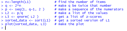
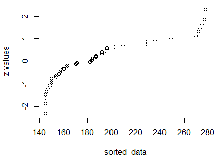
Figure 6 shows the resulting plot.
Figure 6
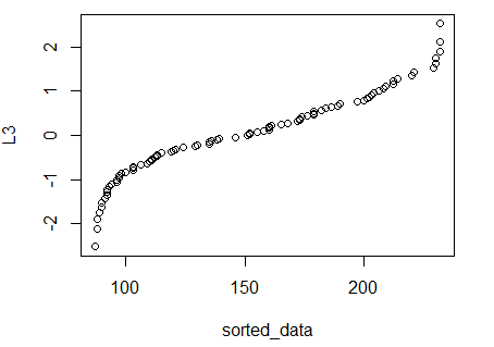
Our expectation, if L1 is approximately normal,
is to have the points fall on a diagonal line. The result
shown in Figure 6 does not conform to that.
As a result, we would say that we cannot justify
calling L1 approximately normal.
Table 4 presents a new collection of data values.
First we use dot_plot(L1, ylim=c(0,14)) to generate the plot
shown in Figure 7.
Figure 7
This shows a skewed distribution with a heavy count of items at the
left end, meaning a long tail on the right: skewed to the right.
We will use boxplot(L1, horizontal=TRUE) to
generate the chart in Figure 8 to get another view of this.
Figure 8
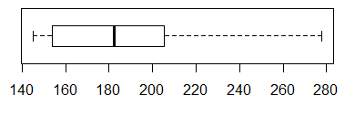
Figure 8 confirms the view that
the data values in L1 are skewed to the right.
This is not a normal distribution. Still, we
look at the histogram in Figure 9 generated by hist(L1).
Figure 9
The histogram shows the skewed distribution too.
Next we want to look at the quantile plot.
We could just repeat the statements that we
saw in Figure 5 to
generate the plot for this data. However, since
this sequence of statements is always the same we might as well
put that sequence into a function. The statements in that function
are:
assess_normality <- function( data_list )
{
  n <- length( data_list )
  sorted_data <- sort( data_list )
  q <- 2*n
  p <- seq(1, q-1, 2 )
  L2 <- p/q
  L3 <- qnorm(L2)
  plot( sorted_data, L3,
        ylab="z values"
      )
}
and Figure 10 shows the console view of that
function definition followed by our first use of the function.
Figure 10
The resulting graph is shown in Figure 11.
Figure 11
We already knew that the
values in L1 do not represent a normal distribution and
the fact that the dots in Figure 11 do not lie on a diagonal line
merely confirms that determination.
Table 5 presents a new collection of data values.
The dot plot appears in Figure 12.
Figure 12
Those location of those dots look to be symmetric (within reason).
There do not seem to be any outliers.
And there seems to be a central modal region to the
distribution. Nothing here says
that this is not a normal distribution.
We look at the box plot in Figure 13.
Figure 13
This too looks completely normal.
The median is about midway between the first and
third quartile points, the whiskers seem about even and are even wider
that the two middle regions.
We check the histogram in Figure 14.
Figure 14
Again, we find nothing to suggest that this is not a
normal distribution.
Move to do a quantile plot via
assess_normality( L1 ), shown in Figure 15.
Figure 15
Finally, we have a collection of data where the
dots all nearly fall on a diagonal line.
This is a confirmation that the distribution
is approximately normal.
Table 6 presents a new collection of data values.
The dot plot appears in Figure 16.
Figure 16
We have a problem here. There seems to be two modal areas.
We will see if there confirmations from the other views.
The box plot appears in Figure 17.
Figure 17
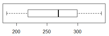
Figure 17 does not show any problems.
We move to look at the histogram in Figure 18.
Figure 18
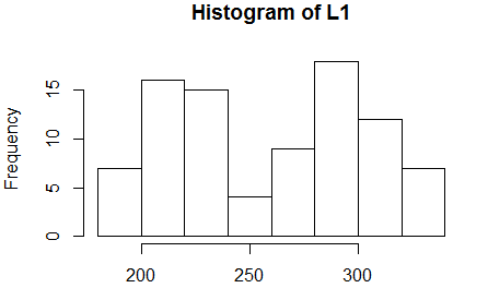
Figure 18 shows the two modal regions. This does
not conform to the normal distribution.
The quantile plot should give us further confirmation.
Figure 19
Indeed, the dots in Figure 19 do not fall on
a diagonal. The data in Table 6 do not represent
a normally distributed sample.
Table 7 presents a new collection of data values.
The dot plot appears in Figure 20.
Figure 20
The distribution seems to be heavy around about 475 without
having that be the central modal area. Also, the extreme
low value is a concern. More views are needed.
We check out the box chart in Figure 21.
Figure 21
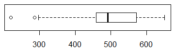
Figure 21 shows two clear outliers.
Also, in that box plot we see that the median
is not midway between the first and third quartile values.
Finally, the first 25% of the values are much more spread out
that are the last 25% of the values.
We turn to the histogram shown in Figure 22.
Figure 22
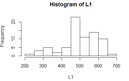
Figure 22 echoes the concerns that we have expressed above.
Finally, we look at the quantile plot in Figure 23.
Figure 23
The fact that the dots do not come close to being on a diagonal line
confirms our view that the values in Table 7 are
not a normally distributed collection of values.
Listing of all R commands used on this page
source( file="http://courses.wccnet.edu/~palay/math160r/gnrnd4.R")

gnrnd4( key1=745122201, key2=200056 )
gnrnd4( key1=2344122201, key2=20005600 )


gnrnd4( key1=357848501, key2=15200083 )


dot_plot<-function( this_list, ... )
{
  ## the first thing to do is to just sort the list into a local copy

  lcl_list <- sort( this_list )

  ## then we want a second list that is just as long as was the
  ## original list, because, in that second copy we will place the
  ## vertical position of the associated value in the sorted copy

  lcl_count <- lcl_list

  ## then, to start, we begin at the first item in the sorted list
  ## It will have  avertical position of 1
  cur_val <- lcl_list[1]
  m <- 1
  lcl_count[1]<-1

  ## now we just move through the rest of the sorted
  ## list and if we are at the same value then we go up one
  ## vertical level, but if we are at a new value we reset
  ## the vertical position to 1

  for (i in 2:length(lcl_list))
  {
    x <- lcl_list[i]
    if ( x==cur_val )
    { m <- m+1
    lcl_count[ i ] <- m
    }
    else
    {
      cur_val <- x
      m <- 1
      lcl_count[i] <- m
    }
  }

  ## once we are done with that, we can just do a scatter plot on
  ## the two vectors that we have created.


  plot( lcl_list,lcl_count, xlab="", ylab="Frequency", ...)
}


dot_plot(L1, ylim=c(0,14))
boxplot(L1,  horizontal=TRUE)
hist(L1)


n<-length(L1)            # find the number of items
q <- 2*n                 # make q be twice that number
p <- seq(1, q-1, 2 )     # make a sequence of the numerators
L2 <- p/q                # make a list of the values
L3 <- qnorm( L2 )        # get a list of z-scores
sorted_data <- sort(L1)  # get a sorted version of L1
plot(sorted_data, L3)    # make the plot


gnrnd4( key1=734054702, key2=13900145 )
dot_plot(L1, ylim=c(0,14))
boxplot(L1,  horizontal=TRUE)
hist(L1)

assess_normality <- function( data_list )
{
  n <- length( data_list )
  sorted_data <- sort( data_list )
  q <- 2*n
  p <- seq(1, q-1, 2 )
  L2 <- p/q
  L3 <- qnorm(L2)
  plot( sorted_data, L3,
        ylab="z values"
      )
}

assess_normality(L1)

gnrnd4( key1=236389404, key2=0001100438 )
dot_plot(L1, ylim=c(0,14))
boxplot(L1,  horizontal=TRUE)
hist(L1)
assess_normality( L1 )


gnrnd4( key1=227358705, key2=1800215,
        key3=2100290 )
dot_plot(L1, ylim=c(0,14), las=2)
boxplot(L1,  horizontal=TRUE)
hist(L1)
assess_normality( L1 )


gnrnd4( key1=830577509, key2=550819432219 )
dot_plot(L1, ylim=c(0,14), las=2)
boxplot(L1,  horizontal=TRUE)
hist(L1)
assess_normality( L1 )
Return to Topics page
©Roger M. Palay
Saline, MI 48176 January, 2016