Figure 1

|
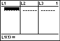
We start the GNRND4 program and give it the two key values shown in Figure 1.
Then we press  to continue. to continue.
|
Figure 2
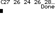 |
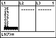
The same data that we have in the table above now appears in the the list shown by the program
After looking at the list we press
to have the program continue to its normal end.
|
Figure 3
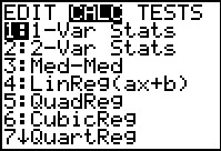 |
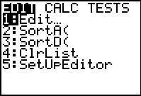
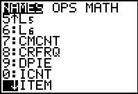
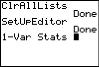
We want to do a one variable analysis on this data. The command to do that is in the
STAT menu. We press  to move to that menu and
  to move to the
CALC sub-menu shown in Figure 3. The command that we want is
1-Var Stats. It is the highlighted command
so we can just press to select it. to move to the
CALC sub-menu shown in Figure 3. The command that we want is
1-Var Stats. It is the highlighted command
so we can just press to select it.
|
Figure 4
 |
This pastes the command onto the main screen. We
press
to have the calculator perform the command.
|
Figure 5
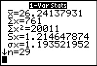 |
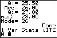
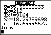
Here is the first set of computed results. We see that
- The mean of the values is approximately 26.24137931
- The sum of the items is 761
- The sum of the squares of the items is 20011
- If the list holds the values in a sample that we have taken,
then the standard deviation of that list is approximatly 1.214647874
- If the list holds the values of a population,
then the standard deviation of that list is approximately 1.193521952
- There were 29 values in the original list.
THe down arrow on the last line of information indicates that
there are more values to display. We use the
 key to reveal those additional values. key to reveal those additional values.
|
Figure 6
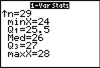 |
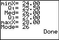
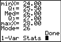
In Figure 6 we still see the n=29 line, but now we see an additional
5 lines of information, namely,
- The minimum value found was 24
- If we calculate quartile points, then the first
quartile point, Q1, has the value 25.5. We note that this
quartile point is not a value in the list. Rather, it is a value
chosen so that 25% of the values in the list are less than this Q1
value.
- The median of the list is 26. In this case the median value, also
known as Q2, is a value in our list.
- the third quartile point, Q3,
has the value 27. Again this value happens to be a value in our list.
We choose the third quartile value so that 75% of the original items in the list are less than this value.
- The maximum value found in the list was 28.
|
Figure 7
 |
Although we just found all of these interesting values related to our original list of values,
we would like to get a picture or two of the values, a picture that helps us see how these values are spread out and how thaey may be clustered.
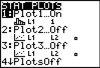
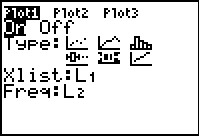
To do this we press   to open the STAT PLOT menu shown in Figure 7.
We note here that Plot1 is On and it is set
to produce a histogram (since  is shown),
to use L1 as the source of values,
and to assume that each value in L1 represents itself,
i.e., it has a frequency of 1. This is what we want.
If we had to make changes to match these settings then we could
open the Plot1 widown and change settings there to match these.
We just
happen to be lucky to find that the calculator already has the settings that we want. is shown),
to use L1 as the source of values,
and to assume that each value in L1 represents itself,
i.e., it has a frequency of 1. This is what we want.
If we had to make changes to match these settings then we could
open the Plot1 widown and change settings there to match these.
We just
happen to be lucky to find that the calculator already has the settings that we want.
|
Figure 8
 |
We can leave Figure 7 and move to this menu by pressing the
 key. We have seen this list many times before. We know that we want the 9th
option, ZoomStat. Ratehr than moving down to highlight the action and then select it,
we can just press the key. We have seen this list many times before. We know that we want the 9th
option, ZoomStat. Ratehr than moving down to highlight the action and then select it,
we can just press the  key to select that option.
This will cause the calculator to examine the
values in L1 and then to determine some appropriate values for the
WINDOW settings, and finally to produce the histograam of the data
based upon those settings. key to select that option.
This will cause the calculator to examine the
values in L1 and then to determine some appropriate values for the
WINDOW settings, and finally to produce the histograam of the data
based upon those settings.
|
Figure 9
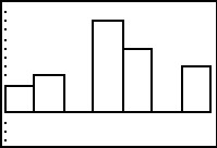 |
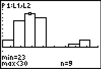
Figure 9 shows this histogram.
|
Figure 10
 |
Press  to put
the calcualtor into TRACE mode. to put
the calcualtor into TRACE mode.
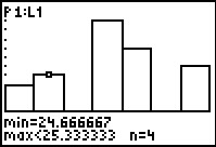
From the display we can see that the first "class" of values
has a lower limit of 24 and an upper limit of 24.666667.
One immediate consequence of this is that we now know the class width is 2/3.
Furthermore,
thre were 3 values in the original list that fell into this class.
Knowing, as we do, that all of the values in the original list were
integers we can conclude that the values 26 appears three times in the list.
|
Figure 11
 |
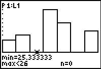
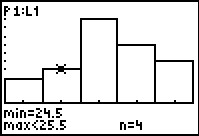
We use the to move the highlight to the next class.
Here the class lower limit is that 24.666667 and the upper class limit is
25.333333. There are 4 values in this class. Again, for the values we know to be in our list that means that tehre
were 4 entries of the value 25.
|
Figure 12
 |
We use the to move the highlight to the next class.
Here the class lower limit is that 25.333333 and the upper class limit is
26. The display shows that there are 0 values in this class.
This seems strange in that we know, by examination, that the value 26 actually appears 10 times in the original list.
The key to understanding why the calculator reports 0 entries in this column is to recall that
we have agreed to have the lower limit be part of the class but to require
any value in the class to be strictly less than the upper limit.
The 10 entries of the value 26 are all equal to the upper limit (i.e., 26) but they are not strictly
less than that upper limit. Therefore, the calculator reports 0 entries in this class.
Looking ahead, the next class will have a lower limit of 26 and an upper limit of 26.666667.
Our 10 instances of 26 will all fall into that class.
|
Figure 13
 |
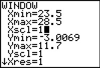
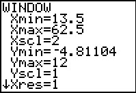
It would seem that a change in the WINDOW
settings would improve the usefulness of the historgrm.
We press  to open the WINDOW
settings screen. to open the WINDOW
settings screen.
THe settings shown in Figure 13 correspond to the values determined by the calculator when we
used the ZoomStat command between FIgures 8 and 9.
|
Figure 14
 |
The values that we have enterd to change the display to that shown in Figure 14 will
give us columns that are 1 unit wide with the column center being the integer values that appear in
the original list. That way each column will correspond to a single
integer value from our original list.
Once we have made these changes we press  to redraw the Histogram, this time using the new settings.
|
Figure 15
 |
Here is the redrawn histogram. Note that tehre are five classes. These
correspond to the five different values that appear in our
list, 24, 25, 26, 27, and 28. (Remember that we knew the
range of values from the output of the 1-Var Stats command shown
in Figure 6.
|
Figure 16
 |
Againm, we can move to TRACE mode by pressing teh
key. We have done that and then used
to move the highlight to the second class in Figure 16.
Observe the lower and upper clas limits as well as the number of items in the class.
|
Figure 17
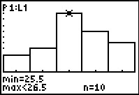 |
We move to the next class, the one that contains the value 26, and we are pleased to see that the
calcultor reports that there were 10 such values in the original list.
|
Figure 18
 |
An alternative to this kind of analysis is to use the COLLATE2
program. That program is designed to process even a long list of values,
as long as there are just a small number of different values in the list.
For Figure 18 we have started the COLLATE2 program
and we have given it the location of our list of values.
We will press to have the program continue.
|
Figure 19
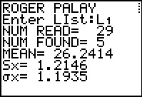 |
The initial output of the program tells us that there were 29 values in the list
but that there were only 5 different values. The approximate mean of the original values is
26.2414. The approximate standard deviation of the values,
treated as a sample, is 1.2146, whereas, the approximate mean of the values, treated as a
popultion, is 1.1935. We press
to have the program continue.
|
Figure 20
 |
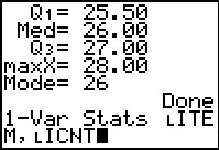
The program goes on to display the five quartile points.
In addition, COLLATE2 displays the mode value of the
original data, in this case it is 26. The display output of COLLATE2
is not much different from that of the built-in 1-Var Stats
command that we saw in Figures 5 and 6. One difference is that the
1-Var Stats command displays many more significant digits for
the computed values. A second is that COLLATE2 provides the number of
distinct values found as well as the mode of the data.
A third difference is that COLLATE2 creates six other useful lists
that we can inspect, as well as setting the StatEditor to display those lists.
|
Figure 21
 |
We use to open the STAT menu.
Then we use to select the highlighted
Edit...
|
Figure 22
 |
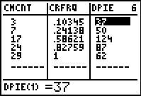
The StatEditor opens showing the values in three lists, along with
the name of each list. The highlight is on the first item in the first list.
The name and index of that item is shown at the bottom of the page along with the value
that is in that indexed position of that list.
Each row of data, i.e., each of the list items with a the same index number,
is associated with the value shown in the ITEM list.
Thus, reading across the first data line in Figure 43, we see that the
first ITEM is 24, that 3 of the values in
L1 are 24's, and that those 3 values represent
0.10345 (i.e., 10.345%) of the combined 29 values.
The following table gives the names and intended use of the lists produced by
COLLATE2.
List
name |
Intended use for this List |
| ITEM | A distict value:
a list, in ascending order, of the different values found in the original list
|
| ICNT | Item Frequency:
the number of times that the
corresponding number in ITEM is found in the user specified list
|
| RFREQ | Item Relative Frequency:
the relative frequency of appearance of the
corresponding number in ITEM within the original list.
This is the value in ICNT divided by the number of values in the original list.
|
| CMCNT | Item Cumulative Frequency:
the sum of the item frequencies up to and including this item. |
| CRFRQ | Item Cumulative Relative Frequency:
the sum of the item relative frequencies up to and including this item |
| DPIE | Degrees in a Pie Chart:
the number of degrees that should be allocated in a pie chart to this item.
This is just 360*ICNT/(total number of values). |
|
Figure 23
 |
We use to scroll over to see the other three
lists produced by COLLATE2.
|
Figure 24
 |
First, we will return to the 1-Var Stats
command. When we give that command by itself it automatically assumes that we
want it to use the values in L1.
However, we can actually specify not only
the location of the data to use, but also the location of a corresponding
list of frequencies for that list of values. In this case, we want to
form the command
1-Var Stats LITEM, LICNT
To start doing this we safely left Figure 24 via
 . Then we returned to the STAT
menu via , moved to the CALC sub-menu
via and selected the
1-Var Stats command by pressing .
This pastes the command onto our main page. . Then we returned to the STAT
menu via , moved to the CALC sub-menu
via and selected the
1-Var Stats command by pressing .
This pastes the command onto our main page.
|
Figure 25
 |
We use
to open the LIST menu and then we use
to scroll down to the desired ITEM name. Now we press
to select that name.
|
Figure 26
 |
We have pasted the desired list name, LITEM,
onto the command, and followed that by pressing the
 key to append the comma. key to append the comma.
|
Figure 27
 |
We use
to return to the LIST menu, where we scroll down to the desired
ICNT. Press to select that name.
|
Figure 28
 |
This completes the command. We will ask the calculator to
perform a 1-Var Stats command on data specified
by the distinct values in LITEM
and their corresponding frequency of appearance as given in
LICNT. Now we press
to get the calculator to actually do the task.
|
Figure 29
 |
This first page of output is identical to that produced above, in Figure 5,
as well it should be.
|
Figure 30
 |
When we scroll down to see the values in Figure 30 we see that they are the same as those in Figure 6.
|
Figure 31
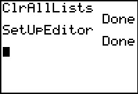 |
First, let us clear and set up the calculator.
We use  to open the memory meny, from which we choose
the 4th option, ClearAllLists
by pressing the
to open the memory meny, from which we choose
the 4th option, ClearAllLists
by pressing the  key. Press
to perform that action. The calculator responds with Done
to indicate that it has removed all data from any lists that exist on the calcualtor.
Then we move to the STAT menu via the
key, and select the 5th option, SetUpEditor
by pressing the key. Press
to perform that action. The calculator responds with Done
to indicate that it has removed all data from any lists that exist on the calcualtor.
Then we move to the STAT menu via the
key, and select the 5th option, SetUpEditor
by pressing the  key. Again, this pastes the command to the main screen where we press
to perform the action. This will set the editor
to display L1 through L6.
Press to perform the action. key. Again, this pastes the command to the main screen where we press
to perform the action. This will set the editor
to display L1 through L6.
Press to perform the action.
|
Figure 32
 |
Open the editor via .
We see that the desired lists are present and empty.
|
Figure 33
 |
We start entering the data for our task. We will do this moving down the
first column, pressing the after each value is entered.
|
Figure 34
 |
Then, press to move to the
L2 column and enter the
appropriate values there.
At this point our display looks just like the problem statement given
in the table above.
|
Figure 35
 |
We return to the STAT menu via the
key. Then press to move to the
CALC sub-menu and press to
select 1-Var Stats.
|
Figure 36
 |
This places the command on the main screen.
Now, in our haste, we press
to get our results.
|
Figure 37
 |
The results are shown in Figure 37. Something is terribly wrong!
For one thing, we know that we have many more that 6 values. In fact,
we know that we have exactly six distinct values, one of which, 27, appears
9 times. What have we done wrong?
The mistake is that we jsut issued the 1-Var Stats command.
We never told the calculator to sue the frequencies that we
carefully placed into L2.
Before we correct this error, we will page down to see the rest of the output.
|
Figure 38
 |
The 1-Var Stats command that we had the calculator perform produces all of this output.
It is important to note that the calculator merely follwos our commands. It is
up to us to verify that the results at least seem correct. In this case we know that we have made an error.
|
Figure 39
 |
To produce the desired command,
1-Var Stats L1, L2
we press to recall our last command
(this was 1-Var Stats) followed by

 .
Finally, press to perform the command. .
Finally, press to perform the command.
|
Figure 40
 |
This is much better. We see results that are much more reasonable.
|
Figure 40a
 |
Here we scroll down to see the rest of the sults produced by 1-Var Stats.
|
Figure 41
 |
Now we would like to get a picture of this data.
We will start with a histogram. To do this we check the
STAT PLOTS menu by pressing .
The result, on this calculator, is shown in Figure 41. We want to use Plot1
to generate our histogram, but the settings for that
plot are not correct. Therefore, we open the Plot1
settings by pressing .
|
Figure 42
 |
Here we have already used the cursor keys to move to the
Type: selections and we have moved to the
histogram choice, , and pressed
to change that to  .
This gives us the correct Type: setting, but we still have a
problem in that the Xlist: setting is not pointed to our
data in L1. .
This gives us the correct Type: setting, but we still have a
problem in that the Xlist: setting is not pointed to our
data in L1.
|
Figure 43
 |
We move to that setting, press
and
to get to the correct image in Figure 43.
From that we press
to do a ZoomStat which takes us immediately to the histogram
in Figure 44.
|
Figure 44
 |
This is an interesting histogram, but it might help us to see
a bit more detail. Therefore, we move to TRACE mode via the
key.
|
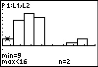
Figure 45
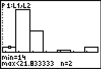 |
In TRACE mode we see that the first column
represents all of the
values that are 14 or more and less than 21.833333.
In our data that is just the 2 instances of the value 14.
|
Figure 45a
 |
Moving one column to the right, we see that there are 16 instances of
values greater than or equal to 21.833333 and less than 29.666667.
Looking back at the rel data we see that this class (column) represents
the combined seven 22's and nine 27's.
|
Figure 46
 |
Moving even further to the right we do see that there are no values in the class
greater than or equal to 37.5 and less than 45.333333.
|
Figure 46a
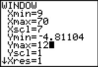 |
The historgram that the calculator created using the WINDOW
values that were set by the ZoomStatcommand is not particularly convenient.
In particular, that histogram has 7 "classes" but only 5 of them show any data.
This seems to be a little misleading in that we know that we have 6 distinct values in our data set.
With a little planning and even a bit of experimentation, we expect that the values
that we have placed into the WINDOW settings shown in Figure 46a will produce a
slightly better graph.
|
Figure 46b
 |
Press to see this new graph.
Again, more details should help.
Move to TRACE mode via .
|
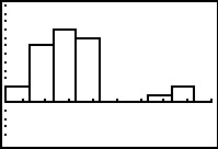
Figure 46c
 |
Now we see that there are 2 instances of values greater than or equal to 9 but less than 16.
|
Figure 46d
 |
Moving to the right twice, that column represents the 9 values greater than or equal to
23 and less than 30.
This histogram is a slight improvement in that we now have 6 classes (columns) that
have data in them, corresponding to the 6 distinct values in our data.
However, we are still missing the spread of the data because our class width is so large tht we do not see
the breaks between most of the data.
|
Figure 46e
 |
Here are new WINDOW settigns that make an attempt to give an even
better picture of the original data. making the Xscl value be 2
will increase our number of classes but it will also show the separation of
the distinct values that we do have.
|
Figure 46f
 |
In this historgram we have a more accurate representation of the data and the spread
of the data.
THinking aboutt he changes that we made in the WINDOW settings, we might
be tempted to return to those and change the Xscl value to be 1.
That way we would have separate classes (columns) even if
we had distinct data values such as 14 and 15. Using the settings of Figure 46e these would
have been combined into the first class. However, the calculator has a limitation that it will not
do a histogram if it has more than 47 classes. With a class width of 1 we would need
more than that many classes.
|
Figure 47
 |
We can try another type of plot, a Box-and-whisker plot, to look at this
same data. We return to the Plot1 settings screen and
change the Type: to  .
Then we go through the
sequence to do the ZoomStat process and generate the image shown in
Figure 48. .
Then we go through the
sequence to do the ZoomStat process and generate the image shown in
Figure 48.
|
Figure 48
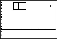 |
This plot gives us a feeling for the spread of the data, showing us the quartile
points and giving us a good feeling about the "middle" of the data.
Seeing the long whisker on the right raises a concern about just how extreme the rightmost,
the highest, values are. Perhaps it would have been better for us to
have chose a modified Box-andWhisker plot.
|
Figure 49
 |
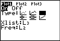
We return to the Plot1 settings and choose the icon for
the modified Box-and-whisker plot,
 . Then we
can return to the graph via . . Then we
can return to the graph via .
|
Figure 50
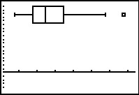 |
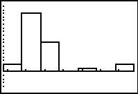
With teh modified Box-and-whisker plot we see that we have at least one outlier
at the right side of the plot. We could return to
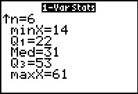
the information of Figure 40a to see that
Q3=35 and
Q1=22. This gives the
IQR= Q3–Q1=13.
If we take 1.5*IQR we get 1.5*13=19.5. Going 19.5 above Q3
puts the upper limit at 35+19.5=54.5.
Thus, our two instances of 61 can be considered outliers.
|
Figure 51
 |
Moving into TRACE mode, via ,
and then using the key to move to the right,
we can highlight the point at the end of the right whisker. The calcualtor tells
us that the value there is 53, our highest data value less than or equal to
the upper limit that we found to be 54.5.
|
Figure 52
 |
Moving to the right one more time, we see that the value of the outlier
is 61, although this plot does not tell us that such a value has two instances
in our data set.
|