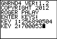
To demonstrate these steps we need to start with some data. We will
use the GNRND4 program to generate that data. One option
for that program asks it to generate data that is approximately normal.
As we will see below, given the KEY values that we use, the program generates
the data set:
Figure 1
|
We start with the run of the GNRND4 program, giving it the appropriate
KEY values.
|
Figure 2
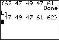 |
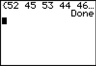
Figure 2 gives a view of the start and of the end of the list of generated va;ues.
We see that we have exactly the desired values now
stored in L1.
|
Figure 3
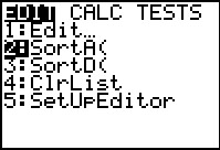 |
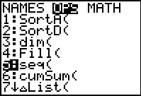
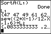
There are four steps to creating "by hand" a normal quantile plot. The first step is
to sort the values. We use the  key to open
the STAT menu, shown in Figure 3.
Then use the key to open
the STAT menu, shown in Figure 3.
Then use the  key to move the highlight to the second item,
SortA(.
Press key to move the highlight to the second item,
SortA(.
Press  to select that option and paste the command
onto the main screen. to select that option and paste the command
onto the main screen.
|
Figure 4
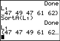 |
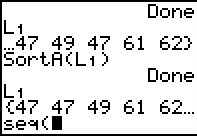
Here, on the main screen, we complete the command via
   to form SortA(L1). Press
to perform the command. Note that this sorts the values in the specified list.
We use
to see the result.
to form SortA(L1). Press
to perform the command. Note that this sorts the values in the specified list.
We use
to see the result.
|
Figure 5
 |
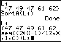
The second step in the process is to form a parallel list with ascending values equally
spaced and all within the open interval from 0 to 1. To do this
for a list of n values, we use the fractions of the form p/q where q=2*n and
p is an odd number from 1 to 2*n-1. In our case, we want to create a lies of
6 such values, namely, 1/12, 3/12, 5/12, 7/12, 9/12, and 11/12.
We could move to the Stat Editor and enter these values by hand. Alternatively,
we can use the built-in function seq( to create such a list. In Figure 5
we used to open the LIST
menu, and we moved the highlight to OPS. That submenu contains the desired
seq( command at position 5. In this Figure we have moved the highlight
to that spot. Then press to paste the command
onto the main screen.
|
Figure 6
 |
Now we need to complete the command.
The seq( command has four arguments. The first is an expression to
evaluate to produce a typical item in the list. The second is the base variable
whose values will change to produce different items in the list. The third is the starting value
that is to be used. The fourth is the final value to be used. For our case,
we want to let a variable, X, take on values from 1
to 6, and each such value we want to calculate (2*X-1)/12.
Thus the desired command is seq((2*X-1)/12,X,1,6)
which will generate the list of values that we can then assign to L2.
|
Figure 7
 |
Of course, the keystrokes to finish the command on the calculator are


 .
Then press to perform the command. .
Then press to perform the command.
|
Figure 8
 |
Figure 8 shows the start of the list of values that we have generated.
|
Figure 9
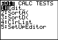 |
Use to move to the STAT menu. Use
to select the Edit option, thus moving to the
Stat Editor shown in Figure 10.
|
Figure 10
 |
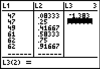
Now we can see the values that have been placed into L2.
We use the  key to move over to enter the first value
into L3. key to move over to enter the first value
into L3.
The third step in generating the normal quantile plot is to produce another parallel
list of values, this time finding the appropriate z-score that has the
area under the normal curve to the left of that z-score equal to the corresponding
value in L2. Thus, the value in L2(1)
is 1/12 so we want the corresponding value in L3
to be the z-score that has an area equal to 1/12 under the normal curve and to the
left of that point. From the home screen we would
find this via the command invNorm(1/12).
We do the same in the editor.
As shown in Figure 10 we are ready to enter the first item in
L3. Press
 to open the DIST menu. to open the DIST menu.
|
Figure 11
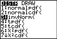 |
Now we use the key to move
the highlight down to the invNorm( option.
|
Figure 12
 |
From Figure 11 we press
to paste invNorm( at the bottom of the screen.
|
Figure 13
 |
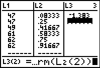
Now, we need to complete the command. In truth, we could just enter the required
value 1/12, but we will take the slightly longer, but more general,
approach of using the value in L2(1). To do this
we complete the command via
,
changing the last line of the screen to that shown in Figure 13.
We complete the command by pressing the key.
|
Figure 14
 |
In Figure 14 we see that the appropriate value has been entered as the first item in
L3. Furthermore, the calculator is now ready for us to enter
a value for L3(2).
|
Figure 15
 |
For Figure 15 we have repeated the process to generate
invNorm(L2(2)) at the bottom of the screen.
Again we use
to perform the command.
|
Figure 16
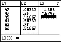 |
Here we see the new value added to L3.
|
Figure 17
 |
Figure 17 shows the result of completing this process for the remaining
values in L3. At this point we are done creating
the parallel lists that we desired. Press  to leave the editor and return to the main screen in Figure 18.
|
Figure 18
 |
Having accomplished the first three steps in the process:
- Sort the values (in L1)
- Create a parallel list of evenly spaced values between 0 and 1 (in L2)
- For each of those evenly spaced values get its invNorm( value (in L3)
We are left with the final, fourth step:
- Create a Scatter Plot using the sorted values (in L1)
and the invNorm( values in L3).
We use the  keys to open
the main Stat Plots
menu shown in Figure 19. keys to open
the main Stat Plots
menu shown in Figure 19.
|
Figure 19
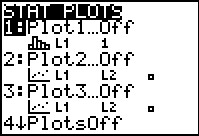 |
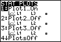
For the calculator being used here we see that all of the plots are Off.
At the moment the highlight is on the first plot, the one we will use here.
Therefore, we press to move to the screen controling the settings
for that plot.
|
Figure 20
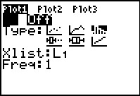 |
Figure 20 was captured without changing anything on the screen. The blinking
cursor is sitting over the On option (in fact it is covering that option
in this screen capture) but we see that the Off option is the highlighted one,
corresponding to the fact that, at the moment, Plot1 is Off.
To set Plot1 to the On status, we just press the
key. The immediate result is shown in Figure 21.
|
Figure 21
 |
Now, not only is the setting changed to On but also the blinking cursor is
still on that option.
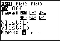
We now turn our attention to the Type of plot. At the moment, in Figure 21,
the plot is set to the histogram option,  . However, we want
a Scatter Plot, currently displayed as . However, we want
a Scatter Plot, currently displayed as  .
To do this we use to move the highlight to the
Type selections. Once the highlight is on the
Scatter Plot option we press to change the setting to .
To do this we use to move the highlight to the
Type selections. Once the highlight is on the
Scatter Plot option we press to change the setting to
 . .
|
Figure 22
 |
Figure 22 was captured once the change has been made, although the
blinking cursor is still on that choice and is obscuring it at the moment.
Looking at the reest of the settings we see that they have changed from what they
were back in Figures 20 and 21. The value of Xlist is correctly set as
L1 but, for this calculator, the value of
Ylist needs to be changed to L3. To do this
we
use the key to move the highlight to the
Ylist field and we press  to change that value to L3.
That is the condition that we find in Figure 23.
to change that value to L3.
That is the condition that we find in Figure 23.
|
Figure 23
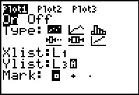 |
Note that the change to the Ylist field has been made. We will
take one extra step just to be sure that the values are set, namely we will use the
key to move the highlight to the last field, the one
where we can set the Mark value. This produces Figure 24.
|
Figure 24
 |
Now that the values have been set all that we need to do is to use the
keys   to open the
Zoom menu and then to choose the ZoomStat option.
Doing so will move the calculator to display the Scatter Plot in a window that has
had its parameters
set appropriately for the given data. to open the
Zoom menu and then to choose the ZoomStat option.
Doing so will move the calculator to display the Scatter Plot in a window that has
had its parameters
set appropriately for the given data.
|
Figure 25
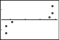 |
We have gone through all of this to produce this graph. A true normal distribution should
produce the set of points in approximately a diagonal straight line from the lower left to the
upper right corner. The plot in Figure 25 does not conform to that. We would have to conclude
that the original data was not really a Normal distribution. [On the other hand, the
data set is really small. Taking such a small sample will often lead to such non-conforming
plots.]
|
The data that we used above came from the GNRND4 program when we specifically
asked that program to generate data that is approximately normally distributed.
Given what we found one might think that there is an error in the program.
However, as just noted, having a small sample of data often leads to
conclusions of non-normality. Let us use the program to generate a
larger sample to see what happens in that case.
We will generate a list of data on the calculator using
GNRND4 with Key 1=357843504 and Key 2=700053. That list
will be the same numbers that appear in the following table:
Thus, our problem will be to generate a normal quantile plot for the data in the
list above.
Figure 26
 |
First we generate the data.
|
Figure 27
 |
The values in Figure 27 correspond to the values that we saw in the table above. These values
are stored in L1.
We could go through the four step process shown above to
sort the data, then generate the parallel lists and then produce the scatter plot.
However, the third step of that process, finding the invNorm( value of each of the
36 evenly spaced values between 0 and 1 that we would
generated in the second step looks daunting at best. This looks like too much work.
There must be an easier way! In fact we will see two easier ways.
|
Figure 28
 |
Remember that L1 holds our values. The calculator has a special
plot option that automatically does the normal quantile plot without our doing any of the work.
We return to the General Plot menu via
. Then we press
to move to the Plot1 screen shown in Figure 29.
|
Figure 29
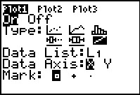 |
In Figure 29 we have moved the cursor to the last of the
Type options and selected it. Note that the
 option is selected.
We confirm that the other values are correct. Note that the
Data List is set to L1.
Once everything is set we use
to open the ZOOM menu and select ZoomStat. option is selected.
We confirm that the other values are correct. Note that the
Data List is set to L1.
Once everything is set we use
to open the ZOOM menu and select ZoomStat.
You might notice that it takes the calculator a bit of time to do all of the
computations that it needs to generate the requested
normal quantile plot
shown in Figure 30.
|
Figure 30
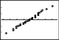 |
Here is the desired plot. In this case we can see that the points do line up
in an approximate diagonal. Therefore, this plot supports the conclusion that
the original data points, our L1 values,
are normally distributed.
Because the calculator generates this plot without our doing any of the
work shown in Figures 5 through 25, it would seem that we have no benefit from
doing that work ourselves. However, note that the calculator did the work but that it does
not directly supply the values in the two parallel lists, nor does it give us the
sorted values of the original data. It is possible that we may need these values.
|
Figure 31
 |
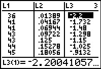
We could extract the sorted values and their associated invNorm( values from the
plot. We move into TRACE mode via the  key.
The calculator then displays, at the bottom of the screen the first sorted point,
in this case 36, and the associated invNorm( value, in this case -2.200411. key.
The calculator then displays, at the bottom of the screen the first sorted point,
in this case 36, and the associated invNorm( value, in this case -2.200411.
|
Figure 32
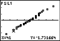 |
We can use the key to highlight the second
point on the plot to get its value, 41, and its associated invNorm( value,
-1.731664. We could continue to use the cursor key to move through the rest of the
points to read out the sorted values and their associated invNorm( values.
This would be tedious, but it could be done. However, the graph does not provide us
with that list of evenly spaced values between 0 and 1 that we had generated when we did
all of this in Figures 5 through 25.
|
Figure 33
 |
Back in the explanation tied to Figure 33 we noted that there would be two
easier ways to generate our normal quantile plot. The first was to use
the built-in Plot Type that we just demonstrated.
The second is to have a program that does all of our
steps from Figures 5 through 25, and more, for us.
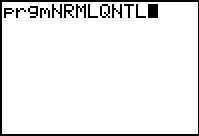
We leave Figure 32 via the
sequence to return
to our main screen. Then we open the program list menu
via the  key. We find and highlight the
program named NRMLQNTL. Then press
to paste the command to run that program onto our screen.
This is shown in Figure 33. Press to run the program. key. We find and highlight the
program named NRMLQNTL. Then press
to paste the command to run that program onto our screen.
This is shown in Figure 33. Press to run the program.
|
Figure 34
 |
The program asks for the location of the original data.
We respond with
to tell it that the data is in L1.
Then press to continue the program.
|
Figure 35
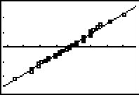 |
The program does all of the computations that we had done in our original process,
along with finding the linear regression equations for the original data points and
their associated invNorm( values. It then displays both the scatter plot
and the regression equation.
Having the graph of the regression equation makes it even easier
to get a feeling for the linearity of the plotted points in the scatter graph.
|
Figure 36
 |
Just as before, we could move into TRACE mode, via the
key, and see the individual values behind each of the points on the plot.
|
Figure 37
 |
However, we could just get out of the plot, via ,
and open the StatEditor via
and we see that indeed the program did do what we had done earlier, namely, it
- sorted the values and put them into L1
- created the evenly spaced values between 0 and 1 and put them into L2
- created a list of associated invNorm( values in L3
|