We need to start with some data.
We will generate a list of data on the calculator using
GNRND4 with Key 1=192338704 and Key 2=9000524. That list
will be the same numbers that appear in the following table:
Thus, our problem will be to generate a frequency table for the data in the
list above.
Before we even start the problem we need to spend a moment explaining why we
are treating this as continuous data. Clearly these are integer values.
Individually they do not look any different from the values that we used
when we did our analysis of discrete data
before.
However, in the 88 values given above we have 80 different values. That means that
at least 72 values appear just once. It would not tell us very much if we
were to use COLLATE2 to find all of those different values and to look
at teh frequency of each. Almost all will have a frequency of 1.
Therefore, we need a different approach.
We treat the values as continuous. We will
divide the range of values into even intervals.
Then we will count the number of items in each interval.
Figure 1

|
Figure 1 starts with a run of the GNRND4 program where we have entered
the two key values given above.
|
Figure 2
 |
In Figure 2 we can see the start of the list of values. We recall that the list is
created by GNRND4 as L1. Also note that
we had pressed the  key to allow the program to terminate
before we took this image of the screen. key to allow the program to terminate
before we took this image of the screen.
|
Figure 3
 |
For the sake of being able to return to the original lsit, we will make a copy of the
list. The keys to do this are
 

 . Then
we use to have the calculator perform the
command. . Then
we use to have the calculator perform the
command.
|
Figure 4
 |
To sort the values in L2
we need to get the proper command.
Press  to move to the LIST menu. Then use the
 key to open the OPS sub-menu.
The option we want is the first one, Sort(.
Therefore, press to
select that option and paste it onto the home screen. key to open the OPS sub-menu.
The option we want is the first one, Sort(.
Therefore, press to
select that option and paste it onto the home screen.
|
Figure 5
 |
We finish the command by pressing
 and we get the calculator to perform the command by pressing
. Once that is done, since the items in
L2 are now in ascending order, we can find the lowest value
by looking at the contents of the first element of
L1. We press the sequence
and we get the calculator to perform the command by pressing
. Once that is done, since the items in
L2 are now in ascending order, we can find the lowest value
by looking at the contents of the first element of
L1. We press the sequence
 to geneerate the command.
We press to have the calculator perform it.
The result is in Figure 6.
to geneerate the command.
We press to have the calculator perform it.
The result is in Figure 6.
|
Figure 6
 |
Now we know that the lowest value is 333. We could find the highest value if we asked the
calculator to display the last position in
L2. We could count the
values in the table above, or we could just ask the calculator to tell us the size of
L2.
The latter alternative is more appealing. the command we want is
dim(L2).
|
Figure 7
 |
We return to the LIST menu, the OPS sub-menu, and select the
dim( option.
|
Figure 8
 |
We complete the command with
and execute it with
.
The calculator responds with 88 meaning that there are 88
values in L2.
Therefore we construct the
command
 and press to have the calculator tell us the
value stored in the last element of
L2.
the response is 728.
We can then ask the calculator to find the range
by getting the difference of the high and low values.
with a range of 395 we might decide to have classes
that are 50 wide, starting at 330.
That way, with 8 classes we will cover the entire range of values.
and press to have the calculator tell us the
value stored in the last element of
L2.
the response is 728.
We can then ask the calculator to find the range
by getting the difference of the high and low values.
with a range of 395 we might decide to have classes
that are 50 wide, starting at 330.
That way, with 8 classes we will cover the entire range of values.
|
Figure 9
 |
We want to examine the values in L2.
We can use the STAT Editor to do that, but, given our earlier use
of some lists produced by COLLATE2, it would be good to reset
the editor to display the built-in lists. We return to the
STAT menu and SetUpEditor option by
pressing the  key. key.
|
Figure 9a
 |
Once the SetUpEditor command has been pasted on the screen, we press
to perform the command. Then, to move to
Figure 10, we press to re-open the
STAT menu and, from there, press
to open the editor.
|
Figure 10
 |
Once in the editor, we move to the second column by using the
key. This screen shows the sorted values in
L2. We know that we want the first "class"
of values to run from 330 to just before 380. Looking at these values we see that we have
6 items (333, 341, 343, 345, 373, and 379) in this class.
Then we can move down the list to see more values.
|
Figure 11
 |
Our next class has limits 380 to just before 430.
There are 4 items in this class (400,403, 407, 425).
We should note that we
could have used the index values,
shown for the highlighted item as the bottom of the screen, to
produce the number of items between two items.
Thus, if we know the index of the first item in the class and the index of
the last item in the class we can compute the number of items in the class as
class size =(index of high value) - (index of low value) + 1
For example, the high value in the second class was 425.
That value is in the 10th position.
The low value in the second class was 400
and it was in the 7th position. Thus
class size = (10) - (7) + 1
class size = 4
|
Figure 12
 |
Here are more items. This is a long list and we have many more such screens to
examine in this brute stength and awkwardness approach of counting items.
|
Figure 13
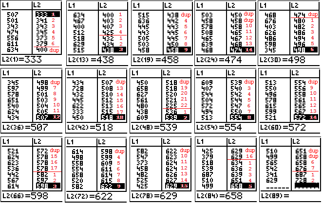
Here is a compilation of portions of all the screens that one would look at
to see the entire list of valeus. The images here have been
amended to have, in red, the cut points for the different
"classes" that we want and a sequential number to count the
items in each class. Note that items that are duplicated from
one screen image to another are marked as "dup".
 |
|
Looking at the values that were displayed in the numerous screens we could compose
a frequency table for the data. In particular we could construct
We have seen a brute strength and awkwardness approach to the proble and
a more efficient use of the histogram feature of the calculator to obtain the same results.
However, given that the brute strength and awkwardness process was
merely a set of simple steps, we should be able to write a program to
have the calculator do this for us.
Figure 26
 |
We press  to open the list of programs. In that list we move to the
COLLATE3
program and press to select it.
to open the list of programs. In that list we move to the
COLLATE3
program and press to select it.
|
Figure 27
 |
That action pastes the command prgmCOLLATE3 onto the main screen.
We press to have the calculator
start the program.
|
Figure 28
 |
The program starts and asks us for the
location of the input data. Ours is in
L1 so we press
.
Then we press
to have the program continue.
|
Figure 29
 |
The program tells us the lowest value in the list, 333,
and the highest value in the list, 728.
The program suggests a lower limit value for the first class, but we do not need to use that suggestion.
In fact, we know that we want to use 330 as the first lower limit.
We enter that value.
|
Figure 30
 |
The program then suggests a class width to use, but we can make our own choice,
which in this case we set to be 50.
|
Figure 31
 |
The progam reports that it found 88 values and has put them into 8
classes. It then gives us some additional information.
The calculator is in a "pause" condition so that we can read the information.
We press to continue the program.
|
Figure 32
 |
The progam concludes after showing us more information.
Behind the scenes COLLATE3 has created some additional lists
and it has reset the Stat Editor to display
these lists.
We move to the Stat Editor to see these values.
|
Figure 33
 |
The first column, Low, gives the lowerr limit of each class.
The second column, ICNT, gives the frequency of items in each
class. These are the same values we found earlier.
The third column, RFREQ, gives the relative frequency for each class.
|
Figure 34
 |
Here we have moved down the lists to see the final class values.
We do note that the first class has one extra entry. That is there to
show the lower limit of the next class if it were there. We use that as the
upper limit of the previous class.
|

 to get the STAT PLOT
screen shown if Figure 14. There we see that Plot1 is "On" but it is
set to use L3 and we have our data in
L1 (and a copy is in L2).
To change the setting we press
to get the STAT PLOT
screen shown if Figure 14. There we see that Plot1 is "On" but it is
set to use L3 and we have our data in
L1 (and a copy is in L2).
To change the setting we press 


 key.
key.


 .
.


 to generate a new graph
based on these new settings.
to generate a new graph
based on these new settings.

 which will move us to Figure 23.


