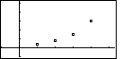
| Year | 1998 | 1999 | 2000 | 2001 |
| Sales (billion) |
$0.35 | $0.75 | $1.5 | $3.0 |
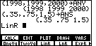
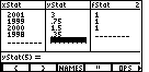
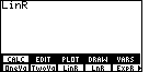
| In Figure 1 we have created two lists, ANY to hold the year for the first three data points and ANS to hold the sales for those years. Then we have opened the STAT menu and the CALC submenu so that we can paste the command LinR onto the screen. |
| We complete the command by opening the LIST menu and the NAMES submenu so that we can past the names ANY and ANS onto the end of the LinR command. We perform that command by pressing the ENTER key. |
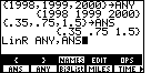
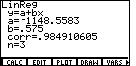
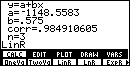
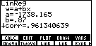
| The results of the computation are given in Figure 3. We can see the intercept and the slope of the regression line, and we note the correlation coefficient. A "corr" value of 0.984910605 indicates an extremely close "fit" between the generated equation and the three real data points. |
| We will go back to look at the graph of the points and the regression line, but first we return to the STAT menu. |
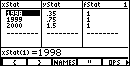
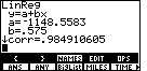
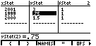
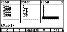
| We leave Figure 4 by selecting the EDIT option. This brings up the Stat List Editor, where we can confirm that the three data points have been copied to xStat and yStat, and that the frequency of each point, namely 1, has been assigned to fStat. |
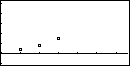
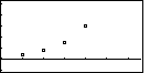
| To generate Figure 6 we return to the STAT menu and select DRAW. We might note that we had set xMin to 1997 and xMax to 2003.6, yMin to -1.1 and yMax to 5.2. Furthermore, we used the CLEAR key to hide the menu at the bottom of the screen. |
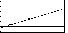
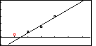
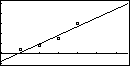
| Figure 7 was created by using the EXIT key to restore the menu, and the MORE key to move the choices to display the DRREG option, and then selecting that option. This draws the regression equation on the graph. Note that Figure 7 has been augmented for presentation here by including (in red) the fourth point. We can see from Figure 7 that the regression equation is quite close to the first three points, but that the fourth point is well off the line generated by those first three points. |
The images shown above confirm the books contention that the first three points seem to fall pretty much on a line, but that the fourth point does not fit that line. Let us now look at the last three points to see how well we can fit a line to those points.
| We return to the STAT menu and select the EDIT option to bring up the Stat List Editor. Now we use that editor to change the xStat and yStat items to replace the first data point by the fourth one. That is the condition shown in Figure 8. Note that the order of the data points is immaterial to the regression process. |
| We EXIT the Stat List Editor of Figure 8 and return to the STAT menu, select the CALC option, and then use the F3 key to past the LinR command onto the screen. This time we will not add any list names tot he end of the LinR command. If we use just the LinR command, then the calculator will do a linear regression using the data points already in xStat, yStat, and fStat. We conclude Figure 8 and move to Figure 9 by pressing the ENTER key. |
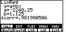
| Figure 10 shows the result of this new regression computation. If we compare this to the earlier values (see Figure 4), we note that we have different intercepts and different slopes. This is a different line. In addition, we have a new correlation coefficient, namely 0.981980506. This is a lower correleation than we had with the first three data points, but not much lower. If one were being absolutely precise, then we would have to say that the first three points are more linear than are the last three points. However, given the values it is clear that we are splitting hairs to say that. |
| In Figure 11 we have moved to graph the three points being used. |
| Figure 12 adds the new regression equation, and Figure 12 has been augmented to show (in red) the original first point. Again we see how well the last three points fit the regression line, but that the first point is off of that line. |
Figures 8 through 12 looked at the regression line generated from just the final three points. Perhaps we should look at the regression line for all four points. After all, we got into this by having the book observe that the points do not seem linear. We should check this observation with some calculations.
| For Figure 13 we have returned to the Stat List Editor, and we have moved down to add the original first point back into the xStat and yStat lists. It is important to note that we still need to fix the fStat list. | ||||||||||||
| Figure 14 shows the correction to the fStat list. | ||||||||||||
| We return to the STAT menu, select the CALC option, and then paste the LinR command on the screen. Again, given by itself, the LinR command will use the values that are in the xStat, yStat, and fStat lists. This is just what we want to do. Press the ENTER key to perform the operation and move to Figure 16. | ||||||||||||
| Now we have a new regression equation, this one based on all four points. Note that the correlation coefficient is lower than it was for the earlier regressions, but that it is still quite close to the value 1. This is not a bad fit at all. Let us look at the data points and at the regression equation. | ||||||||||||
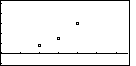
| Figure 17 shows the four data points. | ||||||||||||
| Figure 18 adds the regression equation. Note that the points are not at all far from the regression line. This is what we would expect with a correlation close to 1. | ||||||||||||
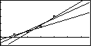
| Figure 19 is a contrived graph that holds the
four data points, and all three regression
equations. We can see the changes in those lines as we
move from using the first three data points,
to all four data points, to using just the final three data points.
It is worth looking at the following table to compare intercepts and slopes.
|
We have loked at the various linear regressions. Let us turn our attention to another regression, namely the exponential regression. The calculator is happy to do this for us. We already have the data points in the machine. All we need to do is select the right command and perform it.
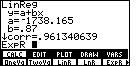
| We have returned to the STAT menu and the CALC submenu. The command that we want is ExpR. we select that command and find that ExpR is pasted onto the screen. We press the ENTER key to perform the command, using the xStat, yStat, and fStat values. This will move us to Figure 21. |
| The results of the computation are shown in Figure 21. We will not interpret those results except to note that the correlation coefficient is a remarkable 0.999719883. These four points are extremely close to the equation that was generated. |
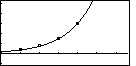
| In Figure 22 we have gone back to the graph, including the points and the regression equation, and we can see how the line fits the data points. |
PRECALCULUS: College Algebra and Trigonometry
© 2000 Dennis Bila, James Egan, Roger Palay