More Linear Regression
Return to Topics page
Here is a typical textbook linear regression problem.
Table 1 gives 22 pairs of values, an X value and a Y value
in each pair.
Thus the first pair of values is the point (81,254) and the second pair is the point
(54,182) and so on. If we were to make a scatter plot of the 22 points
it would look like the plot shown in Image 1.
Image 1
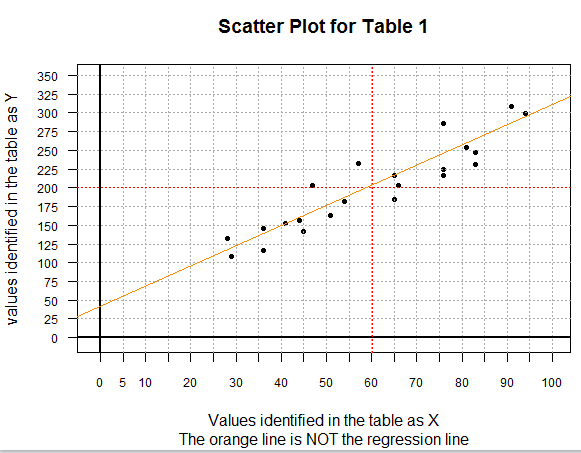
There are a few special things to point out about the scatter plot shown in
Image 1. First, this is a 0-based plot. Second, before doing the plot,
I computed the mean of both the X-values (60.18182) and the Y-values (200.13636).
Then I could graph, in red, both of those values. The point where the two lines
cross, that is, the point (xbar,ybar), will be on the final regression line.
Third, the orange line on the plot is a graph of the equation
y=(35/13)x+(546/13). You can actually find those integer values
in the gnrnd4 statement that created the values in Table 1.
In reality, gnrnd4 is told to randomly choose 22 pairs of values where each pair
represents a point that is near to the line y=(35/13)x+(546/13).
In the end, we expect our regression equation to be close to this generating line.
We can see that the orange line cannot possibly be the regression equation itself
because the orange line does not go through the point (xbar,ybar).
The points plotted in Image 1 do appear to be in some general linear relation.
Our task is to determine the coefficients of the linear regression
equation computed as the line that best fits the data of Table 1.
We will do this in R.
As usual, our first step is to insert our USB drive, create a new
folder (directory), copy our model.R
to that new directory, and then rename that file.
The result of creating a new folder called
worksheet05 and then renaming the copied file to be
more_regression.R is shown in Figure 1.
Figure 1

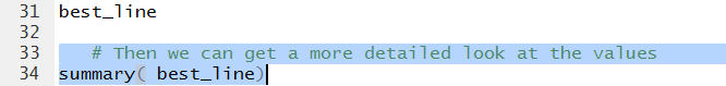
Double clicking on the more_regression.R file name in Figure 1
opens a new RStudio session. The Editor pane shows the contents
of the more_regression.R file.
Figure 2
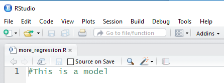
This is clearly not what we need.
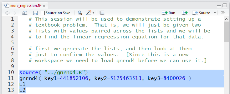
We can replace this with the following comments and statements:
   # This session will be used to demonstrate setting up a
   # textbook problem.  That is, we will just be given two
   # lists with values paired across the lists and we will be
   # to find the linear regreession equation for that data.

   # first we generate the lists, and then look at them
   # just to confirm the values.  [Since this is a new
   # workspace we need to load gnrnd4 before we can use it.]

source( "../gnrnd4.R")
gnrnd4( key1=441852106, key2=5125463513, key3=8400026 )
L1
L2
This is shown in Figure 3 where we have highlighted the
actual comments.
Figure 3
Running the statements of Figure 3 gives us the
Console output shown in Figure 4.
Figure 4
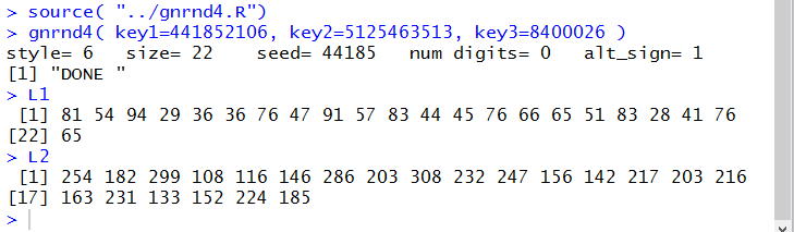
After we have verified that we have the correct values
by comparing them to the ones in Table 1 we
might want to get at least a quick look at the scatter plot of those
pairs of values. To do this we
can add the new lines
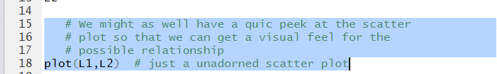
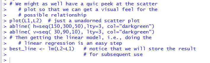
   # We might as well have a quic peek at the scatter
   # plot so that we can get a visual feel for the
   # possible relationship
plot(L1,L2)  # just a unadorned scatter plot
shown in Figure 5.
Figure 5
Running those highlighted lines produces
the plot shown in Figure 6.
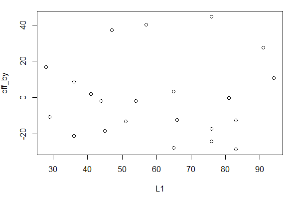
Figure 6
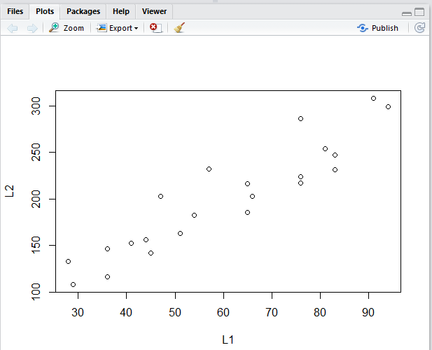
The plot in Figure 6 is not as detailed as was our
original image, Image 1.
There is no need, here, to duplicate that detail, but we
can take a minute just to add a few grid lines to make
the plot easier to read. The new lines to do
this are
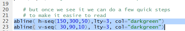
# but once we see it we can do a few quick steps
# to make it easire to read
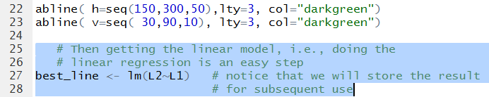
abline( h=seq(150,300,50),lty=3, col="darkgreen")
abline( v=seq( 30,90,10), lty=3, col="darkgreen")
Figure 7
Running those statements changes the graph to that shown in Figure 8.
Figure 8
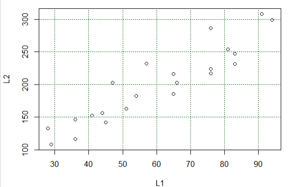
The plot shown in Figure 8 serves most of our purposes. We can
easily identify each pair of (X,Y) values of Table 1 with a plotted point in the graph.
Also, we
see that the points, though not on a line, are at least "sort of along a line".
Back in algebra we had learned that the equation of a line is y=mx+b.
Here we switch around the terms and change the names of the coefficients slightly
to make the equation of a line look like
y=a+bx where a is the second coordinate of the y-intercept and
b is the slope. Our task is to find values for a
and b so that we have the line
that best fits the data points. We can have R do this for us by using the command
# Then getting the linear model, i.e., doing the
# linear regression is an easy step
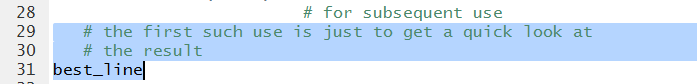
best_line <- lm(L2~L1) # notice that we will store the result
# for subsequent use
shown in Figure 9.
Figure 9
Running that command gives us the output of Figure 10.
Figure 10
In particular, there was no output because we assigned the value
produced by the lm(L2~L1) function to a variable,
namely, best_line.
We use the variable name, shown in Figure 11, to cause the system to
display the result.
Figure 11
The output of running the highlighted lines of Figure 11 is shown in Figure 12.
Figure 12
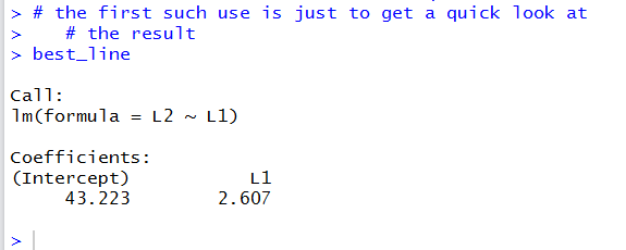
This output really gives us just what we wanted, the values for the coefficients
a and b in the
equation y=a+bx. Figure 12 tells us that the value of
a, the second coordinate of the y-intercept, is 43.223
and the value of b, the slope, is 2.607.
Thus, the regression equation is
y = 43.223 + 2.607*x
A linear model has much more to it than just the two values for the
coefficients. The command of Figure 11 just gave the minimal amount of information
about our linear model.
We can use the command
summary(best_line)
shown in Figure 13, to get much more information.
Figure 13
Running that command produces the output shown in Figure 14.
Figure 14
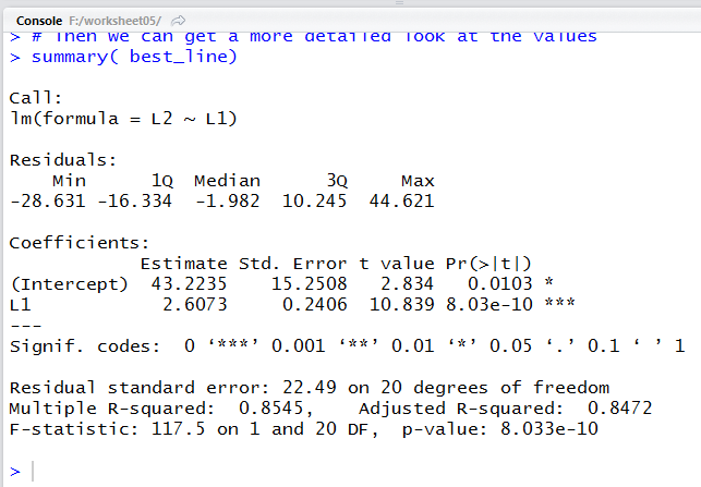
Our same two values, though with a bit more displayed digits,
appear in Figure 14, in the middle of the display, under the title
Estimate. We will look at a few other values in the Figure 14 display
later.
For now let us just have R plot the regression line.
The command to do this, once we have put the linear model into the variable
best_line is
# And just to get a view of this we can plot it
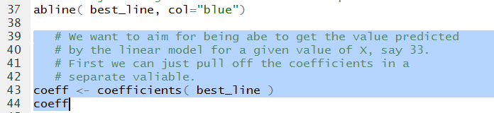
abline( best_line, col="blue")
where the choice of the blue color was just an arbitrary one.
Figure 15
The result of running the highlighted command of Figure 15 is the
change in the plot shown in Figure 16.
Figure 16
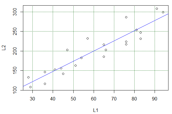
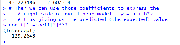
We could use that line to "read" values predicted by the equation. For example,
following the grid lines, if
X has the value 90 we expect the Y value to be around 275.
It is a bit harder to estimate the expected value if we start with X being 33.
Again, trying to read the graph, we expect that if X is 33
then Y should be about 130.
Reading values from the graph is just not good enough.
We want to be able to calculate such values.
Using the regression equation
y = 43.223 + 2.607*x
we really could just evaluate the expression
43.223 + 2.607*33
to get our expected Y value.
Rather than typing the coefficient values, we can pull them out of the
linear model. The command to do this, and then display those coefficient values
is shown in Figure 17.
Figure 17
Running those highlighted lines produces
the output shown in Figure 18.
Figure 18
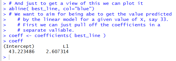
In Figure 18 we get even more significant digits for the
two coefficient values.
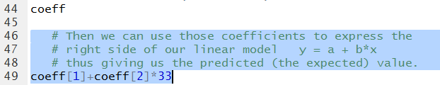
Then we can create a command to evaluate
a + b*33
as
coeff[1]+coeff[2]*33
as is shown in Figure 19.
Figure 19
The result, shown in Figure 20 shows that our
approximation from looking at the graph
was not all that bad.
Figure 20
We can follow that same pattern to get the predicted (expected)
values for a whole collection of X-values. Figure 21
shows the two statements to generate
11 values from 30 through 80 and then display those values.
We follow that with a command, almost identical to the
one we used to generate Figure 20, namely,
coeff[1]+coeff[2]*x
that we can use to find the expected values for each of
those 11 values stored in x
Figure 21
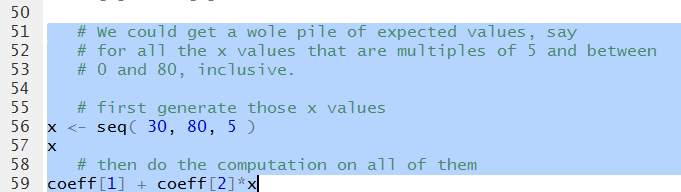
Running the highlighted liens of Figure 220 generates the output
shown in Figure 21.
Figure 22
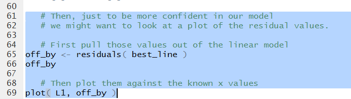
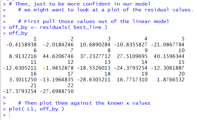
Another thing that we should do is to look
at the scatter plot of the residual values against the x-values.
We can pull out those residual values directly
from the linear model via
off_by<-residuals(best_line), then
display those values (for no particular reason) and then generate a plot
of those values and the original x-values.
These statements are shown in Figure 23.
Figure 23
The Console result is shown in Figure 24.
Figure 24
The generated plot is shown in Figure 25.
Figure 25
As before, grid lines would be helpful in that plot.
Therefore, we can construct such helpful grid lines
by using statements such as those shown in Figure 26.
Figure 26
Once those are run the plot changes to that shown in Figure 27.
Figure 27
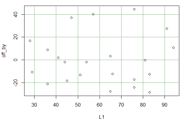
What we wanted to see in Figure 27 was that there is no particular
pattern to those residual values. that is indeed the case.
The last thing we want to see is the correlation coefficient.
To do this we can just use the command cor(L1,L2)
as shown in Figure 28.
Figure 28

The computed correlation coefficient appears in Figure 29.
Figure 29
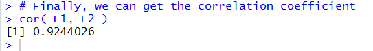
A correlation coefficient of 0.9244026
shows a pretty stron, though not incredibly strong, linear link
between the X and Y values of Table 1.
You may recall that the earlier summary(best_line) command
produced the output in Figure 14. In that output we can find that
the R-squared value is 0.8545.
This is just the square of the
correlation coefficient; it means that about
85% of the variability of the Y
values is explained by our linear model.
At this point we can start to close down our systems. First, we click
on the  icon to save the file
that is listed in our Editor pane. This changes the name of that tab to black,
as shown in Figure 30.
icon to save the file
that is listed in our Editor pane. This changes the name of that tab to black,
as shown in Figure 30.
Figure 30
Then, in the Console
pane we give the q() command and respond to the
question of saving the workspace with a y response.
Figure 31

Once we press the ENTER key the RStudio session will
terminate. We should be able to see our updated directory.
Figure 32 shows a PC version of that directory. There
we see not only our saved Editor file but also the two
hidden files .RData that holds the environment
values, and .Rhistory that holds the sequence
of commands that we have used in this session.
Figure 32

Here is a listing of the complete contents of the more_regression.R
file:
   # This session will be used to demonstrate setting up a
   # textbook problem.  That is, we will just be given two
   # lists with values paired across the lists and we will be
   # to find the linear regreession equation for that data.

   # first we generate the lists, and then look at them
   # just to confirm the values.  [Since this is a new
   # workspace we need to load gnrnd4 before we can use it.]

source( "../gnrnd4.R")
gnrnd4( key1=441852106, key2=5125463513, key3=8400026 )
L1
L2

   # We might as well have a quic peek at the scatter
   # plot so that we can get a visual feel for the
   # possible relationship
plot(L1,L2)  # just a unadorned scatter plot

   # but once we see it we can do a few quick steps
   # to make it easire to read
abline( h=seq(150,300,50),lty=3, col="darkgreen")
abline( v=seq( 30,90,10), lty=3, col="darkgreen")

   # Then getting the linear model, i.e., doing the
   # linear regression is an easy step
best_line <- lm(L2~L1)   # notice that we will store the result
                         # for subsequent use
   # the first such use is just to get a quick look at
   # the result
best_line

   # Then we can get a more detailed look at the values
summary( best_line)

   # And just to get a view of this we can plot it
abline( best_line, col="blue")

   # We want to aim for being abe to get the value predicted
   # by the linear model for a given value of X, say 33.
   # First we can just pull off the coefficients in a
   # separate valiable.
coeff <- coefficients( best_line )
coeff

   # Then we can use those coefficients to express the
   # right side of our linear model   y = a + b*x
   # thus giving us the predicted (the expected) value.
coeff[1]+coeff[2]*33

   # We could get a wole pile of expected values, say
   # for all the x values that are multiples of 5 and between
   # 0 and 80, inclusive.

   # first generate those x values
x <- seq( 30, 80, 5 )
x
   # then do the computation on all of them
coeff[1] + coeff[2]*x

   # Then, just to be more confident in our model
   # we might want to look at a plot of the residual values.

   # First pull those values out of the linear model
off_by <- residuals( best_line )
off_by

   # Then plot them against the known x values
plot( L1, off_by )

   # and, again, we can make the plot a bit easier
   # to read
abline( h=seq(-20,40,20),lty=3, col="darkgreen")
abline( v=seq( 30,90,10), lty=3, col="darkgreen")

   # Finally, we can get the correlation coefficient
cor( L1, L2 )
Return to Topics page
©Roger M. Palay
Saline, MI 48176 September, 2016