Worksheet 04: Linear Regression and Correlationt
Return to Topics page
Years ago, back in the early and mid 90's to be more precise, I would go to
an exerccise program. They had a stationary bike that had various sensors on it
and that provided the users with data related to the workout session.
In particular, every 30 seconds the device would print out a new line giving the
- Elaspsed time,
- Current cadence (i.e., number of pedal rotations per minute),
- The watts generated (i.e., the power of the pedalling),
- The users pulse (i.e., heart rate, beats per minute),
- The resistence (i.e., a measure of the load that the bike was putting on the pedals), and
- Calories expended (i.e., the number of calories brned during the previous 30 seconds).
Image 1 shows a table of such values for the first seven (7)
minutes of my Sept. 10, 1996 session.
Image 1
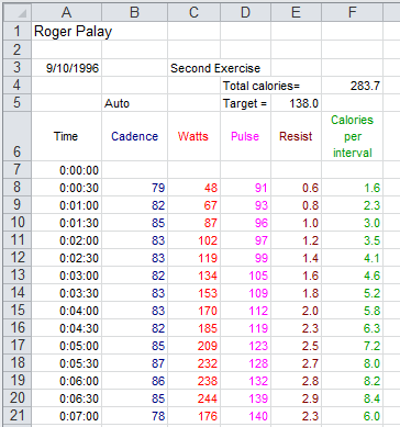
Just looking at the figures in Image 1 it looks like my pulse just rises steadily over the
seven minutes. We can use R to take a look at that.
To do this we will use our USB drive and we will do the usual,
create a new folder (in this case called worksheet04,
copy model.R into that folder, and
rename the file (in this case rogerbike.R).
This is shown in Figure 1.
Figure 1

Then, we double click on the rogerbike.R file to open a new
RStudio session. What we want to do is to get the data
that was in Image 1 into our RStudio session.
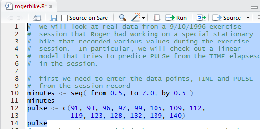
Figure 2 shows some comments and the four statements that
not only specify the data but also display those values so that
we can verify our action.
Figure 2
Once we run the highlighted lines of Figure 2 we get the output shown in Figure 3
in the Console pane.
Figure 3
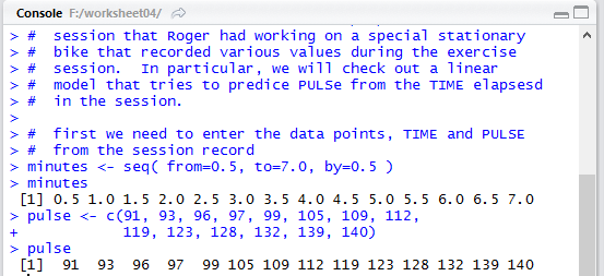
It is important to verify that the values shown in Figure 3
match the values we had in Image 1 and they do.
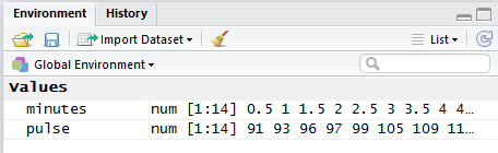
In addition, in the Environment pane, shown in Figure 4,
we can see the two newly created variables and at least a
few of the values that are in those variables.
Figure 4
The next thing to do is to at least look at a scatter plot of the
pulse values versus the time (the minutes).
Figure 5 shows the command as written in the Editor pane.
Figure 5

Figure 6 shows that nothing much happens in the Console
pane when we run the highlighted lines of Figure 5.
Figure 6

But we do get, in the Plots tab, a nice scatter plot of the values.
Figure 7
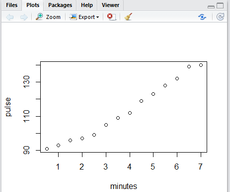
Figure 7 is really quite accurate, but without grid lines it is a
bit hard to see just where each of the dots is on the graph.
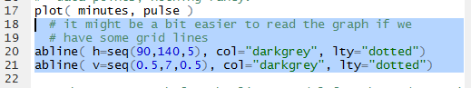
Figure 8 shows the commands, in the Editor pane,
needed to add grid lines to our graph.
Figure 8
Once those have been run we see the updated graph in Figure 9.
Figure 9
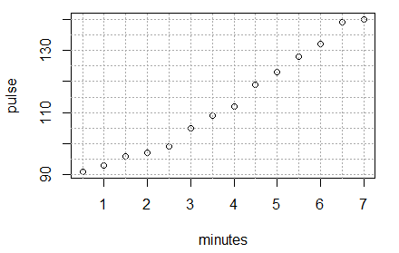
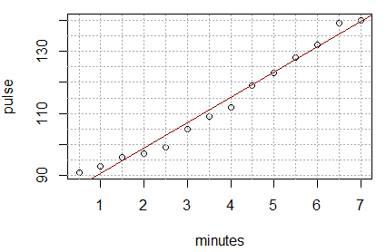
Clearly the dots in Figure 9 do not lie on a straight line,
but they are not far from being on one. Our chalenge is to find the
equation of the line that best fits this data.
To do this we will use the function
lm(pulse~minutes). That function finds the best inear model
to fit the data. Note the formation of the command, especially the use of the
~ character between the two variables that hold the data values.
Also, note the order of the variables. We want pulse to be considered as a function of
minutes. Therefore, we put the pulse variable first.
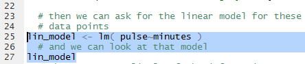
When we use the function in Figure 10 we assign the result of the fnction to
a new variable, lin_model. We did this so that we can make reference
to this result later.
In fact the next command, again shown in Figure 10,
just uses the name of the variable.
That way R will display the contents
of the variable, i.e., the result of using the
lm() function.
Figure 10
When the highlighted lines of Figure 10 are run the result appears
in the Console pane, shown in Figure 11.
Figure 11
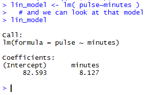
The very brief output shown in Figure 11 is meant to tell us that
the linear equation that best fits the data is given by
pulse = 82.593 + 8.127*minutes
Tht is really all that we need to know.
With that equation, if you specify a certain number of minutes,
say 3.2 minutes, then we can "predict" that the pulse, the heart rate, at that time
in the exercise session will be 82.593+8.127*3.2 or
108.5994, or, in practical terms, either 108
or 109.
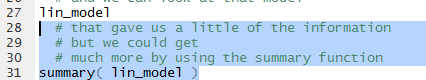
The linear model actually has much more in it than just the values shown in
Figure 11. The summary(line_model) command shown in
Figure 12 will display much more information.
Figure 12
Running the highlighted lines of Figure 12 gives
Figure 13 in the Console pane.
Figure 13
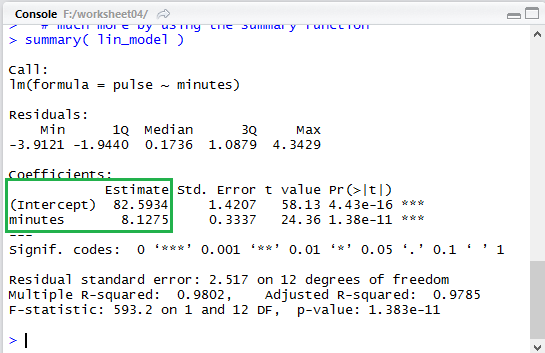
Notice that in the expanded output of Figure 13 the same two values,
82.5934 and 8.7125 are given again,
though in a completely different place (highlighted by the green box
that has been placed in Figure 13).
Of course, the first thing that we want to do is to see the
result of our work.
Therefore, we formulate the abline() function shown in Figure 14
to add the computed line, in dar red, to our existing graph.
Figure 14
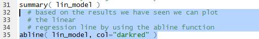
Sure enough, when we run that command we get the graph shown in Figure 15.
Figure 15
As another example of using the linear model to predict the pulse based onthe heart rate,
we could form the command shown in Figure 16, using the values for the coefficients
given back in Figure 13.
Figure 16
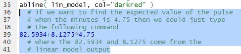
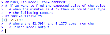
Running that command produces the output shown in Figure 17 which
tells us that the predicted, the expected, value is 121.199.
Figure 17
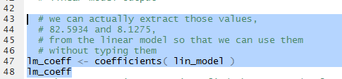
In the two instances above where we have used the values from the linear model we
have relied on our being able to accurately transcribe those values.
We can just extract them from the model.
This is demonstrated by the commands shown in Figure 18.
Figure 18
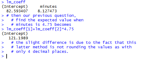
Once those commands are executed we can see that the variable lm_coeff
holds our two values, as shown in Figure 19.
Figure 19
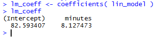
In order to use the values we just refer to them as
lm_coeff[1] and lm_coeff[2].
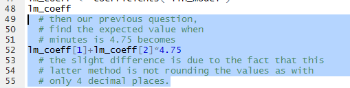
Therefore, we can redo the problem from Figure 16
as the commands shown in Figure 20.
Figure 20
The result, shown in Figure 21, is actually a bit more accurate since it is not using the
rounded values that we used previously for the coefficients.
Figure 21
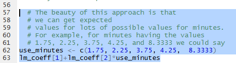
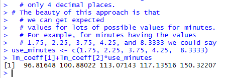
An interesting feature of the design of R is that
we can get multiple values computed for a problem. For example, if we want to
know the expected (prediced ) value for minutes equal to
1.75, 2.25, 3.75, 4.25, and 8.3333 then we can use the statements shown in
Figure 22
Figure 22
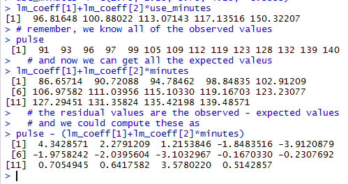
Running those highighted lines produces the output of Figure 23.
Figure 23
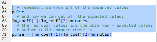
Using that same strategy allows us to compute the residual values, that is,
the observed minus the expectd value
for each item in the list of minutes.
The commands of Figure 24 will, when run,
show the observed values, then show the expected values, and
finally show the (observed-expected) values.
Figure 24
The results can be seen in Figure 25.
Figure 25
Looking at the residual values is important. It is so important that
the linear model that we created, lin_model, actually holds all of
those values.
In fact, if we look back at Figure 13, shown again below,
we see that the output gives us a summary of the residual values
(outlined in red here).
Figure 13 (repeated)
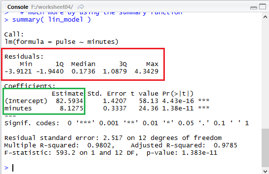
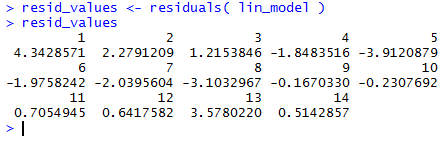
We can easily scan the list of our computed residuals in Figure 25
and verify that the minimum value was -3.9121 and
the maximum was 4.3429, as shown in that summary area of Figure 13.
In order to pull out the residuals from the linear model,
rather than compute them as we did above, we use the function
residuals().
In Figure 26 we have the statement that uses that function and assigns the results
to the variable resid_values.
Then we display the values in that variable.
Figure 26
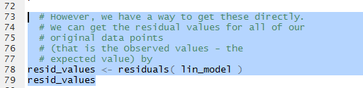
Figure 27 shows those values. When we compare these to the values that we computed
and displayed in Figure 25 we see that they are the same.
Figure 27
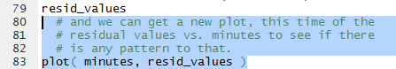
Now that we have the values stored in resid_values
we can take the next step, create of a plot of the residula values
against the minutes associated with them. The command in Figure 28
will create such a plot.
Figure 28
Once we have run the commands of Figure 28 we
get the plot shown in Figure 29.
Figure 29
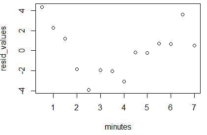
What we want to see here is that there is no pattern to the
plotted points. They should seem like they were just randomly placed on the
graph. If they formed a pattern then we would be suspect of
our linear model.
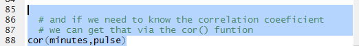
What remains is for us to find the correlation coefficient for the linear model.
The function cor() will do this. The command as formulated in
the Editor pane is shown in Figure 30.
Figure 30
The result of running the command is shown in Figure 31.
Figure 31
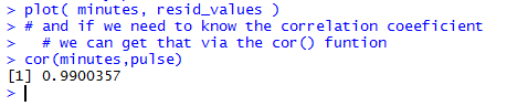
Recall that a correlation coefficient that is close to
either 1 or -1 is an indication of a
strong linear relationship between the variables. In this case,
the value 0.9900357 is a really high correlation.
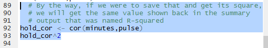
We can take a minute to redo that computation but store the result
in the variable hold_cor. Then we find the square of that
value.
Figure 32
THe resut of the computation is shown in Figure 33.
Figure 33
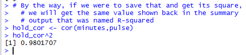
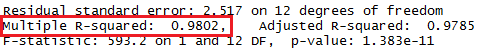
We have seen the square of the correlation coefficient before!
Again, back in Figure 13 it was given toward the bottom of the display
as Multiple R-squared: 0.9802. That portion of Figure 13 is repeated
below with the specific area outlined in red.
Figure 13 (just a portion)
The correlation coefficient is often symbolized by the name r.
Thus the square of the correlation coefficient is known
as r2, or r-squared.
All that remains to be done is to end our session.
We start by saving the file shown in the Editor, clicking on the
 icon, thus changing the file name to
display in black, as shown in Figure 34.
icon, thus changing the file name to
display in black, as shown in Figure 34.
Figure 34
THen, in the Console pane we enter the q()
function and then we respond to the question with y
as shown in Figure 35.
Figure 35
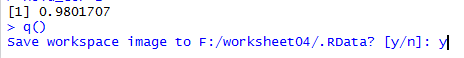
That ends our RStudio session and leaves us looking at the
file explorer display, shown in Figure 36. [As usual, on a Mac in Finder we would not see the
.RData and .Rhistory files even though they
are in the directory.]
Figure 36

Here is a listing of the complete contents of the rogerbike.R
file:
#  We will look at real data from a 9/10/1996 exercise
#  session that Roger had working on a special stationary
#  bike that recorded various values during the exercise
#  session.  In particular, we will check out a linear
#  model that tries to predice PULSe from the TIME elapsesd
#  in the session.

#  first we need to enter the data points, TIME and PULSE
#  from the session record
minutes <- seq( from=0.5, to=7.0, by=0.5 )
minutes
pulse <- c(91, 93, 96, 97, 99, 105, 109, 112,
           119, 123, 128, 132, 139, 140)
pulse
#  now, how about a quick look at a scatter plot of the
#  data points, nothing fancy.
plot( minutes, pulse )
  # it might be a bit easier to read the graph if we
  # have some grid lines
abline( h=seq(90,140,5), col="darkgrey", lty="dotted")
abline( v=seq(0.5,7,0.5), col="darkgrey", lty="dotted")

  # then we can ask for the linear model for these
  # data points
lin_model <- lm( pulse~minutes )
  # and we can look at that model
lin_model
  # that gave us a little of the information
  # but we could get
  # much more by using the summary function
summary( lin_model )
  # based on the results we have seen we can plot
  # the linear
  # regression line by using the abline function
abline( lin_model, col="darkred" )
  # if we want to find the expected value of the pulse
  # when the minutes is 4.75 then we could just type
  # the following command
82.5934+8.1275*4.75
  # where the 82.5934 and 8.1275 come from the
  # linear model output

  # we can actually extract those values,
  # 82.5934 and 8.1275,
  # from the linear model so that we can use them
  # without typing them
lm_coeff <- coefficients( lin_model )
lm_coeff
  # then our previous question,
  # find the expected value when
  # minutes is 4.75 becomes
lm_coeff[1]+lm_coeff[2]*4.75
  # the slight difference is due to the fact that this
  # latter method is not rounding the values as with
  # only 4 decimal places.

  # The beauty of this approach is that
  # we can get expected
  # values for lots of possible values for minutes.
  # For example, for minutes having the values
  # 1.75, 2.25, 3.75, 4.25, and 8.3333 we could say
use_minutes <- c(1.75, 2.25, 3.75, 4.25,  8.3333)
lm_coeff[1]+lm_coeff[2]*use_minutes

  # remember, we know all of the observed values
pulse
  # and now we can get all the expected valeus
lm_coeff[1]+lm_coeff[2]*minutes
  # the residual values are the observed - expected values
  # and we could compute these as
pulse - (lm_coeff[1]+lm_coeff[2]*minutes)

  # However, we have a way to get these directly.
  # We can get the residual values for all of our
  # original data points
  # (that is the Observed values - the
  # expected value) by
resid_values <- residuals( lin_model )
resid_values
  # and we can get a new plot, this time of the
  # residual values vs. minutes to see if there
  # is any pattern to that.
plot( minutes, resid_values )


  # and if we need to know the correlation coeeficient
  # we can get that via the cor() funtion
cor(minutes,pulse)
  # By the way, if we were to save that and get its square,
  # we will get the same value shown back in the summary
  # output that was named R-squared
hold_cor <- cor(minutes,pulse)
hold_cor^2
Return to Topics page
©Roger M. Palay
Saline, MI 48176 September, 2016