Worksheet 03.3: Descriptive Measures Grouped Data
Return to Topics page
The task here is to come up with descriptive measures for the data in Table 1.
This page assumes that you have read through earlier pages and that you have
mastered the steps that we use to set up our work.
To that end we will assume that we have
- inserted our USB drive,
- created a directory called
worksheet033
on that drive
- have copied
model.R from our root folder into
our new folder,
- have renamed that new copy of the file to the name
ws33.R, and
- have double clicked on that file to open RStudio.
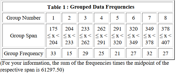
The result should be a window pretty much identical to the one shown in Figure 1.
{Recall that the images shown here may have been reduced
to make a printed version of this page a bit shorter than
it woud otherwise appear.
In most cases your browser should allow you to right click on an image and then
select the option to View Image in order to see the image in its
original form.}
Figure 1
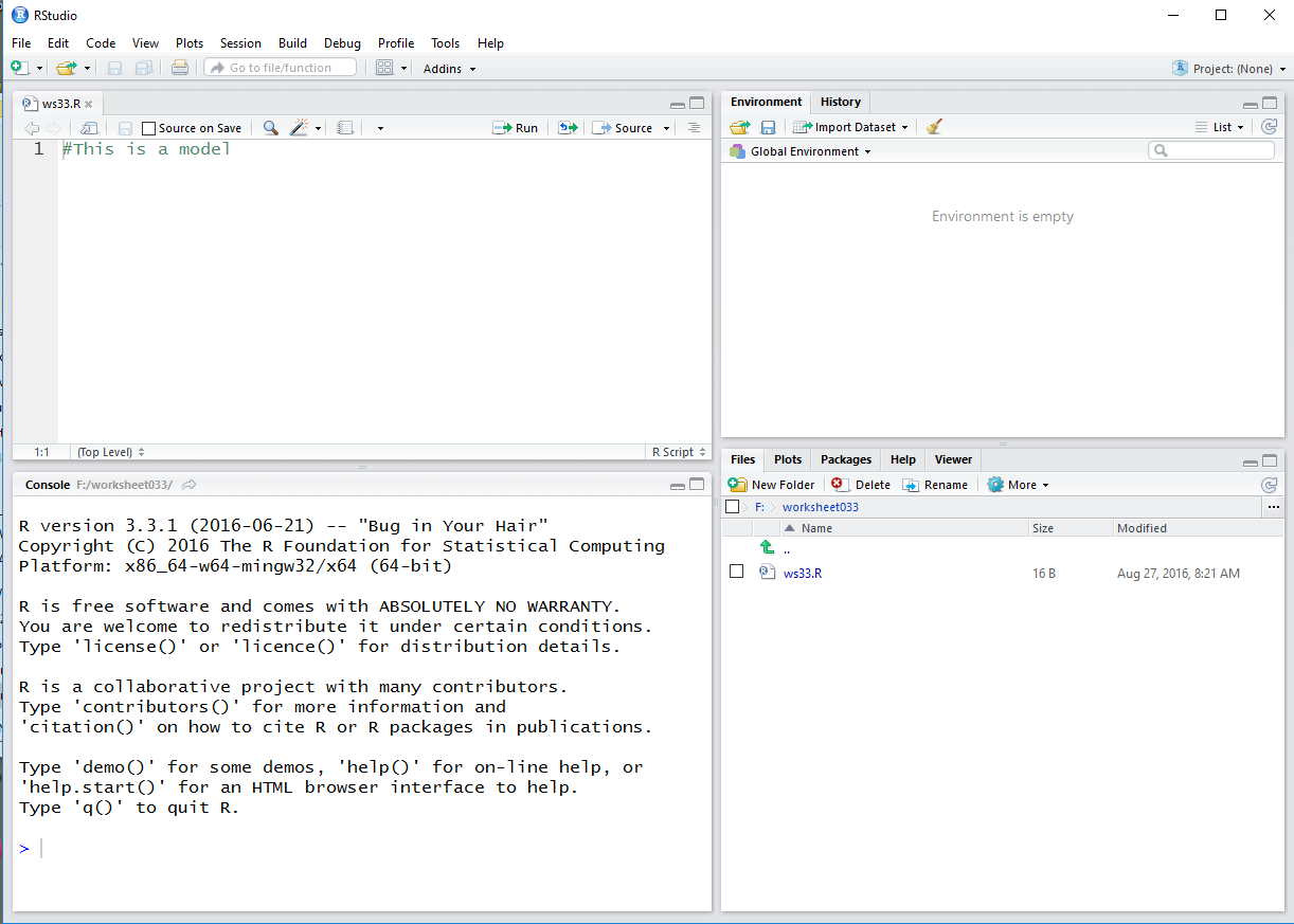
Much of the discussion that would be given here has been included in the
comments in our ws33.R file. Therefore, it is important to read
those comments. We start by generating all of the lower limits for all of
the intervals.
Figure 2
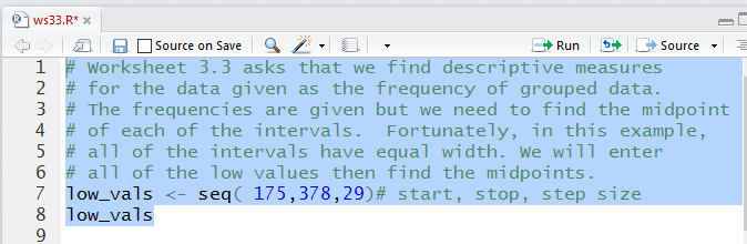
The console view of those commands:
Figure 3
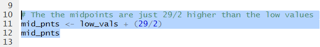
The we add the commands to generate and display the midpoints.
Figure 4
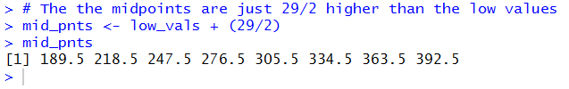
In Figure 5 we can see all of those midpoint values.
Figure 5
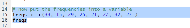
Then we enter the values of all of the frequencies.
Figure 6
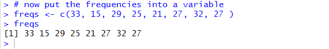
In Figure 7 we can visually verify that we have them correctly entered.
Figure 7
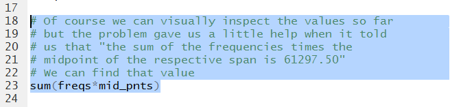
Because the problem was kind enough to give us a way to check
that we have the correct values, we might as well compute the
sum of the products of the frequencies times the midpoints.
Figure 8 shows the required command.
Figure 8
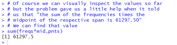
Running that command gives us the value in Figure 9.
We see that it matches and we can move on with some confidence.
Figure 9
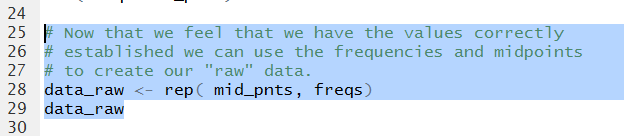
Now we want to use the mipoints and the frequencies to
generate data that will approximate the data represented in Table 1.
Figure 10 shows the command to do this.
Figure 10
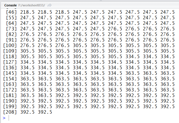
It turns out that we need 209 values to represent that data.
Displaying the 209 values, as shown in Figure 11,
means that the list just scrolled off the Console pane
in Figure 11.
Figure 11
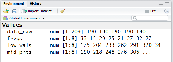
A quick look at the Environment pane shows the data that we have created so far.
It is worth noting that the Environment pane display may show some of
the values in a "rounded" fashion. In particular,
note that the mid_pnts values shown in Figure 12
are rounded version of the mid_pnts values that we saw in
Figure 5.
Figure 12
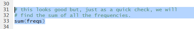
Just for the fun of it, Figure 13 shows the command to actually compute the sum of the
the freqs values.
Figure 13
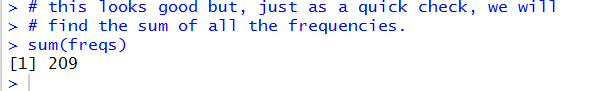
And, when we rn that command we see in Figure 14 that there are indeed
209 such values.
Figure 14
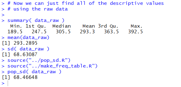
We can now dive into finding the various descriptive measures.
Remember that we have an new Environment
in our working directory, worksheet033,
so we need to reload the functions that are not built-in R functions.
Figure 15
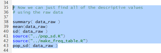
Figure 16 shows the various values.
Figure 16
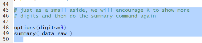
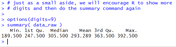
As we have seen before the summary function does not
provide a lot of decimal places to the right of the
decimal point. Figure 17 shows a method for increasing that
number of displayed digits.
Figure 17
This gives rise, in Figure 18, to a restatement of the results of the
summary function.
Figure 18
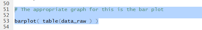
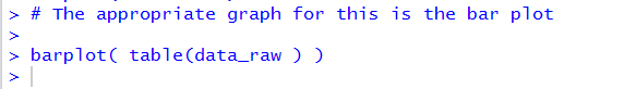
The we create the command for a quick and dirty bar plot.
Figure 19
The Console reflects the command but there is no output there.
Figure 20
Instead, the plot shows up in its own pane, displayed in Figure 21.
Figure 21
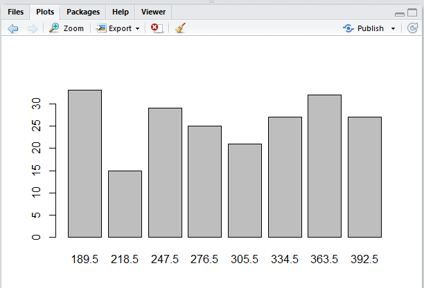
That is a pretty ugly plot, but it does get across the
graph of the distribution of values in our data.
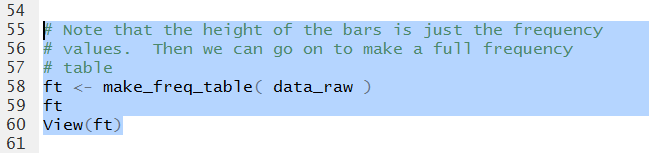
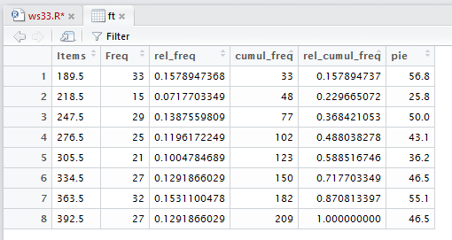
Even though we started with a frequency table, Table 1,
we know that we could get a more expanded table,
one that included things like he relative frequency,
by using our make_freq_tablefunction.
Figure 22 shows the command to do that as entered into our file.
Figure 22
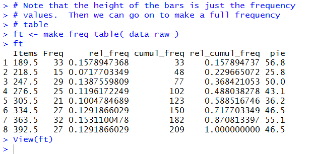
We get the Console view of that table in Figure 23.
Figure 23
The View(ft) command causes the nicely
formatted table to appear in the Editor pane
shown in Figure 24.
That is really all that we need to do. We do note, in Figure 24, that we have
yet to save all of our work. This is clear because the name of the file we are using
to hold our work, ws33.R appears in red letters.
We just click on the  icon to save the file.
Figure 24
That will change the color of the file name, as we see in Figure 25.
Figure 25
Finally, in the Console pane, we give the command q()
and then we respond to the prompt with a y , as shown in Figure 26.
Figure 26

Once we press ENTER after that the RStudio session closes and saves our
two hidden files.
Here is a listing of the complete contents of the ws33.R
file:
# Worksheet 3.3 asks that we find descriptive measures
# for the data given as the frequency of grouped data.
# The frequencies are given but we need to find the midpoint
# of each of the intervals.  Fortunately, in this example,
# all of the intervals have equal width. We will enter
# all of the low values then find the midpoints.
low_vals <- seq( 175,378,29)# start, stop, step size
low_vals

# The the midpoints are just 29/2 higher than the low values
mid_pnts <- low_vals + (29/2)
mid_pnts

# now put the frequencies into a variable
freqs <- c(33, 15, 29, 25, 21, 27, 32, 27 )
freqs

# Of course we can visually inspect the values so far
# but the problem gave us a little help when it told
# us that "the sum of the frequencies times the
# midpoint of the respective span is 61297.50"
# We can find that value
sum(freqs*mid_pnts)

# Now that we feel that we have the values correctly
# established we can use the frequencies and midpoints
# to create our "raw" data.
data_raw <- rep( mid_pnts, freqs)
data_raw

# this looks good but, just as a quick check, we will
# find the sum of all the frequencies.
sum(freqs)

# Now we can just find all of the descriptive values
# using the raw data

summary( data_raw )
mean(data_raw)
sd( data_raw )
source("../pop_sd.R")
source("../make_freq_table.R")
pop_sd( data_raw )

# just as a small aside, we will encourage R to show more
# digits and then do the summary command again

options(digits=9)
summary( data_raw )

# The appropriate graph for this is the bar plot

barplot( table(data_raw ) )

# Note that the height of the bars is just the frequency
# values.  Then we can go on to make a full frequency
# table
ft <- make_freq_table( data_raw )
ft
View(ft)
Return to Topics page
©Roger M. Palay
Saline, MI 48176 January, 2017