Worksheet 03.2: Descriptive Measures
Return to Topics page
The task here is to come up with descriptive measures for the data in Table 1.
| Table 1 |
| Item number |
1 | 2 | 3 | 4 | 5 | 6 | 6 |
8 | 9 | 10 |
| Data value |
34 | 37 | 38 |
41 | 42 | 43 | 46 |
47 | 51 | 53 |
| Frequency of data |
8 | 11 | 2 | 7 | 13 | 17 | 5 |
11 | 15 | 8 |
This page assumes that you have read through earlier pages and that you have
mastered the steps that we use to set up our work.
To that end we will assume that we have
- inserted our USB drive,
- created a directory called
worksheet032
on that drive
- have copied
model.R from our root folder into
our new folder,
- have renamed that new copy of the file to the name
ws32.R, and
- have double clicked on that file to open RStudio.
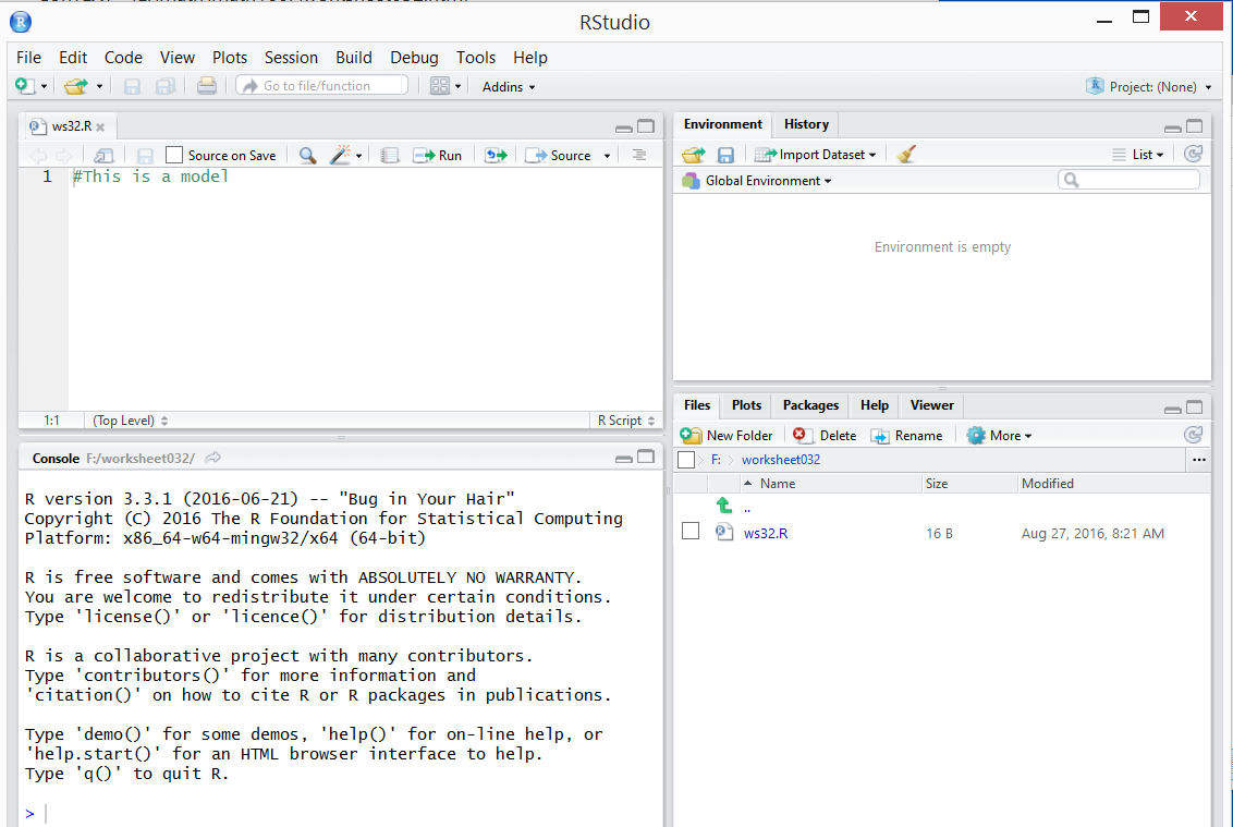
The result should be a window pretty much identical to the one shown in Figure 1.
{Recall that the images shown here may have been reduced
to make a printed version of this page a bit shorter than
it woud otherwise appear.
In most cases your browser should allow you to right click on an image and then
select the option to View Image in order to see the image in its
original form.}
Figure 1
The data that we have been given in Table 1 shows us the frequency
of each of the different data values. Rather than try to work with that
consolidated set of values we would prefer to work with
the "raw" data. That is, we would like the data to hold 8 of the 34's,
11 of the 37's, 2 of the 38's, and so on.
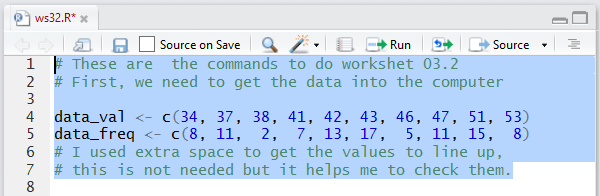
To do this we start by getting the different values and the different
frequencies into R.
The commands
data_val <- c(34, 37, 38, 41, 42, 43, 46, 47, 51, 53)
data_freq <- c(8, 11,  2,  7, 13, 17,  5, 11, 15,  8)
will do this.
Figure 2
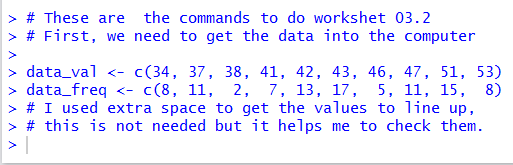
When we run those commands the Console pane merely shows the
the commands (and the comments).
Figure 3
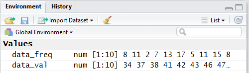
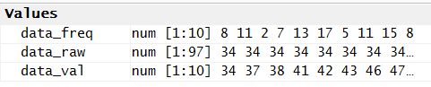
However, if we look in the Environment pane we can see that
our two new variables have been created and we can see that they hold
the correct values (well, actually all we see is that data_freq
holds the correct 10 values, but the pane shown in
Figure 4 is only wide enough to show the
first 8 values in data_val.
Figure 4
Then, we use those two variables in the rep
function to produce all of the desired values and store them in the
variable data_raw.
Figure 5
The Console display shown in Figure 6 shows our 97
values comprised of eight 34's, eleven 37's, two 38's, and so on.
Figure 6
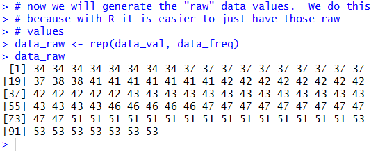
Figure 7 shows the new variable in the Environment pane.
Figure 7
Of course, now that we have the 97 raw values we can just process them
sas we usually do.
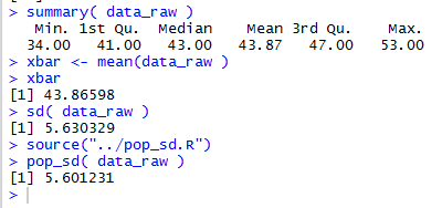
Figure 8 holds the commands to get a summary of the values,
then to compute and display the mean separately,
then to find the standard deviation assuming Table 1
represents a sample, then loading the pop_sd function
into our environment, and finally, using the pop_sd function to find the
standard deviation assuming the data in Table 1
represents a population.
Figure 8
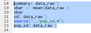
Figure 9 shows the Console output from those commands.
Again, we notice the brevity of the display of the value of the mean
by the summary function and the increase in the
number of digits displayed by computing the mean separately and displaying it.
Figure 9
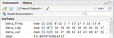
Examining the Environment pane we see the display of the value there
has even more significant digits.
Figure 10
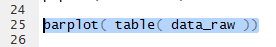
The appropriate graph for this kind of data is a bar chart.
Figure 11 shows the command that we would use to get the default
graphic.
Figure 11
Running that command will produce the graph shown in Figure 12.
Figure 12
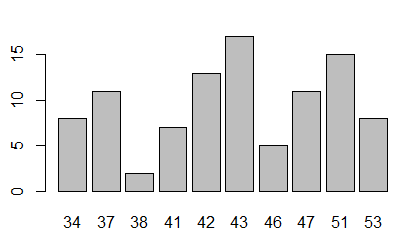
There is nothing wrong about the graph shown in Figure 12, but we have seen,
on other pages, some of the commands that we can use to
improve the appearance of that chart.
Figure 13 shows the more elaborate commands.
Figure 13
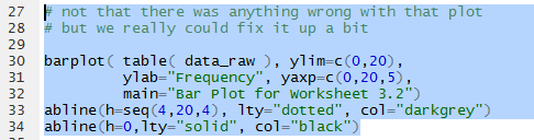
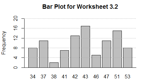
Running the commands of Figure 13 gives the graph shown in Figure 14.
This is more informative and it is easier to read.
Figure 14
We could also produce a frequency table for the data.
It is interesting to note that Table 1 really stated the first part of such a
frequency table. However, because we have created the raw data and because we
have the function make_freq_table (which we have on the
USB drive but which we need to load into our environment, the command that we use
make_freq_table( data_raw )
looks at data_raw and processes the values in it
to get back to Table 1 and then to expand it with
values for the relative frequency, the cumulative frequency,
the relative cumulative frequency, and the number of degrees
required for ach value in a pie chart.
Figure 15
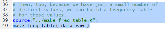
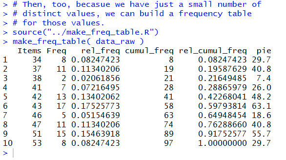
Figure 16 shows the Console display of that
frequency table.
Figure 16
The Console display version is OK, but we recall that we could
get a much prettier display.
To do that we will have R compute the table again but this
time we will store the result, the frequency table, in a variable,
in this case data_ft, and then we will View
that variable. Note the capital V in the command
View(data_ft).
Figure 17
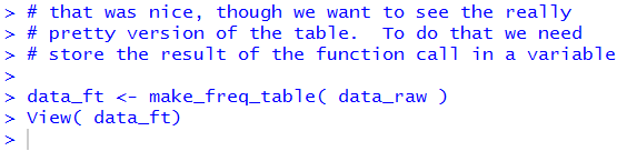
Of course, running the new commands does little in
the Console pane, shown in Figure 18.
Figure 18
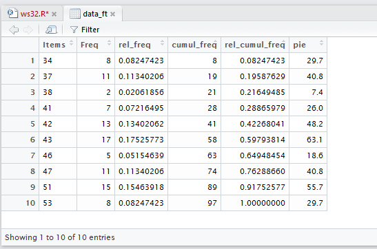
However, it does open a new tab in the Editor pane
shown in Figure 19.
Figure 19
Finally, before we leave all of this work, we note that
our file, ws32.R has had its contents changed
causing its name to appear in red in the tab.
Figure 20
We will click on the  to save that file.
This will change the name to black letters.
to save that file.
This will change the name to black letters.
Figure 21
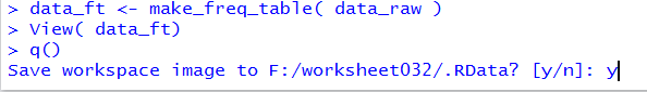
Once that is done we move to the Console pane and directly enter the command
q() k followed by the Enter key.
Then we respond to the question with y
as in Figure 22.
Figure 22
Once we press Enter at that point RStudio will save our hidden files
and terminate.
Here is a listing of the complete contents of the ws32.R
file:
# These are the commands to do workshet 03.2
# First, we need to get the data into the computer
data_val <- c(34, 37, 38, 41, 42, 43, 46, 47, 51, 53)
data_freq <- c(8, 11, 2, 7, 13, 17, 5, 11, 15, 8)
# I used extra space to get the values to line up,
# this is not needed but it helps me to check them.
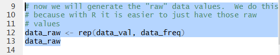
# now we will generate the "raw" data values. We do this
# because with R it is easier to just have those raw
# values
data_raw <- rep(data_val, data_freq)
data_raw
# now that we have the "raw" data we can go ahead and
# get our usual measures
summary( data_raw )
xbar <- mean(data_raw )
xbar
sd( data_raw )
source("../pop_sd.R")
pop_sd( data_raw )
barplot( table( data_raw ))
# not that there was anything wrong with that plot
# but we really could fix it up a bit
barplot( table( data_raw ), ylim=c(0,20),
ylab="Frequency", yaxp=c(0,20,5),
main="Bar Plot for Worksheet 3.2")
abline(h=seq(4,20,4), lty="dotted", col="darkgrey")
abline(h=0,lty="solid", col="black")
# Then, too, becasue we have just a small number of
# distinct values, we can build a frequency table
# for those values.
source("../make_freq_table.R")
make_freq_table( data_raw )
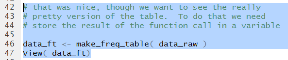
# that was nice, though we want to see the really
# pretty version of the table. To do that we need
# store the result of the function call in a variable
data_ft <- make_freq_table( data_raw )
View( data_ft)
Return to Topics page
©Roger M. Palay
Saline, MI 48176 January, 2017