Worksheet 03.1: Descriptive Measures
Return to Topics page
The task here is to come up with descriptive measures for the data in Table 1.
Assuming that you have read through earlier pages and that you have
mastered many of the steps that we use to set up our work,
you can skim through the first ten Figures and their associated discussions.
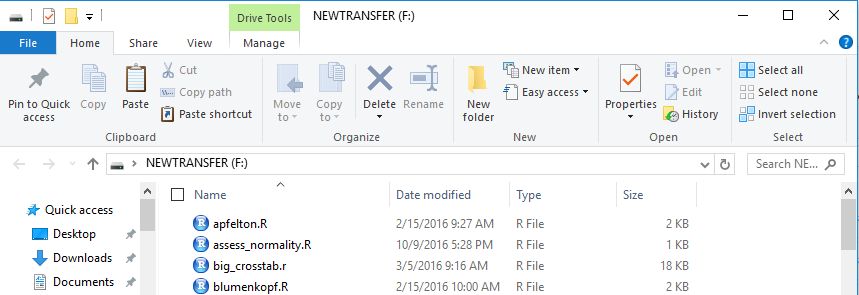
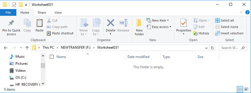
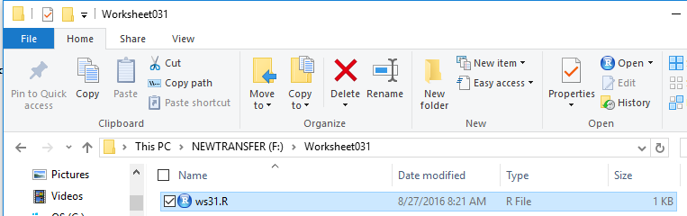
We start by inserting our special USB drive. On the computer
used for this demonstrations that drive was asigned the letter F.
The File Manager view of that drive is shown in Figure 1.
{Recall that the images shown here may have been reduced
to make a printed version of this page a bit shorter than
it woud otherwise appear.
In most cases your browser should allow you to right click on an image and then
select the option to View Image in order to see the image in its
original form.}
Figure 1
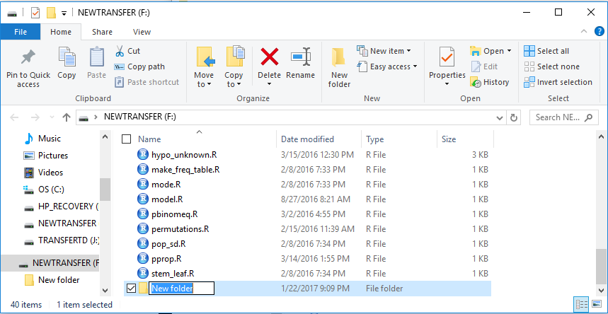
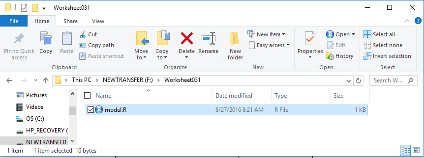
Then we create a new folder, on that drive. To do this here I just clicked
on the New Folder icon toward the middle top of the window of Figure 1.
The result is shown at the bottom of Figure 2.
Figure 2
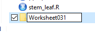
Rather than accept the default folder name of
New folder, we give it a new name, in this case
worksheet031.
Figure 3
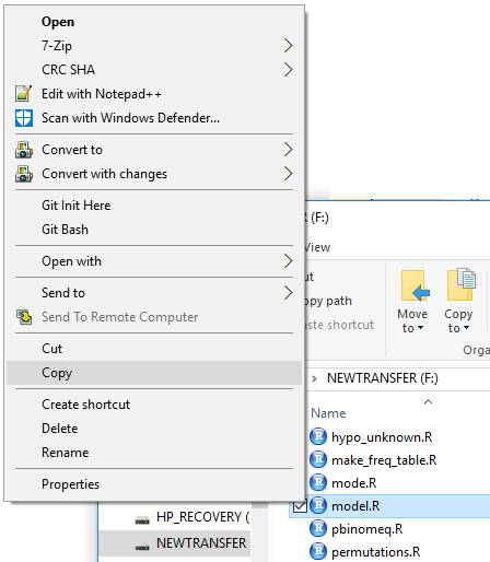
Once the folder is there we want to copy the
model.R file that is on the USB drive into the folder.
First we right click on the model.R file.
This opens the options shown in Figure 4, where we point to the Copy
option and then click on it.
Figure 4
Next we double click on our new folder name, Worksheet031,
to move into that folder, shown in Figure 5.
Figure 5
We can see, in Figure 5, that the folder is empty.
But now we can right click in the folder and select the Paste option.
That puts the copy of model.R into this folder.
Figure 6
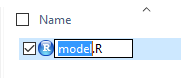
However, we have learned that it is probably best to rename this file.
To do that we click (just once) on the name of the file. That will allow
us to edit the name of the file, as shown in Figure 7.
Figure 7
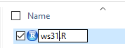
For this project we will use the name
ws31.R. We change the file name to that,
as we see in Figure 8.
Figure 8
And we can press the Enter key to move to Figure 9.
Figure 9
At this point we have our new folder and in that
folder we have a renamed copy of our model file.
We can double click on that file name to
open a session of RStudio. This is shown in Figure 10.
Figure 10
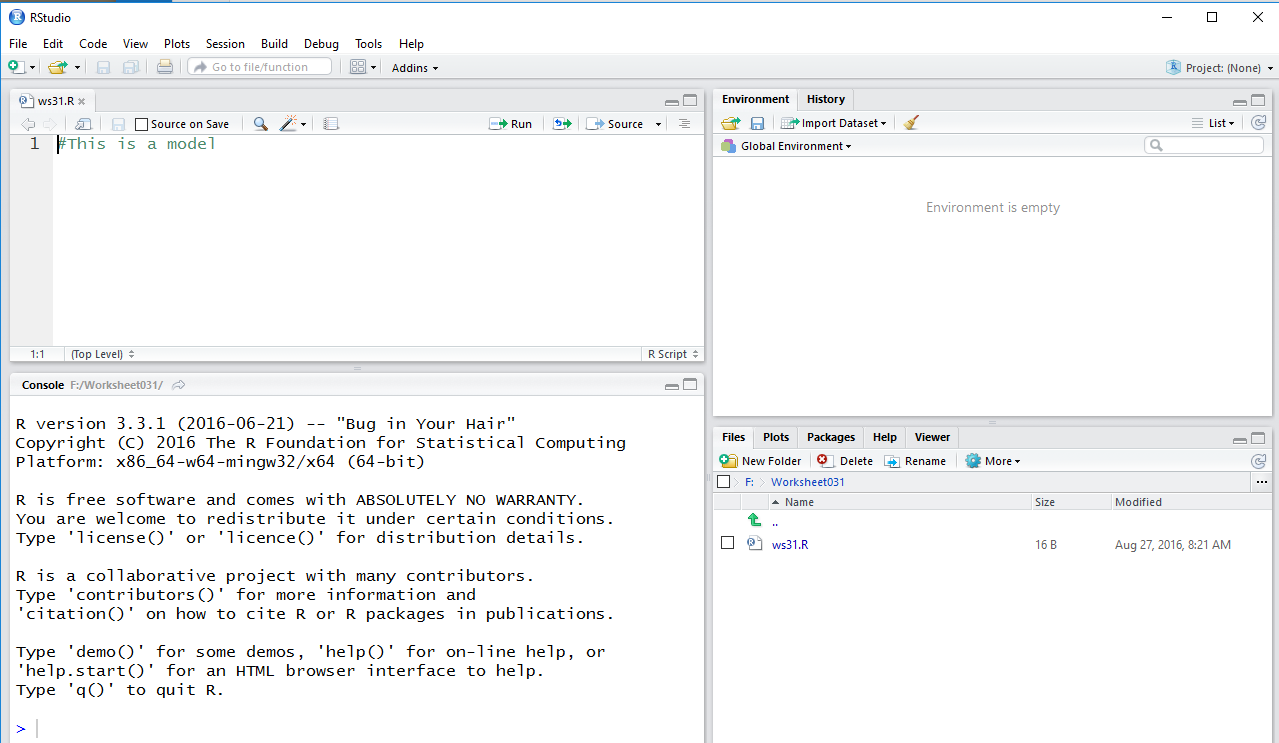
An important relation her is that because we started this
session of RStudio from the file in our directory the
result is that this directory, this folder,
is our working directory. We do get a feeling for this in that
the lower right pane of the RStudio window shows us the
contents of our very own directory.
We also note, because we have not done any work in this currect directory,
we have a blank Environment pane, the top right pane in the window.
Therefore, if we want to use any of the functions that have been supplied
on the USB drive we will have to load those functions, via
the source command, into the Environment.
We will consistently type commands into the Editor pane,
then highlight those commands, and then run the highlighted portion
by clicking on the run icon,
 , in the Editor pane.
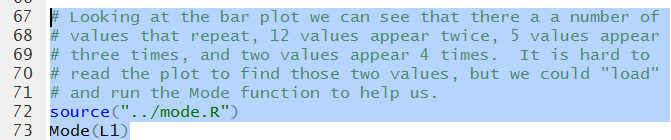
That last step will copy the highlighted commands to the Console
pane and use R to execute them.
, in the Editor pane.
That last step will copy the highlighted commands to the Console
pane and use R to execute them.
|
Certainly, you may decide to type all of the commands (and hopefully the comments)
yourself as you follow along. However, all of the commands used in this page
have been provided in machine readable form at the bottom of this page. If it were me
doing the work I would find that listing, copy the lines from this page and
paste them into the editor. Then, to follow along, just highlight the lines that
you wish to execute.
|
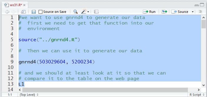
We were given values above in Table 1. We want to generate those same
values in our RStudio session.
To do this we need to load the gnrnd4 function
into our environment and then run the function using the values given
with our table above.
Once generated it makes sense that we look at the values
so that we can compare them to the values in Table 1
The commands to do this are given in Figure 11.
Figure 11
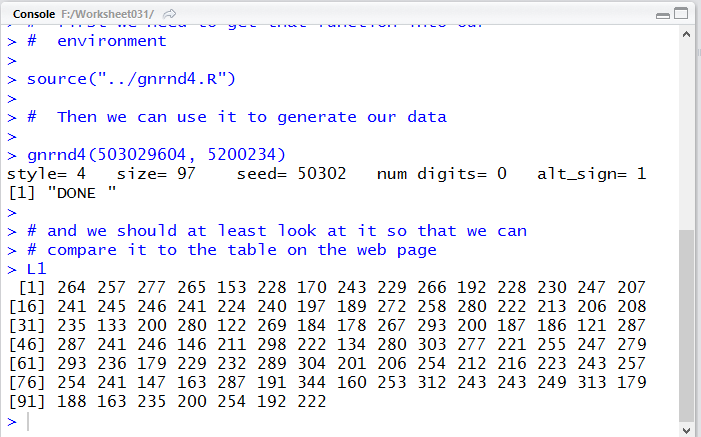
When we run those commands we get the lines shown in Figure 12 in to Console
pane, as is shown in Figure 12. In particular, comparing the numbers displayed in
Figure 12 to the values given in Table 1 we see that we have generated
exactly the required values.
Figure 12
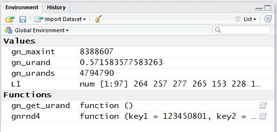
If we look at the Environment pane, shown in Figure 13, we see, among other things that
our function is defined and that there are now 97
values in the variable L1.
Figure 13
We recall that the built-in function summary will tell us a lot about the
data in our table. It will give us the median, the mean,
the first and third quartle points, and the minimum and maximum
values in our data. It will not give us the standard deviation for those values.
The command sd(L1) will give us that value, but it only gives
us the standard deviation assuming that the data represents a sample.
We will have to load and use the function pop_sd to find the
standard deviationassuming that the data that we have is a population.
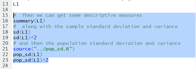
Figure 14 holds the commands for doing all of this.
Figure 14
We run the commands highlighted in Figure 14 to get the Console
output shown in Figure 15.
Figure 15
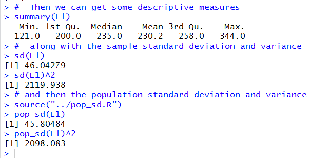
We read the output in Figure 15 to find that medianis 235.0,
the mean is 230.2, the minimum is 121.0,
the maximum is 344.0, and the 1st and 3rd quartiles
havng the values 200.0 and 258.0, respectively.
Then considerting the data is a sample,
we have the standard deviation is 46.04279
and therefore, the variance is 2119.938.
On the other hand, if the data represents a population
then the standard deviation is 4.80484 and the
variance is 2098.083.
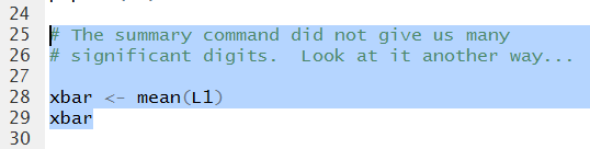
In all of this we might be a little concerned that the mean is
only given to 1 decimal place. We can look at some other ways to
display this value a bit more accurately.
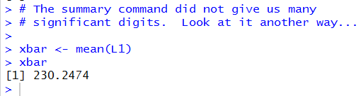
First, we could compute it separately and assign its value to a variable.
The commands to do this are given in Figure 16.
Figure 16
Running those commands produces the output in Figure 17.
There we
see the value of the mean is 230.2474.
Figure 17
However, if we look in the Environment pane,
shown in Figure 18, we can see that R has calculated
the mean, stored in xbar to be
230.247422680412.
Figure 18
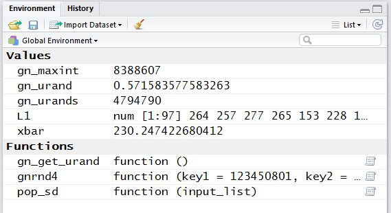
The 15 digits shown in Figure 18 is clearly more than we need.
The 7 digits shown in Figure 17 is quite helpful.
The 4 digits shown in Figure 15 do not really give us enough
information, but the summary ommand, which produced
Figure 15, is just so convenient!
There is a way to tell R to give us more digits in the display
by default. We can use the
options(digits=10) command to change the default output setting.
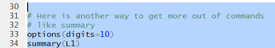
This, along with another run of the summary command are given in the
Editor pane in Figure 19.
Figure 19
The result of running those two commands is in Figure 20.
There we see that all of the values are given with more displayed digits.
Figure 20
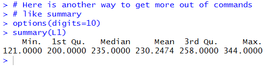
One might reasonabley ask, "I set digits to 10, why are there only 7 shown
for each value in Figure 20?"
The answer is that the setting, digits=10,
is taken by R as a "suggestion" not as a rule.
We got what we wanted, more displayed digits,
and that is enough.
At this point we have found our measures of central tendency
and our measures of
dispersion. Let us look at some graphs of the data.
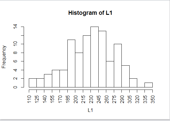
First, we can get a histogram.
Figure 21
When we run the command of Figure 21 we get the
histogram shown in Figure 22.
Figure 22
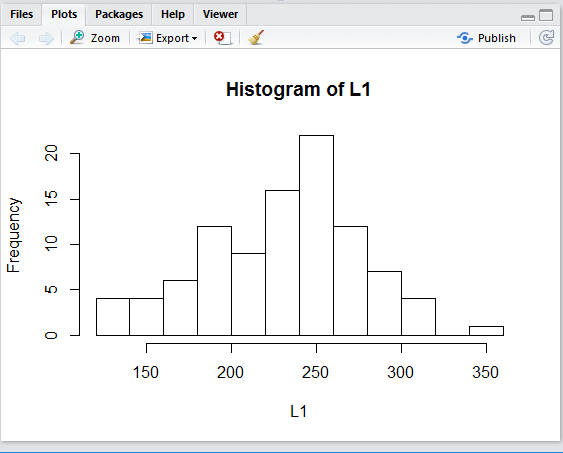
The graph in Figure 22 is completely accurate, but it is a bit
hard to understand, in part because we have no idea of
where R has decided to make the breaks for the
different bins or groups. If we had to guess it certailnly seems that
one break is at 200 and another is at 300 with that
interval broken into 5 bins. Therefore, we would expect
that the bins are each 20 units wide and we can compute that the break points are at
120, 140, 160, 180, 200, 220, 240, 260, 280, 300, 320, 340, and 360.
For the purpose of this course, the default graph is good enough.
However, with just a few additional values we can really improve the quality of
the graph.
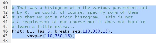
Three immediate changes will be:
- to include the wierd
las=3
option which will cause all of the axis values to appear perpendicular
to the axis,
- to include the option
breaks=seq(110,350,15)
which will set the breaks for the bins to start at 110 and to be 15 units wide
and to not go over 350, and
- to include the option
xaxp=c(110,350,16) which will set the x-axis
labels to start at 110 and go to 350 and to have 16 even steps along the way,
thus coinciding with the values for our break points.
The new command is shown in Figure 23.
Figure 23
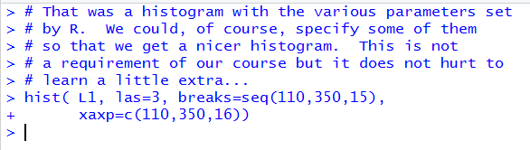
Running the command does not produce anything to speak of
in the Console pane, shown in Figure 24.
Figure 24
However, it does produce the histogram shown in Figure 25, a significant improvement over
the default graph of Figure 22.
Figure 25
One aspect of the histograms that we have yet to examine is where do you
place a value that is on a break point.
In the data in Table 1 there is exactly one 245.
In Figure 25 there appears to be
one more value in the 230-245 bin than there is in the 245-260
bin.
The question is "In which bin is the data value 245?"
The answer is that by dfault R uses the break points to include values
at the right side of the break but not on the left side. Thus, in mathematical
nomenclature, the two bins are for values
(230,245] and (245,260], where the parenthesis indicates the "open"
end of the interval and the bracket indiates the closed end.
We can change this default by including the option right=FALSE
in our command. This is shown in Figure 26.
Figure 26
As expected, running the command does little but echo it n the Console pane.
Figure 27

But runing the command does produce the new histogram shown in Figure 28.
Figure 28
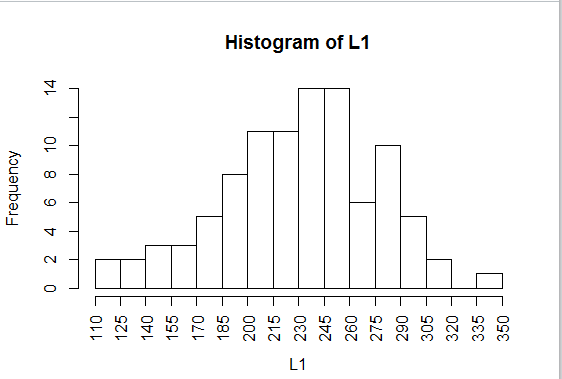
We can see some change from Figure 26 to Figure 28. In particular,
the 245-260 bin has grown. That is because it picked up the 245
value that used to be in the 230-245 bin. That 230-245 bin
did not shrink because it pickd up a replacement for the lost
245 value, namely the 230 value.
We can see that because the 215-230 bin is now shorted than it was in Figure 26.
The three bins that we have examined, in Figure 28, would now
be described as [215,230), [230,24), and [245,260).
We would say that these are closed on the left
and open on the right.
There are a few more tweaks that we could add to our histogram, just to make it easier to
read:
- the option
main="For Worksheet 3.1" give the graph a main title,
- the option
xlab="Table Values" replaces the default label
for the x-axis,
- the option
ylab="count of values" replaces
the default label for the y-axis,
- the option
xlim=c(110,350) explicitly sets the x-axis to
that range,
- the option
ylim=c(0,16) explicitly sets the y-axis to that range,
- the option
cex.axis=.7 causes the labels for both axes
to be given at 70% the regular size,
- the option
yaxp=c(0,16,8) makes the tick marks on the y-axis
start at 0, end at 16, and have 8 steps along the way, and
- the additional command
abline( h=seq(2, 16, 2 ), col="blue", lty="dotted")
will write over the histogram dotted blue horizontal lines starting at 2, ending at 16, and
going in steps of 2.
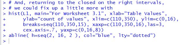
This gives the commands shown in Figure 29.
Figure 29
Running those commands changes the Console to appear as in Figure 30.
Figure 30
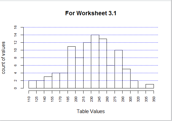
And, doing so produces the graph
shown in Figure 31.
Figure 31
It would be inapproprite to use a barplot for the data
in Table 1. Remembere that a barplot graphs the value given in the list.
In this case the first bar would be of height 264, the second of height 27, the third of height 277,
and so on.
We could, however, get a barplot of the frequency of each different value in
L1 by using the command barplot(table(L1)).
Figure 32
As usual, not much shows up on the Console pane.
Figure 33
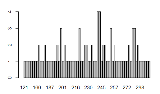
The generated barplot found in the Plot pane, is shown in Figure 34.
From that plot we can tell that 12 values appear twice,
five values appear three times , and two values appear 4 times.
However, it is really hard to figure out just what those multiple
values might be.
Figure 34
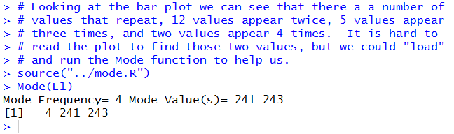
We do remember that to find the mode of the values in
L1 we can use the command Mode(L1), but
only after that function has been loaded into the Environment.
Figure 35
The result of running the two commands is shown in Figure 36 where we see that
there are two mode values, 241 and 243, and that each appeas 4 times in
the data.
Figure 36
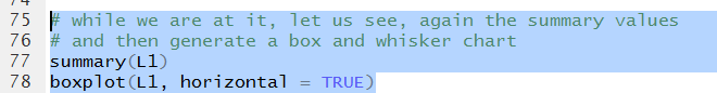
We can move on to explore a boxplot but it will help to recall the values
from our summary function at the same time.
Figure 37 has both commands. Note that the boxplot
command has been modified to include the
option horizontal=TRUE.
Figure 37
We see the output of the summary command
in Figure 38.
Figure 38
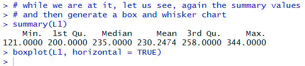
The boxplot is shown in Figure 39.
As expected, the heavy middle bar is at the median;
the left end of the box is at the 1st quartile;
the right end of the box is at the 3rd quartile;
the left end of the whisker is at the minimum; and
the right end of the whisker is at the maximum.
Figure 39
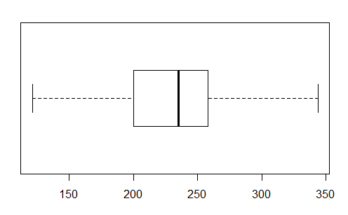
Again, as was the case with the histogram it is sufficient for this course
to be able to produce such a graph.
However, with just a few additional options we could dramatically improve the graph.
Figure 40 shows the changes that we would make.
Figure 40
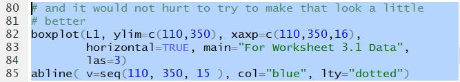
Figure 41 shows the resulting Console pane.
Figure 41
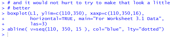
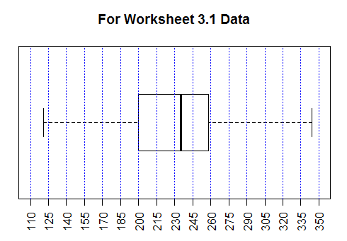
Figure 42 shows the new graph. It is much easier to approximate the
various values by reading this chart than it
was by reading the default chart shown in Figure 39.
Figure 42
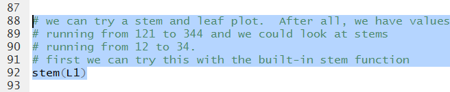
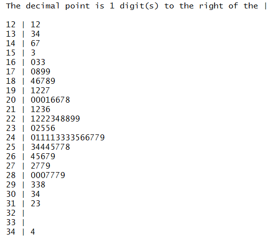
Another way to look at the data is via a stem and leaf diagram.
The built-in function is stem. We will just try that command.
Figure 43
The result is shown in Figure 44 below.
Figure 44
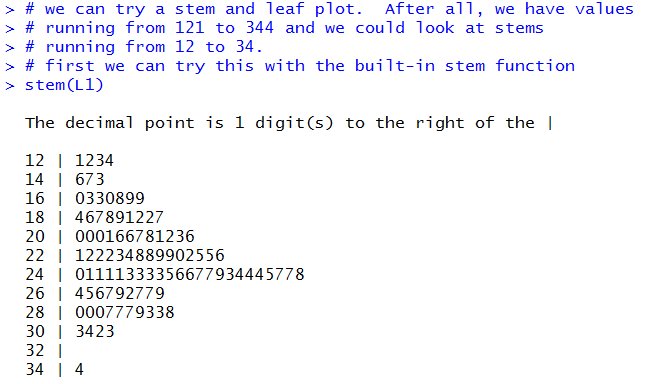
Figure 44 looks like a stem and leaf diagram.
It was produced from the data via R.
One would expect that it is completely correct.
However, it does seem a bit strange that the stems go up by 2.
Looking back at the original values we see that the second was
257 and the third was 277. Where are they in Figure 44?
The problem is that the built-in function groups values according to its own need.
For the stem function it seems to want to group values so that
the number of output lines remains fairly small. This produces the strange
arrangement that we see in Figure 44.
There is an option that we can specify to try to override that
behaviour. Figure 44.1 shows that modified command.
Figure 44.1
Running the command of Figure 44.1 produces the diagram shown in Figure 44.2
where we now find the complete set of values. Note that 257and 277 are both in
the new diagram.
Figure 44.2
Recognizing the default strange behavior of the built-in command, we do have
a different function that you can load and run, namely,
stem_leaf.
Those commands appear in Figure 45.
Figure 45

Running those commands produces the diagram shown in Figure 46.
Figure 46
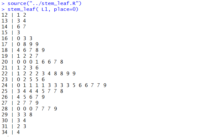
It is worth comparing these two solutions. Each has its advantages.
That leaves us with attempting a dot plot.
To do that we need to first load the function into our
Environment and then run the function.
Figure 47
The Console output, shown in Figure 48, doesnot tell us much
other than there were no errors.
Figure 48
The Plot pane, however, now holds the dot plot.
Figure 49
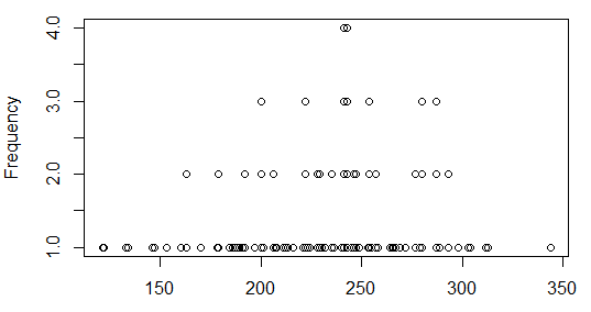
That plot is not particularly interesting. In fact, it is no more informative than was
the bar plot that we saw in Figure 34.
Before we leave we should make sure that we have saved our Editor file.
Because we have made changes in that file ts name appears in red
in its Editor tab, as we see in Figure 50.
Figure 50
By clicking on the floppy disk icon,
 , we save the file and turn its name to a black font
as in Figure 51.
, we save the file and turn its name to a black font
as in Figure 51.
Figure 51
Finally, we need to close our RStudio session.
we do that in the Console pane via the q()
command.
Press enter to perform the command and then
respond to the question with y and
use the Enter key again.
Figure 52
Here is a listing of the complete contents of the ws31.R
file:
#we want to use gnrnd4 to generate our data
# first we need to get that function into our
# environment
source("../gnrnd4.R")
# Then we can use it to generate our data
gnrnd4(503029604, 5200234)
# and we should at least look at it so that we can
# compare it to the table on the web page
L1
# Then we can get some descriptive measures
summary(L1)
# along with the sample standard deviation and variance
sd(L1)
sd(L1)^2
# and then the population standard deviation and variance
source("../pop_sd.R")
pop_sd(L1)
pop_sd(L1)^2
# The summary command did not give us many
# significant digits. Look at it another way...
xbar <- mean(L1)
xbar
# Here is another way to get more out of commands
# like summary
options(digits=10)
summary(L1)
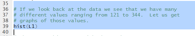
# If we look back at the data we see that we have many
# different values ranging from 121 to 344. Let us get
# graphs of those values.
hist(L1)
# That was a histogram with the various parameters set
# by R. We could, of course, specify some of them
# so that we get a nicer histogram. This is not
# a requirement of our course but it does not hurt to
# learn a little extra...
hist( L1, las=3, breaks=seq(110,350,15),
xaxp=c(110,350,16))
# Note that these intervals are closed on the right
# but we can change that with
hist( L1, las=3, breaks=seq(110,350,15),
xaxp=c(110,350,16), right=FALSE)
# And, returning to the closed on the right intervals,
# we could fix up a little more with
hist(L1, main="For Worksheet 3.1", xlab="Table Values",
ylab="count of values", xlim=c(110,350), ylim=c(0,16),
breaks=seq(110,350,15), xaxp=c(110,350,16),las=3,
cex.axis=.7, yaxp=c(0,16,8))
abline( h=seq(2, 16, 2 ), col="blue", lty="dotted")
# we could try to do a barplot, but remember that a barplot
# will show the count (i.e., frequency) of each unique value
barplot( table(L1) )
# Looking at the bar plot we can see that there a a number of
# values that repeat, 12 values appear twice, 5 values appear
# three times, and two values appear 4 times. It is hard to
# read the plot to find those two values, but we could "load"
# and run the Mode function to help us.
source("../mode.R")
Mode(L1)
# while we are at it, let us see, again the summary values
# and then generate a box and whisker chart
summary(L1)
boxplot(L1, horizontal = TRUE)
# and it would not hurt to try to make that look a little
# better
boxplot(L1, ylim=c(110,350), xaxp=c(110,350,16),
horizontal=TRUE, main="For Worksheet 3.1 Data",
las=3)
abline( v=seq(110, 350, 15 ), col="blue", lty="dotted")
# we can try a stem and leaf plot. After all, we have values
# running from 121 to 344 and we could look at stems
# running from 12 to 34.
# first we can try this with the built-in stem function
stem(L1)
# that produced some questionalbe output since, looking
# at the data we do not find a 123 but we do find a 133
# which is not in the stem-leaf plot. There is an option
# that may help this:
stem(L1, scale=3)
#And then we can load our version and try that...
source("../stem_leaf.R")
stem_leaf( L1, place=0)
# we can also do a dot plot, but that will not be much
# different from that bar plot that we did before.
source("../dot_plot.R")
dot_plot(L1)
Return to Topics page
©Roger M. Palay
Saline, MI 48176 January, 2017