Worksheet 02: Descriptive Measures
Return to Topics page
The task here is to come up with descriptive measures for the data in Table 1.
This page assumes that you have read through earlier pages and that you have
mastered many of the steps that we use to set up our work. [If that is not the case then
you should go back to the earlier pages where we walk through
all of those steps.]
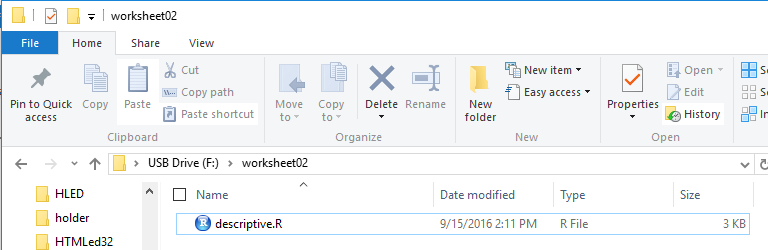
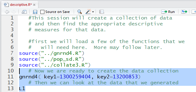
We start by inserting our special USB drive. On the computer
used for this demonstrations that drive was asigned the letter F.
Then we create a new folder on that drive.
For this demonstration I have used the name worksheet02.
We make a copy of the model.R file that is on the USB drive.
We open the new folder and paste the copy of the file into the new folder.
Finally, we rename the file; in this instance it has been called
descriptive.R. That leaves us in the situation shown in Figure 1.
Figure 1
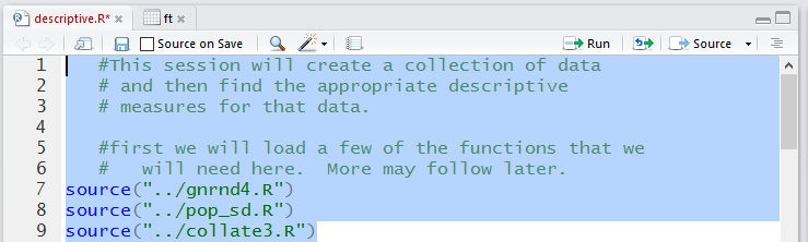
Then, double click on the descriptive.R file to open RStudio with
a copy of the contents of descriptive.R in the Editor pane.
Just thinking about the task at hand, we now that we will need to load a few
of the functions supplied on the USB drive. Figure 2 shows the comments
and commands written into the editor to start our project.
A complete listing of the commands that we will
use in this demonstration is given at the end of this page.]
Note that those lines have been highlighted. We click on the
 icon to have those highlighted commands prformed.
Figure 2
Note that those lines have been highlighted. We click on the
icon to have those highlighted commands prformed.
The result is shown in Figure 3.
Figure 3
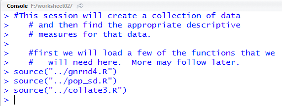
With no error messages in Figure 3 we assume everything went well.
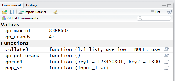
However, we can check in th Environment tab to
verify that the two functions have been loaded.
We see this as true in Figure 4.
Figure 4
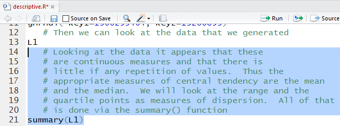
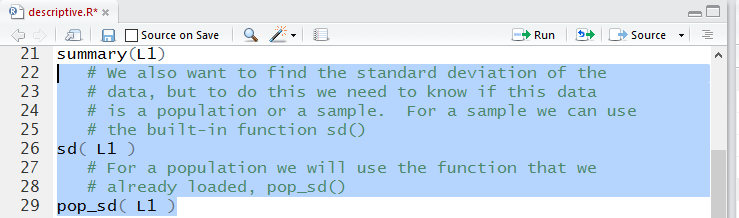
Back in the Editor pane, we can add the comments and commands
reguired to generate and list the new data.
Figure 5
Those lines were highlighted in Figure 5. We run them
to get the output shown in Figure 6.
Figure 6
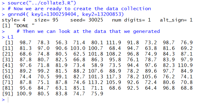
We make the essential check that the numbers we show in Figure 6 are
identical to those shown in Table 1.
They are so we can move forward. The summary() function will give
us lots of important descriptive values.
In Figure 7 you find a lengthy comment leading up to the
use of the summary() function.
Figure 7
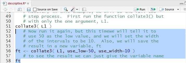
Once those lines are run we get the output shown in Figure 8.
Figure 8
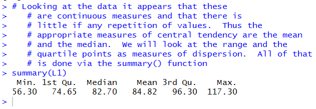
We see that
- the mean of the values in the table is 84.82,
- the median of the values in the table is 82.70, so half the values are less than 82.70
and half of them are greater than 82.70,
- the range of the values in the table is from 56.30 to 117.30,
- the first quartile, Q1, of the values in the table is 74.65, and
- the third quartile, Q3, of the values in the table is 96.30.
As noted in the comment, it would not make sense to find the mode
of the values in the table because there is so little repetition of values.
[In fact, 87.8 happens 3 times in the table but that is not much in a data collection of 95 values.]
We can compute the standard deviation, but we recall that there are two different
definitions depending upon if the data in Table 1 is a sample or
a population. Since nobody bothered to tell us that we will compute both of them.
Those commands are in Figure 9.
Figure 9
The result of running the commands is in Figure 10.
Figure 10
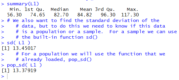
From that output we see that
- if this is a sample then the standard deviation is 13.45017, but
- if this is a population then the standard deviation is 13.37919.
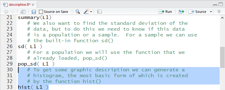
So much for the measures describing the data. Let us turn to
a picture of the data. The function
hist() will create such an image.
Figure 11
Running the highlighted text of Figure 11
does not produce an image in the Console
shown in Figure 12.
Figure 12
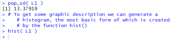
However, it does create the histogram shown in
Figure 13 in the Plot tab.
Figure 13
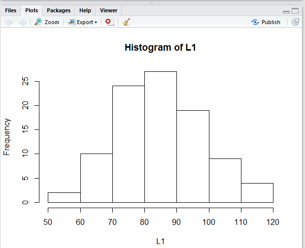
The histogram gives us quite a good feel for the
distribution of values in the data collection.
We can see that there are just a few extreme values and
that most of the values are clustered toward the middle.
Looing back at the mean (84.82) and the
median (82.70) we see that both values are in the tall
middle rectangle.
We can even try to read the frequency of values in each
"bin" in the figure. For example, it looks
like there are 10 values in the 60 to 70 range.
A box and whisker plot should give us a different view of
the data collection. The boxplot() function will produce
such a view.
Figure 14
Aagain, running the highlighted text of Figure 14
does not produce much in the Console pane shown in
Figure 15.
Figure 15
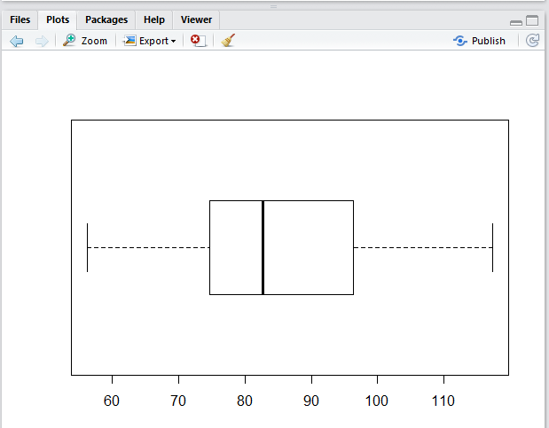
But it does produce, in the Plots tab,
the diagram shown in Figure 16.
Figure 16
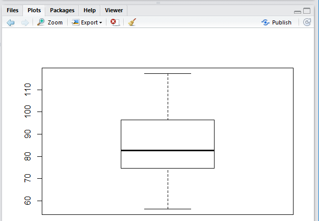
In Figure 16 we see the range of the values, the location
of the first and third quartiles, and the position of the median.
The vertical alignment of Figure 16 is merely the default alignment.
A horizontal alignment is often more pleasing. With just the small change shown in
Figure 17 we can ask for the alternative arrangement.
Figure 17
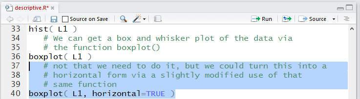
Figure 18 shows the horizontal box and whisker plot
of the same data.
Figure 18
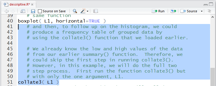
Having seen the hstogram before raises our expectations for getting
more detailed information about the distribution of values in the
data collection. A frequency table would provide much
more specific information about the values in the table.
When we first went through the development of a frequency table
we found that through a series of steps we could have R create such a table.
Rather than memorize and repeat those steps each time
that we want to build such a frequency table we developed
a function, called collate3(), that will create such a frequency table.
Recall that the process for building the frequency table depends upon us
specifying the lower end of the first "bin"
and the width of the "bins".
We wrote collate3() so that if we just give it the
data collection then it just tells us the
range of the collection and it suggests a width for the "bins".
Figure 19 shows the collate3() function when it is
just given the data collecton.
Figure 19
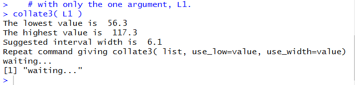
The result of running those higlighted lines is given in
Figure 20.
Figure 20
We, however, will construct our
"bins' to conform to the "bins" that R used in
making the histogram shown back in Figure 13.
In particular, we want to use the function as
collate3(L1,use_low=50,use_width=10)
as shown in Figure 21. Please note that the result
of the function (it produces an entire table) is assigned to a new
variable, in this case ft. Once ft
has been given a value we just use its name to cause the system to display its contents, namely, the
frequency table.
Figure 21
Running those highlighted statements produces the
output, in the Console pane, shown in Figure 22.
Figure 22
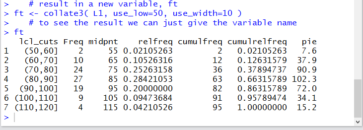
In that frequency table we see the actual number if items in each "bin",
along with the endpoints of each "bin", and th midpoint of each "bin'.
In addition we can see the relative frequency, the cumulative frequency,
the cumulative relative frequency,
and even the number of degrees that we would ascribe to sectors of a pie
chart for the data colloection.
The table of Figure 22 gives all of the inforamtion that we have,
but it is not pretty.
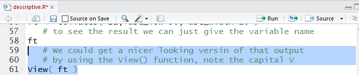
Figure 23 shows the command, View(ft),
that causes a pretty version of that same
table to appear as a new tab in the Editor pane.
Figure 23
Running the highlighted lines of Figure 23 produces no new output in the
Console pane as shown in Figure 24.
Figure 24
However, it does create a new tab in the Editor pane,
as shown in Figure 25, to show the pretty version of the frequency table.
Figure 25
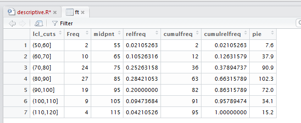
Figure 25 does not contain any more information than did Figure 22.
It just looks much better. [And, as was noted in the earlier introductory pages,
there are some extra features available in this new presentation, though we
will not present them again here.]
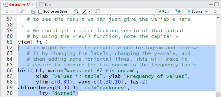
Before leaving this description of the data in Table 1 we note that
the frequency table gave a bit more specific data than we could read from the histogram.
However, we could enhance that histogram to make it much easier to read and understand.
This added enhancement is presented just to show you how to do
these sorts of things. You are not expected, in this course,
to be proficient at making such enhancements.
Figure 26 shows the enhanced and expanded commands.
Figure 26
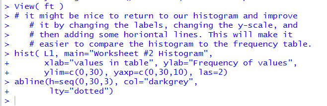
Once we run the commands highlighted in Figure 26 the
Console display is shown in Figure 27.
Figure 27
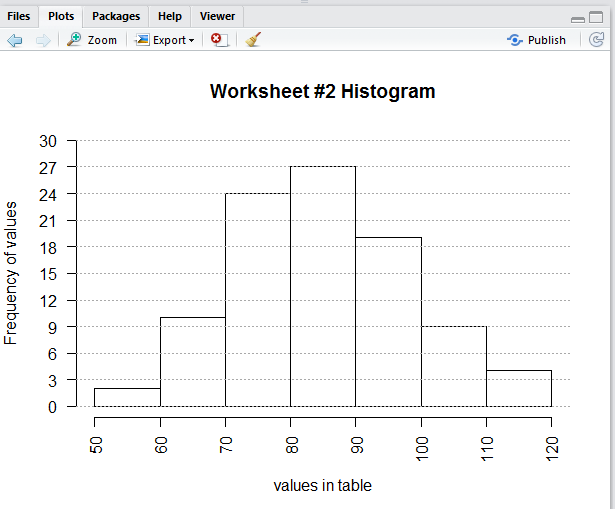
The enhanced histogram appears in th Plots tab shown in
Figure 28.
Figure 28
Before we leave all of this we should save the editor file.
We click on the descriptive.R tab there and then
click on the  icon.
Doing so will cause the file name to be displayed in black,
as shown in Figure 29.
icon.
Doing so will cause the file name to be displayed in black,
as shown in Figure 29.
Figure 29
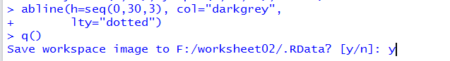
Then we use the q() function, and we respond to the prompt
with a y to quit our session, as shown in Figure 30.
Figure 30
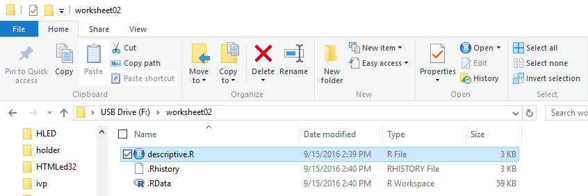
At that point, when we look at the folder, shown in Figure 31,
we should see not only our much larger
descriptive.R file but also, if we are on a PC, the two hidden files
.Rdata and .Rhistory which hold the working environment and
a historical list of all the commands that we gave in our session, respectively.
Figure 31
Here is a listing of the complete contents of the descriptive.R
file:
#This session will create a collection of data
# and then find the appropriate descriptive
# measures for that data.
#first we will load a few of the functions that we
# will need here. More may follow later.
source("../gnrnd4.R")
source("../pop_sd.R")
source("../collate3.R")
# Now we are ready to create the data collection
gnrnd4( key1=1300259404, key2=13200853)
# Then we can look at the data that we generated
L1
# Looking at the data it appears that these
# are continuous measures and that there is
# little if any repetition of values. Thus the
# appropriate measures of central tendency are the mean
# and the median. We will look at the range and the
# quartile points as measures of dispersion. All of that
# is done via the summary() function
summary(L1)
# We also want to find the standard deviation of the
# data, but to do this we need to know if this data
# is a population or a sample. For a sample we can use
# the built-in function sd()
sd( L1 )
# For a population we will use the function that we
# already loaded, pop_sd()
pop_sd( L1 )
# To get some graphic description we can generate a
# histogram, the most basic form of which is created
# by the function hist()
hist( L1 )
# We can get a box and whisker plot of the data via
# the function boxplot()
boxplot( L1 )
# not that we need to do it, but we could turn this into a
# horizontal form via a slightly modified use of that
# same function
boxplot( L1, horizontal=TRUE )
# and then, to follow up on the histogram, we could
# produce a frequency table of grouped data by
# using the collate3() function that we loaded earlier.
# We already know the low and high values of the data
# from our earlier summary() function. Therefore, we
# could skip the first step in running collate3().
# However, in this example, we will do the full two
# step process. First run the function collate3() but
# with only the one argument, L1.
collate3( L1 )
# Now run it again, but this time we will tell it to
# use 50 as the low value, and we will set the width
# of the intervals to be 10. Also, we will save the
# result in a new variable, ft
ft <- collate3( L1, use_low=50, use_width=10 )
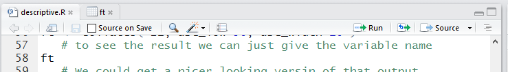
# to see the result we can just give the variable name
ft
# We could get a nicer looking version of that output
# by using the View() function, note the capital V
View( ft )
# it might be nice to return to our histogram and improve
# it by changing the labels, changing the y-scale, and
# then adding some horiontal lines. This will make it
# easier to compare the histogram to the frequency table.
hist( L1, main="Worksheet #2 Histogram",
xlab="values in table", ylab="Frequency of values",
ylim=c(0,30), yaxp=c(0,30,10), las=2)
abline(h=seq(0,30,3), col="darkgrey",
lty="dotted")
Return to Topics page
©Roger M. Palay
Saline, MI 48176 September, 2016