Interpolation and Extrapolation
Return to Topics page
In the context of linear regressions, interpolation
and extrapolation both involve finding the expected
value(s), derived from the regression equation,
based on independent variable values(s).
[We will distinguish between interpolation
and extrapolation below.]
For example, if
we have the equation y = 7.3633 + 0.5685*x,
what is the expected value of y if the value of x is15?
To illustrate this, we will use the data in Table 1.
Here is one version of some commands that will generate that data and
do a linear regression on it.
gnrnd4( key1=789321006, key2=6120480812, key3=5500010 )
L1
L2
summary(L1)
summary(L2)
lm_L2L1 <- lm(L2~L1)
lm_L2L1
cor(L1,L2)
Figure 1 holds the image of the console after running those commands.
Figure 1
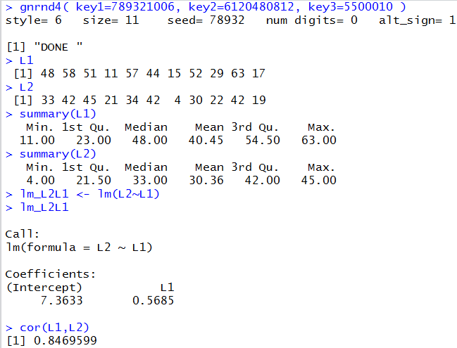
From the information in Figure 1 we see that the
regression equation is
y = 7.3633 + 0.5685*x.
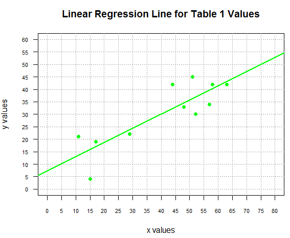
The following commands generate the plot of the points and the
regression line shown in Figure 2.
plot(L1,L2, xlab="x values", ylab="y values",
     main="Linear Regression Line for Table 1 Values",
     xlim=c(0,80), ylim=c(0,60),
     xaxp=c(0,80,16), yaxp=c(0,60,12),
     pch=19, col="green", las=1, cex.axis=0.7
     )
abline( v=seq(0,80,5),col="darkgray", lty=3)
abline( h=seq(0,60,5),col="darkgray", lty=3)
abline(lm_L2L1, col="green", lwd=2)
Figure 2
Let us return to our question.
We have the equation y = 7.3633 + 0.5685*x,
what is the expected value of y if the value of x is15?
Clearly, we just need to evaluate 7.3633 + 0.5685*15.
We could do this by hand, on a calculator, or on the computer.
Using R, we could just give the command
7.3633+0.5685*15 and get the results, as shown in Figure 3.
Figure 3
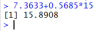
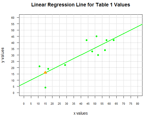
What we have found is that the point (15,15.8908) is on our
regression line. We can add that point to our plot
by giving the command
points(15,15.8908, pch=5, col="orange", cex=1.5)
and we can see this in Figure 4.
Figure 4
In Figure 3 we saw how to find one point on the line, but what if we want to find
a number of points, say all of the points
with x values from 20 to 55 in steps of 5?
One solution, just to find the dependent y values,
would be to use the command
7.3633+0.5685*seq(20,55,5)
shown in the console image in Figure 5
Figure 5

Now that we know those values we could create a points()
command for each of them. But that seems a bit much.
A more efficient approach is to put all of the
independent x values into a variable, use
that variable to create a corresponding sequence of
dependent y values and then plot the two
sequences in one points() command. We could do this with
x_vals <- seq(20,55,5)
y_vals <- 7.3633+0.5685*x_vals
points(x_vals,y_vals, pch=17, col="red", cex=1.5)
with the result being shown in Figure 6.
Figure 6
Of course, part of the process that we just went through involved
reading the output of the lm() command, shown back in Figure 1,
to find the values for the intercept and coefficient of x.
Then we had to transcribe those values to form our commands, such as
y_vals<-7.3633+0.5685*x_vals. It might have been better if we
could have R find and use those values directly.
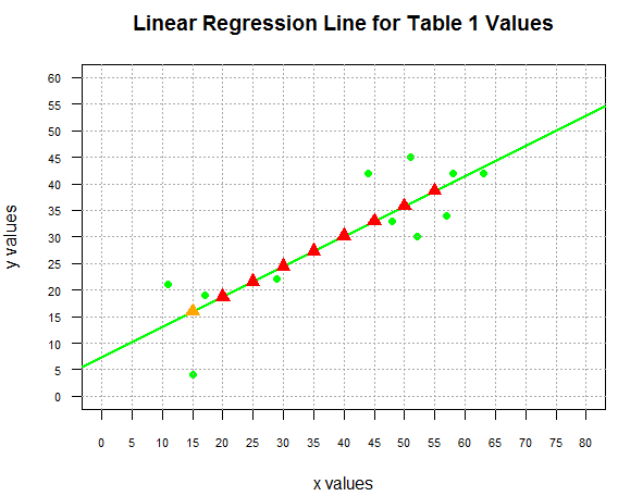
The following commands do just that
c_vals <- coefficients(lm_L2L1)
c_vals
x_vals <- seq(22.5,57.5,5)
y_vals <- c_vals[1]+c_vals[2]*x_vals
points(x_vals,y_vals, pch=17, col="blue")
In an earlier page we had seen the use of the coefficients() command to
extract the desired values from the model. In the commands above, we follow
that with a command that just displays the extracted values.
We use that command, in this example, just to confirm the values.
This is shown in Figure 7.
Figure 7
The values shown in Figure 7 have more significant digits
than what we saw in Figure 1. By using the coefficients()
function to extract those values we will be able to use
the slightly more exact representation of the true value
(remember that even our new values are just rounded to 7 secimal places).
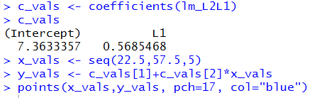
Returning our attention to the commands listed above,
to demonstrate using the extracted values
we create a new sequence of independent x values and
use them to compute, via the two values in c_vals, the
corresponding dependent y values.
These new values are then used to plot the new points,
shown in Figure 8.
Figure 8
Of course, if we had actually wanted to know those
dependent values, rather than trying to read them from the graph
we could just use the command y_vals to get the
values displayed in the console pane, shown in Figure 9.
Figure 9

Interpolation
All of the values that we have computed above are examples of interpolation
because all of the independent values (the x-values) used to
produced those values fell within the range
of the x values used to produce the linear regression coefficients.
Notice, back in Figure 1,
when we displayed the summary(L1)
that the minimum value was 11 and the maximum
value was 63.
In each instance above, the x values that we used fell between the
minimum and maximum values in L1.
We feel somewhat safe in interpolating values within this range
because we have observed values that surround the values we are
interpolating.
This particular example does provide us with a region where we have
a gap in the x values in the original
data, namely, we jump from 29 to 44.
That means that we do not have any
observed values in that region.
Nonetheless, we have values around the gap and therefore,
we still feel comfortable doing the interpolation.
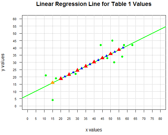
Extrapolation
Up to this point we have not seen any examples of extrapolation.
We extrapolate when we use the regression equation to
produce a y value from an x value that is outside the
range of the observed x values.
Thus, in our example, if we were to
ask for the expected value when x=80 we would be doing an
extrapolation.
The mathematics is the same. We could just use the command
7.3633+0.5685*80 to compute the value,
finding that it is 52.8433
and we could plot that point via
points(80,52.8433, pch=25, col="brown", cex=1.5)
as shown in Figure 10.
Figure 10
Although we "can" do the extrapolation we should be quite cautious
about doing so. The model that we have, the straight line model,
is derived from the observed points. We feel somewhat confident
that the model is a good one
though not a great one since the correlation coefficient
shown back in Figure 1 was 0.8469599.
However, we have no particular indication that the model will hold beyond (on either
the low or the high side) the observed data range.
Let us explore this with some real life data.
As it turns out, I have been keeping track of my heart rate during
exercise. I have the following table of values.
We can use the following commands
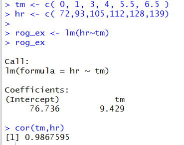
tm <- c( 0, 1, 3, 4, 5.5, 6.5 )
hr <- c( 72,93,105,112,128,139)

rog_ex <- lm(hr~tm)
rog_ex
cor(tm,hr)
to create our model of this data. The result is shown in Figure 11.
Figure 11
We can use the following commands
plot( tm,hr, xlab="Time in minutes",
      ylab="Heart Rate in beats per minute",
      main="Roger's Exercise Record",
      xlim=c(0,10), xaxp=c(0,10,10),
      ylim=c(0,220), yaxp=c(0,220,22),
      pch=19, col="red", las=1, cex.axis=0.7
      )
abline( v=seq(0,10,1), col="darkgray", lty=3)
abline( h=seq(0,220,10), col="darkgray", lty=3)
abline( rog_ex, col="blue", lwd=2)
to generate the plot in Figure 12.
Figure 12
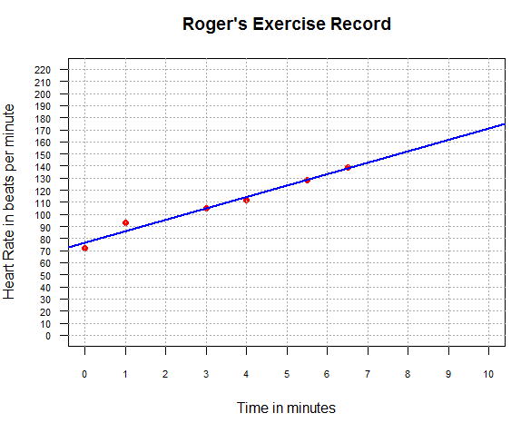
From Figure 11 and Figure 12 it seems that our
linear model is quite good. We can get interpolated values for
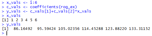
minutes 1 through 6 by performing the following commands:
x_vals <- 1:6
c_vals <- coefficients(rog_ex)
y_vals <- c_vals[1]+c_vals[2]*x_vals
x_vals
y_vals
and the results of those commands are shown in Figure 13.
Figure 13
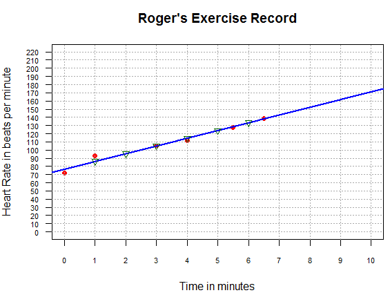
Then we can add those points to the graph
via the command points(x_vals, y_vals, pch=6, col="darkgreen")
to produce the image shown in Figure 14.
Figure 14
The values that we found for time equal to 2, 5, and 6 minutes,
namely, about 96, 124, and 133, are quite likely to be really close to the
actual values that I experienced in that exercise session.
On the other hand, we could follow the similar steps
to extrapolate values for time equal to 10, 20, and 30 minutes.
The commands that we use would be
x_vals <- seq(10,30,10)
c_vals <- coefficients(rog_ex)
y_vals <- c_vals[1]+c_vals[2]*x_vals
x_vals
y_vals
and the results of those commands are shown in Figure 15.
Figure 15
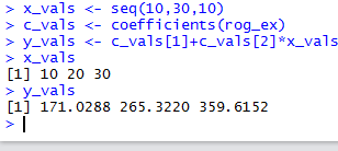
These results demonstrate the danger of extrapolation.
We can certainly compute the values but a quick examination
of the results shows that they cannot be accurately
predicing my heart rate at those times.
For those of you who are not familiar with human heart rates
I will merely point out that at my age, as I write this, my expected
maximum heart rate is about 141. Or, to put it more
bluntly, if I were to exercise hard enough to try to get my heart rate
to 170 I would certainly pass out, if not die, before reaching that goal.
Getting my heart rate to 265 or 360 is just not going to happen.
What we see here is that the recorded data,
the original data in Table Roger's Exercise Record, represents a
pattern of increasing heart rate over time. That pattern just
cannot be sustained over a longer period of time. The model for the
first 6 minutes
cannot be the model for the following 24 minutes.
The absurdity of blindly applying the model to values
outside the observed range is even more evident if we
were to extrapolate to predict my hear rate ten minutes
before I started to exercise.
That computation, which we could do, would produce a negative heart rate
at time -10 minutes, that is 10 minutes before I started to exercise.
Return to Topics page
©Roger M. Palay
Saline, MI 48176 September, 2025