Classifications of distributions
Return to Topics page
In general there are at least five "typical" distributions that we classify
with special names. These are a uniform distribution, a skewed distribution (both left and right skewed),
a normal or "bell-shaped" distribution, and a bimodal distribution.
On this page we will look at a histogram for each classification.
Histograms provide a good visual for distinguishing these classifications.
We will also look at a box and whisker plot of each. It is useful to look at
these box plots but they are not as useful as are the histograms.
Uniform Distribution
A uniform distribution has values that are evenly spread out across the range of values.
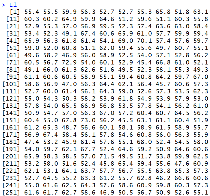
Thus, we might look at the values shown in Figure 1.
Figure 1
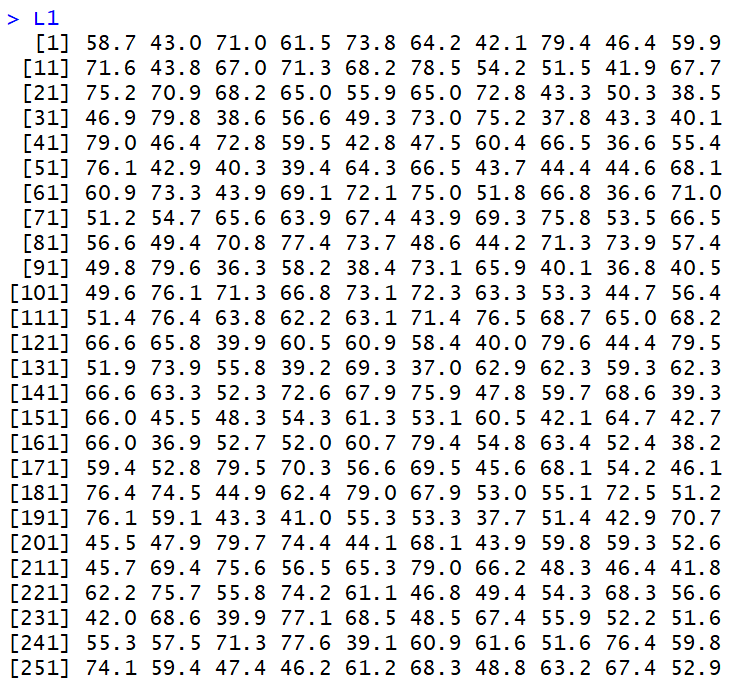
These 260 values are spread out between 36 and 80 in a fairly uniform manner. That is,
if we break the range up into evenly spaced intervals we expect to see about the same number of
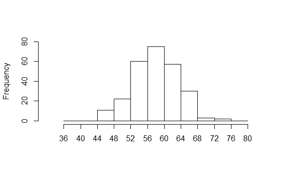
values in each interval. The histogram of the data, shown in Figure 2, demonstrates this.
Figure 2
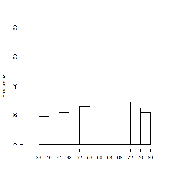
We do not expect that there will be exactly the same number of values in
each interval, but we do expect that there will be approximately the same number of values for each interval.
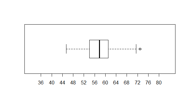
We can look at the box plot for that data, shown in Figure 3.
Figure 3
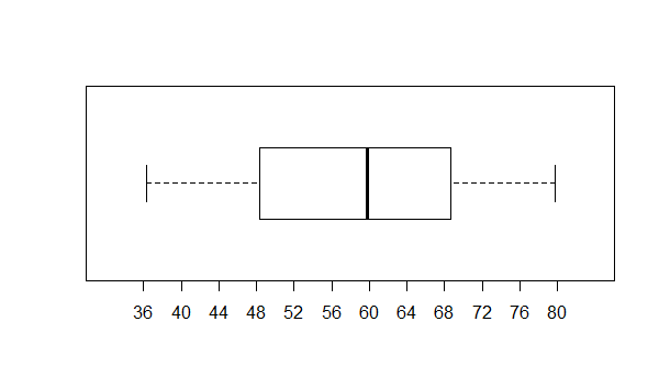
There is not much in Figure 3 to distinguish this data from
data we will see later for the normal and bimodal characteristics.
We might note, however that the box shows that each 1/4 of the data
is spread out over about the same span. That is, the two whiskers are about
as long as are the two halves of the box.
Skewed Right Distribution
The data shown in Figure 4 also ranges between 36 and 80.
Figure 4
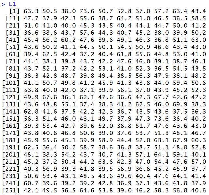
However, the
values are bunched up at the lower end of that range.
We can see that when we look at the histogram
of the data, shown in Figure 5.
Figure 5
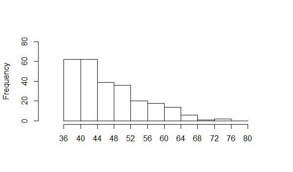
This is an example of data that is said to be skewed to the right.
It may seem strange that we say to the right" when the data piles up
on the left, but the "direction of the skew" is toward the long tail.
In our example, that long tail is on the right.
Figure 6 holds a box plot of the data.
Figure 6
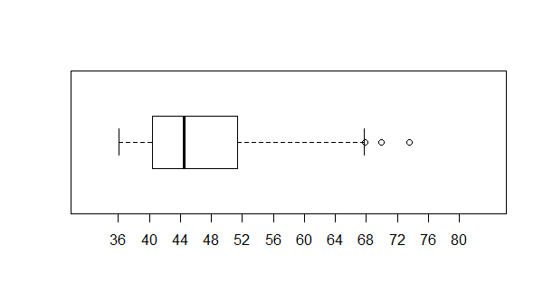
It is not a shock to see the box from Q1
to Q3 way over to the left of the plot.
Nor is it a shock to see the long "whisker" extending to the right
of Q3. This conforms to our idea of skewed to the right
having data values bunched up to the left with the long tail extending to the right.
Skewed Left Distribution
Figure 7 holds data, again in the range of 36 to 80, but this time
bunched up on the right.
Figure 7
We can see this by looking at the histogram shown in Figure 8.
Again, the "long tail" extends to the left and we call this kind
of distribution skewed to the left, in the direction of
the long tail.
Figure 8
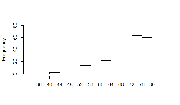
Figure 9 shows the box plot.
Figure 9
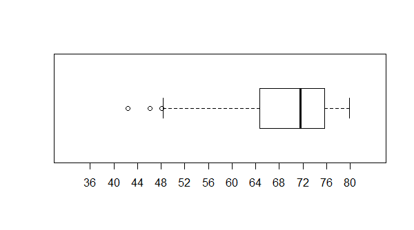
As expected the box is over on the right with the long whisker extending to the left.
Normal Distribution
Somewhat later in this course we will look at the Normal distribution much more carefully.
In fact, we will even get a way to tell if a set of data is normally distributed. However, at this
time we will say that a normal distribution should have most of the values in the middle and it should have two, approximately equal, tails
that go off to the sides. The values in Figure 10 meet that definition.
Figure 10
If we look at a histogram of those values, shown in Figure 11,
we will see the concentration of values close to the middle but
with values trailing off in either direction.
Figure 11
Some note should be made here to the effect that the impression
of the histogram is that of a bell shape. It is essentially balanced around its middle value and
that middle range has the most number of values in it. In our language, that middle range
is the "modal" range, having the highest frequency of values. Because the values are balanced around the
middle, we also expect that the mean of the data will
be close to that middle.
Again, a look at the box plot, in Figure 12, is instructive.
Figure 12
The box plot is similar to the one we saw in Figure 3.
The box is in the middle and the whiskers are approximately the same length.
However, the box in Figure 12 is narrower than was the one in Figure 3. That is because we have
a high concentration of values close to the median of the data.
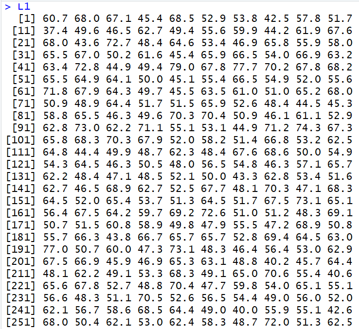
Bimodal Distribution
Again, the data in Figure 13 falls in the range from 36 to 84.
Figure 13
However, this
time we have two modal areas. We can see this when we look at the histogram shown in Figure 14.
Figure 14
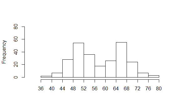
We have one concentration in the interval from 48 to 52 and another popular area from
64 to 68. This is called a bimodal distribution. Such a distribution is indicative
of having two different kinds of things in the sample (or population).
For example, we might look at the percent fat of people (how much of their body weight is made up of fat tissue).
A distribution of that measure would be bimodal because the population is made up of males and females
and those two groups have significantly different average percent body fat.
Again, we look at the box plot, this time in Figure 15.
Figure 15
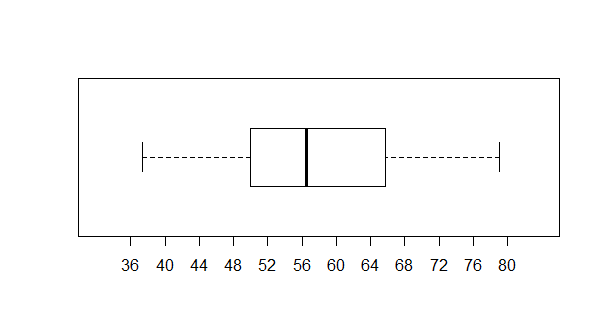
The bar plot of this distribution, in this example, is not that different from
the plot shown in Figure 3. The box is wider than the box of Figure 12,
but much of that is related to the particular
example here where the two modal regions are similar and not two far apart.
The discussion above illustrates the usefulness of the histogram in
characterizing data sets. We also saw that although the box plot was
helpful for identifying skewed data sets, both left and right, it was not
of much help with the other styles.
Below is a listing of the R commands used to produce the
data values and graphs used in this page.
# let us try to create some example distributions
# uniform
source( "../gnrnd5.R")
gnrnd5(key1=186754025901, key2=438000361)
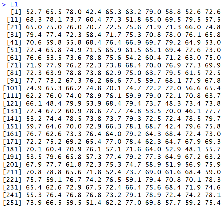
summary(L1)
L1
hist(L1,ylim=c(0,80), xlim=c(32,84),
breaks=seq(36,80,by=4), main="",
xaxp=c(36,80,11),
xlab="")
boxplot(L1,horizontal=TRUE,
ylim=c(32,84),xaxp=c(36,80,11)
)
# skewed right
gnrnd5(key1=187854025902, key2=438000361)
summary(L1)
L1
hist(L1,ylim=c(0,80), xlim=c(32,84),
breaks=seq(36,80,by=4), main="",
xaxp=c(36,80,11),
xlab="")
boxplot(L1,horizontal=TRUE,
ylim=c(32,84),xaxp=c(36,80,11)
)
# skewed left
gnrnd5(key1=187854025903, key2=438000361)
summary(L1)
L1
hist(L1,ylim=c(0,80), xlim=c(32,84),
breaks=seq(36,80,by=4), main="",
xaxp=c(36,80,11),
xlab="")
boxplot(L1,horizontal=TRUE,
ylim=c(32,84),xaxp=c(36,80,11)
)
# normal
gnrnd5(key1=183454025904, key2=52000580)
summary(L1)
L1
hist(L1,ylim=c(0,80), xlim=c(32,84),
breaks=seq(36,80,by=4), main="",
xaxp=c(36,80,11),
xlab="")
boxplot(L1,horizontal=TRUE,
ylim=c(32,84),xaxp=c(36,80,11)
)
# bimodal
gnrnd5( key1=178854025905, key2=45000500, key3=44000660)
summary(L1)
L1
hist(L1,ylim=c(0,80), xlim=c(32,84),
breaks=seq(36,80,by=4), main="",
xaxp=c(36,80,11),
xlab="")
boxplot(L1,horizontal=TRUE,
ylim=c(32,84),xaxp=c(36,80,11)
)
Return to Topics page
©Roger M. Palay
Saline, MI 48176 January, 2019