To demonstrate these steps we need to start with some data. We will use the
GNRND4 program on the calcualtor to generate this data.
We will generate the same list of values here.
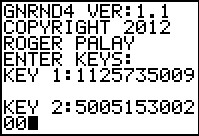
As noted in Figure 5, we generated the list of data on the calculator using
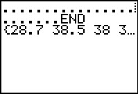
GNRND4 with Key 1=1125735009 and Key 2=500515300200. That list, shown in Figures 6 and 7,
has the same numbers that appear in the following table:
Figure 8
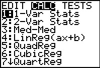 |
Continuing with the calculator, we press  to
open the STAT menu, then use the to
open the STAT menu, then use the  key to move to the CALC sub-menu shown in Figure 8.
The command that we want is the first one, 1-Var Stats.
We press  to select that command and
paste it to the main screen. to select that command and
paste it to the main screen.
|
Figure 9
 |
The 1-Var Stats command, when given by itself, will do an analysis of
the values in L1. That is exactly where the GNRND4
program put our numbers. Thus, we are ready to perform the command.
To do that we press the key.
|
Figure 10
 |
The calculator does the analysis and then provides 11 lines of output, the first six of which are immediately
available on the screen. Here we see that the mean of the data is 37.21372549 to 10 significant digits.
(There is little chance that we really need so many digits, but the calculator is happy to provide them
anyway.)
The next line, 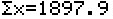 , provides us with
the sum of all the values. We follow that
with the line , provides us with
the sum of all the values. We follow that
with the line  .
This gives us the sum of the squares of all the values. .
This gives us the sum of the squares of all the values.
The line 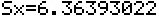 displays
the calculated sample standard deviation of the values
in our list, while displays
the calculated sample standard deviation of the values
in our list, while
 displays
the population standard deviation of those values.
Finally, this page indicates that the size of the sample or population is 51 items.
THe down arrow to the left of the n=51 merely indicates that there are more values to
display.
We use the displays
the population standard deviation of those values.
Finally, this page indicates that the size of the sample or population is 51 items.
THe down arrow to the left of the n=51 merely indicates that there are more values to
display.
We use the  key to scroll down to see those values. key to scroll down to see those values.
|
Figure 11
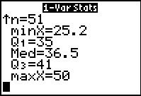 |
The remaining values are the five quartile points:
| Q0 | the lowest value | Minimum Value |
| Q1 | 25% point | First quartile point |
| Q2 | the middle value, 50% | Median Value |
| Q3 | 75% point | Third quartile point |
| Q4 | the hiighest value | Maximum Value |
|
Figure 12
 |
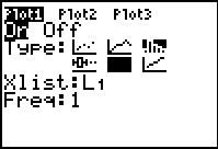
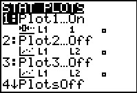
A Box-and-whisker plot gives a graphic representation of
the five
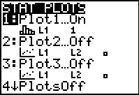
quartile values noted above. To get that Box-and-whisker plot we return to the
STAT PLOT menu via the

 keys. Here we see that Plot1 is On and that
it is set for a histogram based on L1 with
no list of the frequency of the individual items in the list. Clearly, to
obtain a Box-and-whisker plot we need to make some changes to Plot1.
Since that plot is already highlighted, press the
to move to the Plot1 settings screen shown in Figure 13. keys. Here we see that Plot1 is On and that
it is set for a histogram based on L1 with
no list of the frequency of the individual items in the list. Clearly, to
obtain a Box-and-whisker plot we need to make some changes to Plot1.
Since that plot is already highlighted, press the
to move to the Plot1 settings screen shown in Figure 13.
|
Figure 13
 |
Figure 13 shows the Plot1 settings before we have made any changes to them.
We want to change the Type: setting from histogram, shown selected as
 , to the
Box-and-whisker icon, shown unselected as , to the
Box-and-whisker icon, shown unselected as
 . .
|
Figure 14
 |
To make this selection we move the cursor to the desired spot,
shown in Figure 14, and then press to actually
make the selection. Once the selection is made the Box-and-whisker
choice will appear as
 .
[Note that the image shown here was captured before the ENTER
key was pressed. We can see that because the histogram icon is still selected.
After the ENTER key is pressed the histogram icon will change to .
[Note that the image shown here was captured before the ENTER
key was pressed. We can see that because the histogram icon is still selected.
After the ENTER key is pressed the histogram icon will change to
 .] .]
|
Figure 15
 |
After we set the Type: to the ,
we can move directly to the ZOOM menu, and then move down the
menu to the 9th option, ZoomStat. We then select that
option. This will cause the calculator to examine the data associated with the
Plots that are turned ON, to adjust, based on those values, the
WINDOW settings, and then display the image, as shown in Figure 16.
|
Figure 16
 |
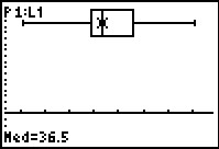
The Box-and-whisker plot for our data is shown here. We recall the values that we saw above.
| 25.2 | Q0 | the lowest value | Minimum Value |
| 35.0 | Q1 | 25% point | First quartile point |
| 36.5 | Q2 | the middle value, 50% | Median Value |
| 41.0 | Q3 | 75% point | Third quartile point |
| 50.0 | Q4 | the hiighest value | Maximum Value |
The Box-and-whisker plot shows us the relationship between these values. It is
easier to see, in the plot, that the middle two quartiles are in the middle of the range,
that the second quartile is quite narrow, and that the first and fourth quartiles are wider
than are the middle two.
|
Figure 17
 |
As a small demonstration of another calculator capability, we can move into
TRACE mode by pressing the  key. The plot changes to highlight the median value on the chart and to display
the actual value of the median and the bottom of the screen. We can use the cursor keys to
move the highlight to other quartile points.
key. The plot changes to highlight the median value on the chart and to display
the actual value of the median and the bottom of the screen. We can use the cursor keys to
move the highlight to other quartile points.
|
Figure 18
 |
One of the concerns that we always face is that of identifying any outliers in the data.
Our "rule" for doing this is to first compute an intra-quartile range (IQR) as the value of
Q3–Q1, or in this case, 41–35=6.
Then we take 1.5 times that value, (1.5)*6=9 and we use that value to set limits, one below
Q1 and one above Q3. In this particular case
that puts us at Q1–9=35–9=26 and
Q3+9=41+9=50.
These are the lower and upper limits, respectively. Any data values outside
of those limits are considered outliers. For our data set we immediately know tat
we have at least one such outlier because
the minimum data value is 25.2 which is below the lower limit that we found,
namely, 26.
There is a modified Box-and-whisker plot that depicts the lower and upper limits.
We return to the STATS PLOT menu,
via ,
choose the Plot in which we will change our settings to that style. Once there we can press
to select Plot1.
|
Figure 19
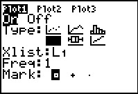 |
In the Plot1
screen we have moved the highlight to the  icon and pressed . (Unfortunately, we cannot see directly
that the modified Box-and-whisker icon has been selected because the screen
was captured as the blinking cursor covered the icon. However, since
no other Type: is selected we are sure that we have selected this one.)
icon and pressed . (Unfortunately, we cannot see directly
that the modified Box-and-whisker icon has been selected because the screen
was captured as the blinking cursor covered the icon. However, since
no other Type: is selected we are sure that we have selected this one.)
|
Figure 20
 |
Having made the selection we return, via  .
to the ZOOM menu. We could scroll down to our desired
ZoomStat. However, at this point we have done this so often that
we know it it the 9th option.
Therefore, we will just press the .
to the ZOOM menu. We could scroll down to our desired
ZoomStat. However, at this point we have done this so often that
we know it it the 9th option.
Therefore, we will just press the  key
to select that option. key
to select that option.
|
Figure 21
 |
The display is now that of the modified Box-and-whiskerr plot.
Note that the "whiskers" only extend to the ends of the
lower limit (Q1–1.5*IQR) and the
upper limit (Q3+1.5*IQR). Furthermore,
the one outlier in our data set is identified by a mark
beyond the "whisker".
|
Figure 22
 |
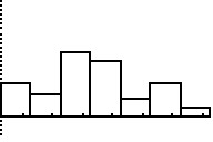
It might be interesting to now view the same data with a historgram.
To change our plot to such a histogram we first return to the
STAT PLOT menu via
. Then we move to the
Plot1/B> settings via the key.
|
Figure 23
 |
This capture of the Plot1 settings is after we have moved
to the icon
and pressed to select it and change it
to the icon.
|
Figure 24
 |
Use to return to the ZOOM menu.
Use to select the ZoomStat action.
|
Figure 25
 |
Here is the graph of the data.
|
Figure 26
 |
Here we have pressed the column is
highlighted and the range of that
key to move to TRACE mode. The first
column is highlighted and the range of that
column along with the count of items in that range is given at the bottom of the screen.
|
Figure 27
 |
We use the cursor keys to change the column selection.
In Figure 27 we have moved the selection to the rightmost column.
THe calculator chose the breakpoints for the columns. We may want to set up different breakpoints.
To do this we press
 to open the WINDOW settings. to open the WINDOW settings.
|
Figure 28
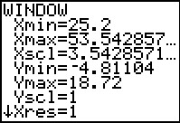 |
These were the values that the ZoomStat action derived from the
data in L1. We can change any of these.
|
Figure 29
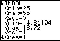 |
We will reorganize the chart by having the first column start at 25 and setting the
column width to 5. That means, if we want the maximum value, 50, to be in a column,
then we will need to have a final column tha tgoes from 50 to 55. Therefore,
we want to set the Xmax value to 55.
|
Figure 30
 |
Press  to display the new histogram. to display the new histogram.
There is an obvious problem with this histogram.
the third column is off the screen. We cannot see the top of that column.
We can move into TRACE mode to gather more information.
|
Figure 31
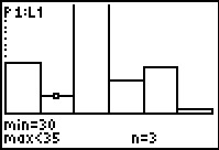 |
Figure 31 shows the calculator in TRACE mode and after we have
used to move the highlight to the second column.
|
Figure 32
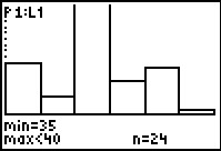 |
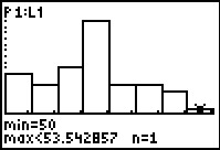
We use again to look at the third column. Here we note, at the bottom of the screen,
that there we 24 items in the range for this column. If we glance back to Figure 29 we see that
the Ymax value was left at 18.72, well below the 24 items in this column.
We will need to change that Ymax setting.
|
Figure 33
 |
We have made three changes here. We changed the column width to 4.
THis will give us 7 columns. We have changed the max value to 53,
corresponding to the 7 columns. And, we have changed the Ymax value
to 25. This will accomodate the 24 items that we found earlier, but we
should remember that by changing the column width we will probably change the number
of items in each column.
|
Figure 34
 |
Returning to the histogram by pressing
we see the effect of the new settings. It would seem that we made
a bigger adjustment to the Ymax value than we needed to do once we
changed the column width.
|
Figure 35
 |
Moving back into TRACE mode, via the key,
we can see that there are 7 items in that first class (the first column).
We could continue to move across the classes to get the count of items
in each class. Alternatively,
we could run the COLLATE3 program and do that and more.
|
Figure 36
 |
Here we have started the COLLATE3 program. It asks for the
location of the data. We respond with
L1.
Then press to have the program continue.
|
Figure 37
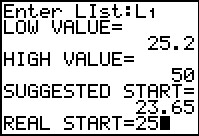 |
The program reads all the data and reports that the lowest value found
was 25.2 and the highest was 50. Using its own "strange"
algorithm, the program suggests a starting value
for our first class should be 23.65. We, however, want our first class to start at 25.
We enter that value and press to continue.
|
Figure 38
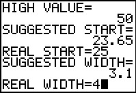 |
The program responds by suggesting a class (column) width
of 3.1, but we want to use a class width of 4.
We enter that value and press .
|
Figure 39
 |
The output from the program gives us the same values
that we got from 1-VAR STATS back in Figure 10
but this time those values have been rounded to 2 decimal places.
The COLLATE3
program is still running at this point, but it is in a paused
condition, waiting for us to press
before it continues with its output.
|
Figure 40
 |
Figure 40 has the rest of the output from the program.
So far it does not look like there is much advantage to
running COLLATE3. However, that program does much more than just
produce the out we have seen. In particular, that program creates
six lists of values and it sets the StatEditor to display those
lists when the user chooses the Edit... option in the STAT
nebu.
|
Figure 41
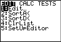 |
We press to open that menu and
then to select the highlighted optin,
Edit...
|
Figure 42
 |
The StatEditor opens showing the values in three lists, along with
the name of each list. The highlight is on the first item in the first list.
The name and index of that item is shown at the bottom of the page along with the value
that is in that indexed position of that list.
Each row of data, i.e., each of the list items with a the same index number,
represents attributes of the class associated with the given index.
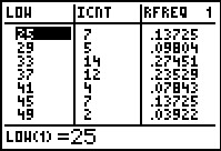
Thus, reading across the first data line in Figure 43, we see that the
first class starts at 25, that 7 of the values in
L1 fall into the first class, and that
0.13725 (i.e., 13.725%) of the values are in this first class.
Because the second class has a LOW value of 29 we know that the first
class is really values 25≤x<100.
Remembering that each "row" across the various lists holds the attributes of
a single "class" (i.e., grouping) of values in the original user specified list,
the following table gives the names and intended use of the lists produced by
COLLATE3.
List
name |
Intended use for this List |
| LOW | Class Lower Limit: the lowest allowed value in this class.
Note that there is an extra entry in this list. That final entry gives the lower limit
of what would be the next class if there were one. |
| ICNT | Class Frequency:
the number of values found in the user specified list that are in this class |
| RFREQ | Class Relative Frequency:
the relative frequency of the values that fall into this class. This is just the number
of items in the class divided by the total number of items in the original
user specified list. |
| CMCNT | Class Cumulative Frequency:
the sum of the class frequencies up to and including this class. |
| CRFRQ | Class Cumulative Relative Frequency:
the sum of the class relative frequencies up to and including this class |
| DPIE | Degrees in a Pie Chart:
the number of degrees that should be allocated in a pie chart to this class.
This is just 360*ICNT/(total number of items). |
|
Figure 43
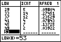 |
For FIgure 43 we have moved down the fist list to see that there is indeed
an 8th entry representing the lower limit of an
8th class if there were an 8th
class. Of course, this is also the upper limit of the 7th
class. Again, note that the index of the class is displayed in the
last line of the display.
|
Figure 44
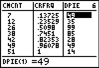 |
For Figure 43 we have moved back to the top of the lists and moved to
the right to see the values in the other three lists. Note here that the
last item in the CMCNT list is 51, the
number of items in the original list. Also, the
last item in the CRFRQ list is 1 which should always
be the case since the sum of all
relative frequencies must be 1 representing 100% of the
values.
|
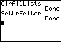
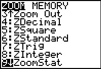
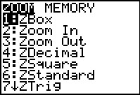
 keys we open the window
shown in Figure 1. From this list we select the fourth item
by pressing the
keys we open the window
shown in Figure 1. From this list we select the fourth item
by pressing the  key.
key.

 key.
key.