Lecture 24: CSS3
Overview:
- Introduction to CSS3
- CSS3 Colors
- CSS3 Multi-Column Layouts
- CSS3 Content
- CSS3 Backgrounds
- CSS3 Borders
- CSS3 Text Effects
- CSS3 Display
- CSS3 User Interface
- CSS3 Selectors
Introduction to CSS3
- CSS3 has been in development for a long time (initial ideas were being gathered in the late '90s) but has not been finalized in a W3C Recommendation (for that matter CSS 2.1 is not a final Recommendation either).
- There is a very long list of new properties, pseudo-classes, pseudo-elements, and selectors currently proposed and in Working Draft, Candidate Recommendation, or Last Call status.
- CSS3 differs from CSS1 and CSS2 because it is modular. This means that related CSS properties are grouped together into groups or modules. CSS3 modules include CSS1, CSS2, and CSS2.1 content.
The modules being worked on (from a CSS3 Introduction) include:
- Syntax / grammar
- Selectors
- Values & units
- Value assignment / cascade / inheritance
- Box model / vertical
- Positioning
- Color / gamma / color profiles
- Colors and backgrounds
- Line box model
- Text
- Fonts
- Ruby
- Generated content / markers
- Replaced content
- Paged media
- User interface
- WebFonts
- ACSS
- SMIL
- Tables
- Columns
- SVG
- Math
- BECSS
- Media queries
- A modular approach was taken because it is easier for a given device (a handheld device browser, a speech browser) to support only the portions that pertain to it, rather than trying to claim support for some percentage of a huge specification that has everything in it. Modularity also means that updating is easier, because a given portion can be updated without needing to update the other modules. On the structural markup side, XHTML 1.1 and 2.0 are modular, for the same reasons.
- As we have seen in previous lectures, there are proprietary properties reflecting a particular implementation of a property, pseudo-class, or pseudo-element. The ones we have seen begin with -moz, although other
browsers have their own implementations (typically beginning with a - or _). By designating them in this fashion, it is easier to "drop" them if they do not make it into the final Recommendation.
Note that not all proprietary properties are versions of something in development by the W3C; in some cases they were proposed additions to the standard that were rejected. This is true for some of the proprietary Internet Explorer properties.
- For the Candidate Recommendations there is already some browser support (and not necessarily in the format of proprietary versions). Safari, Konqueror, and the Gecko-based browsers have the strongest support, followed by Opera. As you could guess, Windows Internet Explorer 6 and 7 have almost no support.
- This lecture focuses on the CSS3 that has at least some browser support. It is also worth noting that some browsers have incomplete CSS2 support, so it is a bit early to expect strong CSS3 support.
- Apple has a page indicating CSS support in Safari / Web Kit. There is also a list of the -moz extensions as well as a list of regular CSS support in Mozilla (which maps fairly well to Firefox support) The Konqueror browser (commonly found in the Linux world) has similar support levels to Safari, due to its use of the KHTML rendering engine; a Konqueror CSS support chart is available.
CSS3 Colors
| Property | Usage and Effect | Values Accepted | Recommendations and Support |
|---|---|---|---|
| opacity | Sets the opacity (transparency level / opaqueness level) for an element. | Value ranging from 0 (fully transparent) to 1 (fully opaque; this is the default) | Gecko-based browsers, Opera (as of version 9), and Safari have support.
IE needs the proprietary filter property, which only works for elements with a defined width and/or height. Values range from 0 to 100 and lack units. None of this will validate; the W3C CSS validator is not expecting CSS3 yet and the IE property is proprietary. |
| rgba | Allows you to set color as well as transparency when setting a background (the 'a' represents 'alpha'); an alternative to the opacity property. | background: rgba(255, 255, 0, 0.8) | Supported by Safari; slated for implementation in Firefox 3 |
| hsl | Color is based on HSL (Hue, Saturation, Lightness) values. Hue is a degree (number) on the color wheel (0 or 360 is red, 120 is green, and 240 is blue); saturation and lightness are percentages (100% saturation is the full color, 0% lightness is black/dark and 100% lightness is white/light). | background: hsl(240,100%, 50%) | Supported by Gecko-based browsers, Safari, and Konqueror |
| hsla | Allows you to set transparency as well as hue, saturation, and lightness (the 'a' represents 'alpha'); an alternative to the opacity property. | background: hsla(0,100%,50%,0.6) | Supported by Safari; slated for implementation in Firefox 3 |
Sample code for opacity:
<!DOCTYPE html PUBLIC "-//W3C//DTD XHTML 1.0 Strict//EN"
"http://www.w3.org/TR/xhtml1/DTD/xhtml1-strict.dtd">
<html xmlns="http://www.w3.org/1999/xhtml" xml:lang="en" lang="en">
<head>
    <title>Embedded CSS: Opacity</title>
    <meta http-equiv="Content-Type" content="text/html; charset=utf-8" />
    <style type="text/css"><!--
    body {font: 12px verdana,geneva,lucida,arial,sans-serif;}
    div {color: #fff; background: #006; height: 25px;}
    .opaque {opacity: 1;  filter: alpha(opacity=100);}
    .seventyfive {opacity: .75; filter: alpha(opacity=75);}
    .half {opacity: .5; filter: alpha(opacity=50);}
    .twentyfive {opacity: .25; filter: alpha(opacity=25);}
    --></style>
</head>
<body>
<div class="opaque">Fully opaque background.</div>

<div class="seventyfive">Opacity of .75</div>

<div class="half">Opacity of .5</div>

<div class="twentyfive">Opacity of .25</div>
</body>
</html>
CSS3 Multi-Column Layouts
- These properties allow web page content to be easily laid out in columns, similar to a newspaper.
- Columns can either be set up by widths or by count; those are the two possibilities.
- Mozilla (as of version 1.8) and Firefox have -moz extensions for some properties in the Columns module; no other browsers have any support.
| Property | Usage and Effect | Values Accepted | Recommendations |
|---|---|---|---|
| -moz-column-count | Specifies the number of columns. | Number (representing number of columns) | If a height is not specified the content is spread across the indicated number of columns.
If a height is specified it takes precedence over column-count, so that if the height is too large fewer columns will be shown and if the height it too small more columns will be shown. This will not validate due to being a Mozilla extension. |
| -moz-column-width | Specifies the width of each column. | Number and unit (e.g., px, em, %) | Each column is the same width.
If a height is specified that determines the number of columns, based on the content. If font size increases then more columns are added; the height is not exceeded. This will not validate due to being a Mozilla extension. |
| -moz-column-gap | Specifies the gap (gutter) between each column. | Number and unit (e.g., px, em, %) | Each column has the same space between it.
This will not validate due to being a Mozilla extension. |
Sample code:
<!DOCTYPE html PUBLIC "-//W3C//DTD XHTML 1.0 Strict//EN"
"http://www.w3.org/TR/xhtml1/DTD/xhtml1-strict.dtd">
<html xmlns="http://www.w3.org/1999/xhtml" xml:lang="en" lang="en">
<head>
    <title>Embedded CSS: Columns</title>
    <meta http-equiv="Content-Type" content="text/html; charset=utf-8" />
    <style type="text/css"><!--
    body, h1 {font: 12px verdana,geneva,lucida,arial,sans-serif;}
    h1 {font-size: 16px;}
    div {margin-bottom: 35px; -moz-column-gap: 20px;}
    #columns1 {-moz-column-count: 3;}
    #columns2 {-moz-column-count: 3; height: 100px;}
    #columns3 {-moz-column-width: 250px;}
    #columns4 {-moz-column-width: 250px; height: 75px;}
    --></style>
</head>
<body>
<h1>Example using Column-Count and No Height:</h1>
<div id="columns1">
sample text sample text sample text sample text sample text sample text
sample text sample text sample text sample text sample text sample text
sample text sample text sample text sample text sample text sample text
sample text sample text sample text sample text sample text sample text
sample text sample text sample text sample text sample text sample text
sample text sample text sample text sample text sample text sample text
sample text sample text sample text sample text sample text sample text
</div>

<h1>Example using Column-Count and Height:</h1>
<div id="columns2">
sample text sample text sample text sample text sample text sample text
sample text sample text sample text sample text sample text sample text
sample text sample text sample text sample text sample text sample text
sample text sample text sample text sample text sample text sample text
sample text sample text sample text sample text sample text sample text
sample text sample text sample text sample text sample text sample text
sample text sample text sample text sample text sample text sample text
</div>

<h1>Example using Column-Width and No Height:</h1>
<div id="columns3">
sample text sample text sample text sample text sample text sample text
sample text sample text sample text sample text sample text sample text
sample text sample text sample text sample text sample text sample text
sample text sample text sample text sample text sample text sample text
sample text sample text sample text sample text sample text sample text
sample text sample text sample text sample text sample text sample text
sample text sample text sample text sample text sample text sample text
</div>

<h1>Example using Column-Width and Height:</h1>
<div id="columns4">
sample text sample text sample text sample text sample text sample text
sample text sample text sample text sample text sample text sample text
sample text sample text sample text sample text sample text sample text
sample text sample text sample text sample text sample text sample text
sample text sample text sample text sample text sample text sample text
sample text sample text sample text sample text sample text sample text
sample text sample text sample text sample text sample text sample text
</div>

</body>
</html>
CSS3 Content
- In CSS2 the content property only allowed content to be inserted using :before and :after
- CSS3 allows the content property to edit the element content itself, without needing to put it either before or after the existing content.
- No (X)HTML tags can be provided; they will not be rendered and will appear exactly as typed as regular text content.
- This is a controversial aspect of CSS that I am not convinced is appropriate. CSS should be about presentation, not about content. Content manipulation should be the domain of JavaScript or other scripting languages.
- Opera is the only browser supportive of content in the way CSS3 indicates.
Sample code:
<!DOCTYPE html PUBLIC "-//W3C//DTD XHTML 1.0 Strict//EN"
"http://www.w3.org/TR/xhtml1/DTD/xhtml1-strict.dtd">
<html xmlns="http://www.w3.org/1999/xhtml" xml:lang="en" lang="en">
<head>
    <title>Embedded CSS: CSS3 Content</title>
    <meta http-equiv="Content-Type" content="text/html; charset=utf-8" />
    <style type="text/css"><!--
    body {font: 12px verdana,geneva,lucida,arial,sans-serif;}
    #example {content: "This div content was changed using CSS3."}
    --></style>
</head>
<body>
<div id="example">Your browser does not support the content property as
described in CSS3.</div>
</body>
</html>
CSS3 Backgrounds
- One of the most notable CSS3 changes is the ability to assign multiple background images to one element.
- The existing background-image property or the background shorthand property can be used. If the shorthand is used, commas separate each block of shorthand code.
If the individual (non-shorthand) properties are used, then the background-image urls are separated by commas and the background-position values are also separated by commas. The browser matches the url to its position based on the sequence of values.
- Safari, Konqueror, and Gecko-based browsers have experimental versions supported for most of these (Mac and Windows IE 5.x show the last background image and other browsers show nothing), but once all modern browsers support this it will be an excellent way to streamline (X)HTML code. The current practice is to use multiple tags (typically divisions) and apply one background to each division, which results in very clunky, ugly, semantically confused code.
| Property | Usage and Effect | Values Accepted | Recommendations and Support |
|---|---|---|---|
| background-origin | Determines how the background-position of an element is calculated. | padding (the default; position is relative to the upper left padding edge) | border (position is relative to the upper left border edge) | content (position is relative to the upper left corner of the content) | -webkit-background-origin for the latest versions of Safari
-khtml-background-origin for Konqueror -moz-background-origin for Gecko-based browsers This will not validate due to non-standard properties. |
| background-clip | Determines whether a background extends into the border. | border (the default; the background image extends into the border) | padding (the border stops at the padding edge and the background of the border is transparent) | -webkit-background-clip for the latest versions of Safari
-khtml-background-clip for Konqueror -moz-background-clip for Gecko-based browsers This will not validate due to non-standard properties. |
| background-size | Sets the dimensions of the background image. | Number and unit (e.g., px, em, %) or 'auto'
If one value is given, it is used for height and width If two values are given they are separated by a space; the first value is width and the second value is height. Percentages only work for block-level elements and are relative to the area within the element defined by the background-origin property. The 'auto' value uses the image's intrinsic value (its actual dimensions), either as 'auto', 'auto auto', or with a specified height or width as the other value. Negative values are not allowed and '0' should result in the image not being shown. |
-webkit-background-size for the latest versions of Safari
-khtml-background-size for Konqueror This will not validate due to the non-standard property. |
Sample code for background-origin, background-clip, and background-size:
<!DOCTYPE html PUBLIC "-//W3C//DTD XHTML 1.0 Strict//EN"
"http://www.w3.org/TR/xhtml1/DTD/xhtml1-strict.dtd">
<html xmlns="http://www.w3.org/1999/xhtml" xml:lang="en" lang="en">
<head>
    <title>Embedded CSS: CSS3 Backgrounds</title>
    <meta http-equiv="Content-Type" content="text/html; charset=utf-8" />
    <style type="text/css"><!--
    body {font: 12px verdana,geneva,lucida,arial,sans-serif;}
    div {background: #407C07 url(flower.jpg) top left no-repeat;
         height: 100px; width: 600px; border: 5px dotted #000;
         padding: 20px; color: #fff; margin-bottom: 30px;}

    #alternate1 {
         -webkit-background-origin: content;
         -khtml-background-origin: content;
         -moz-background-origin: content;
         -webkit-background-clip: padding;
         -khtml-background-clip: padding;
         -moz-background-clip: padding;
         -webkit-background-size: 50px;
         -khtml-background-size: 50px;
    }

    #alternate2 {
         -webkit-background-origin: border;
         -khtml-background-origin: border;
         -moz-background-origin: border;
    }
    --></style>
</head>
<body>

<div>This division uses the defaults for background-origin,
background-clip, and background-size.</div>

<div id="alternate1">This division uses a 'content' background-origin,
'padding' background-clip, and resizes the background-size.</div>

<div id="alternate2">This division uses a 'border' background-origin
but otherwise uses defaults.</div>

</body>
</html>
Sample code for multiple background images:
<!DOCTYPE html PUBLIC "-//W3C//DTD XHTML 1.0 Strict//EN"
"http://www.w3.org/TR/xhtml1/DTD/xhtml1-strict.dtd">
<html xmlns="http://www.w3.org/1999/xhtml" xml:lang="en" lang="en">
<head>
    <title>Embedded CSS: CSS3 Multiple Backgrounds</title>
    <meta http-equiv="Content-Type" content="text/html; charset=utf-8" />
    <style type="text/css"><!--
    body, h1 {font: 12px verdana,geneva,lucida,arial,sans-serif;}
    h1 {font-size: 16px;}
    #top {background: #ccc url(box-images/top.gif) top left no-repeat;
          width: 300px; height: 6px;
          font-size: 1px; /* for proper div height in Windows IE */}
    #bot {background: #ccc url(box-images/bottom.gif) bottom left no-repeat;
          width: 300px; height: 6px;
          font-size: 1px; /* for proper div height in Windows IE */}
    #text {padding: 10px; width: 280px; background: #ccc; color: #000;}
    #box {background: #ccc url(box-images/top.gif) top left no-repeat,
          #ccc url(box-images/bottom.gif) bottom left no-repeat;
          padding: 16px 10px; width: 280px; color: #000;}
    --></style>
</head>
<body>

<h1>A CSS1/CSS2 approach:</h1>
<div id="top"></div>
<div id="text">A rounded edge box</div>
<div id="bot"></div>

<h1>A CSS3 approach:</h1>
<div id="box">A rounded edge box</div>

</body>
</html>
CSS3 Borders
| Property | Usage and Effect | Values Accepted | Recommendations and Support |
|---|---|---|---|
| border-colors | Shorthand allows multiple colors to be specified within a border, so that gradients can be created. | One of the pre-defined color names, a hexadecimal value (e.g., #fff), or an rgb value: rgb(255,0,0) or rgb(0%,50%,25%)
Multiple values are separated by a space |
Only supported via -moz versions in Gecko-based browsers.
-moz-border-bottom-colors, -moz-border-top-colors, -moz-border-left-colors, -moz-border-right-colors This will not validate due to non-standard properties. |
| border-image | Shorthand allows images to be used for borders. | url()
This property becomes fairly involved; the relevant module gives more details. There is also a border-corner-image shorthand and properties dealing with border-fit and border-image-transform. |
Only supported via -webkit-border-image in the latest versions of Safari.
This will not validate due to the non-standard property. |
| border-radius | Shorthand allowing borders to be rounded. | Number and unit (e.g., px, em, %) | Only Gecko-based browsers and the latest versions of Safari have support.
-moz-border-radius, -moz-border-radius-topleft, -moz-border-radius-topright, -moz-border-radius-bottomleft, -moz-border-radius-bottomright -webkit-border-radius, -webkit-border-radius-topleft, -webkit-border-radius-topright, -webkit-border-radius-bottomleft, -webkit-border-radius-bottomright This will not validate due to the non-standard properties. |
Sample code for border-color:
<!DOCTYPE html PUBLIC "-//W3C//DTD XHTML 1.0 Strict//EN"
"http://www.w3.org/TR/xhtml1/DTD/xhtml1-strict.dtd">
<html xmlns="http://www.w3.org/1999/xhtml" xml:lang="en" lang="en">
<head>
  <title>Embedded CSS: CSS3 Border-Color</title>
  <meta http-equiv="Content-Type" content="text/html; charset=utf-8" />
  <style type="text/css"><!--
  body {font: 12px verdana,geneva,lucida,arial,sans-serif;}
  div {
  -moz-border-bottom-colors: #00f #0020ff #0040ff #0060ff #0080ff #00a0ff #00c0ff #0ff;
  -moz-border-top-colors: #00f #0020ff #0040ff #0060ff #0080ff #00a0ff #00c0ff #0ff;
  -moz-border-left-colors: #00f #0020ff #0040ff #0060ff #0080ff #00a0ff #00c0ff #0ff;
  -moz-border-right-colors: #00f #0020ff #0040ff #0060ff #0080ff #00a0ff #00c0ff #0ff;
  border-width: 8px; border-style: solid; padding: 10px;
  }
  --></style>
</head>
<body>

<div>A box with a special border.</div>

</body>
</html>
Sample code for border-radius:
<!DOCTYPE html PUBLIC "-//W3C//DTD XHTML 1.0 Strict//EN"
"http://www.w3.org/TR/xhtml1/DTD/xhtml1-strict.dtd">
<html xmlns="http://www.w3.org/1999/xhtml" xml:lang="en" lang="en">
<head>
    <title>Embedded CSS: CSS3 Border-Radius</title>
    <meta http-equiv="Content-Type" content="text/html; charset=utf-8" />
    <style type="text/css"><!--
    body {font: 12px verdana,geneva,lucida,arial,sans-serif;}
    div {background: #000; border: 1px solid #000; color: #fff;
         padding: 15px; margin-bottom: 20px;}
    #all {-moz-border-radius: 15px; -webkit-border-radius: 15px;}
    #tl {-moz-border-radius-topleft: 15px;
         -webkit-border-radius-topleft: 15px;}
    #tr {-moz-border-radius-topright: 15px;
         -webkit-border-radius-topright: 15px;}
    #bl {-moz-border-radius-bottomleft: 15px;
         -webkit-border-radius-bottomleft: 15px;}
    #br {-moz-border-radius-bottomright: 15px;
         -webkit-border-radius-bottomright: 15px;}
    --></style>
</head>
<body>

<div id="all">All edges are rounded.</div>
<div id="tl">Top left edge is rounded.</div>
<div id="tr">Top right edge is rounded.</div>
<div id="bl">Bottom left edge is rounded.</div>
<div id="br">Bottom right edge is rounded.</div>

</body>
</html>
CSS3 Text Effects
| Property | Usage and Effect | Values Accepted | Recommendations and Support |
|---|---|---|---|
| text-overflow | Specifies what should occur when content goes outside of an element; ideally you indicate that content continues by using ellipses. | Various values exist, but the ones supported are: ellipsis (three dots are used to show that content continues) | clip (content is cut off) |
The values indicated are supported in Windows Internet Explorer 6, Internet Explorer 7, and Safari.
Opera 9 supports the 'ellipsis' value for the proprietary '-o-text-overflow' property. The text-overflow property will not validate unless you select the 'CSS version 3' Profile when validating. |
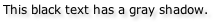
| text-shadow | Shorthand property indicating color of the text shadow, its location relative to the text, and the blur radius of the shadow. | Sequence of Values: color x-coordinate y-coordinate blur-radius
Sample Value 1: color: #000; text-shadow: #ccc 4px 4px 3px;
Renders as:
Sample Value 2: color: #fff; text-shadow: #000 -2px -2px 2px;
Renders as:
|
Only supported in Safari and Konqueror.
The coordinates and blur radius accept the standard sizing units. Setting a negative value for the x- or y-coordinate causes the shadow to move in the opposite direction. Positive values have the shadow down and to the right of the text. Negative values would move the shadow above and to the left of the text. Be careful not to blur text too much. A value of 0 is no blur; 2px is pretty blurry. Too high of a value and the text cannot be read. Keep in mind the usability problems (readability issues) that inappropriate use can cause. Also make sure that content is still readable if text-shadow is not supported but the rest of the CSS is used (a good example is white text with a black text-shadow on a white background). This was actually part of CSS2 that was never implemented and has now moved into CSS3. |
Sample code for text-overflow:
<!DOCTYPE html PUBLIC "-//W3C//DTD XHTML 1.0 Strict//EN"
"http://www.w3.org/TR/xhtml1/DTD/xhtml1-strict.dtd">
<html xmlns="http://www.w3.org/1999/xhtml" xml:lang="en" lang="en">
<head>
    <title>Embedded CSS: Text-Overflow</title>
    <meta http-equiv="Content-Type" content="text/html; charset=utf-8" />
    <style type="text/css"><!--
    body {font: 12px verdana,geneva,lucida,arial,sans-serif;}
    div {border: 1px solid #000; padding: 10px; width: 175px;
         overflow: hidden; white-space: nowrap; margin-bottom: 30px;}
    .ellipses {text-overflow: ellipsis;
               -o-text-overflow: ellipsis;}
    .clip {text-overflow: clip;}
    --></style>
</head>
<body>
    <div class="ellipses">In this division the content is too wide</div>

    <div class="clip">This division also has too much content</div>
</body>
</html>
CSS3 Display
- When an image is instructed to 'display: none;' it is not supposed to be downloaded until its display changes to something else (such as 'inline' or 'block').
- Such a change could be made using JavaScript, for example.
- Currently only Opera handles this properly.
CSS3 User Interface
| Property | Usage and Effect | Values Accepted | Recommendations and Support |
|---|---|---|---|
| box-sizing | Specifies the box model to use (the normal W3C box model or the one implemented in Windows Internet Explorer 5.x). | content-box (the default; padding and border add to width and height) | border-box (the Windows IE 5.x version; padding and border are deducted from width and height) | Opera and the latest versions of Safari support this property.
Gecko-based browsers use -moz-box-sizing This property will not validate yet due to being part of CSS3. |
| resize | Allows an element to be resized by the user. The element must have an overflow value set to something other than 'visible'. Resizing can be horizontal, vertical, or both directions. | none (the default) | both | horizontal | vertical | inherit | There is support for this in the nightly builds for Safari, so those will make their way into new versions. |
Sample code for box-sizing:
<!DOCTYPE html PUBLIC "-//W3C//DTD XHTML 1.0 Strict//EN"
"http://www.w3.org/TR/xhtml1/DTD/xhtml1-strict.dtd">
<html xmlns="http://www.w3.org/1999/xhtml" xml:lang="en" lang="en">
<head>
    <title>Embedded CSS: Box-Sizing</title>
    <meta http-equiv="Content-Type" content="text/html; charset=utf-8" />
    <style type="text/css"><!--
    body {font: 12px verdana,geneva,lucida,arial,sans-serif;}
    p {width: 600px; padding: 10px; border: 3px solid #000; height: 100px;}
    .borderBox {box-sizing: border-box; -moz-box-sizing: border-box;}
    --></style>
</head>
<body>
    <p>This paragraph uses the standard box model and will be wider
    as well as taller.</p>

    <p class="borderBox">This paragraph uses the alternate box model
    dating back to the Windows IE 5.x days.  It will be narrower and
    shorter than the paragraph above, even though they share the same
    width, padding, and border.</p>
</body>
</html>
CSS3 Selectors
| Selector | Usage and Effect | Syntax | Supported By |
|---|---|---|---|
| Indirect Adjacent | The elements share the same parent and the second element follows the first element, but it does not have to immediately follow the first element (like in the + direct adjacent selector). | div~table {border: 1px solid #000;}
The above code would apply to every <table> that follows a <div> in the code, as long as they shared the same parent element. The amount of tags between them would make no difference. |
Gecko-based browsers, Internet Explorer 7, Konqueror, and Opera (as of version 9) have support. Nightly builds of Safari also have support.
This will not validate because it is CSS3. |
| Prefix Substring Matching | Looks for a match using the text at the start of an attribute's value.
The use of ^ for this follows typical syntax for Regular Expressions. |
a[href^='https://'] {border-bottom: 3px double #000;}
The above code would put double border lines below secure links. |
Gecko-based browsers, Internet Explorer 7, Opera (as of version 9), Konqueror, and Safari have support. |
| Suffix Substring Matching | Looks for a match using the text at the end of an attribute's value.
The use of $ for this follows typical syntax for Regular Expressions. |
a[href$='.pdf'] {font-weight: bold;}
The above code would boldface all links to PDF documents. |
Gecko-based browsers, Internet Explorer 7, Opera (as of version 9), Konqueror, and Safari have support. |
| Instance Substring Matching | Looks for a match somewhere in the attribute's value.
The use of * for this follows typical syntax for Regular Expressions. Note that this is different from the universal selector, which selects elements. This is focused on attribute values. |
a[title*='glossary'] {cursor: help;}
The above code would use the help cursor for all links with title values containing the word "glossary" in that attribute's value. |
Gecko-based browsers, Internet Explorer 7, Opera (as of version 9), Konqueror, and Safari have support. |
Sample code:
<!DOCTYPE html PUBLIC "-//W3C//DTD XHTML 1.0 Strict//EN"
"http://www.w3.org/TR/xhtml1/DTD/xhtml1-strict.dtd">
<html xmlns="http://www.w3.org/1999/xhtml" xml:lang="en" lang="en">
<head>
    <title>Embedded CSS: CSS3 Selectors</title>
    <meta http-equiv="Content-Type" content="text/html; charset=utf-8" />
    <style type="text/css"><!--
    body {font: 12px/1.5 verdana,geneva,lucida,arial,sans-serif;}
    div ~ div {border: 3px double #000;}
    a[href^='mailto:'] {border-bottom: 2px dotted blue;
                        text-decoration: none;}
    a[href$='wccnet.edu']:after {content: " (WCC)";}
    a[href*='jwithrow'] {font-weight: bold;}
   --></style>
</head>
<body>
<div>An initial division, with a mailto: link to
<a href="mailto:jwithrow@wccnet.edu">Jason Withrow</a>
that demonstrates the prefix, suffix, and instance substring matching.
In supportive browsers the link should be boldface, have a dotted blue
line under it, and contain (WCC) after my name.</div>

<p>This paragraph was put in to set up the indirect adjacent selector
for the next division.  It has a link to the
<a href="http://www.wccnet.edu">Washtenaw Community College website</a>
as well, which should trigger the suffix substring selector.</p>

<div>And now the final div, which should have a double border.</div>

</body>
</html>